My Houzz: From Belgium With Love
http://decor-ideas.org 04/01/2015 21:13 Decor Ideas
More than 20 years ago, Hilde and Reza Leiaghat began providing Los Angeles residents with a line of curated vintage furniture and reproductions through their chain of Pom Pom Interiors stores. So popular was their style of relaxed luxury that Jennifer Lopez looked to them to design her twins’ nurseries in New York and L.A. “Our company motto has always been ‘European elegance with American comfort,’ and our home is a true reflection of that,” Hilde says.
Houzz at a Glance
Who lives here: Hilde and Reza Leiaghat
Location: Los Feliz neighborhood of Los Angeles
Size: 1,976 square feet (183 square meters); 5 bedrooms, 2½ bathrooms
Year built: 1911
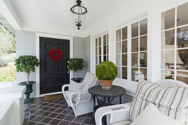
The couple’s design aesthetic can be seen from the moment you step onto the porch of their charming two-story Craftsman home. Antique urns holding sculpted boxwood and neatly trimmed ficus are balanced by comfy wicker chairs and vintage linen pillows. Linen is the favorite textile of these Belgium natives. “Vintage linens sold so well at the stores that we decided to create our own line that would emulate the soft, distressed feel of old linen,” Hilde says. The couple has since discontinued the retail business to focus solely on Pom Pom at Home, a wholesale line of linens and home furnishings.
The gray and white color scheme is punctuated by a black door and black ceramic tiles that they installed to cover a plain cement floor.
Furniture: vintage and antique pieces
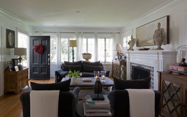
The neutral palette continues inside with dark gray upholstery and wood furniture. “We love natural, muted colors with lots of white. It has such a soothing effect, and we love to feel relaxed as soon as we open the front door,” Hilde says. The couch and sofa are from a local vendor who sold to their store. “We worked a lot with other L.A.-based companies for the reproduction pieces sold in the store,” Reza says.
Sofa, chairs: Moss Studio; painting: Benson-Cobb; marble urns: vintage; curtains: Pom Pom at Home; bird’s eye maple chest of drawers: vintage; lamp: Aidan Gray
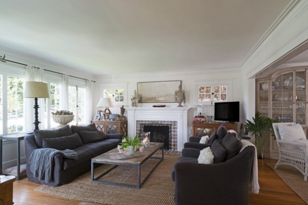
The existing mantel was rather plain, so they added an antique mantel from their store. It fits nicely over the old mantel while allowing the original Batchelder tiles to show through. The Leiaghats removed two built-in bookcases on either side of the fireplace and replaced them with a pair of matching wood and glass cabinets. An antique garden urn by the window holds driftwood gathered from a trip up the Washington coast. A wooden bowl on the mantel holds shells collected on other trips. “We love to display personal mementos throughout the house, and we often use them as props in our catalog photography,” Reza says.
Cabinets, lamps: Noir; coffee table, console, side table: Dovetail
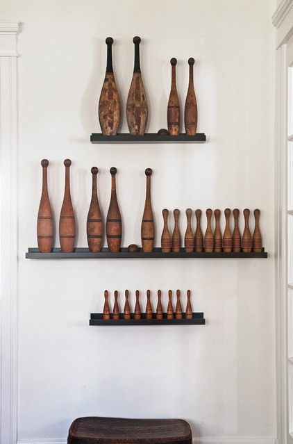
Reza and Hilde have a passion for anything made of wood, especially handcrafted objects and toys. A collection of vintage bowling and juggling pins gathered over the last 25 years, along with a vintage African basket, decorate a wall in a small space off the dining room.
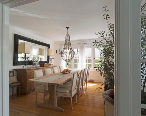
The dining room is an example of the design style they showcased in their stores, containing a combination of antique pieces, reproductions and custom-made pieces. The buffet is one of the first antiques the couple acquired. Reza embellished it with metal pieces taken from an old chandelier. Sitting on top of it are Spanish antique wrought iron lamps with their original goat-skin lampshades. Antique French chairs covered in Belgian linen are combined with a reproduction table. A dramatic Empire chandelier of brass and wood, purchased from one of their local vendors, serves as a focal point.
When Hilde wants to add a dash of color to the neutral palette, she uses flowers or edibles, like this bowl of bright tangerines gathered from the backyard.
Chandelier: Bobo’s Intriguing Objects; mirror: custom made
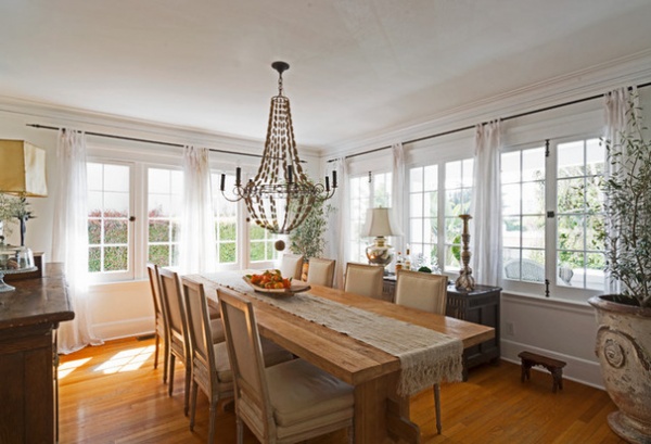
The ample windows were the main draw for the couple. “We love having so much light, and the windows are almost always open in our home,” Reza says. Dressing so many windows can be costly, though, and the couple spent almost $1,500 on hardware purchased through an upscale catalog. Dissatisfied with the quality, they decided to make their own with materials purchased from a local iron vendor. Reza, a consummate handyman who says his guilty pleasure is an afternoon at the hardware store, assembled and painted the rods himself. “It cost only about $300 to make and install rods for the whole house,” Reza says.
The olive trees do very well in the light-filled room. “We simply put them outside for a day or two each month, and they thrive,” Hilde says.
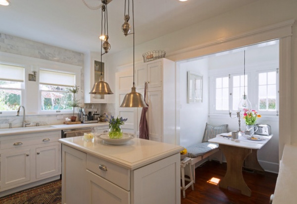
The changes the couple made to the house consisted mainly of redoing the kitchen and bathrooms. The classic look of the kitchen comes from the white Carrara marble and Shaker-style custom cabinets. Knowing that marble is prone to staining, the couple opted for white Caesarstone countertops with beveled edges. “It’s practical and reasonably priced and has withstood red-wine spills and cut berries,” Hilde says.
Breakfast nook table and benches: flea market; pendant lighting: Light & Living
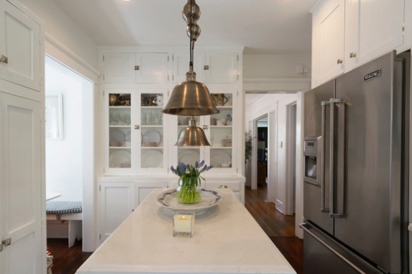
The couple added the built-in shelving when they redid the kitchen.
Refrigerator: Viking
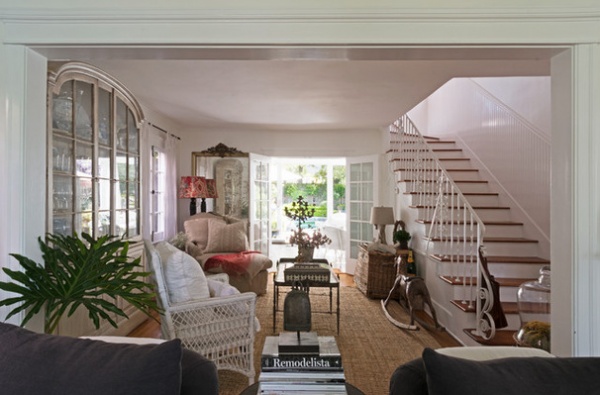
The outside patio and the space adjoining the living room are extensions of the living area. “The French doors are almost always open, and we really inhabit the outdoor space as much as the indoor space,” Hilde says.
Here the couple continues to mix things up for a look that is personal and inviting. Formal European antiques, like a large china cabinet and a French gilded mirror from the 1800s, share the room with a playful wooden rocking horse and a driftwood lamp acquired at a farmer’s market.
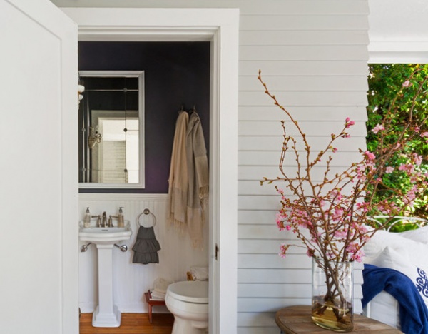
Just beyond the French doors off the patio is the first floor’s only bathroom. “When we first bought the house, the outdoor bathroom seemed so odd to us. We wanted to build some type of hallway to incorporate it indoors somehow,” Hilde says. Due to budget constraints, however, the couple held off on that improvement. “A year later we added the pool, and the outdoor bathroom suddenly made perfect sense,” she says. The petite room did pose some challenges, such as finding a sink small enough to fit. They found a pedestal sink via special order at Lowe’s.
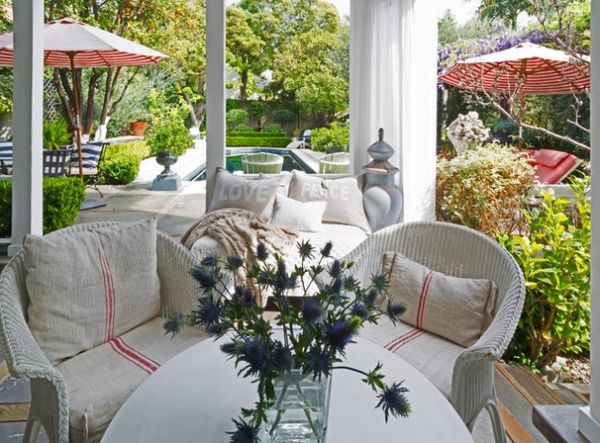
White wicker chairs, piles of pillows and gently swaying linen drapes that open to reveal the surrounding garden make the patio a dreamy space. A large carved wood chess piece in a sun-faded shade of blue adds a touch of whimsy.
Wicker furniture and chess piece: antiques; linen pillows and drapery: Pom Pom at Home
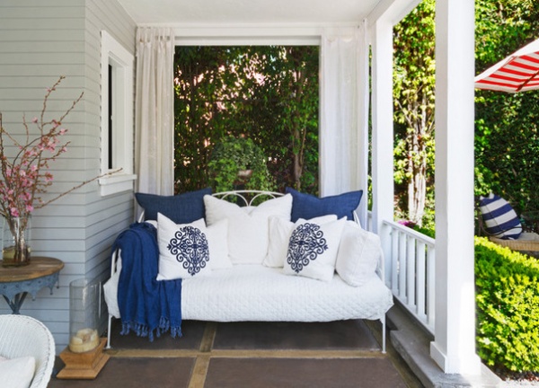
A vintage metal daybed filled with voluminous pillows makes for a welcoming corner for relaxing. “We’re fortunate to have weather that allows us to enjoy the garden year-round,” Hilde says. “I often sink into this bed with a coffee to read and relax. On colder days and nights, we simply bundle up with blankets and throws.”
Bed linens, pillows, throw: Pom Pom at Home
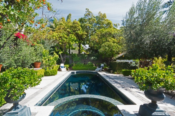
The garden design is another example of the couple’s love for mixing elegance and comfort. With its strong center axis, symmetrically placed urns and precision-trimmed hedges, it has all the timeless elements of an Italian Renaissance garden. At the same time, its fragrant fruit trees and flowering vines cascading from a weathered pergola give it the enchanting feel of a cottage garden. Maintaining this lush space is a labor of love for Reza, who wakes up at 5:00 every morning to care for the garden.
The dark blue pool color was Hilde’s choice, giving her the natural look she wanted.
Pool finish: Pebble Fina in Black Galaxy
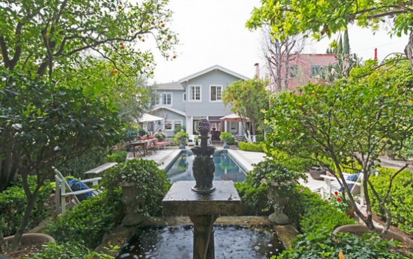
Behind the pool was an old birdbath surrounded by ivy that the couple wanted removed. “It was so firmly entrenched that even after much digging, we were not able to remove it. So we decided to attach a stone sculpture we had and added a pump to create a fountain out of it,” Reza says. “It must have been fate, since it became the center point from which the entire garden was designed.”
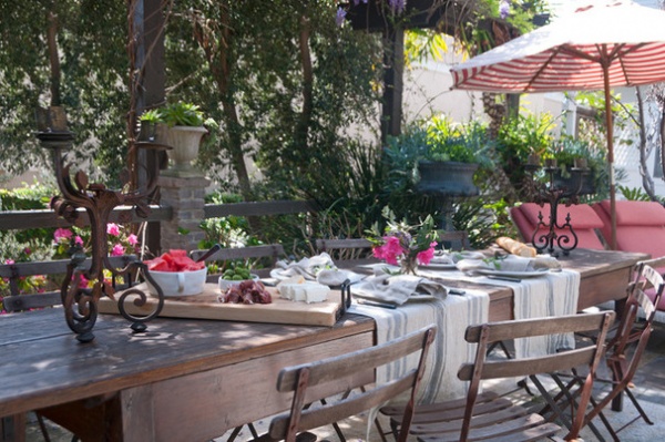
The couple does much entertaining outdoors by the side of the pool. An old German beer table that is long and narrow fits the space perfectly. Two lounge chairs to the side offer extra seating for guests.
Beer table: antique; lounge chairs: Bonhams; umbrella: Cost Plus World Market
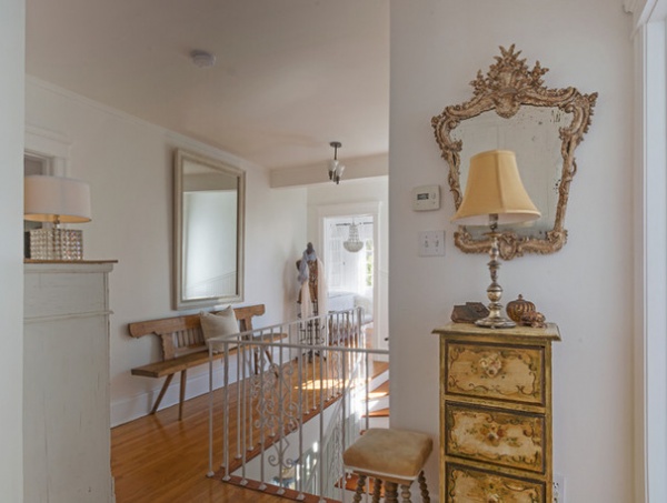
The upstairs hallway is simply furnished with European and American antiques. An old dress form is used by Hilde to hold some of the jewelry and scarves that she designs for the company.
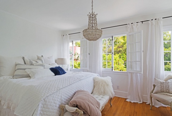
The master bedroom is mostly neutral, with a jolt of color provided by the green foliage outside and a cobalt-blue faux-fur pillow.
Bedding: Pom Pom at Home
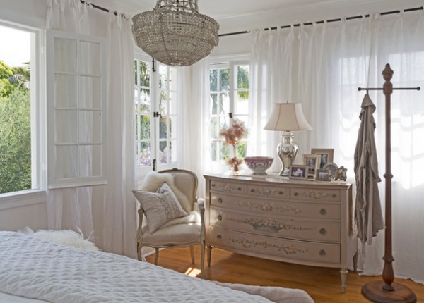
A pretty area with mostly French antiques, with the exception of the hand-painted American dresser, sits opposite the bed.
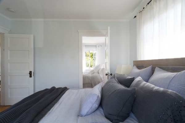
Two adjoining bedrooms once occupied by the couple’s two sons now serve as guest bedrooms.
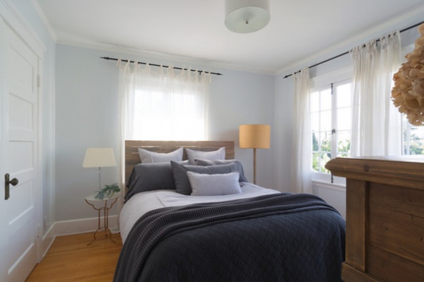
Hilde loves a relaxed, even wrinkled, look for beds. Here she used varying tones of blue and gray for a calming effect.
Lamps: Light & Living; tables: Aidan Gray; headboard, bedding: Pom Pom at Home
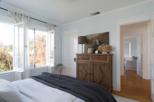
Wooden cabinet; Dovetail; lamps: Light & Living; painting: antique from Belgium
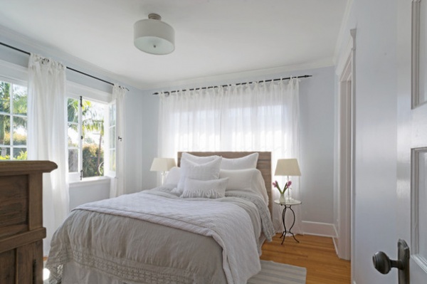
The matching guest room has a similar look but in soothing whites.
Lamps: Light & Living; tables: Aidan Gray; headboard, bedding: Pom Pom at Home
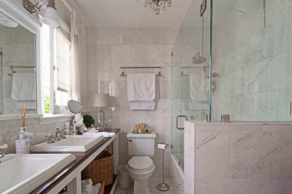
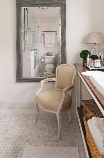
To maximize space in the narrow bathroom, the couple installed a long vintage workbench. “We simply cut two openings to create a double-sink vanity,” Reza says. White Carrara marble is used for a classic bathroom look.
The couple chose frameless glass shower doors over shower curtains to keep the small space feeling open.
Consistent with the rest of the house, European antiques such as the mirror, chair and chandelier add drama and elegance.
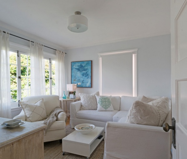
A fourth bedroom once used by Hilde as a home office is now an upstairs TV and family room.
Chair: BSC
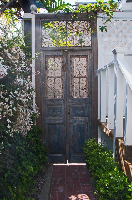
Antique garden doors from the couple’s store separate the driveway from the garden area. “We used to sell so many of these doors that we had to ship containers full of them from Europe,” Hilde says.
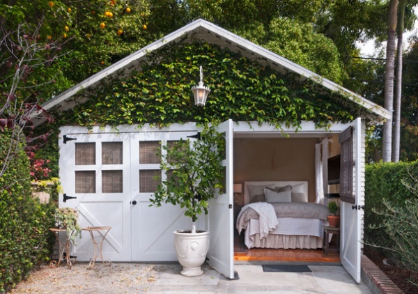
When their oldest son, Sam, started college, they converted the two-car garage into a guest cottage for him. They raised the floor to add the plumbing needed for the kitchen and bath. It was a $20,000 investment, including labor, materials and furnishings, to convert it into a livable space. Though Sam eventually chose dorm life over the cottage, it has been consistently used by visiting family members and other guests.
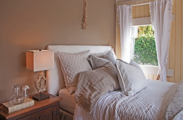
Hilde chose sunny yellow and soft beige for the guest cottage walls to create a cheerful and relaxed look.
Lamp: Aidan Gray; curtains, bedding: Pom Pom at Home
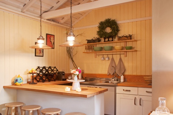
The kitchen cabinets, sink, faucet and counter are from Ikea.

Hilde, seen here, says they have plans for expanding the master bedroom into a full suite with a balcony and a master bath. “It’s an idea we’re playing with but nothing we’re in a rush to do,” she says. “Our sons are grown, so it’s just the two of us now. The house is pretty perfect as it is.”
See more photos of this home
My Houzz is a series in which we visit and photograph creative, personality-filled homes and the people who inhabit them. Share your home with us and see more projects.
Browse more homes by style:
Small Homes | Colorful Homes |Eclectic Homes | Modern Homes| Contemporary Homes | Midcentury Homes | Ranch Homes | Traditional Homes | Barn Homes | Townhouses | Apartments | Lofts | Vacation Homes
Related Articles Recommended


