Houzz Tour: Elegant Georgian Townhouse for a Family of 6
The owners of this Georgian townhouse had an advantage when it came to renovating their home. The interior designer they called, Henriette von Stockhausen, had directed their home’s initial renovation some 15 years earlier and knew their likes and dislikes inside and out. “We’ve known the family for a long time, and we understand how their lives work and what they enjoy,” Von Stockhausen says. “I know [the mother] so well, I can predict exactly what sort of wallpaper and fabric she’ll like.”
With four young children in the house, the biggest challenge for Von Stockhausen was designing a space that would stand up to the wear and tear of family life without compromising on beauty. “It was difficult to keep a clean and pretty look while making it work for everyday life,” Von Stockhausen says. The designer used hidden storage to keep the design streamlined, and retained some traditional elements to ensure it didn’t end up being a standard clean look, but rather a detailed, nuanced and elegant interior.
Photos by Alison Hammond Photography
Houzz at a Glance
Who lives here: A family of 6
Location: Kensington, London
Size: 5 bedrooms, 4 bathrooms
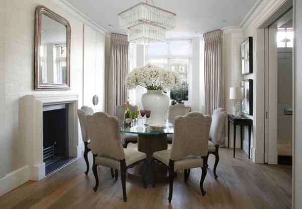
This dining area, at the front of the house, is accessed via large pocket doors off the hallway, increasing the sense of space. “Now we’ve opened up this room, it’s almost part of the hall,” says Von Stockhausen, of VSP Interiors. “We wanted to make the space flow a bit better because of all the children. Most of the time the doors are left open, but for more formal dinner parties, the space can be shut off.”
She adds, “The client likes everything quite neutral, leaning more to grays than creams, and she loves things that sparkle.” The designer chose a soft sea grass wallpaper with silver leaf to bring in a bit of texture and weight. She had the dining table made with an ebony veneered base and a glass top, and stained the dining chair legs to match. She also reupholstered the chairs in a silvery taupe fabric with chrome nailing for a more contemporary look.
A cupboard in the left-hand corner is covered in the same wallpaper so it blends seamlessly with the rest of the room. “Everything from carafes to glasses are in there — basically anything you’d need in a dining room,” Von Stockhausen says.
Wallpaper: Ralph Lauren; flooring: Fulham light oiled and smoked oak, Solid Floor
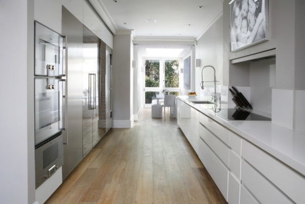
The kitchen is off the dining room through an open archway. While the feel of the space is quite different, with the kitchen having a more contemporary vibe, continuity was created through the oak floorboards and similar color scheme.
The key to the calm look of this room is that everything is hidden to keep the lines sleek and the surfaces clear. A full-height bank of appliances and cabinets spans the left-hand wall. Gaggenau ovens, a steamer and a large fridge-freezer stand next to tall walnut sliding doors that hide more cabinets and preparation areas, keeping any messes out of sight. All of the small appliances, including the toaster, coffee machine and teakettle, are stored here.
The kitchen was custom designed by VSP Interiors. The cabinets are white lacquer, and the countertop is granite in Snowdrift.
Appliances: Gaggenau; sink, faucet: Franke
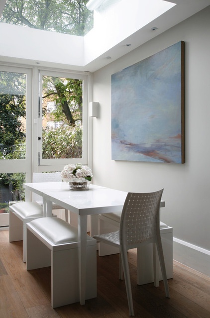
At the other end of the kitchen is an informal dining space that the family regularly uses. “It’s quite a tricky space, because it’s narrow,” Von Stockhausen says, “so to make the most of it, the dining table needed to be custom made. It’s a size you can’t buy off the shelf.”
A skylight was added to make the area light, bright and a friendly space for casual meals.
The dining table and benches are white lacquer with dyed leather seats. Ever conscious of practicalities, the client did a “spaghetti test” — placing spaghetti Bolognese on the leather samples overnight to see which would be best suited to family life.
Wall paint: Cornforth White, Farrow & Ball
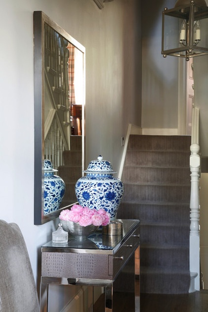
The house has five stories, with two additional half levels. The front door opens to a hallway that merges with the open dining and kitchen areas. A basement level houses a bedroom, bathroom, playroom and powder room. On the half level above the kitchen–dining room is a study, and a drawing room is on the first floor. Up a half flight of stairs is a guest bedroom, then more steps lead up to a master bedroom, a walk-in wardrobe and an en suite on the second floor. On the third floor are two more bedrooms and a family bathroom.
Table, mirror: Louise Bradley; carpet: Stark Carpet; wall paint: Pavilion Gray, Farrow & Ball
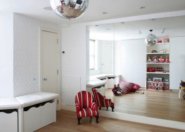
The playroom–family room is in the basement. With four children born since the last renovation, the family was in need of a less formal living space. There’s now lots of built-in storage so toys can easily be stashed away and the room can be used as a place in which the parents can relax.
Wallpaper: Designers Guild
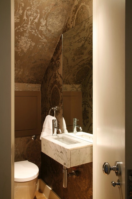
To add interest to the small, windowless powder room in the basement, Von Stockhausen went with a bold choice of wallpaper. “Without windows, spaces need something interesting to make them a bit more fun and give them some sort of impact,” she says. She went for a dark and atmospheric design, with a contrasting custom-made Carrara marble sink. The sink is hung slightly lower than normal to enable the children to reach it.
Wallpaper: Ralph Lauren; sink fixtures: Hansgrohe; toilet, Laufen
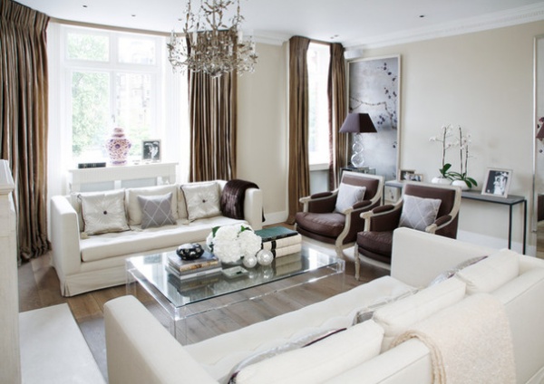
To bring the sparkle and glamour the client adores into the drawing room, Von Stockhausen opted for embroidery, glass beads and luxurious fabrics. White sofas are teamed with chocolate armchairs and fabrics from Designers Guild and Ralph Lauren to build up layers of texture and sumptuousness.
John Cullen Lighting designed the home’s lighting scheme. Von Stockhausen worked with the company to develop six mood settings for the Lutron lighting system that was installed, enabling the family to change the atmosphere with the touch of a button.
Sofas: Nicky Haslam; armchairs: Massant; coffee table: Carew Jones; chandelier, console table: Louise Bradley; curtain fabric: Salon Silk in Pearl Grey, Ralph Lauren; flooring: Solid Floor
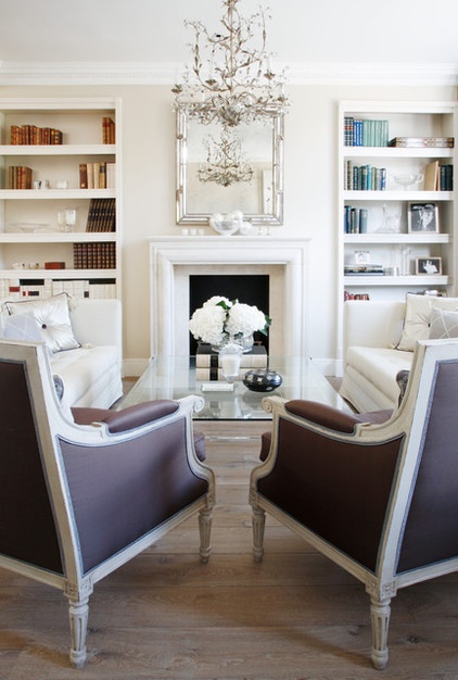
“It was quite difficult to walk the line between classic and modern,” Von Stockhausen says. “Everything the client likes is quite modern, but she didn’t want to lose the traditional feel altogether.” The designer opted for classic elements, such as the Louise Bradley chandelier seen here, but kept clean lines in all of the cabinetry and the old stone fireplace.
Fireplace: Wharton Antiques
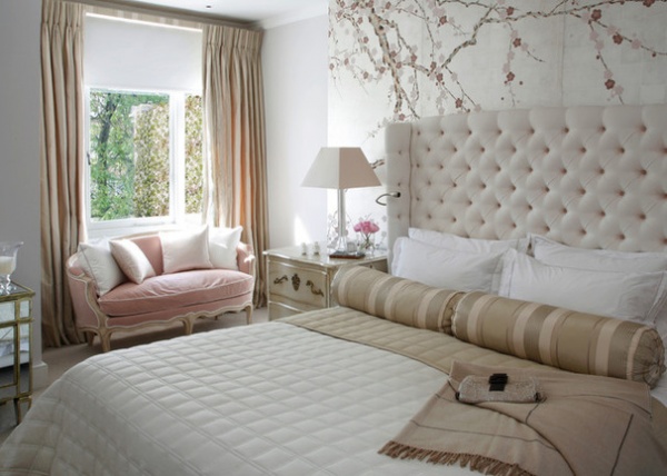
The client wanted the master bedroom to stay fairly neutral but still be very pretty. “We found the most gorgeous, old-fashioned, dusky gray-pink color for the walls,” Von Stockhausen says, “and everything went from there.” A pink sofa was updated using white piping to give it a slightly more contemporary edge. The headboard was custom made by VSP Interiors, as were the curtains, in a fabric from Designers Guild.
Bedside table: Moissonnier; bedside lamp: Porta Romana (discontinued); spotlights: John Cullen Lighting; sofa: Massant; chinoiserie wallpaper: Stark
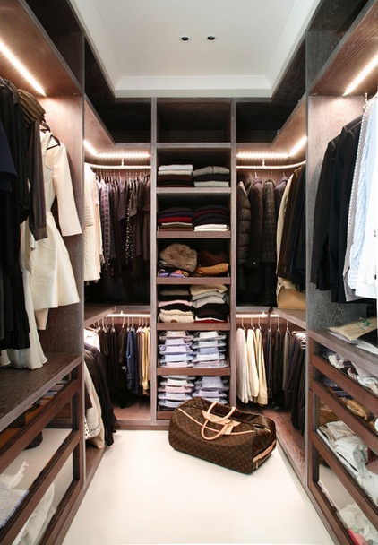
An important part of the redesign for the master bedroom was the addition of this sleek walk-in closet. It has a boutique feel and gives the whole suite a more lavish and indulgent feel. It was made by custom furniture company Minimo in stained limed oak with the input of John Cullen Lighting. “This is essentially a very dark room, but lit properly it looks amazing,” Von Stockhausen says.
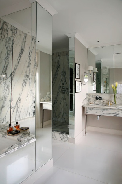
The sense of opulence is continued in the master en suite, with mirrored walls reflecting the natural details of the Calacatta d’Oro marble. The flooring is granite in Snowdrift.
Shower: Hansgrohe; sink: Villeroy & Boch, undermounted in a custom-made marble unit; sink fixtures: CP Hart; lights: Vaughan; wall paint: Cornforth White, Farrow & Ball
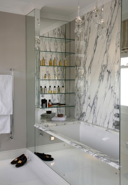
A deep, double-ended bath and a separate large shower make for luxurious bathing. “All of the surfaces that could be mirrored are, in order to maximize the light,” Von Stockhausen says.
Tub: Starlet double-ended undercounter, Bette
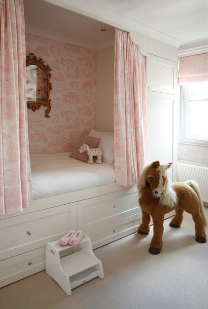
On the top floor are two children’s bedrooms and an additional bathroom. This particular bedroom is quite small, so to accommodate all of the necessary storage, Von Stockhausen designed this princess bed with a built-in wardrobe and drawers.
“The wallpaper is basically toile de Jouy but with children’s patterns on it — children on swings and other things,” she describes. The simple blind fabric adds a lighter touch and prevents the wallpaper from feeling too serious.
Wallpaper: Play Garden, Ralph Lauren; blind fabric: Designers Guild; carpet: Oatmeal, Wool Classics
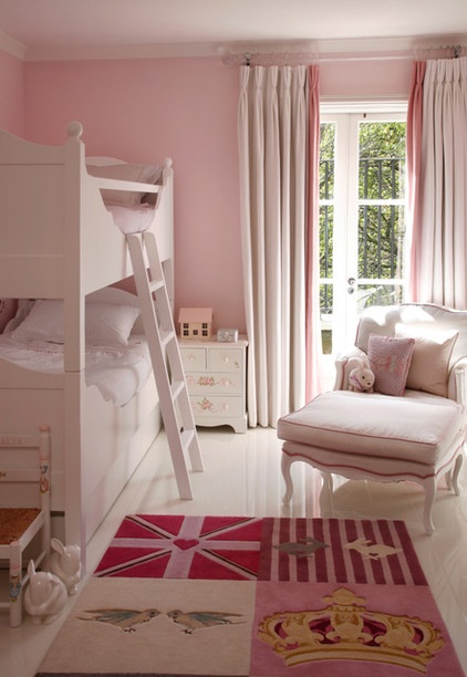
As the kids are all still quite young, and totally into pink, the second bedroom follows a similar scheme. “We wanted to keep it pretty and not too bright,” Von Stockhausen says. They installed a click flooring system made from a type of plastic that’s highly shiny and easy to clean. To soften the look, Von Stockhausen had a rug made by Loomah.
Bed, bedside table: The White Company; armchair, ottoman: Massant; armchair fabric: Brunschwig & Fils; curtain fabric: Diamond Matelasse, Ralph Lauren
Browse more homes by style:
Small Homes | Colorful Homes | Eclectic Homes | Modern Homes | Contemporary Homes | Midcentury Homes | Ranch Homes | Traditional Homes | Barn Homes | Townhouses | Apartments | Lofts | Vacation Homes


