My Houzz: A Family Makes a Fresh Start in a Remodeled Beach House
http://decor-ideas.org 03/31/2015 21:13 Decor Ideas
This three-story beachfront property has undergone several renovations since Andy Gordon purchased it almost 15 years ago. The latest came with his recent marriage to Carlo Brandon in 2013. This renovation involved two interesting design challenges: how to accommodate the needs of a new and growing family and how to create a style that was masculine as well as warm and inviting. The couple turned to interior designer Tim Clarke for help in all phases of the home’s transformation.
Houzz at a Glance
Who lives here: Andy and Carlo Gordon-Brandon; their kids, Adam, Sofia and Stella; and their dogs, Rumor and Hank
Size: 6 bedrooms, 5 full bathrooms, 2 powder rooms
Location: Malibu, California
Year built: 1983
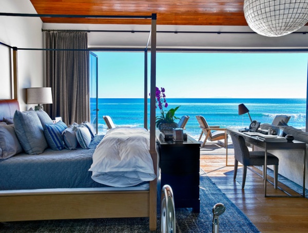
When Andy purchased the house, the ocean-facing wall of the master suite had only two small windows with Juliet balconies. He replaced the entire wall with folding glass doors that open up to a new balcony spanning the entire length of the room. The result is a light-filled space with expansive ocean views that seamlessly blends indoors and out.
Bed: Holly Hunt; overdyed area rugs: Lawrence of La Brea
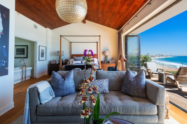
The color palette here and throughout the rest of the house, a mix of blues, grays and browns, reflects the tastes of both Andy and Carlo. Designer Clarke used both finished and unfinished woods for the floors, ceilings and furniture to incorporate different shades of brown. Subtle gray and blue fabrics of varying textures are used for the upholstery and bed linens and soften the look of the solid furniture pieces.
Ceramic lamps: handmade by Clate Grunden; nightstands and upholstered furniture: custom design by Tim Clarke Design; leather ottoman: Mecox
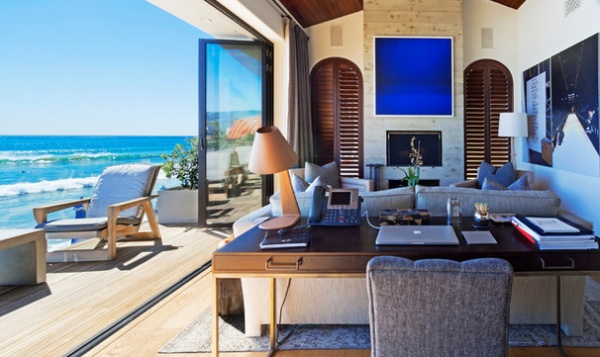
A large Kiki Kausch photograph hangs on the ocean-facing wall in the room’s sitting area. Carlo, a former model who used to walk the runways in Europe, saw the piece while staying at the Hotel de Roma in Berlin and immediately connected with it. “It reminded me of all the backstage chaos and drama,” he recalls. On a return trip to Berlin four years later, a chance encounter with the artist’s rep led to his purchasing the artwork.
Desk: Lawson-Fenning; outdoor lounge chairs: Sutherland; leather ottoman: Mecox
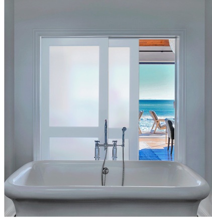
In keeping with the open-plan design, the master bath has sliding translucent doors that allow both privacy and a full ocean view.
Fixtures: Waterworks
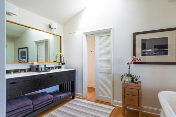
An angular double-sink vanity in ebony-stained wood balances the curves of the freestanding pedestal tub and reflects the modern feel of the space.
Fixtures: Waterworks
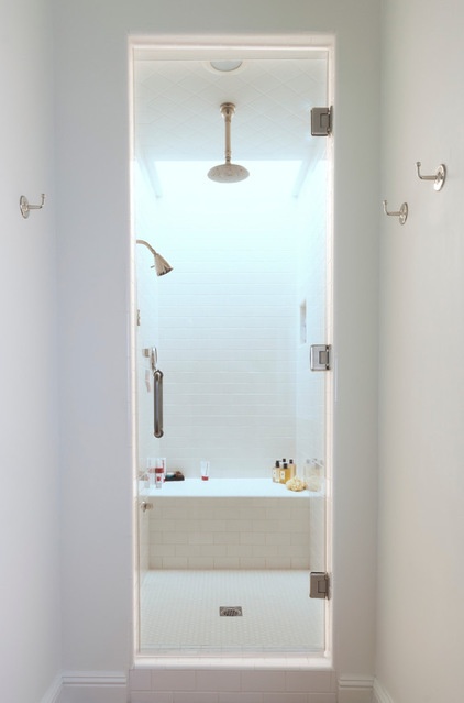
A steam shower is located behind the pocket door.
Fixtures: Waterworks
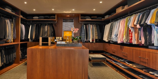
Across from the bathroom is the couple’s impeccable walk-in closet. With its custom-built caramel-colored cabinetry, the space emulates a luxury Italian menswear boutique.
Custom cabinets, closet design: Tim Clarke Design
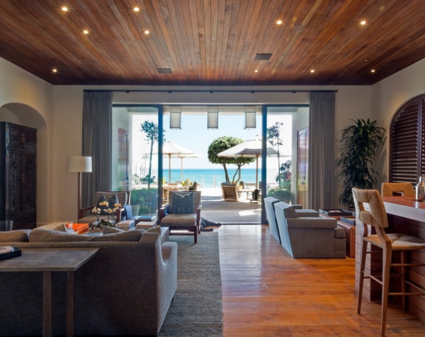
The open-plan design continues downstairs in the living room, where giant glass doors open to the large deck and ocean views.
Upholstered furniture: custom design by Tim Clarke Design
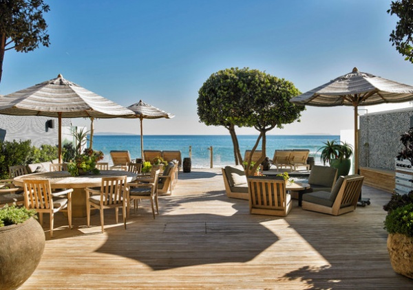
The beachside deck extends the full width of the house and is equipped with a built-in barbecue, a refrigerator and a storage area. Other amenities include a fireplace, a spa tub and plenty of seating areas for the couple and their kids to entertain friends. “As you can expect, this is the most inhabited and favorite space of our home,” says Carlo. Clarke’s landscape architect filled the space with potted succulents that thrive despite the salty ocean air.
Patio furniture: Sutherland; fabric: Janus et Cie
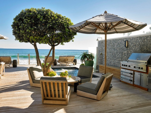
The expansive deck is the result of Andy’s earlier teardown of a teahouse, which occupied most of the right side of the space when he bought the house. Teahouses are common on Malibu porches, allowing inhabitants to enjoy the ocean views in warmth during cold winter months, but Andy didn’t see the need for one. “I much prefer the open space and only came here during summer,” he explains.
However, Carlo insisted on spending time here during winter and suggested the addition of the spa tub and fireplace. “It’s now Andy’s favorite time in Malibu. It’s peaceful, since the summer crowd is gone, and the sunrises and sunsets are more brilliant,” says Carlo.
Clarke used unfinished wood throughout, pale blue Mexican stones for the walls and a muted color scheme for the furniture, allowing the ocean to take center stage. “With the harsh sun and ocean air, the floors require sanding every year. It’s a commitment, but we love the aesthetic,” says Carlo.
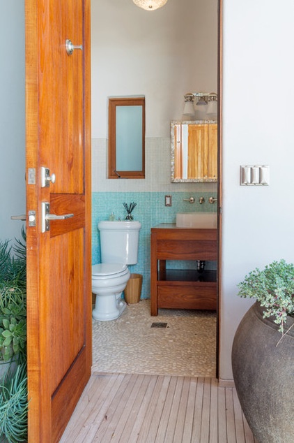
Also part of Andy’s initial renovation was the addition of an outdoor bathroom–changing room.
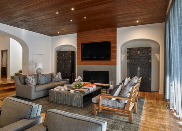
As in the master bedroom, the living room’s design was Clarke’s response to the couple’s request for a masculine look that was also comfortable and inviting. The interior previously had a more classic beach house look, with a white and light blue color scheme. Clarke gave it a modern update with a stark limestone fireplace and a dark wood-beamed ceiling. The ceilings here and in the master bedroom are oiled teak. The solid angular furniture is softened by big, comfy pillows, keeping the space kid-friendly and relaxed.
Ceramic lamps: handmade by Clate Grunden; coffee table: Cisco Home; overdyed area rugs: Lawrence of La Brea
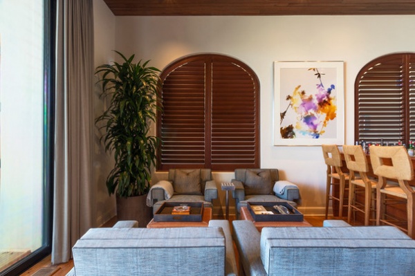
The right side of the room previously contained card tables, which were replaced with extra seating and a bar. “We love to entertain and have guests every weekend, so we wanted to accommodate that,” says Andy. An avid art collector and a cochairman of the board of trustees of the Los Angeles County Museum of Art, Andy has some interesting artwork, including this chromogenic print by James Welling.
Iron and leather ottoman: Mecox
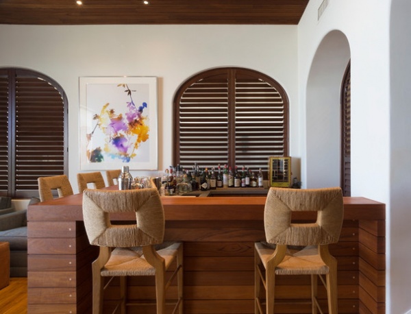
The square bar was an immediate hit with the family and their friends. “It’s casual in feel, and we love to gather around it,” says Carlo. Even daughter Sofia says, “It’s a cool place to hang around.”
Bar stools: Hollywood at Home
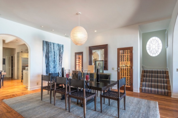
As consummate hosts, the couple had a wine and cigar cellar installed for their many dinner parties with friends and family. A large archival inkjet print by Michael Reisch serves as a centerpiece.
Chairs: Henry Beguelin; table, credenza: vintage, Downtown
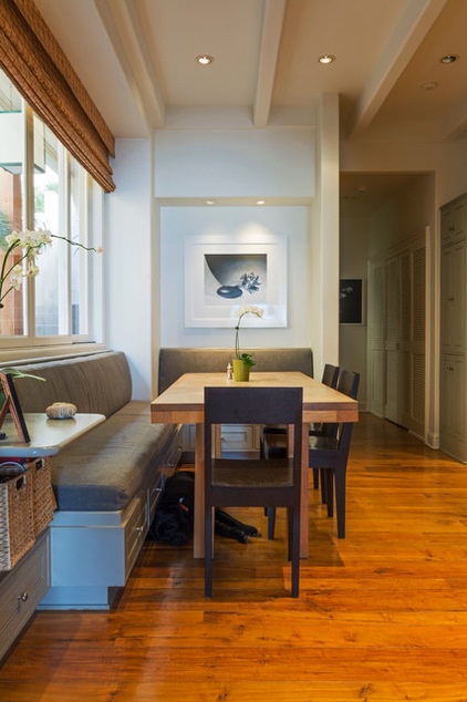
Beyond the dining room, there is a more casual eating nook off the kitchen. A Robert Mapplethorpe silver print on the wall plays off the colors of the banquette.
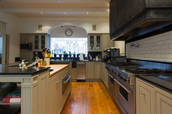
The chef-quality kitchen was installed as one of Andy’s previous renovation projects. It was previously a Moroccan-inspired space that Clarke simplified by painting the walls white and the cabinets gray.
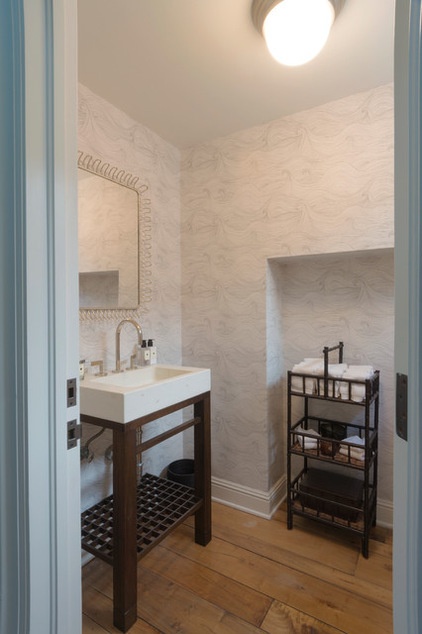
Two staircases flank both ends of the house. Each includes a landing between the second and third floors with an opening to a powder room.
Fixtures: Waterworks; wallpaper: Walnut Wallpaper; sink: Ann Sacks
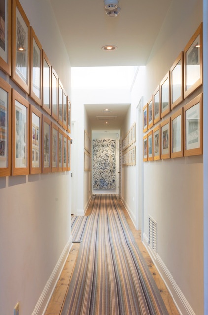
The upstairs hallway is decorated with family photos and a painting by Gonzalo Papantonakis.
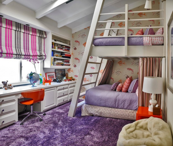
Carlo’s daughters, Sofia and Stella, share the room once occupied by Andy’s now-college-age son, Adam. “It was very important to us that the girls felt completely at home when we first moved in,” says Carlo. The girls were allowed to work with Clarke in every stage of the room’s redecoration. “They picked all the furniture, colors, fabrics and wallpaper,” Carlo adds.
Bed: custom design by Tim Clarke Design; shade fabric: Osborne & Little
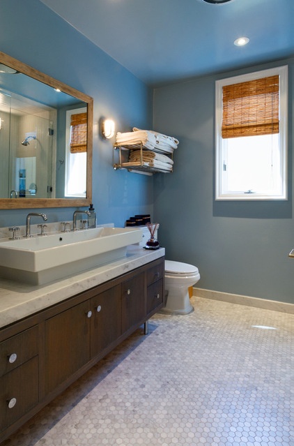
The bathroom shared by the girls has a double-sink vanity and a double shower.
Fixtures: Waterworks; sink: Duravit
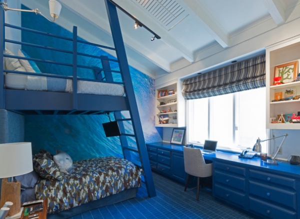
Adam occupies a nearby room. However, since he is now old enough to drive and has friends over every weekend, he will be moving to the largest guest suite, which can accommodate sleepovers for two or more friends. It is located at the end of the hall by the staircase, so they won’t disturb the girls during late-night get-togethers.
When that move happens, Sofia will take over this room. “We feel very fortunate that this house can accommodate the needs of the kids during all the different phases of their lives,” says Carlo.
Bed: custom design by Tim Clarke Design; shade fabric: Pindler
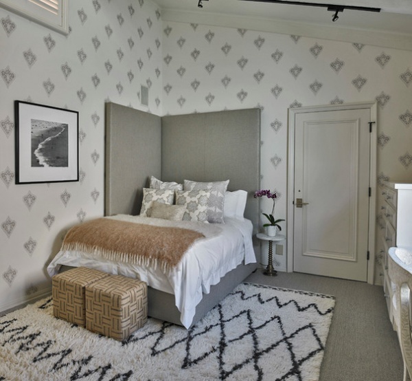
A classic gray and white design was used for one of the three guest rooms. “The rooms are always clean and ready with fresh linens should anyone not feel up for the drive back to town after a full day in the sun or a particularly festive evening,” says Carlo. “It’s also important that the home is open and ready for my college-aged kids to visit,” says Andy.
Bed: custom design by Tim Clarke Design; rug: West Elm; brass and stone side table: Mecox; pillows: John Robshaw Textiles; burlap ottomans: Schoolhouse Electric & Supply
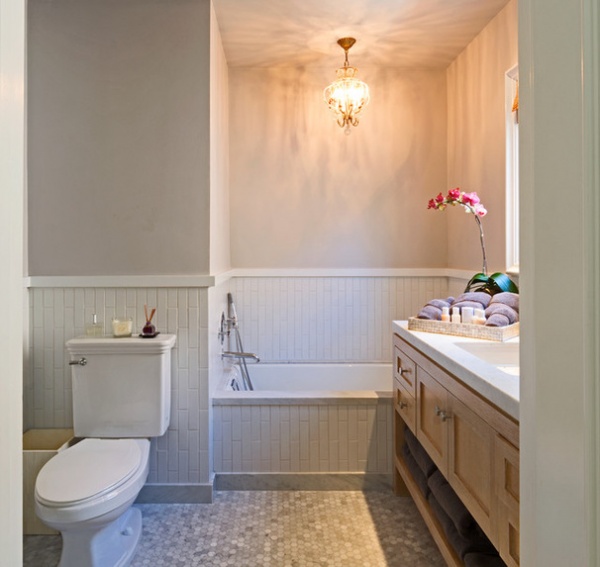
The adjoining bathroom features an open-storage vanity sink. Stocked with fresh towels, it gives the room a boutique-hotel feel.
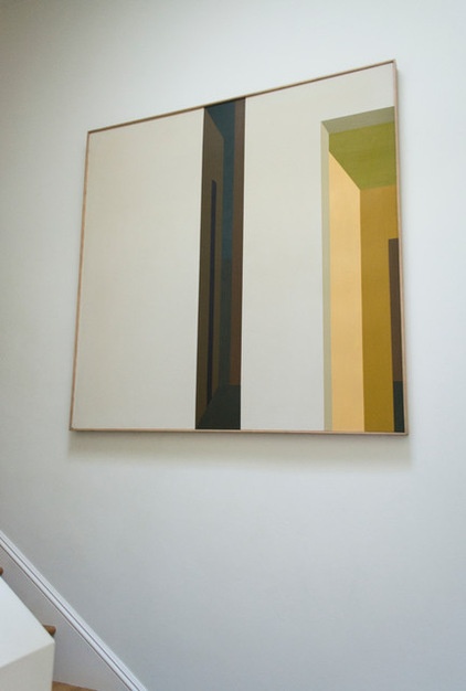
Each of the staircases showcases more artwork from the couple’s collection, including this piece by Helen Lundeberg.
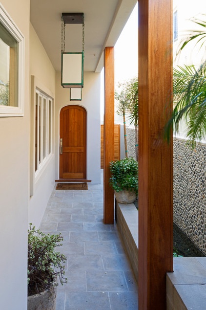
The main entrance outside features the same natural wood and stone design and sun-faded color scheme favored by Clarke that was used on the back deck.
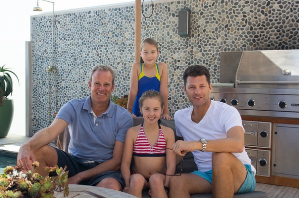
Clockwise from left: Andy, Stella, Carlo and Sofia take a break from an afternoon at the beach.
See more photos of this home
My Houzz is a series in which we visit and photograph creative, personality-filled homes and the people who inhabit them. Share your home with us and see more projects.
Browse more homes by style:
Small Homes | Colorful Homes | Eclectic Homes | Modern Homes | Contemporary Homes | Midcentury Homes | Ranch Homes | Traditional Homes | Barn Homes | Townhouses | Apartments | Lofts | Vacation Homes
Related Articles Recommended


