Houzz Tour: Compact Beach House With Room to Grow
This modern beach house in the township of Barwon Heads, near Melbourne, is a far cry from its previous life as a tiny, dilapidated clapboard. Recently retired academics wanted to spend more time at their retreat, but as their family grew — three grown-up children plus grandchildren — they required more room to sleep up to three families during summers. The renovation essentially doubled the floor area, providing a new bedroom pavilion, linked to the main house via a wood deck. “It evokes memories of our own childhood beach holidays,” says Auhaus Architecture architect Kate Fitzpatrick.
Houzz at a Glance
Location: Barwon Heads, Victoria, Australia
Size: About 1,670 square feet (155 square meters) plus a 323-square-foot (30-square-meter) deck; 4 bedrooms, 2 bathrooms
That’s interesting: The original worker’s cottage was transported from the Snowy Mountains scheme, a hydroelectric and irrigation complex in southeastern Australia, many years ago.
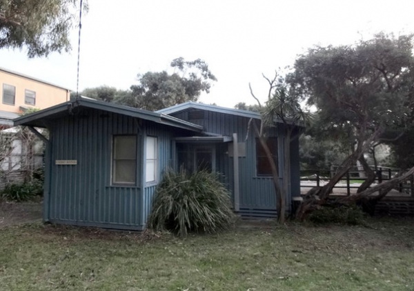
BEFORE: Here is the cottage before the remodel and addition. Only the floor structure, chimney stack, a few walls and the two back bedrooms were retained. Note the leaning tea tree on the right; it will help orient you for the “after” photo, next.
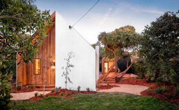
AFTER: Here we see the leaning tree again, between the updated original cottage on the left and a deck leading to a new guest pavilion farther back.
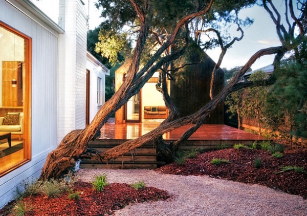
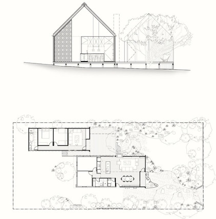
The two gabled pavilions are nestled among the existing twisted trees, creating a semienclosed deck area and a leafy, indigenous outlook for the living areas. The main house pavilion, which was slightly elongated and renovated to include a new kitchen, bathroom and living and dining areas, while also retaining two existing bedrooms. The siding on the main pavilion is painted plywood with highlights of oiled hardwood lining boards. “After we painted the whole outside of the [original] house white, the new and old blended in pretty seamlessly,” says Fitzpatrick.
The site levels were manipulated with mounded landscaping, bringing the ground level up to the height of the deck and drawing the front garden into the living zone. The site has a number of mature trees that influenced the layout.
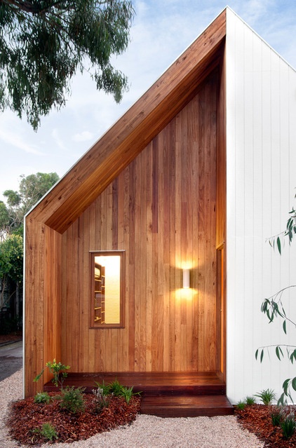
The original house lacked a defined entry; the new design embraces the arrival to the front door, with a double-height porch recessed into the building.
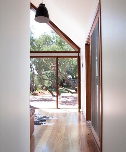
The new facade exaggerates the original pitched roof and opens up the interiors with cathedral ceilings to increase the sense of space in the small footprint.
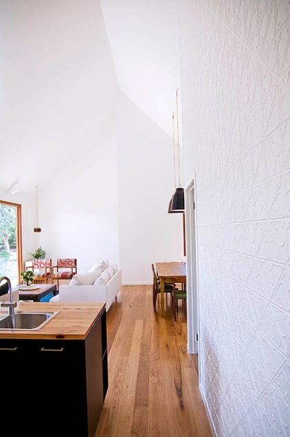
“We bedded the color scheme with white to increase the sense of space and brighten the rooms, helping to bounce light around the room,” says Fitzpatrick. “Although we initially considered using color, we were wary of making the spaces feel too enclosed, so we instead opted for a palette of black, white and timber.”
Cabinets: blackbutt veneer and black laminate
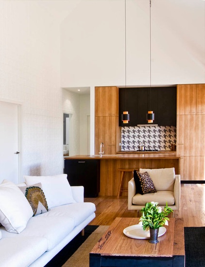
The kitchen countertop and the floors are recycled hardwood. The white pressed metal wall in the living room and the houndstooth kitchen backsplash “add layers of texture without dominating the space,” says Fitzpatrick
The old-school pattern on the backsplash harks back to the look of the original 1950s shack.
Nook sofa and leather armchair: Jardan; coffee table: custom made by Auhaus for the project from leftover floorboards and the base of a plan filing cabinet, painted black; backsplash: houndstooth glass mosaic tiles: Bisazza
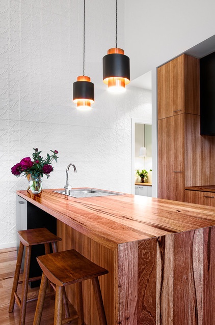
Blackbutt flooring and work surfaces are enhanced with highlights of copper, burnt orange and olive that reflect the rich colors of the surrounding native landscape.
Countertop: solid blackbutt; copper pendants: vintage, from Denmark
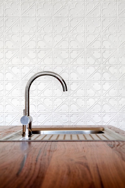
The owners were happy to give Fitzpatrick and fellow architect Benjamin Stibbard the freedom to choose all the products.
Sink: Abey, Barazza; faucet: Mizu, Reece
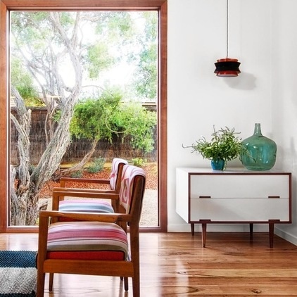
“Working with a small footprint, we were very aware that the house could easily become cluttered if we tried to do too much,” says Fitzpatrick. “To keep the spaces feeling bright and uncluttered, we kept the formal geometry strong and clean.”
They sourced many vintage pieces to create the feeling of a seasoned holiday home.
Occasional chairs: Vintage Parker, re-covered; striped jute rug: World Weave
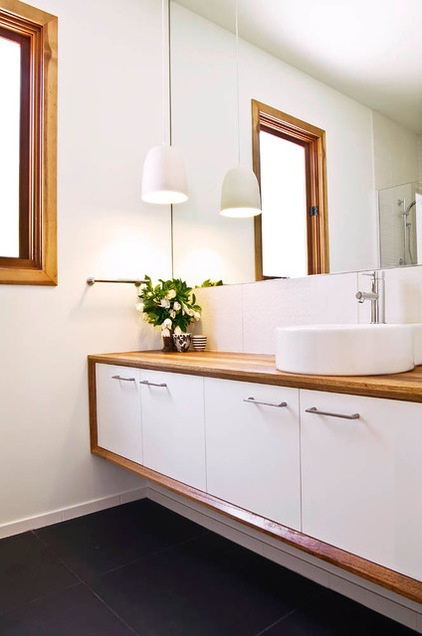
The black and white theme continues in the bathrooms via the tiling and cabinetry.
Vanity: custom made with blackbutt top and surround and white laminate cupboards; sink: Geo, Caroma; faucet: Scala, Reece; pendant light: Mud Australia; tiles: Signorino Tile Gallery
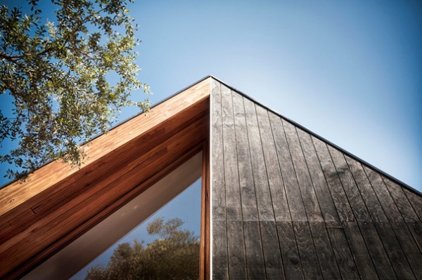
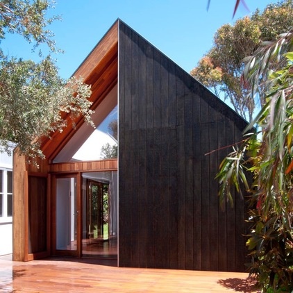
The family calls the new guest pavilion, shown here, the Pod. Its siding is black Colorbond sheeting on three sides, with black stained plywood cladding on the front face.
“Material choices were based around economy as well as function and aesthetic,” says Fitzpatrick.
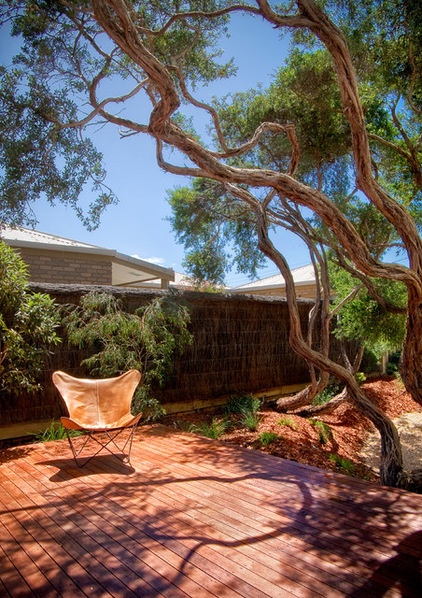
The deck area linking the two pavilions has become the family’s main gathering space. “The brief for the project was simply to provide more room in the most economical way,” Fitzpatrick says. “At 155 square meters [1,670 square feet], the renovated house consciously bucks the trend of oversized housing yet comfortably accommodates three families.”
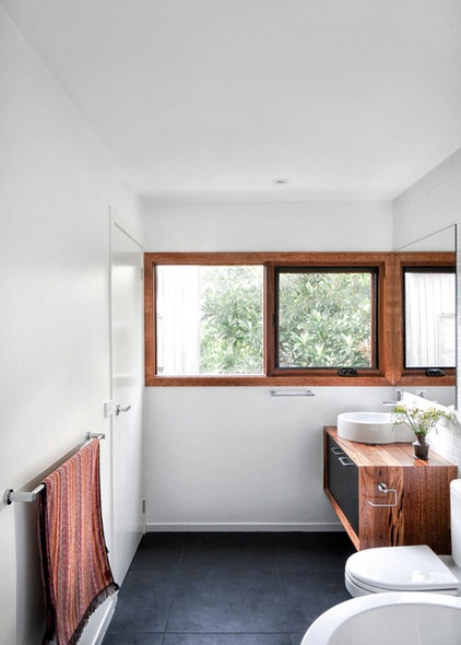
The guest bathroom features a custom vanity with a blackbutt top, waterfall and surround, and black laminate cabinet.
Porcher Cygnet toilet and Kado freestanding bath: Reece; tiles: Signorino Tile Gallery
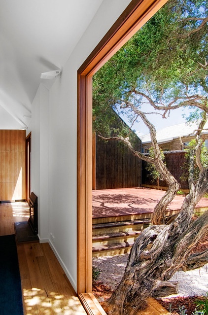
“The strong geometry of the two pavilions counterpoints the twisting tea trees, which appear to grow from the foundations,” says Fitzpatrick.
The architects say they are pleased to have delivered a project that has transformed how the owners use the house and increased the livability for the extended family. “It is a simple renovation that eschews any bells and whistles but delivers on things that matter,” says Fitzpatrick.
Browse more homes by style:
Small Homes | Colorful Homes | Eclectic Homes | Modern Homes | Contemporary Homes | Midcentury Homes | Ranch Homes | Traditional Homes | Barn Homes | Townhouses | Apartments | Lofts | Vacation Homes


