Houzz Tour: Desert Home Blurs Every Line Between Indoors and Out
http://decor-ideas.org 03/28/2015 23:13 Decor Ideas
This house in the desert is not only a home but an art gallery and part-time concert hall for the couple who live in it. One of the homeowners is an amateur singer and a music aficionado, and the other is a watercolor artist. They wanted to live in a place that would showcase their art collection and accommodate large groups for concert piano and opera singing performances. In addition, they wanted to soak up the beautiful views of the surrounding desert and golf course, and of the city lights and mountains in the distance.
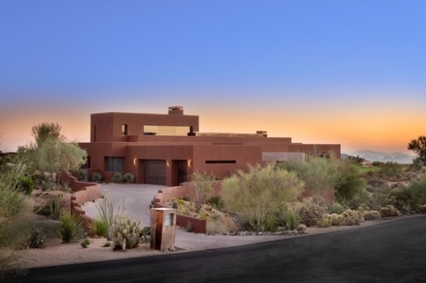
Photos by Michael Woodall
Houzz at a Glance
Who lives here: A music- and art-loving retired couple
Location: Scottsdale, Arizona
Size: 3 bedrooms, 5½ baths, plus an exercise room and an art studio
The architects at Tate Studio Architects sited the house to make the most of the views and the natural light and to create a sense of privacy. Placing the garage at the front of the house created a buffer from the road and a close neighboring house, which is just out of view to the right in this photo.
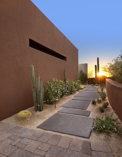
Architect Mark Tate wanted to create an arrival processional. Just off the driveway, one heads almost directly west, looking out to carefully placed cacti and, at dusk, to the setting sun. The long view keeps the area from feeling constricted.
Stepping stones: aggregate concrete with Graphite pigment by Davis Colors
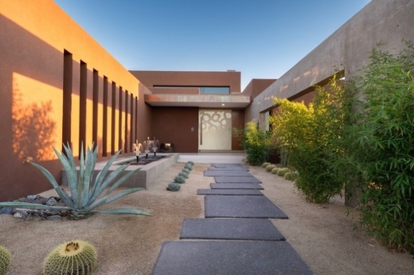
Around the corner, the house and a large cast-in-place concrete wall (right) form a courtyard. Tate blurred the lines between inside and out throughout the property, beginning along this path.
“I wanted to have framed views and for them to live in the view,” he says. The concrete wall provides a massive frame for the view out to the mountains. A large canopy marks the entrance to the house. The pivot door is a 9-footer.
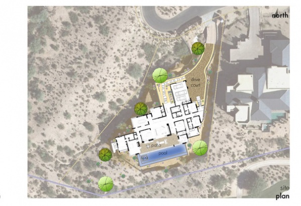
The house was sited to take advantage of the natural light and views, while still maintaining privacy. “This was a tricky lot,” Tate says. “It’s wider at the back and has a narrow entrance at the end of a cul-de-sac.”
The plan provides privacy from the road and the neighboring house on the right. There is a wash to the left, where nothing will ever be built, and the golf course is beyond the pool.
Tate also sited and designed the house and windows to handle the sun the right way. The house is built to meet the requirements of the city of Scottsdale’s Green Build program. “The mechanical units are state-of-the-art, high-efficiency, high-SEER-rated units designed to keep energy consumption as low as possible,” Tate says. (“SEER” stands for “seasonal energy efficiency ratio.”)
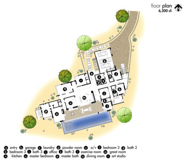
Before we step inside, let’s look at the plan. The center of the house contains the public spaces. To the left is the master suite; to the right, the guest bedrooms, exercise room and home office.
Large corner windows are oriented to the north and west; the largest south-facing windows are protected by the overhang between the house and the pool. The home’s location, 2,800 feet above sea level, means temperatures dip below freezing and it snows a few times a year. Thus, passive heat gain was also an important consideration in orienting the house and placing the windows.
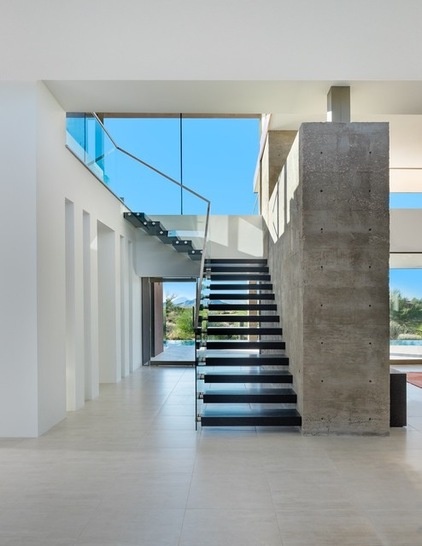
The 9-foot height of the outdoor canopy continues into a compressed entry space inside. Here the 9-foot ceiling gives way to layers of higher ceilings. “The ceilings pop up as you go through the house,” Tate says. There are 9-foot, 12-foot and 15-foot ceilings, creating dynamic layers overhead.
“Anywhere you walk in the house, we want you to be looking outside,” Tate says. The house is full of expansive windows, corner windows, transoms and tall, narrow windows that frame the views. In some of the spaces, there are crisply framed views; in others there is the wide-open feeling of living in the view.
Inside the house the view through to the backyard is open, except for the stair treads, which are cantilevered from a massive cast-in-place concrete wall. Underfoot, the same porcelain tile continues through the public areas and hallways and outside onto the covered patio (the tile outside has a rougher texture to prevent slips). The tile is just one example of the seamless transitions from indoors to outdoors throughout the house.
Tile: Refin, Ceramiche
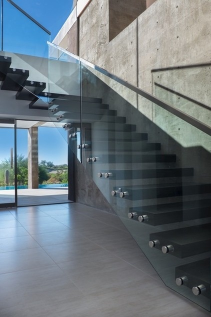
The concrete wall repeats the texture seen outdoors in the entry courtyard. Its scale stands up to the home’s large volume. The wall divides the stairwell from the great room. The homeowners are art collectors, so Tate kept the texture palette neutral and limited in size. This puts the attention on the artwork and the views.
“The staircase was a real feat of engineering,” Tate says. The ebonized ash treads slip over tubing welded to steel supports that were cast into the concrete wall. The staircase glass is Starphire, which doesn’t have the green cast of other clear glass products.
The windows are not just about the views but can also passively heat the house, while protecting it from the heat of the sun in the hotter months. The glass on the windows and doors is high-performance Solar Gray insulated glass with Solarban 70 low-E coating on the third surface. The orientation of the house, the placement of the windows, the overhang above the patio and hidden shades on the windows all cut down on the amount of direct sunlight that reaches the interiors during the hottest months.
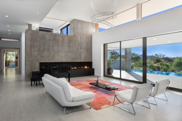
On the other side of the wall is the great room. Here you can see how the 9-, 12- and 15-foot ceilings create layers that connect the different spaces.
The home was also designed to serve as a concert hall. One of the homeowners is an amateur singer, and they have enjoyed having a concert pianist and professional opera singers perform here. Tate estimates that the living room extending out to the patio can hold up to 150 chairs.
Shortly upon the home’s completion, the homeowners opened up the doors, filled the space with chairs and held a concert in here. “The acoustics were amazing,” Tate says. “The neighbors across the golf course probably heard it.”
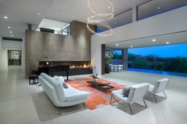
Four 6-foot-wide doors disappear into pockets, creating a 24-foot-wide opening from the great room out to the covered pool patio. The fireplace creates a void within the bulk of the concrete wall, while the hearth adds a 14-foot-long large rectangular chunk of basalt. “Basalt is my new favorite material,” Tate says. “We are using it everywhere now: countertops, hearths, base, wall tiles … everywhere.”
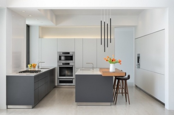
“The kitchen is engineered like a BMW,” Tate says. Fabricated by Bulthaup, the cabinets are sleek touch-latch. The countertops are white quartz; the chunky wooden block is applewood.
As with the concrete wall and layered ceilings, there is a play between positive and negative space, like with the uplit recess above the cabinets and the lines of the ceiling. The island and cabinets float over steel toe kicks. Halogen lights float down from overhead like musical wind chimes.
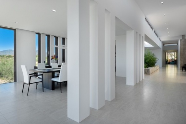
Thick columns play with the positive and negative space and create a rhythm down the long hallway. The proportions are repeated with openings, windows to the outdoors and, just down the hall, windows from the hallway into the art studio.
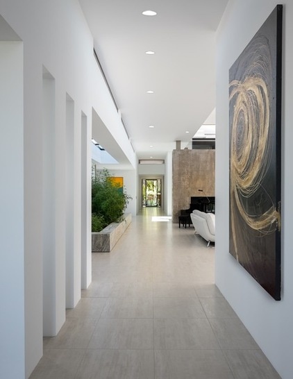
You can look completely through one side of the house to the other down this main hallway; each side has an opening like the one at the end in this photo to give a view outdoors. To the right is the kitchen; to the left, the dining room.
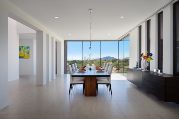
“Almost every corner on this house has a corner window,” Tate says. Here the channel-set glass windows offer a view of Mount Black, a prominent landmark in the region. This room is a great example of how the rectilinear lines and neutral palette put the focus on the views and the art.
Floating is another theme that runs throughout the house, which keeps the expansive floors clear. In the dining room, the buffet cantilevers off the wall.
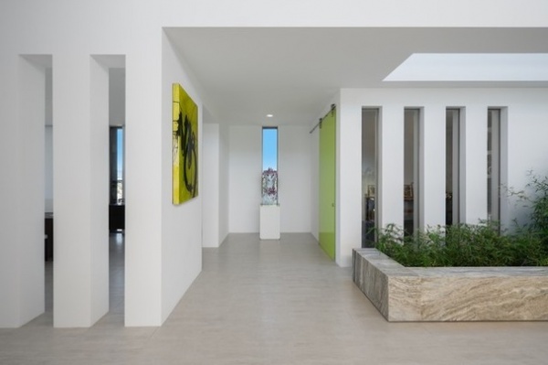
Past the dining room’s long, vertical openings on the left, a tall, narrow window to outside plays with the same proportions.
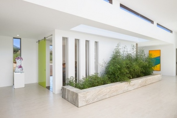
One of the homeowners is a watercolor artist, and beyond the bright green glass door is her art studio, which has a concrete floor and a glass wall that captures the great northern light artists love. While the wall makes it private, the long, vertical windows create a connection and take advantage of some of the natural light from above.
“Bamboo plants bring the green in here,” Tate says. A travertine planter adds another interesting hefty volume to the space in the same way the long basalt hearth does in the great room. Natural light from overhead creates an atrium that once again blurs the lines between indoors and out.
Painting: Quim Bove, Bonner David Gallery
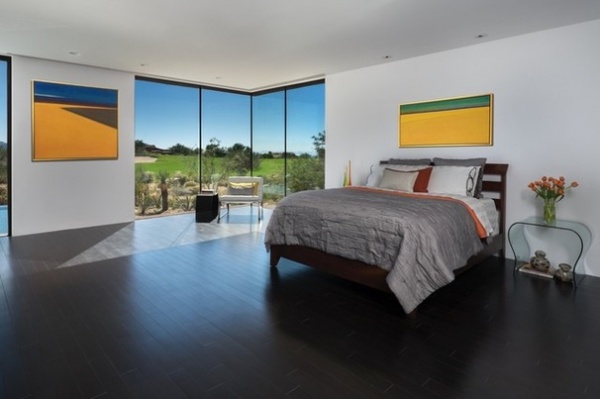
The master bedroom enjoys views out to the golf course through a corner window on this side. “The corner windows really bring the outside in,” Tate says. All of the windows have pocket shades that hide in the ceiling.
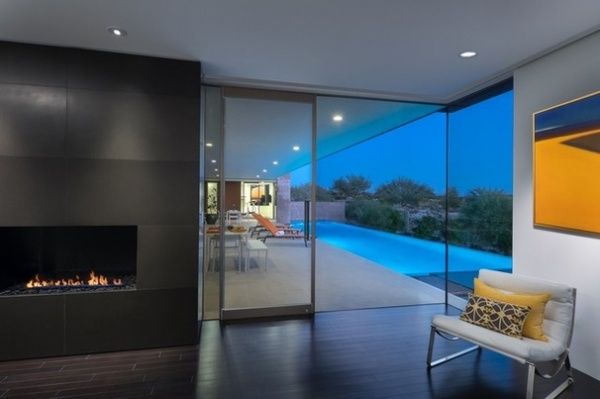
The other corner looks out to the pool. Note the continuous ceiling from indoors to the covered poolside patio —even the recessed lights are lined up. It’s another element that makes the transition from indoors to out seamless.
The fireplace has a patinated steel plate surround, and the flooring is bamboo.
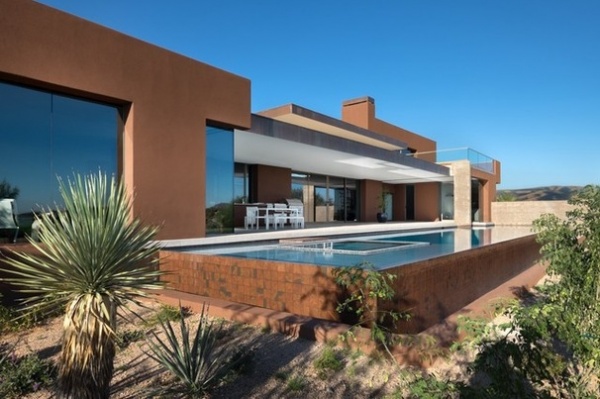
The patio overhang was also designed to keep direct sunlight off the patio and out of the great room during the summer. In the winter the lower sun warms the area.
The way the pool comes up aboveground creates another rectangular volume that corresponds to the planes of the roofline. The tiles surrounding it pick up on the colors of the stucco and copper fascia.
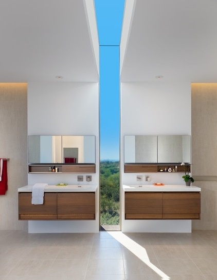
A window slice from the floor up to and across the ceiling is a dramatic stunner in the master bathroom. At night one can see the city lights. The cantilevered vanities float high off the floor.
Vanities: Wetstyle
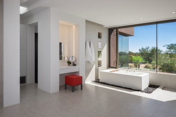
“You can see out 50 miles from this tub,” Tate says. Soaking in the tub next to the windows feels like soaking outside. The tub sits atop a bed of Mexican beach pebbles.
Lighting behind the mirror at the dressing table makes it appear to float off the wall and creates depth. This area is another great example of how the architects played with positive and negative space; the dressing area and towel niches are crisp recesses.
Bathtub: Wetstyle
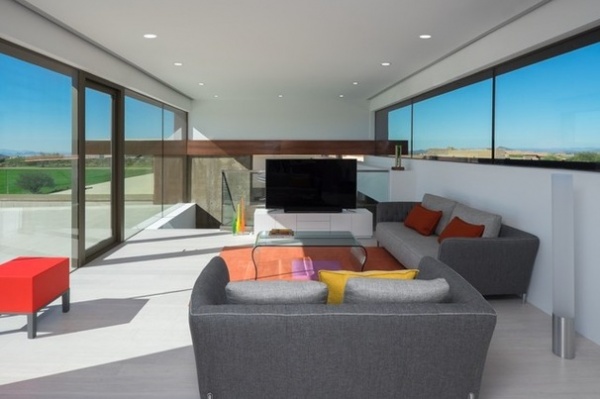
Upstairs, a media room opens out to a roof deck. This is the only TV in the house; with so much to see through the windows, that there isn’t much need for it.
The copper fasia from the exterior facade cuts right through the interior, a bold connection from outdoors to in to out again.
Browse more homes by style:
Small Homes | Colorful Homes | Eclectic Homes | Modern Homes |Contemporary Homes | Midcentury Homes | Ranch Homes | Traditional Homes | Barn Homes | Townhouses |Apartments | Lofts | Vacation Homes
Related Articles Recommended


