Kitchen of the Week: Fans of Traditional Style Go For a ‘Mad Men’ Look
The influence that the TV series Mad Men has had on revitalizing midcentury modern design is no secret. But if you need further proof, just ask Tom and Kathy Barrett. The Columbia, Illinois, couple had been enjoying years of traditional furnishings, accumulating antiques and Oriental rugs from places like Japan. Then, while watching an episode of Mad Men, they had a change of heart. “We saw Don Draper’s office and both just realized, ‘That’s it. That’s our style,’” Tom says.
The couple got to work transitioning their Mediterranean-style home to show more retro zeal and spunk. Recently they tackled the kitchen, which, with its standard off-the-shelf oak cabinetry, laminate countertops and vinyl floors, probably would have caused Draper to spit out his old-fashioned. Working with designer Dana King, they rearranged the layout for better function and added white cabinets and appliances; a seafoam-green backsplash, walls and ceiling; and a zingy breakfast area with a vintage 1950s table. Meanwhile, scoops of orange accents show up in throwback accessories, including a rotary phone and transistor radio. Draper would be proud.
Kitchen at a Glance
Location: Columbia, Illinois
Who lives here: Tom, who retired from the Air Force five years ago after serving 22 years, and now works at Scott Air Force base doing budget analysis; Kathy, a stay-at-home mom; and their two 9-year-old girls
Size: About 12 by 20 feet (240 square feet); 4 by 6 meters (22 square meters)
Cost: About $70,000, including design fees, appliances, materials, labor and the conversion of a sliding-glass door to French doors
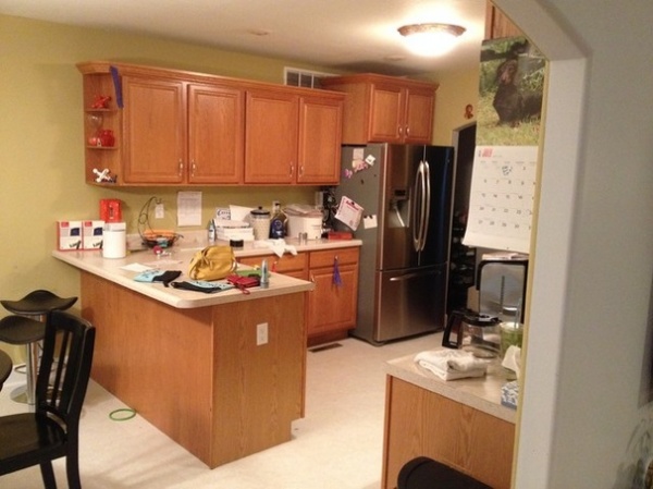
BEFORE: Standard off-the-shelf oak cabinets, laminate countertops and sheeted vinyl floors didn’t fit the Barretts’ ideal style. Plus, the lighting was poor, and the layout wasn’t working for them. Kathy wanted to be able to stand at the kitchen sink and look out to the backyard to keep an eye on the couple’s two 9-year-old daughters.
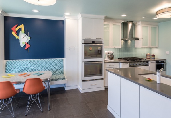
AFTER: The placement of the sink kicked off the new layout. Designer King, of Next Project Studio, flipped the original peninsula to the other wall and then tweaked things to get a good work triangle established, which meant putting the range, ovens and microwave on the long wall.
The Barretts wanted to avoid stainless steel appliances, because they were tired of constantly wiping off fingerprints. “Kids use everything but the handles to open appliances,” Tom says. They settled on a refrigerator, ovens and dishwasher from Whirlpool’s Ice White collection.
King designed the custom cabinetry, which was built by Amish workers and painted in a custom Benjamin Moore color to match the white appliances.
The couple and King had originally discussed removing a wall to open the kitchen to the living room, but they couldn’t work out a furniture arrangement if that were to happen. To make up for the lack of connectivity to a seating group, King designed the banquette area on the left as a place for the family to gather.
Cabinet paint: White and Distant Grey, Benjamin Moore; cabinet pulls: Riva, Amerock
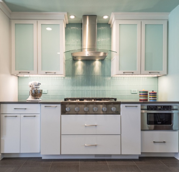
A faint seafoam color adorns the walls, ceiling, backsplash and upper cabinet faces. For the backsplash King used glass tile in a stacked pattern to create a more contemporary look. She switched the pattern to vertical over the range and used the same tile in a wavy texture to mix things up.
She then found outlets by Lutron that closely matched the tile color. Turning the outlets sideways made them more discreet.
When King couldn’t find grout to match the color of the tile, she discovered Grout Shields, a company that would create a custom grout sealer matched to any Benjamin Moore color. She applied porous, unsealed white grout and then paid an artist to come in and use a small paintbrush to apply the colored stainproof sealer on top. “The grout was cheap in material cost but expensive in labor,” she says. “But totally worth it in the end.”
LED strip lighting under the cabinets highlights the backsplash. King says she prefers to install lights in kitchens that are 3,000 Kelvin. “I’ve found this amount renders nicely. It’s not too warm or cold,” she says.
The opaque panels on the upper cabinets are Lustrolite, a scratch-resistant, acrylic-like material.
“It also works better than a whiteboard,” King says. “I’ve used it in showers, as a barn door in my office; it’s my designer secret.”
Backsplash tile: Crystile Wave series and Crystile series, 4 by 12 inches, both in Soft Mint; cooktop: 36-inch DCS, Fisher & Paykel; range hood: Whirlpool; flush-mount lights: Nuvo; opaque panels: Lustrolite in Glacier
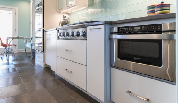
King says the microwave drawer is another one of her best tricks. She likes to use it in lieu of putting a bulky appliance on the countertop or above a range. “Every time I use one in a project, the homeowner never wants to go back,” she says.
The bumped-out cooktop area creates a focal point and gives Tom a little more headroom in relation to the range hood. “That way the hood isn’t right at his forehead,” King says.
Microwave drawer: 24-inch, Sharp
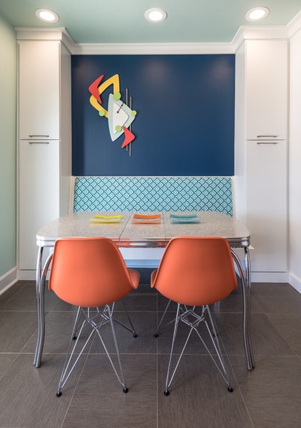
A Chromecraft table from the 1950s adds a retro touch to the breakfast area. King added a navy accent wall to give more prominence to a midcentury-style clock that Tom built based on an image Kathy found online.
Additional pantry space is on either side of the banquette, the cushion of which Kathy covered in outdoor fabric.
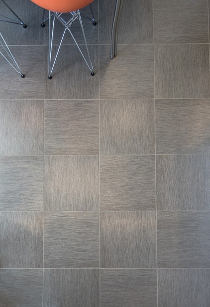
The floors are luxury vinyl tile. “It gives you a ceramic tile look without being cold on the feet,” King says.
Floor tile: 16-inch Adura in Graphite, Vibe style, Mannington
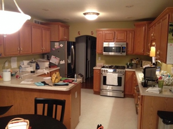
BEFORE: In the original kitchen, the stove, sink and dishwasher prevented ample counter space on the right side.
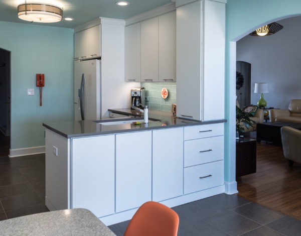
AFTER: Placing the range on the opposite wall freed up this side, allowing space for the refrigerator, more countertop space and the peninsula sink.
The placement of the sink created dead space in the lower corner cabinets, so King put drawers on the other side — seen here near the archway — to store the daughters’ crayons and other art supplies.
The counter-to-ceiling cabinet above the drawers offers glass storage but also prevents the family from placing papers, keys, phones and other clutter on the countertop as they enter the kitchen.
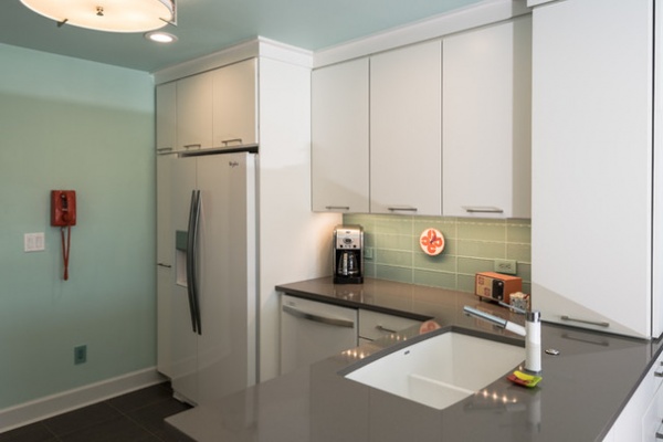
The location of the sink also meant that the dishwasher would be in an awkward spot, behind whoever is rinsing dishes in the sink. King had Kathy role-play washing and putting dishes away to make sure she was OK with the twisting.
King was strategic about not calling out the 8-foot ceiling. She painted it and the walls the same color to give the appearance of more space, and chose a shallow overhead light fixture instead of hanging pendants, for a more open feel. A low-profile faucet performs the same duty and limits blocking the view to the backyard.
An orange rotary phone, a mod clock and a vintage transistor radio nod to the midcentury era.
Countertop: Silestone in Gris Expo with a polished finish; sink: Silgranite 40/60; faucet: Blanco
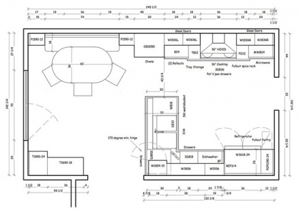
This floor plan shows the new kitchen layout.
See more Kitchens of the Week
More: Why We Love Midcentury Modern Design


