Houzz Tour: Undone in the French Quarter
One theory about how New Orleans earned its “Big Easy” nickname points to a local gossip columnist in the 1970s who contrasted the city’s easygoing, laid-back lifestyle with the pace of New York’s Big Apple.
Laid back is exactly what New York TV producer-director Chris Fisher thought of New Orleans after he spent time there visiting his goddaughter. And he liked it. Looking for a respite from his hectic New York life, he purchased a unit in an 1820s-era three-story Creole mansion on St. Philip Street in the French Quarter. The property had been split up in the 1950s, and Fisher’s two-story unit has a balcony over an interior courtyard and a semiprivate rooftop deck. However, the sleek new kitchen and overdoneness of the space didn’t fit with its historic vein. So Fisher hired Katie Logan LeBlanc and Jensen Killen of local Logan Killen Interiors to bring the magic back. “He wanted something authentic, dreamy, a place of repose where his imagination could recharge. He did not want the place to feel ‘done,’” Killen says.
Photos by Brie Williams
Houzz at a Glance
Who lives here: This is a second home for TV producer-director Chris Fisher; his wife, Blair; and their 4-month-old daughter
Location: French Quarter, New Orleans
Size: About 1,300 square feet (121 square meters); 2 bedrooms, 2 bathrooms
Year built: 1820s
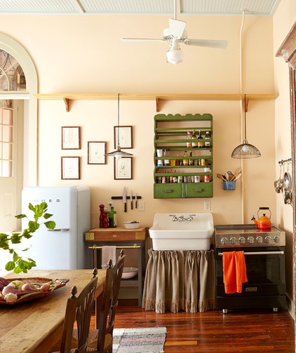
Logan LeBlanc and Killen aimed to highlight the building’s original architecture and add back any lost elements. Here in the kitchen, the original 3-inch-wide antique heart pine floors were salvaged by filling holes and working with the floor’s history instead of replacing it.
When the house was constructed, residential electricity use was still far on the horizon. The brick-core walls and the open ceiling structure were limiting in terms of adding new plumbing lines and internal electrical conduit.
Because the project was about stripping away and highlighting the bones of the house versus adding, they didn’t want to build new wall components merely to hide all of the mechanicals. So the design team made use of the few outlets already in the kitchen.
Additional wall-mounted electrical conduit runs along the wall behind the stove. A ceiling fan with integral lighting was installed in place of the existing overhead light fixture. To honor the homeowner’s quest for simplicity and genuineness, the designers also hung pendant lights from a kitchen shelf rather than hardwiring them.
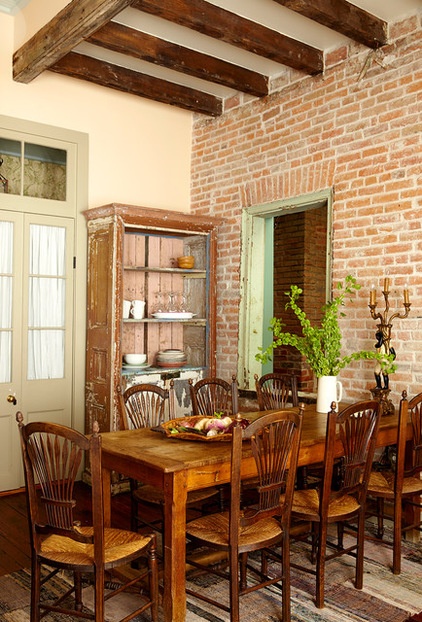
When a window opening was discovered hiding behind a wall above the entry door, the designers found salvaged windows to install above the doors throughout the rest of the home. Quite a bit of brick replacement and remortaring had to be done on the home’s brick walls.
To carry the sense of history and warmth into the kitchen’s eating area, Killen and Logan LeBlanc purchased the dining table, chairs and cabinet at local antiques stores.
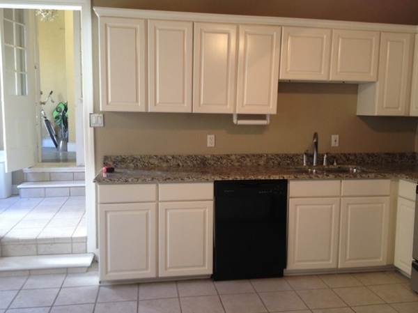
BEFORE: Here’s an image of the kitchen before the renovation. All of the removed components were donated to charity.
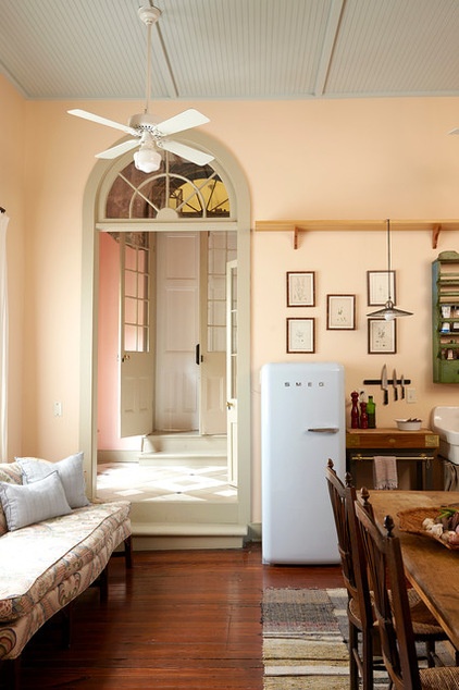
AFTER: Killen recalls that one of the most difficult parts of the project was figuring out what to do with the features they uncovered. The biggest surprise was removing a piece of drywall in the living room and finding the brick of a former exterior wall. It was then when they realized that a portion of the kitchen and the entry were originally exterior space.
Since those two areas were open to the outside at one point, Killen and Logan LeBlanc took this cue to inform the material choices, giving them a porch feeling. They chose beadboard for the ceiling and installed concrete floor tiles in the entryway and master bathroom. Shutters chosen for window treatments continue the porch language. In the kitchen, standard cabinets were switched out in favor of an eclectic mix of fittings.
Wall paint: Jumel Peachtone HC-54; ceiling paint: Woodlawn Blue HC-147, both by Benjamin Moore
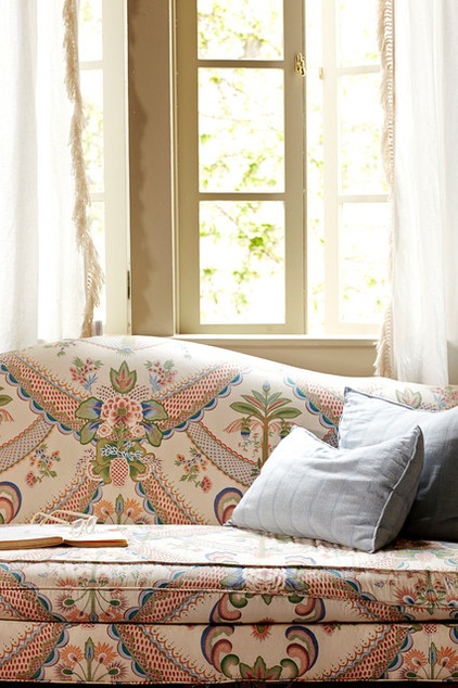
One of the designers’ treasured finds, an antique settee found at a local consignment shop, is perfectly perched in the kitchen to make it a more comfortable place for hanging out. Luckily, it was already upholstered in this fabulous, dynamic fabric.
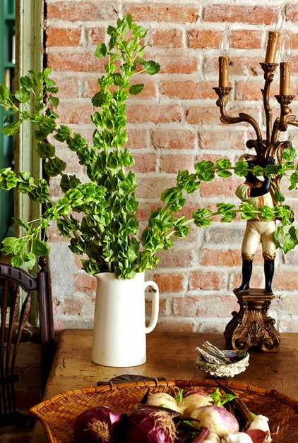
An antique candelabra and a simple pitcher filled with fronds of bells of Ireland (Moluccella laevis)
add a distinctive regional flair to the dining table. Killen and Logan LeBlanc spotted them at local antiques shops.
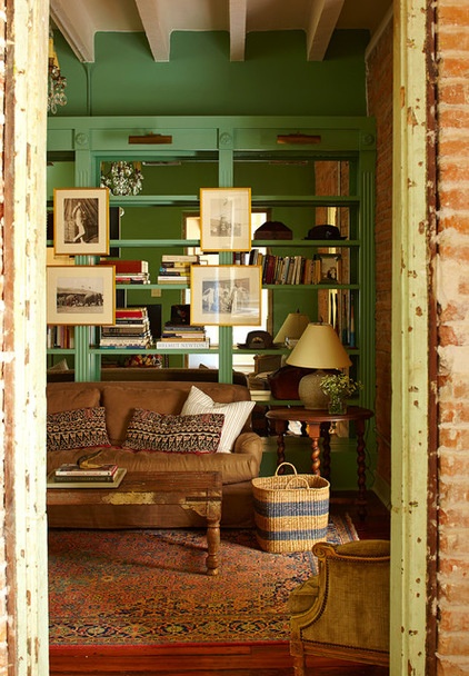
One of the first things you notice about the home is the use of color. The light in New Orleans “holds color really well,” Logan LeBlanc says.
Many of the hues were driven by the homeowner. Killen says that when Fisher first contacted them, he envisioned a story for every room. He wanted a foyer in Breakfast at Tiffany’s pink and a master bedroom in gold, inspired by the historic local Pitot House and surrounding Creole cottages. “We basically used those ideas as a jumping-off point and then sculpted the design for each space,” Killen says.
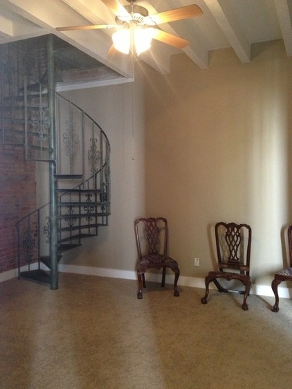
BEFORE: Here’s a look at the living room before the remodel. The beige walls and wall-to-wall carpet made the already-dark space drab and lifeless. Killen recalls that the treatments “made for a very sad room.”
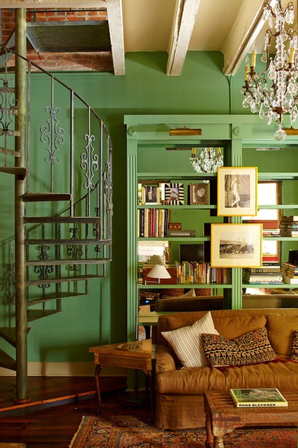
AFTER: A rich, deep green paint was chosen for the living room. Because the space is windowless, the designers decided to back the new bookcase with mirrors to reflect light from the adjacent kitchen.
The wrought iron spiral staircase is original to the house and leads upstairs to the guest bedroom loft, which offers access to the rooftop terrace.
A second staircase leads up to the roof-deck level from the interior courtyard; it’s the main staircase serving the two upper units. Luckily, the designers could use it to move furniture into both levels of the house. However, this still proved challenging, particularly for an antique armoire in the master bedroom. “It was a real teeth-clenching moment, but we made it,” Killen says.
Wall and built-in paint: Clearspring Green HC-128, Benjamin Moore
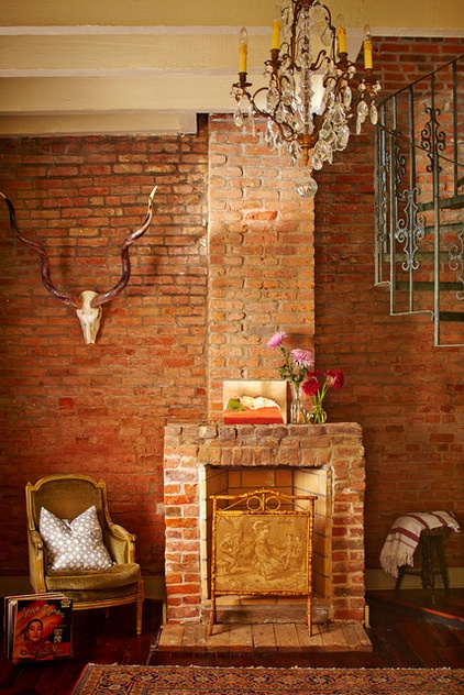
The team restored the fireplace to working order. Killen says they found the velvet bergère, the antique chandelier and the skull at a New Orleans consignment shop. The small painting resting on the fireplace was purchased locally and given to Fisher as a gift by a friend.
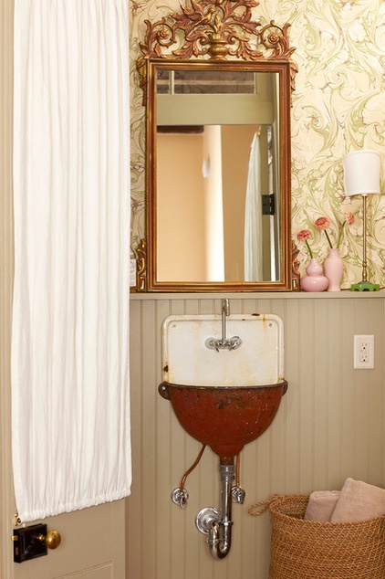
The small wall-mounted garden sink in the guest bathroom is one of the first items the designers bought for the house. They picked it up at a store next door to the home called Out of the Closet.
They found the faucet at a local hardware store and had the sink retrofitted to accept the plumbing.
Killen says they removed the vanity cabinet that was there and added the beadboard wainscoting. Also retired was a wall-mounted light above the sink. The designers replaced it with two quaint lamps that rest on the ledge, flanking the sink.
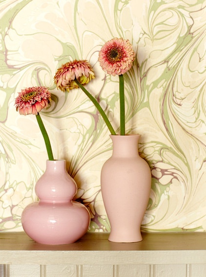
Swirly marbled wallpaper in pale pink, beige and sage adds a nostalgic elegance and sense of fun to the guest bath.
Wallpaper: Marble Wallpaper in Sage Green/Beige, Fabrics & Papers
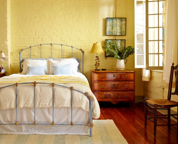
This is perhaps the cheeriest master bedroom in New Orleans, with a gold palette that’s a breath of fresh air. After the beige wall-to-wall carpet was removed, restoring the 6-inch-wide plank cypress wood floors was quite a challenge for the flooring contractor, Killen says. However, the result speaks for itself.
Wall paint: Goldtone OC-112, Benjamin Moore
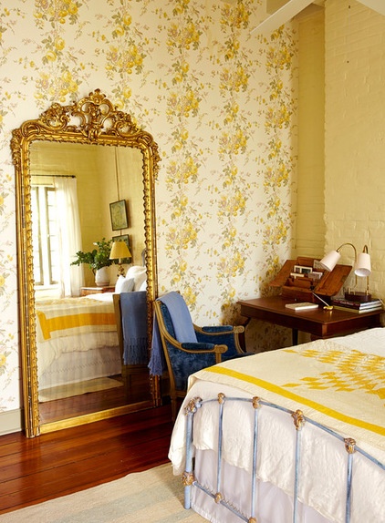
Not part of the original design for the master bedroom, this fancy mirror was an unexpected find on a shopping trip with Fisher.
Wallpaper: Roses and Hummingbirds in Mimosa/Sage, GP & J Baker
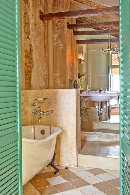
Renovating the bathroom proved to be an intensive process. To open up the space, they removed a wall that divided the bathtub and sink area.
By stripping the layers of materials that had been added over the years, they uncovered the original brick and stucco walls, a pitched roof and timber beams, all of which they left raw and exposed. This area too had previously been exterior space, a link between the main house and former slaves’ quarters.
To make up for the lack of natural light, Killen added a transom window above the door and installed a mirror on the sink wall to reflect light from the window of the adjacent entry. The bathroom has two sets of doors: one a set of French doors and a second interior set of shutter doors in a jazzy turquoise. The doors provide the homeowner with flexibility regarding light and continue the indoor-outdoor aesthetic.
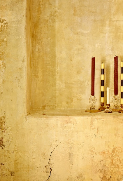
The nearly 200-year-old brick and stucco walls unveiled in the bathroom were pretty unstable in a few places. A faux finisher was brought in to skim coat and secure loose spots, then visually tie in the new areas with the old.
“There were also layers of paint that we didn’t want to totally cover up, so she was integral in the process of unifying the space through this applied finish,” Killen says.
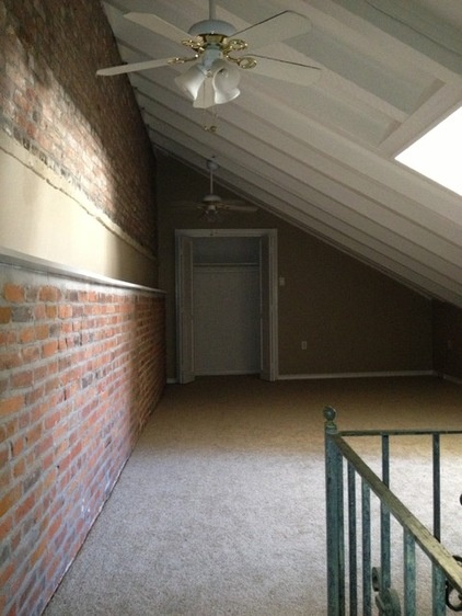
BEFORE: This image shows the guest bedroom on the second floor before the transformation.
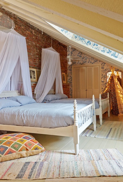
AFTER: A lofty space on the top floor is a guest bedroom intended for Fisher’s goddaughter.
Because this space had the only new floor, and since the rooftop garden is accessed from it, the designers painted it white to give it more of an outdoor feel. Casual vintage rag rugs are paired with a canopied spindle bed and nostalgic blue and white wallpaper.
“It is romantic, peaceful, timeless, with a touch of bohemian mischief,” Fisher says.
Wallpaper: Emperor’s Garden in Blue/Cream, GP & J Baker
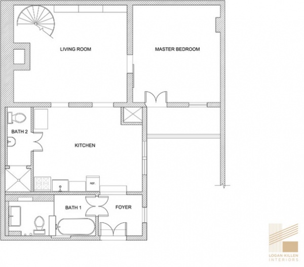
Here’s a look at the first-level floor plan.
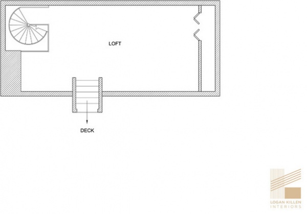
Here’s the second-level floor plan.
Interior design and project management: Logan Killen Interiors
Contractor: Mayer Building Construction
Browse more homes by style:
Small Homes | Colorful Homes | Eclectic Homes | Modern Homes | Contemporary Homes | Midcentury Homes | Ranch Homes | Traditional Homes | Barn Homes | Townhouses | Apartments | Lofts | Vacation Homes


