Houzz Tour: Modern Addition for a Historic Bungalow
http://decor-ideas.org 03/13/2015 01:13 Decor Ideas
Joel Contreras has always felt torn. He loves historic homes but is also a huge fan of modern design. So when it came time for the real estate agent to design his own house, he thought, “Wouldn’t it be cool if I could combine the two?” A large lot with a 1927 bungalow fit the bill, and after scooping up the property, he set out to restore the original structure and have a modern addition built at the back.
Houzz at a Glance
Who lives here: Joel and Angie Contreras and their 6-month-old son, Brody
Location: Coronado neighborhood of Phoenix
Size: 1,600 square feet (149 square meters); 3 bedrooms, 2 bathrooms; guest house: 585 square feet (54 square meters), 1 bathroom
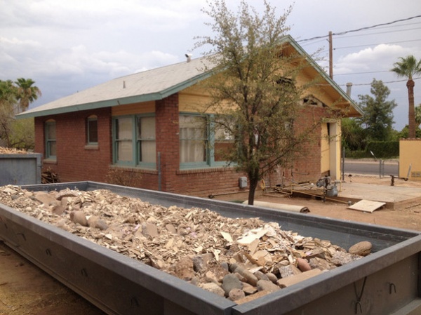
BEFORE: “There was nothing great about the home except the exterior,” Contreras says. Major repairs were needed, including a new roof and updated plumbing, electrical and ductwork. He gutted the original 800-square-foot home, removed a former 120-square-foot addition (the debris of which can be seen here in the foreground) and took off the back wall to connect the home to a new modern addition. “I basically borrowed three and a half walls and rebuilt the rest,” he says.
“After” photography by Jason Roehner
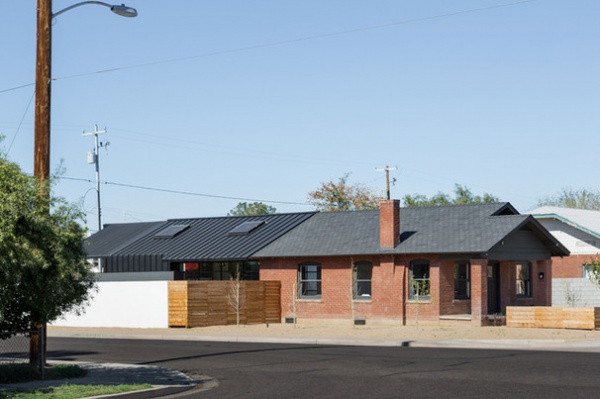
AFTER: Here you can see the restored original home and the new 800-square-foot addition behind it. Contreras wanted a standing-seam metal roof to go on the entire structure, but historic preservation rules governing the protected home prevented it. Instead, he used a metal roof on the addition and folded it down to create the walls. He added new asphalt shingles to the original home.
Contreras has never taken a design course but has made design his hobby over the past 10 years, training his eye by looking at countless photos of homes and experimenting with houses he and his extended family have owned. All told, he’s designed about eight properties now. He’s currently working on one with his mom. “I don’t have a company or anything,” he says. “I just design for myself or when family members want to do something cool.”
For this house he teamed up with Jonah Busick of Foundry 12 to draft the plans.
Exterior paint: Jet, Benjamin Moore
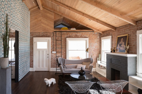
Contreras, who is 6-foot-4, removed the 8½-foot ceilings to make the interior feel roomier. In the living room, which the front door opens into, you can see how he removed the attic space to create vaulted ceilings clad in tongue and groove cedar. The ceiling height and pitch are carried 80 feet from the front of the house to the back of the new addition.
He turned a small nook over the front porch into a reading space with cork flooring and a fluffy mattress, accessed by a sliding ladder. “It’s gimicky, but I don’t like wasting square footage,” he says.
It took about nine days for a work crew to grind off the plaster to expose the brick walls inside.
Contreras and his family are still in the process of furnishing the house. At the moment the pieces are a mix of his own items and things he’s borrowed from friends. The floors are original red oak that he stained a walnut tone to match the cabinetry in the kitchen. All the windows are original.
He clad the entry wall in a custom-made Moroccan-patterned tile ordered from Mexico.
Delos Sofa: Control Brand; chairs: Bertoia Diamond
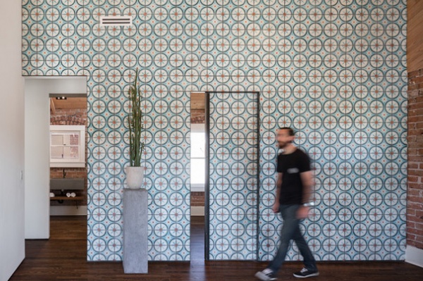
“That tile might be slightly busy in the space,” he says. “But clean drywall is all I see in Arizona. Besides, when I let people in, everyone goes, ‘Wow.’”
A pocket door slides open to reveal a guest bedroom that serves as Contreras’ office. The entrance to the left leads to a hallway and bathroom. Photographer Jason Roehner is shown here.
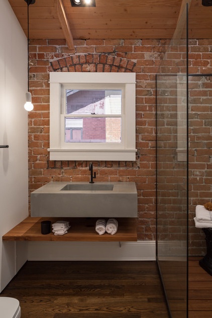
The hallway guest bathroom has a walk-in shower with teak floors. Contreras wanted to be able to see the exposed brick in the shower, so he added an L-shaped glass wall that protects it from water. The sink is concrete. The shelf is teak.
Hanging light fixture: Nud; ceiling lights: Breville
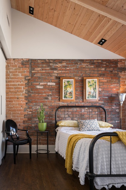
In the guest bedroom, you can see where Contreras bricked in what once was a window on the back of the original home. He wanted something that would look sloppy and contrasting. “I like gritty mixed with clean,” he says.
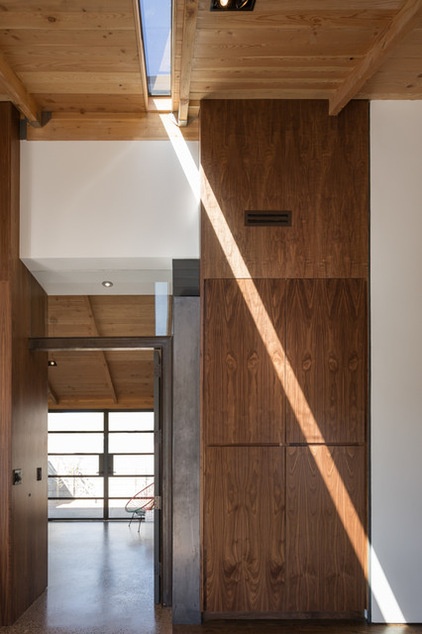
A slim skylight connects the old and new structures. This feature is on only one side of the house because having it on the other side would have brought a sliver of light into the master bedroom and disrupted the TV screen.
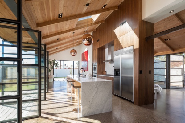
Here’s the beginning of the 800-square-foot addition, which contains the kitchen, the master suite to the right and a small second living area at the end. Each side opens to patio space via large custom steel and glass pivot doors.
Kitchen countertop and backsplash: Carrara marble; pendants: Tom Dixon
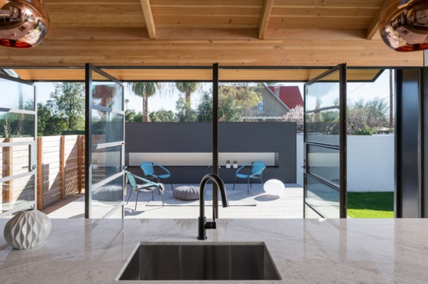
All the large pivot doors were custom made, a process that took five months. Here they open to an entertaining deck with an 18-foot-long fire feature.
Faucet: Brizo; sink: Vigo
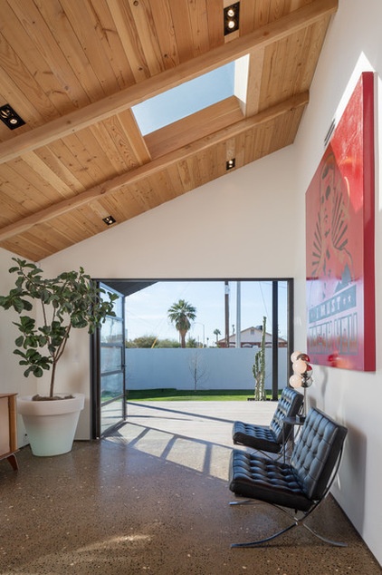
The TV lounge off the kitchen can double as a formal dining room in a pinch.
The floor is a custom aggregate. “I call it the poor man’s terrazzo,” Contreras says. He couldn’t find an aggregate mix with white rock in it, so he arrived the day the slab was poured — fighting the flu, no less — and had a 30-minute window to throw crushed white marble rock he picked up at a store over the aggregate blend. After it dried, the floor was ground down an eighth of an inch to expose the rock.
Credenza: birch plywood, Thaden Jordan; Bordato Illuminated Planter 30
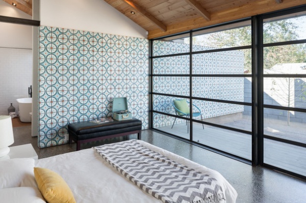
The master suite has a private patio. More Moroccan-patterned tiles cover the wall inside and out.
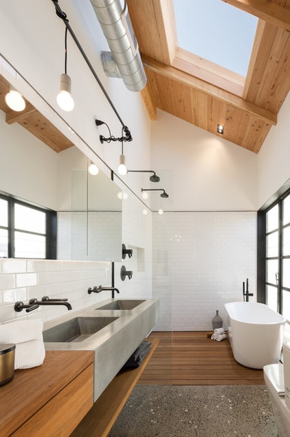
A large skylight and wall of windows flood the master bathroom with natural light. A large floating concrete double sink defines the vanity area. A teak drawer to the left stores things like curling irons and hair dryers. The mirrors front three large medicine cabinets that store toiletries. And a teak shelf below the sink holds towels. There’s also a large closet to the right.
Bathtub: Signature Hardware; faucets: Brizo; hanging lights: Nud; toilet: Duravit
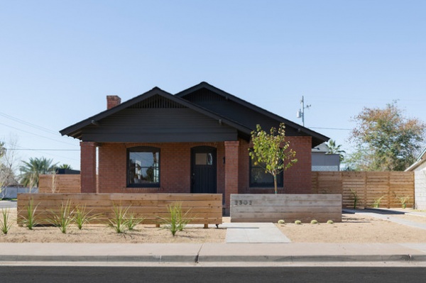
From the front view of the home you can barely see a sliver of a two-story barn structure near the back-right corner of the lot.
A cedar half fence hugs a patio extension where Contreras can put a few chairs and a fire pit so he can mingle out front with passing neighbors. A board-formed concrete wall sits in front of a purple orchid tree. The hardscaping is decomposed granite.
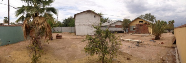
BEFORE: Here’s a view of the original 1930s barn structure in the backyard.
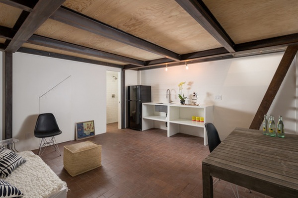
AFTER: Contreras added steel bracing inside the barn for stability so he could turn the structure into a guesthouse. He also added brick over the 80-year-old concrete slab floor to make it look like something you might have seen around the time of the barn’s construction.
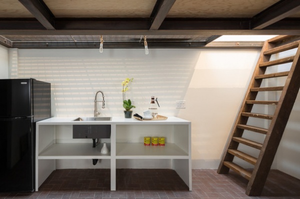
While there’s an exterior staircase that leads up to the bedroom, Contreras had this ladder made from old joists to create an interior shortcut.
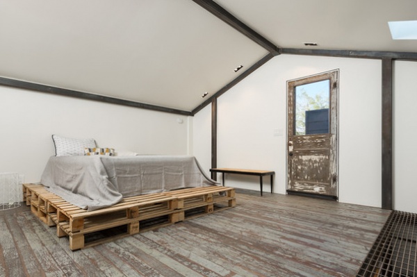
Historic preservation restrictions prevented Contreras from punching windows in the structure but allowed him a couple of skylights. To capture some of that light and bring it to the first floor, he added a steel grate over the kitchenette that can be walked on.
The flooring and door are original. The bed sits on eight shipping pallets.
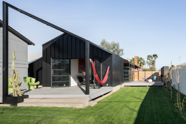
From the rear of the lot you can get a good sense of the property’s size and the new addition. “It’s like the house has two faces,” Contreras says. “I think it’s cool.”
To the left is the remodeled guesthouse.
The gable roof continues into a steel slat patio cover. Contreras says he consulted with a few people about how the metal would perform in the intense Phoenix summers. “It doesn’t get crazy hot. The roof does, but you can lean against the wall no problem,” he says.
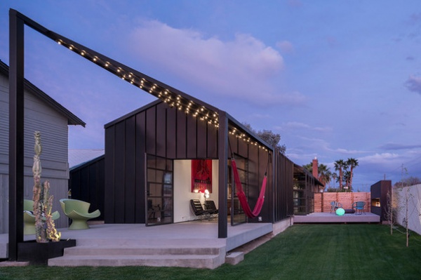
At night bistro lights create a fun vibe on the patio.
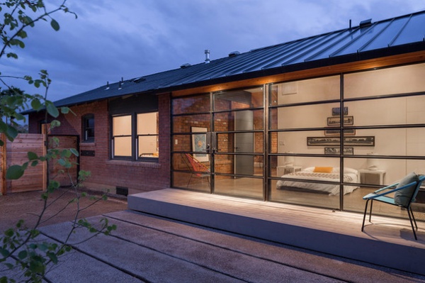
Here’s a look into the master bedroom. You can see the brick exterior of the original home as well as the original siding.
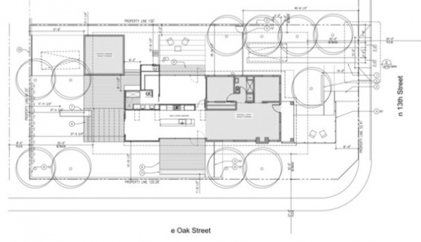
This plan shows the layout of the old and new structures.
Contreras says there are people in the neighborhood who don’t exactly like what he’s done to the home, but that most of the response has been positive. In fact, he says, the state preservation board has reached out to him about submitting the project for a governor’s award.
More: Style Divide: How to Treat Additions to Old Homes?
Browse more homes by style:
Small Homes | Colorful Homes | Eclectic Homes | Modern Homes | Contemporary Homes | Midcentury Homes | Ranch Homes | Traditional Homes | Barn Homes | Townhouses | Apartments | Lofts | Vacation Homes
Related Articles Recommended


