Houzz Tour: Color and Light on the Sussex Coast
When interior designer Anna Standish was asked to redesign this Victorian property, a mile or so from England’s dramatic East Sussex coastline and surrounded by fields and sky, she was struck by the natural light. “I first visited in February,” Standish recalls. “It was raining, and there was a sea fog blowing in, but you could tell how on a clear day, the rooms would be flooded with light.”
In addition to its striking location, the house had beautiful features, including tall sash windows, high ceilings and smart, square rooms. Standish, who has worked for a host of celebrity clients, including Madonna and Claudia Schiffer, was excited to have the chance to rethink this quintessentially country home. She began by redesigning the layout. “How the rooms flow is more important than how the house is decorated,” she says. A wall separating the kitchen and dining space was taken down so that all the ground-floor rooms now lie in a U shape, flowing into one another, with the stairs at the center. Standish then chose a backdrop of soft white and added bright accent colors, including yellow and turquoise, to bring heaps of personality to this beautiful home.
Houzz at a Glance
Who lives here: A couple with 2 children
Location: East Sussex, England
Size: 4 bedrooms, 2 bathrooms
Period: Early Victorian
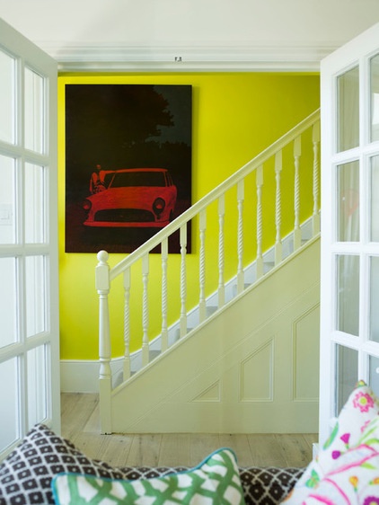
The hallway lies at the center of the house, with doors opening into the living room on one side. “I didn’t want the house to be completely open plan,” Standish says. “It’s important to be able to isolate rooms, to meet all the family’s needs at once. Now one person can watch TV in this living room while another is listening to the radio in the kitchen and the children are tucked away in the TV room, but you can open it all up when you want to be together.”
Standish believes in the power of strong colors to uplift us, so she chose a bright yellow for the hallway. “I had already used splashes of yellow around the house in other places,” she says, “and that led me to it.”
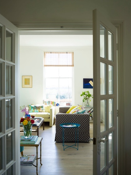
You can reach the living space from the hallway and also from the kitchen–dining area. It means the ground floor has a good flow, but separate rooms that feel intimate and cozy can be created within it. “Now the layout has that opening and closing flexibility,” Standish says.
She chose a generous armchair for this room. “I like to play with scale,” she says.
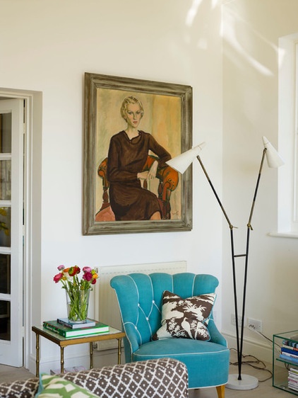
A clean backdrop of white walls and pale oak floorboards links the living areas, against which furniture and finds can stand out. The lamp here is a 1950s Italian Stilnovo light, and the vintage chair is covered in fabric from Lee Jofa.
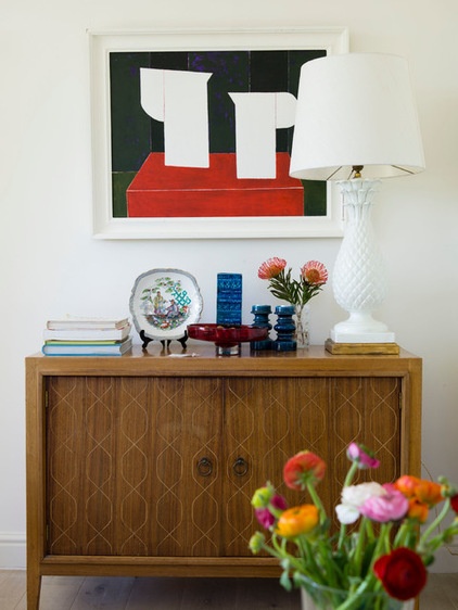
A mix of serious collectible pieces, such as this Gordon Russell cabinet, are teamed with unexpected, witty finds, such as the oversize lamp picked up at an antiques market.
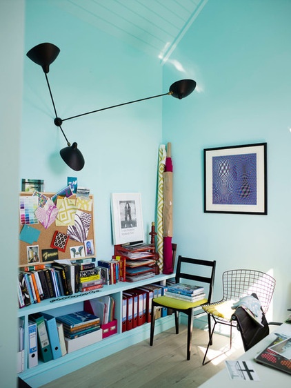
The study, which is off the main living room, bucks the neutral trend and is painted turquoise. “When you paint a whole room in one shade, the color will reflect against itself and become more intense,” Standish says. “So it’s a good idea to always choose a shade that is less strong than the final color you want to achieve.”
Wall light: Serge Mouille, Voltex
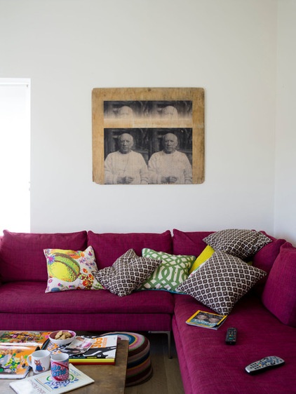
A second living room is flooded with sunshine in the afternoon. This room is used mostly by the owners’ children and their friends. “It has the biggest TV,” Standish says. The picture of Picasso was a market find.
Sofa: Charles by B&B Italia, available at Innes, with fabric by Osborne & Little, available at Kingdom Interiors; table: The Conran Shop; white and yellow pillow: Josef Frank, Liberty
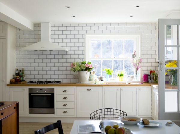
Standish designed the kitchen cabinetry unit and had it built by a cabinetmaker. The range ventilation hood, sink and faucets are white. “I try to keep those things that are not so attractive, such as the cooker hood, less prominent so they seem to melt into the wall,” she says. She chose dark grout between the tiles for a more graphic look.
Extractor fan: Rangemaster; faucet: Ikea; side chair: Bertoia, available at The Conran Shop
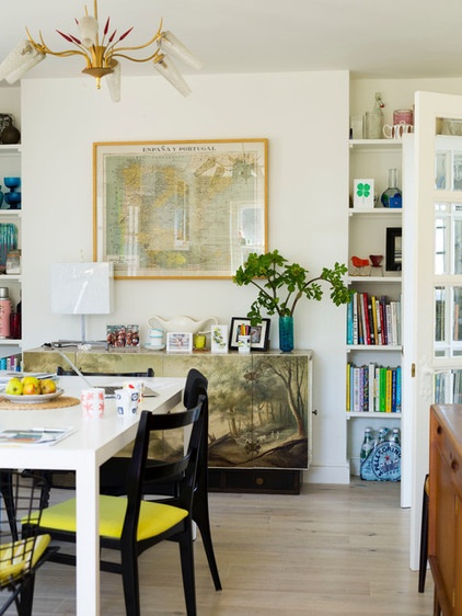
The dining space flows off the kitchen across the back of the house, with glass doors leading into the living room beyond. Standish found the black Alfred Hendrickx dining chairs in an antiques shop. An unusual painted sideboard is home to finds and photos, and a vintage map showing the rivers of Spain and Portugal hangs above.
Dining table: Habitat
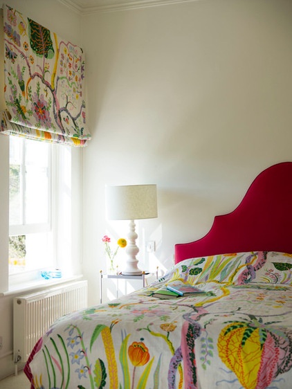
Standish designed the headboard by attaching paper to the wall and drawing the shape she wanted on it. This became a template for the headboard, which was then cut from wood and upholstered.
Headboard fabric: Linara, Romo
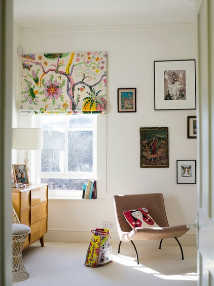
Standish used vintage Josef Frank fabric to make the blinds in the master bedroom. Since the room has three windows, they are quite a feature. “I then created the room around the fabric, with the blinds dictating the colors,” Standish says.
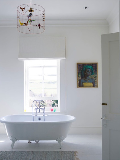
“There is a lighthouse on the coast about a mile and a half away, and anyone lying in the bath can see its beam,” Standish says. White linen blinds hang in front of sheer blinds, which provide privacy during the day.
Tub: The Cast Iron Bath Company; pendant light: The Conran Shop
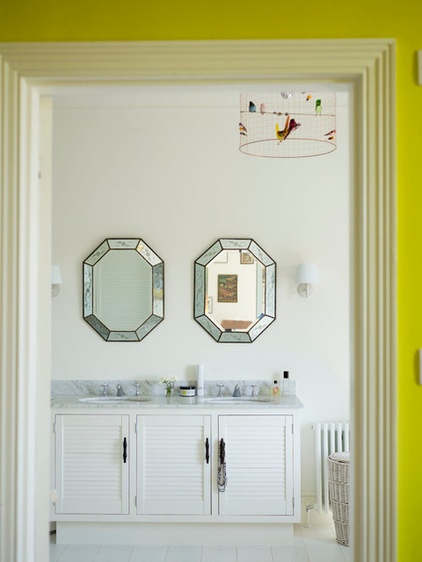
Antique mirrors and two sinks in a marble-topped cabinet bring a luxe feel and a pleasing sense of symmetry to the master bathroom. Standish had pale floorboards laid, rather than repainting the originals. They bring a much cleaner finish to the room, she says.
Browse more homes by style:
Small Homes | Colorful Homes | Eclectic Homes | Modern Homes | Contemporary Homes | Midcentury Homes | Ranch Homes | Traditional Homes | Barn Homes | Townhouses | Apartments | Lofts | Vacation Homes


