Houzz Tour: 3-Story Design Extends a Bungalow’s Living Space
http://decor-ideas.org 03/12/2015 02:13 Decor Ideas
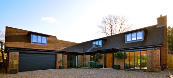
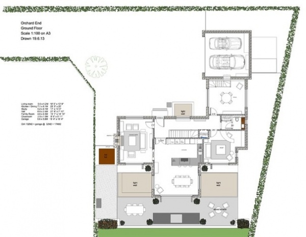
A plot of land at the end of a quiet lane in Beaconsfield, England, northwest of London, provided property developers Amber Valentine and partner Howard Reay with the opportunity to flex their design muscles. “We bought the plot in 2012 with permission to build a one-bedroom bungalow, but we always intended to extend this,” Valentine says. Strict planning regulations meant they were unable to widen the footprint on the ground floor, so they extended down into a basement and up into a loft. The cleverly designed basement is flooded with light from the large garden. The open-plan home has a modern feel but with traditional details. “It’s an odd mix of contemporary and traditional, but it all comes together very harmoniously,” Valentine says.
Houzz at a Glance
Who lives here: Amber Valentine and partner Howard Reay lived in the house until recently and now rent it out.
Location: Beaconsfield, Buckinghamshire, England
Size: 4 bedrooms, 4 bathrooms
Appearances are deceiving with this house. “Essentially it’s still a bungalow, but once people step inside, they’re always amazed by how much space there is,” Valentine says.
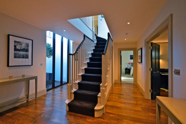
A large light well helps to give the basement hallway a bright, airy feel. “It doesn’t look like a basement at all; it’s so bright,” Valentine says. “For a successful basement, you need a big garden, as it makes the internal space work so much better.”
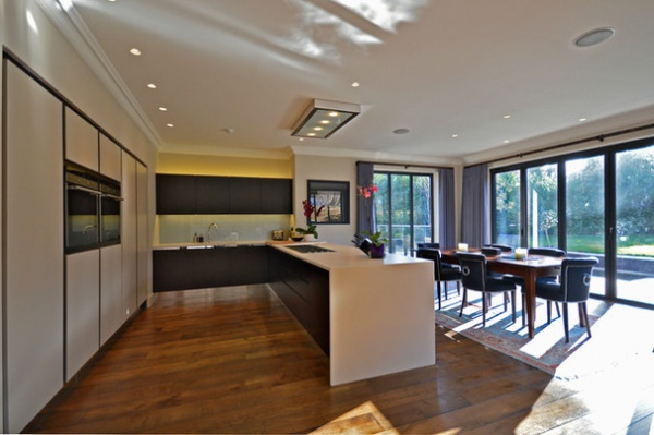
Wide-open spaces and clean, sleek finishes greet you in the open-plan kitchen-dining area. The custom-built kitchen features smooth cabinetry with handleless doors for a minimalist finish. Strips of mirrored glass behind the cupboard openings add a dash of understated glamour.
Kitchen: Zodiac Design
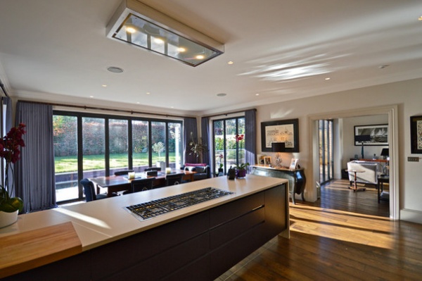
Glossy marble worktops and dark stained wood flooring enhance the elegant feel in this part of the house. “It’s a lovely, spacious room, so we didn’t want anything to interrupt the flow,” Valentine says. Even the extractor fan sits flush to the ceiling; it drops down when in use. “It’s a wonderful design and feels less intrusive than traditional fans,” she says.
A classic French-style cabinet takes center stage in another corner of the room. “I love to mix antiques with contemporary pieces,” she says.
Gas range: Barazza; extractor fan: Airone
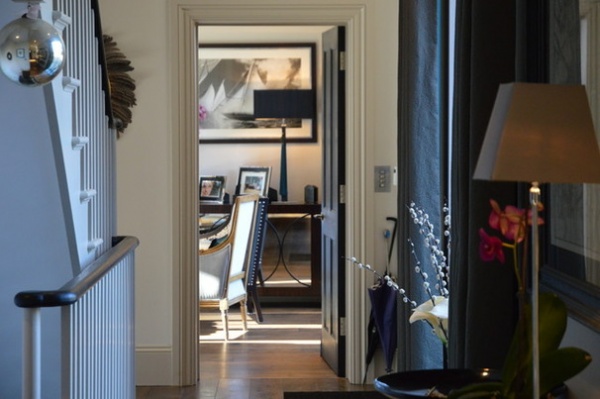
Just off the living room, the elegant hallway features a custom staircase with a dark painted handrail. The windows have been dressed with silk curtains lined in vibrant turquoise. “White linings are boring — it’s nice to have a bright color showing, particularly at the front of the house,” Valentine says.
Silk curtain fabric: James Hare
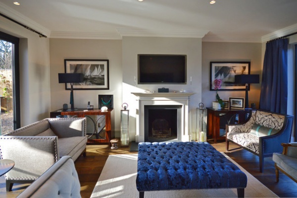
The classic living room is furnished with a mix of antiques and custom furniture. The walls and floorboards have been painted in a blend of colors mixed by the designer. “I mix and match, depending on the light in the room and the effect I want to create,” she says.
As with the kitchen appliances, Valentine was eager to set the family TV into the wall for a polished, seamless look. “I really don’t like TVs sticking out,” she says. “We created a recess in the wall for a much more elegant finish.”
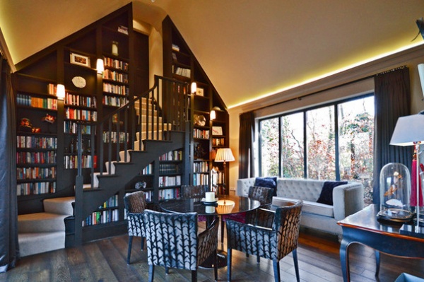
“This is the Harry Potter staircase room,” says Valentine of the versatile dining room–office. The evening sun pours through the floor-to-ceiling windows in this part of the house, enhanced by the warm glow emanating from strips of LED uplights concealed in the cornicing. The custom staircase leads to the bedrooms above the garage.
Sofa: India Jane
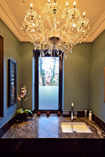
Valentine embraced the darkness of the downstairs powder room and went for smoky green walls paired with a glossy gray marble vanity top. She also chose glamorous lighting. “Every small space should have a chandelier,” she says. “I always advise people to be creative when it comes to decorating their downstairs loo. I think it should be a glamorous space and, because it’s small, it’s easy and cheap to give it a little wow factor.”
Chandelier: India Jane
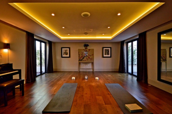
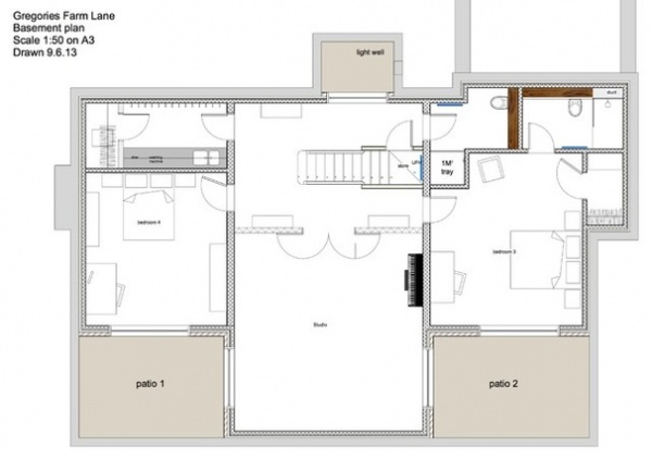
The yoga and ballet studio in the basement benefits from natural light from two light wells. “There are two bedrooms on either side with adjoining little gardens. The light from the gardens feeds into the yoga room, so during the day it’s a lovely, bright space,” Valentine says.
When the sun goes down, LED strip lighting in the ceiling soffit provides a soft, gentle glow in the minimalist space. “We’ve kept this room very simple,” Valentine says. “The unit at the far end is upcycled, and I had the flowers painted on.”
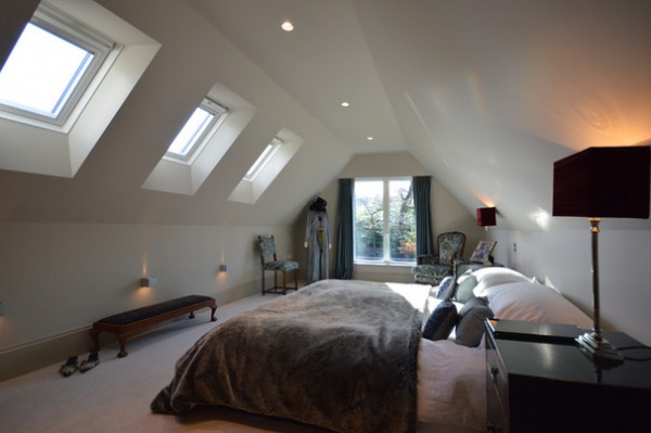
Up in the eaves, the master bedroom is a serene space. “It’s like a cocoon,” Valentine says. “On paper I wasn’t very enamored with it, but the restrictive headroom only serves to make it even more cozy.” Sparkly cushions and a tactile faux-fur throw blanket add hints of glamour.
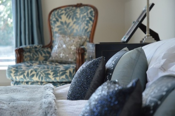
Valentine chose rich, textural fabrics in soft blues to add depth to the master bedroom scheme, with hints of contrasting red. “The bedside lampshades are lined with dark red velvet. They give off a lovely warm glow — it’s very sophisticated,” she says.
Chair fabric: Linwood; pillows: custom, James Brindley; bedside lamps: from Valentine’s own line
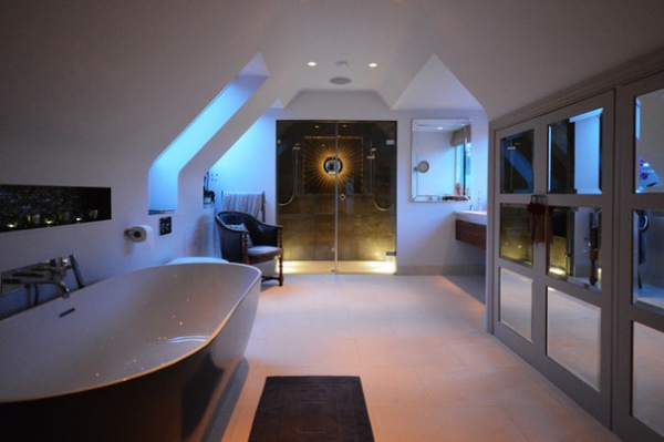
The spacious en suite bathroom doubles as a dressing room, with a row of mirrored cupboards providing plenty of hanging space for clothes. Much like the rest of the house, there are plenty of flourishes with character in here, such as tassels used as doorknobs and a retro sunburst light in the his-and-her shower.
While the designer splurged on some items in the house, others were just revamped to enhance their appearance. “The huge plastic bath was relatively cheap, but we had it spray painted for a more sophisticated, ‘expensive’ look,” she says.
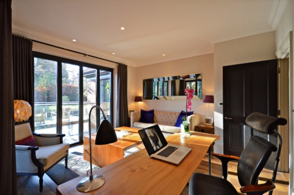
“There are eight sets of bifold doors in the house, so there’s a wonderful connection to the outdoors,” Amber says. “Everything can be opened up in summer, which makes the house feel even more spacious than it is.”
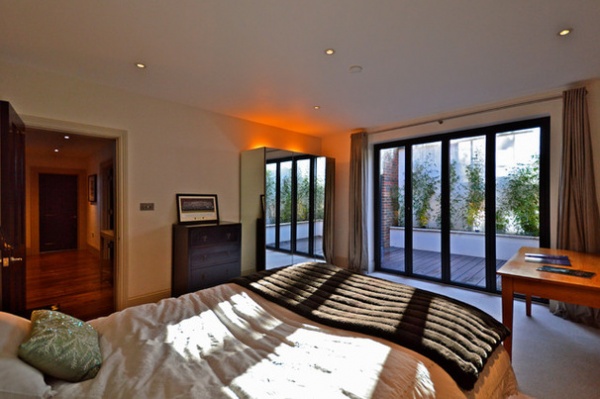
One of two south-facing bedrooms in the basement is flooded with natural light. “This room was intended for a child, but I’ve kept it neutral so it can be accessorized,” the designer says.
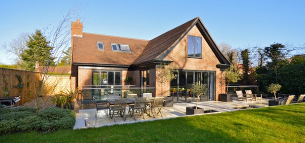
“Outdoor space is at a premium in Beaconsfield, but we’ve managed to fit in a decent-sized lawn as well as a patio area,” Valentine says.
Elegant black cornicing with a wood surround, distressed roof tiles and carefully chosen bricks elevate the property from an average new build into a home with curb appeal. All of the dormer windows are clad in lead, and wisteria growing at the front of the house gives it a more mature look.
Rooftop solar panels satisfy the property’s hot-water needs.
Browse more homes by style:
Small Homes | Colorful Homes | Eclectic Homes | Modern Homes | Contemporary Homes | Midcentury Homes | Ranch Homes | Traditional Homes | Barn Homes | Townhouses | Apartments | Lofts | Vacation Homes
Related Articles Recommended


