What to Know Before You Paint Your Walls White
There are few better ways to bring a fresh start to a home’s interior than by painting it white. This clean-slate strategy is often used immediately upon the purchase of a new home. I’ve known clients who prime the walls white even before the boxes arrive on move-in day.
But the same white paint that makes one room seem magical can make another look frighteningly chilly. As with all colors, white has an associated temperature, mood, light reflectivity and style, along with maintenance requirements and history. Ignore these elements, and your seemingly fresh, crisp white paint can make your space feel completely off. But worry not. Oftentimes all it takes is just a little addition of another color to warm things up or tone them down. Here’s what to consider before you paint your walls white.
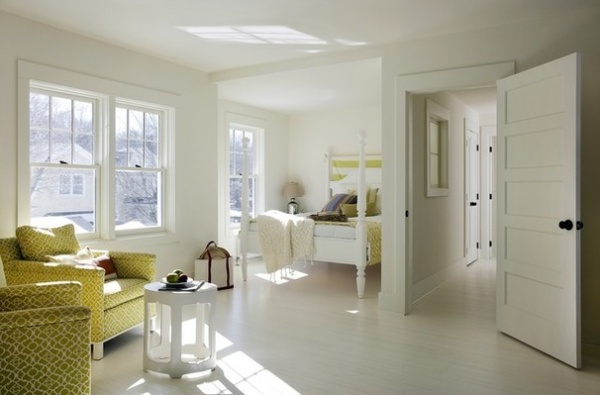
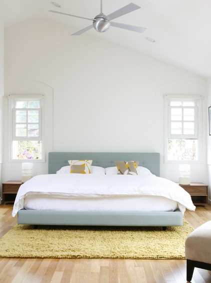
1. Consider the natural light source. Before painting a room white, identify its orientation. Rooms that face away from the noonday sun receive gray-blue light, which is great for a summer bedroom, a gym or a studio where you want constancy. A clear white paint will optimize the light of these spaces while keeping things cool.
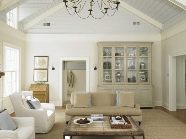
The same white color, though, would not work in a north-facing family room in New England. White’s visual relationship to the snow and ice outside the windows would be visually chilling. Instead, try tinting your white with red, yellow or orange or selecting a color from Benjamin Moore’s Off-White Collection for rooms where you plan to eat, socialize and linger.
Rooms that do not benefit from sunlight streaming in each day are good candidates. Warm color pigments replicate the heat aspect of sunshine and will increase blood pressure, the level of activity and the positive vibe you want with company. Neuroscience, using MRIs, has documented the physiological effects of color and supported what artists have long held to be true about the power of warm colors to make us feel the heat.
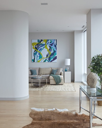
South-facing rooms (in the Northern Hemisphere; north-facing in the Southern Hemisphere) receive the most intense sun during the day. Winter or summer, the side of your home that faces the sun at noon will be illuminated with red-yellow light on a clear day.
White walls are a good choice to cool these spaces, and the paint can be adjusted with pigmenting options that will address glare. For example, gray softens the reflective quality of white and will help “quiet” the space if there are large windows inundating the living room with strong light.
Know that one color option could not possibly control all diurnal or seasonal light situations. But if you take a look at your use, you will find that there are times of day and certain seasons when your rooms get the most wear.
Decide to use the walls to either radiate or dampen what comes in naturally by adding the conditioning element of color. Benjamin Moore’s Off-White Collection of 140 whites is arranged by hue and can help you select a cool (one with blue, gray or green tones) or a warm white (with red, orange or yellow tones). When using your favorite paint brand, check the fan deck for the white in each color range to see the underlying hue for each option (Benjamin Moore provides this info for its OC White Collection).
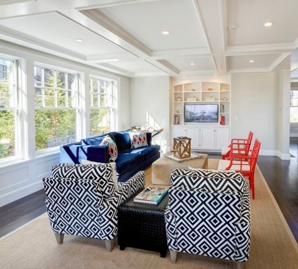
2. What’s outside affects what’s inside. Take a look outside the window and decide if the foliage that blocks the light helps or hinders your use of the room. For example, a deciduous tree outside a south-facing (in the Northern Hemisphere) kitchen and family room will condition the house year round for more sunlight in the winter and shade in the summer. This makes it a good idea to add color to the white (known as “dirtying the white”). Gray-green will cut down on the brightness when the tree is without leaves and the angle of the sun is low following the winter solstice. A purer white would excessively bounce the low-angled winter sunlight.
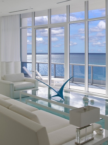
Rooms with a view of the ocean can be spectacular. For a summer residence, white walls can enhance the benefits of living by the sea, opening the house up and bringing the cool water view closer.
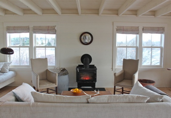
But for homes that hug the shoreline with ocean views in winter (where the climate has more extreme seasonal temperature shifts, like Maine), white intensifies the chill of the inhospitable sea beyond the windowpanes. One client opted for heavy drapes pulled all winter to shield her family from the million-dollar view, and the moodiness that comes with looking out to a forbidding ocean.
Transference, the idea that we feel cold when we see something cold, explains why we identify colors by their coldness or warmth. White is considered the coldest color (in a range of blues, grays and greens), because it reminds us of ice and snow. What we see is what we expect to see (this is a truism of vision and explains why we feel tricked by a magician’s illusions), and color that is associated with something known to be hot or cold can make us feel it.
White can still be a solution for a year-round shoreside house where the climate has extreme differences in air temperature and an ever-fascinating view. Select a creamy white that has a small amount of yellow-orange pigment, like California Paints’ DE6141 Salt Box, framing the coolness outside by bringing the architecture forward and visually keeping the ocean at bay. In the summer, when the family is outside more than inside, the soft vanilla will retain its cool in the evening when beachgoers return to relax.
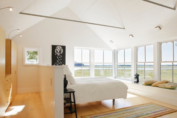
If you have already decided to paint your walls white and your home has a breathtaking view, consider painting the trim to match. Eliminating the delineation between the walls and woodwork with white paint will allow the landscape to remain frameless, expanding the view’s presence in your home. This strategy (painting both walls and trim the same), used to drop out the architecture obstructing the view, can be used with any color, but it is most effective with white because of its reflectivity.
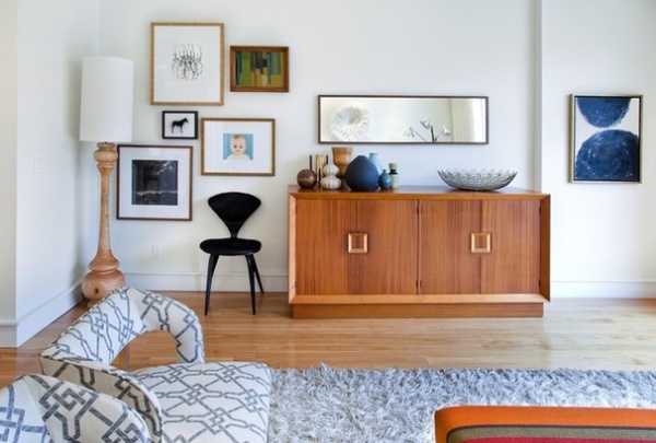
3. Reconsider the gallery look. There’s a reason galleries paint their walls and trim the same bright, white paint color: It drops out the architectural details and focuses attention on the artwork. The same method works for homes, too.
But if your home does not have a noteworthy collection of art or a breathtaking view, white can be stark and uncomfortable as a backdrop to family randomness and clutter. White tends to show imperfections, marks and disorder. If your family is as freewheeling as mine, you may not want to point arrows at this fact. That’s why galleries paint after taking down a show. And young families often choose to postpone the pristine white that they wish for and instead embrace khaki, which hides a multitude of bumps and bangs.
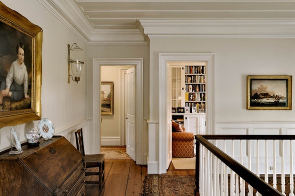
4. Pay attention to history. White is classic, formal, refined and restrained in style. For your Greek revival or federal interiors, white will be expected on trim and on walls in the kitchen and third-floor bedrooms. Make the mistake of painting everything white, and your home will look like a builder’s “flip.”
Color selections can, therefore, have contextual requirements that need to be respected if you want your choices to support the history of your architecture. Nothing says “wrong” more than white painted trim paired with walls painted a saturated color in a midcentury modern home.
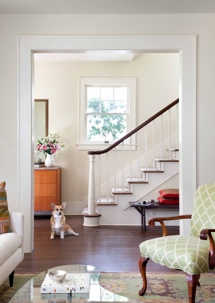
5. Use white to expand spaces. Rooms painted white appear larger due to the amplification of light. Shadows and edges also diminish in white spaces. When creating a palette for your home, try to keep in mind that cool white drops back in space and can be used to enlarge and open your smaller spaces.
But remember that spatial perceptions and human habits of navigation are improved when successive rooms on one floor unfold with subtle shifts in hue, not sharp contrasts. For example, using a white that deepens in color as the rooms get larger can diminish the size variation from one room to the next.
Find a white that you like on the paint company’s fan deck that you are using. This color can be painted on the walls of the smallest room. Then use the next darker value of color on the next largest room. Use the value (darkness or lightness of color) to enlarge or reduce the overall size of each space. Your guests will not be aware of the change from room to room, but will compliment you on the calm and comfortable home that you have created.
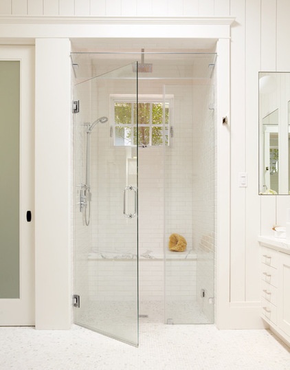
6. Add texture to white to avoid that sterile look. There isn’t a bathroom or kitchen that wouldn’t look cleaner with white as the color for walls, trim, countertops, cabinets or fixtures. Culturally we associate white with cleanliness. White’s crisp look is important to employ when you are readying a house for sale and want to make the best impression.
Whitewashing a room can have some drawbacks, however. By reducing the elements of the bathroom’s design to a single color, you can make this utilitarian space with hard surfaces appear sterile, even boring. Often just the simple addition of a textured wall surface such as beadboard can bring enough interest to the reduced palette to save the day.
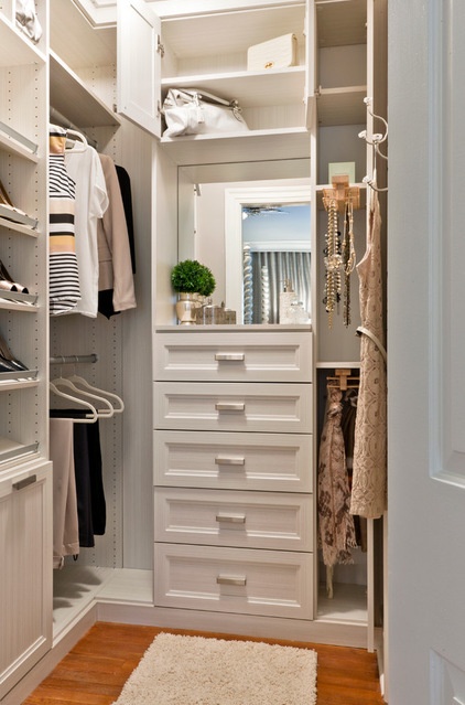
7. The closets don’t need to match the room’s walls. Most closets lack windows. Plus, the lighting in closets is usually an afterthought. This creates, to put it mildly, a poorly lit and poor viewing space — not ideal for when you’re trying to pick out that power outfit for your next big company meeting.
The best way to treat closet interiors is to paint all surfaces with light-reflective white for maximum visibility. You can check how reflective your white is by looking on the color card at your local paint store for the LRV number. The higher the number (accompanied by the initials LRV, for “light-reflective value”), the more the available light will bounce.
As in a gallery, white highlights the distinctive colors that it surrounds. This will allow you to sort out the color combinations that you want to have harmonious for a well-dressed day.
If you have a bold wall color in your bedroom, don’t feel the need to automatically make your closet interior match. Instead, tint white paint with a percentage of your bedroom wall color.
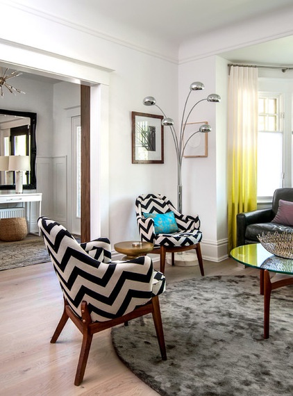
White is simple and sophisticated. Its crisp appearance satisfies our craving for a new paint job and a new look. Painting a room or a series of rooms with this cool, calm color is like taking the leap of faith required for a shorter haircut — new do, new you. Be adventuresome and consider the white option for your home’s design by looking at the site, considering the light and space, and making a sure-footed jump to a clean-cut, chic new interior.
More:
Why White Is the Ultimate Pop of Color
How to Create a Whole-House Color Palette
Houzz guides to working with white


