Light-Filled Artist’s Studio in the Pennsylvania Countryside
http://decor-ideas.org 03/05/2015 23:13 Decor Ideas
“Well, first take me to your studio and show me how you paint.” This was all architect Matthew Moger had to say to a still-life artist to win the job over all the other architects who had arrived to bid for the job armed with models and plans without ever asking about how she worked. While the artist’s studio was in Philadelphia at the time, she was planning to move to the rolling horse pastures of the Brandywine River Valley and establish her life in the country full-time. These same fields inspired Andrew Wyeth, who also had a studio there. “This studio was about combining her passions — her work and her horses,” Moger says.

Photos by Barney Leonard
Houzz at a Glance
Who lives here: A still-life artist
Location: Chadds Ford, Pennsylvania
Size: About 1,500 square feet (139 square meters), including 300 square feet (28 square meters) of hallway and 1,200 square feet (111 square meters) of studio space
The artist already had the antique farmhouse, seen on the right side of the photo. The addition begins just to the left of the large dormer window. That is the beginning of a long hallway that winds its way around to the studio, seen here on the far left.
Saving the sycamore tree was a priority, so Moger worked the addition around it. This allowed him the opportunity to make the trip from the main house to the studio a transformative one, where the homeowner goes from at-home mode to art mode.
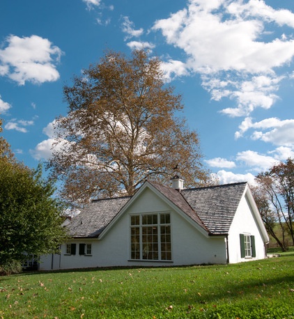
Because of the nature of still-life painting, the ability to control natural light was the most important factor. Moger placed the studio on a true north-south axis (northern light is best for the way the homeowner works, because it does not cast any shadows). The large windows you see here face north. Light from the rest of the windows can be controlled via shutters and barn doors.
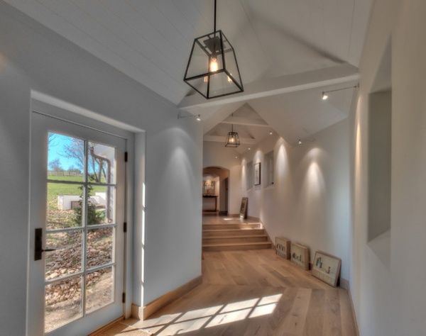
The artist would have liked to create a separate outbuilding for her studio, but factors like snowy winters made this option impractical. The artist told Moger: “Create a space that will inspire me every day.”
Having to work around the sycamore tree was fantastic inspiration to create a truly transformative and inspiring space between home and studio. The long hallway turns, and because the studio is built at a higher elevation than the house, there are steps up along the journey. This causes the owner to pause, shake off household tasks and get into a creative state of mind along the way. While the space is narrow, the vaulted ceiling is uplifting.
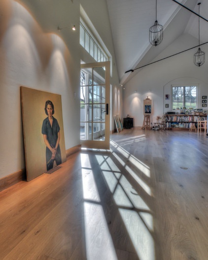
Moger also saw the opportunity to give this space a very appropriate secondary use as an art gallery. All of the lighting was designed for hanging artwork (here on photo shoot day, the artwork had yet to make its way off the floor, but it eventually did). “The hallway creates a procession that slows you down,” the architect says.
The gallery lighting design was completed in collaboration with Sean O’Connor Lighting.
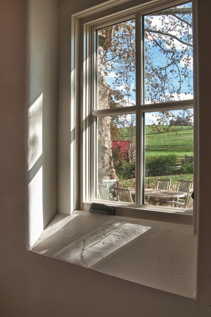
Moger also played with the natural light in the gallery. Angled windowsills bounce the light around. This trick, borrowed from cathedral architecture, was used throughout the space. The walls are covered in rough plaster, smoothed in some places and with a “cat’s paw” texture in others.
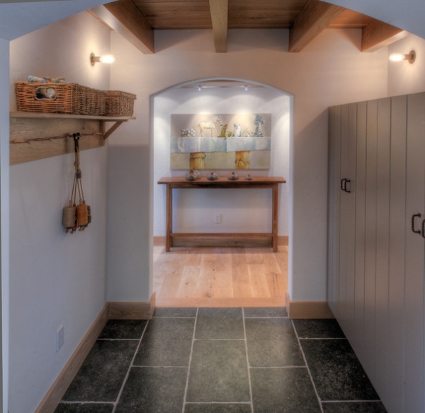
Before the owner enters the studio, the experience changes again, this time from the feel of a gallery to that of a more utilitarian space. White oak gives way to Belgian granite; the vaulted ceiling transitions to a more compressed one. This area includes storage for art supplies, a kitchenette for making tea and a full bathroom. The sliding barn doors that conceal these spaces are reminiscent of stalls in a horse barn.
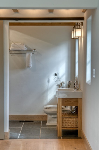
“Once she’s out here, she doesn’t like to have to break from artist mode by going back into the house. She works for long periods at a time,” Moger says.
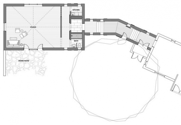
This is where it starts to get tough envisioning the plan mentally, so luckily, Moger has provided us with this plan. The long wall to the left of the utilitarian area corresponds to the console table wall in the next photo.
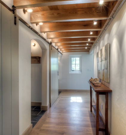
At this point in the entry sequence, one must turn 90 degrees to enter the studio. Just as she can control the light, the owner can also control the studio space by shutting it off via these interior sliding barn doors.
“A sense of craft is very important here,” Moger says. Although the space is contemporary, well-edited details reference the area, whether barn doors alluding to horse stalls or handmade metalwork recalling the history of farriers, or horseshoers, in the area.
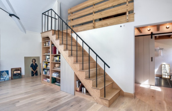
On the other side of the console table wall is this staircase. The entry on the right is where the most dramatic part of the entry sequence occurs, as one comes from the darker, compressed hallway into the light-filled, vaulted studio.
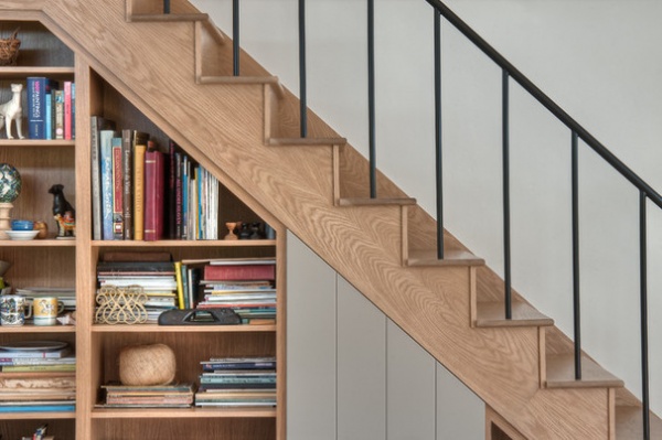
Upstairs is a loft for reading and power naps. Built in under the stairs is a library full of inspiration.
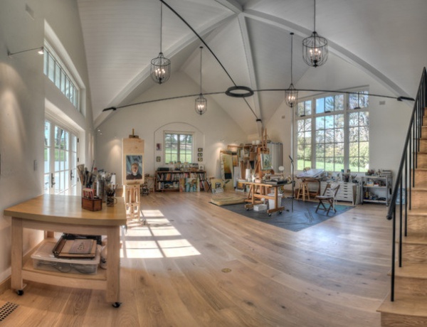
“This is a very charged space,” Moger says of the studio. “The gable-on-gable roof creates a pyramid in the ceiling, and the metal ring in the center hyperemphasizes it — she works in the center of the room.” The metal rods and rings are key parts of the ceiling’s structure.
“We talked a lot about the material palette,” Moger says. He used simple, utilitarian farm design elements, including the slightly whitewashed oak floors. The long history of the skilled farriers in the area also inspired the material choices. “The idea of them heating up metal and banging on metal can be felt through the materials — the hand-forged turnbuckles, the ring, the handrails and light fixtures,” he says.
Here you can see how all of that careful consideration regarding the light during the planning stages comes into play. “She is able to create an environment of only northern light in here,” Moger says. “Northern light is sacred light to a still-life artist.”
The south-facing transom windows are covered by a fixed awning, large exterior sliding barn doors can be closed against the rest of the southern light, and operable shutters can be closed to shut out the light from the west. These details also help the addition fit in with the original antique farmhouse and the outbuildings on the rest of the property.
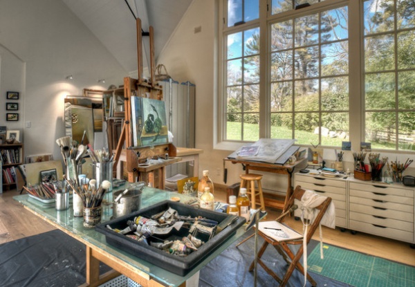
The tongue and groove paneled area here is a hinged door that conceals a little closet for a vacuum cleaner and other cleaning supplies.
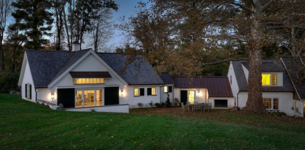
The addition respects the historic architecture on the exterior. Details like the cedar shake roof, green shutters and stucco finish match those on the main house, and the scale and massing are well balanced. Digging the studio into the ground kept it from looming high over the house. It also made the studio feel like a true part of the pastural landscape and gave the owner wonderful views of her beloved horses.
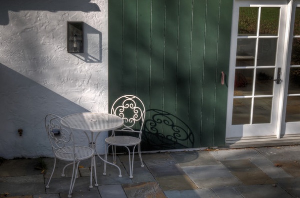
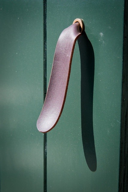
Outside, a small patio made of local bluestone is a lovely spot for enjoying the view and getting inspired in the fresh air. Leather straps serve as pulls on the large barn doors. The doors are easy to close when the artist needs to control the direct southern light.
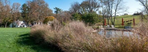
Here’s a glance at the surroundings and the horses that inspired the artist to move from the city to the country.
More:
14 Home Studios That Nurture Creativity and Art
35 Makers Show Us What They Do With Their Favorite Tools
Related Articles Recommended


