Houzz Tour: Redo Shines Light on 19th-Century Newport Beauty
http://decor-ideas.org 03/05/2015 21:13 Decor Ideas
Most empty nesters opt for a smaller house, but Gale and Peter Goff decided to upsize after their children left home. It was a simple case of mathematics: Now that their kids had kids, when everyone gathered for holidays, the tribe in one place was larger than ever before. But the answer was also more abstract. “When we found this house, we knew we had discovered a jewel,” Gale says.
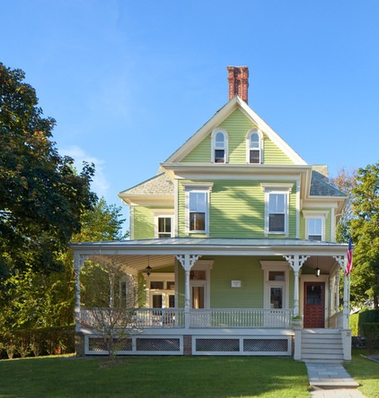
Photos by Anthony Crisafulli
Houzz at a Glance
Who lives here: Architect Gale Goff and Peter, her husband
Location: Newport, Rhode Island
Size: 4,200 square feet (390 square meters); 3 bedrooms, 2½ bathrooms. The third floor has a 2-bedroom, 2-bathroom apartment.
Year built: 1887
When Gale describes the state of the home on the day her family purchased it, it’s plain that by “jewel” she means “diamond in the rough.” “The house had old-fashioned knob and tube wiring, dark woodwork, a strange sunroom that you accessed by climbing a ladder and a kitchen that was so small, I didn’t notice it,” she says.
The architect says that what the home also had was wonderful flow and a large wraparound porch. “Underneath the dark colors and flocked wallpaper, there was a beautiful house,” Gale says.
It was also a place with history. The plaque on the front porch announced that the home had been built in 1887 by J.A. Johnson for a family named Briggs. For some, renovating a very old house is daunting. But this was not Gale’s first old-house redo. “Living in this area, I had remodeled old houses before, some of them for my family — although I’d never renovated one quite this old,” she says. “In some ways I’m my own best client. I thought it would be fun.”
But just because she’s a fan of old homes doesn’t mean this is a case of history repeating itself. That much is clear by the chartreuse color on the home’s exterior — a hue that probably did not grace the homes built during the reign of Queen Victoria.
“I wanted to have a little bit of fun with the color, and after trying out a lot of them, I had this one custom mixed. I wanted the house to be lighter and brighter on the outside and the inside,” Gale says. “I love older homes, but I’m not a purist. I think they have to work for our needs today — plus, I like to mix old and new.”
She took the same approach to the exterior materials. The roof of the house is composed of traditional slate tiles. The porch roof is made of standing-seam metal. It’s a material that is also traditional but, at the time this house was built, probably would have been more common on barns, outbuildings or the roof of a rear addition. The choice has a secondary benefit: Sitting on the porch when it’s raining is a delight to the ears.
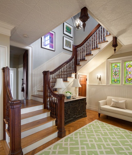
When the Goffs purchased the house, the woodwork, ceilings and walls were dark colored. “It was all a bit funerary,” Gale says. “With the deep porch, there is really no direct sunlight on the first floor.”
Choosing to paint the cherrywood was a difficult decision, but Gale says she doesn’t regret it. “I wanted a lighter home,” she says. “Once we started painting the woodwork white, we started seeing details you couldn’t see in the shadows.”
She left the stair rail the natural color of the cherrywood, and feels its details stand out better against a white backdrop.
The bronze radiator screen (it looks like an elaborately carved wooden chest to the right of the stairs) was also left untouched. “This was one of the first houses to be heated by radiator. The system is nearly 130 years old, but it works like a charm,” Gale says.
She worked on the interiors with her daughter, interior designer Kirby Goff. The color scheme was taken from the trio of stained glass windows found in the entry.
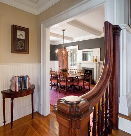
Although a remarkable number of finials remain inside the home on the fireplaces and stairs, one is probably missing. “I’m pretty sure a large finial would have been on the top of the newel post,” Gale says. “Although there is a lot of decoration on it, the home is a Queen Anne Victorian, and it was built during a time when the Victorians were not quite as ornate.”
Gale says that during the late 1800s, Newport was a popular summer retreat for American Southerners. Only later did the mild coastal summer climate find favor with New York City residents, and they constructed the grand summer mansions that have made the port city well known.
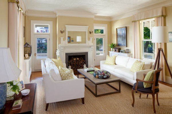
One of the features that drew the Goffs to the house is visible in the living room: Every space on the first floor has at least one door to the porch or the yard. For the pair of doors that flank the fireplace, Gale designed storm doors that look like the original doors. The benefits are twofold: They give the house an extra layer of insulation during the cold months and allow for screens during the warm months.
Sconces: Visual Comfort & Co.; rug: Merida; coffee table: Mitchell Gold + Bob Williams
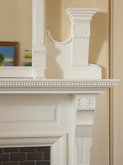
Gale says the home’s details, like these floral motifs and the sunburst pattern on the living room fireplace, became much more noticeable when they were painted white.
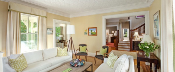
The lower level has a traditional circular floor plan, with one room opening to another. “Many people like to have one big room — a kitchen, dining room and family room,” Gale says. “But as long as there is good flow, my husband and I like to have doors. Sometimes you just like to get away from others.”
Lamp: Visual Comfort & Co., chairs: vintage, sofa pillow fabric: Kelly Wearstler
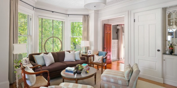
The living room is for formal entertaining, and the den next to it is for more casual family time. “This is where we gather to watch television and read the newspaper,” Gale says.
Like the staircase, most of the doors in the house were left in their natural wood state. The glass doors on the right were salvaged from one of Gale’s clients’ homes. She used them to front a bar in this room.
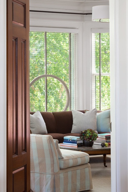
The large wooden ring is a sculpture found on a shopping expedition. The bay window faces southeast, so blinds and curtains were necessary for light control.
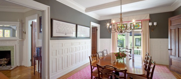
Taking a cue from the rosy tones in the stained glass windows, Gale laid down a pink and white rug in the dining room. The dining table belonged to her mother, and their curvaceous lines inspired the choice of the scrolled chandelier.
The raised-panel wainscoting runs high on the wall, so it allowed Gale to choose a darker color for the wall without making the room seem gloomy.
Wall paint: Tobacco, Pratt & Lambert; chandelier: Visual Comfort & Co.; artwork: Natural Curiosities; rug: Madeline Weinrib
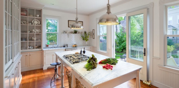
Gale says that the space where the kitchen is used to be three small rooms. “Before, there was a small room that had a range and not much else,” the architect says. “The first time I left the house, I honestly had the impression there was no kitchen at all.”
The three spaces were combined to make one kitchen that allows Gale to realize her dream of having a large kitchen island. “One of my clients saw it and said, ‘That’s not an island, it’s a continent,’” she says.
Gale thought there was plenty of storage elsewhere in the kitchen, so she elected to make the island stand on four legs. “Otherwise, I felt, it would look too solid and blocky.”
For the island legs, Gale used pilasters salvaged from an old theater in nearby Providence (her hometown). “I have a cooktop here, so electricity runs up one leg and gas runs up the other,” she says. Because the island is constructed like a table (it’s too shallow to allow a pop-up ventilation hood) and because she didn’t want anything hanging from the ceiling, Gale chose an exhaust fan that’s installed flush with the ceiling. “For us this works just fine,” she says.
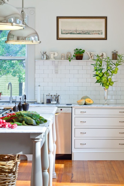
Gale installed a shelf on top of the tile backsplash to keep jars of tea and coffee close to the sink. “It also gives me a small space to decorate,” she says. “At Christmastime, I usually put up a row of miniature trees.”
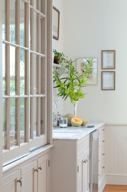
Before the three rooms were combined to make a larger space, one of them served as a butler’s pantry. Gail salvaged the glass doors from cabinets in that space to create storage with visibility in the new kitchen (her silver collection lives behind the doors).
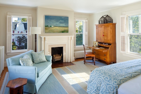
In the master bedroom, there’s a love seat for relaxing and a secretary for working. The secretary belonged to Gale’s mother and is topped by an antique birdcage. The small sofa is a placeholder until the architect can find her dream chaise.
“The thing about this house is that it’s a home for all seasons,” she says. “It’s big enough for the summers when all of our kids come, but there are lots of cozy spots where you can cuddle up with a book in the winter.”
Wall paint: Noodle, C2
Browse more homes by style:
Small Homes | Colorful Homes | Eclectic Homes | Modern Homes | Contemporary Homes | Midcentury Homes | Ranch Homes | Traditional Homes | Barn Homes | Townhouses | Apartments | Lofts | Vacation Homes
Related Articles Recommended


