Why White Is the Ultimate Pop of Color
http://decor-ideas.org 03/04/2015 23:13 Decor Ideas
Many people think of an accent color as being a bright, bold shade that they wouldn’t dare use in a larger amount. But in my opinion, one of the most effective colors to use for contrast isn’t even a true hue but a combination of all of them: pure, radiant white. Using dollops of white, you can add drama to grays, break up patterns and dark colors, soften bold decor and more. Here’s how this noncolor color manages to pop in a big way, and why you should consider introducing fresh yet timeless white into your interior color scheme.
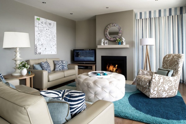
Add Drama to Grays and Taupes
In a space focused on muted shades like grays and taupes, a pop of fresh, clean white becomes more of a dramatic feature than even a chilly blue. But it also helps accentuate the undertones of the other neutrals by contrast, making sure every hue in the room gets its due.
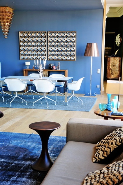
In a design with colorful walls, white is a powerful tool for adding a sense of contrast without clashing or overloading on too many hues. It brings drama to the center of the room here so the walls aren’t the sole source of interest. And yet it does this without creating visual conflict.
Break Up Patterns
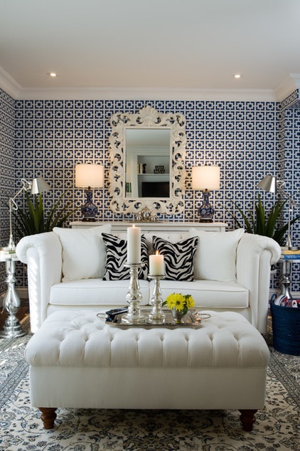
Solid white furniture is a perfect way to break up a busy wall treatment so the overall effect isn’t overwhelming, as evident in this Toronto living room. Also notice how the mirror with a large white frame above a white console gives the eye a visual break.
Tufted white ottomans are a particularly great way to add a pop of white with a graphic textural detail (the tufting) so as to appear inviting and not clinical. Also: fun zebra-patterned pillows add just the right amount of wild flair anywhere.
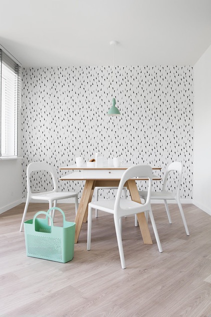
White furniture doesn’t have to be a maintenance nightmare, either. A material like plastic, lacquered wood or coated metal will add an eternally clean counterpoint to a busy dining room wall for fresh energy in your breakfast nook.
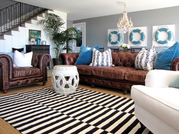
Giving the eye a break from a bold pattern is also worth considering for the fifth wall, also known as the floor. Although this rug includes white, the chunky stool breaks up the geometry and becomes both a visual resting spot and a focal point, all without introducing any new color.
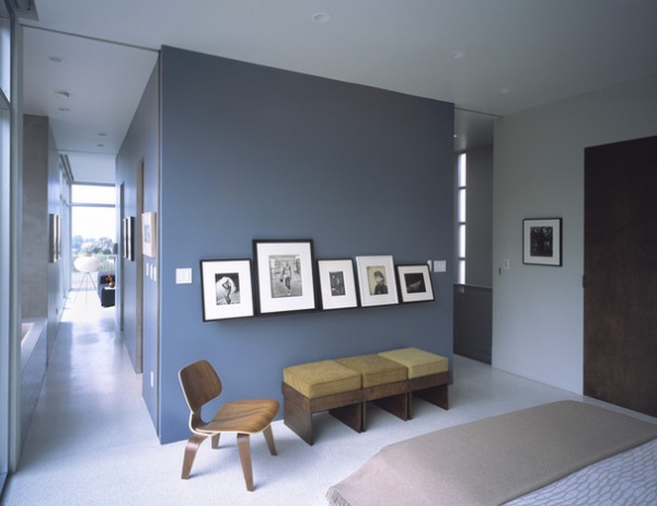
Break Up Dark Colors
Simply adding some art with chunky white matting, white frames, or both, can break up a dark wall treatment and create a sophisticated gallery vibe even without the expensive paintings and prints.
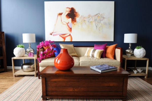
One large piece with a white background can also effectively command attention and create a focal point against a dark wall. Notice here how the white accents are even more powerful than the hits of orange, despite orange being blue’s direct color complement. Picking it up with simple white lampshades and white trim helps the “color” feel integrated throughout the space.
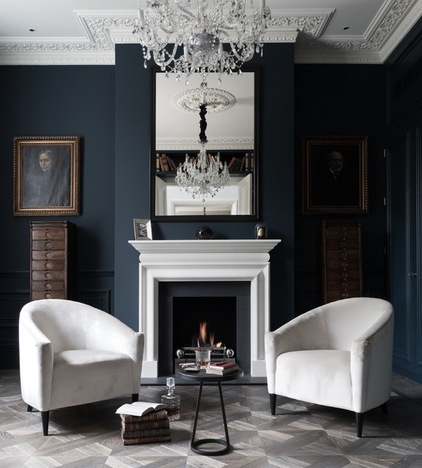
In a very dark space, hits of white become especially important to help reflect light. (Notice how the white elements here appear even brighter than the mirror.) White furniture in this case also helps draw the eye into the center of the room, which can visually shrink the space. But if the intention is a moody effect, a dash of clean white will amp up the sophistication and make the look feel self-assured.
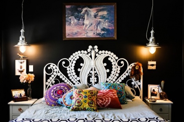
A dark wall treatment can be edgy, but it’s easy to live with in a bedroom, where you spend most of your time in the dark anyway. Here a white bed frame helps give the room some sense of visual definition and balances the mood with a sense of softness.
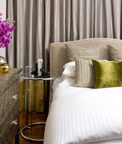
Whether the walls are dark, light or in between, I’m a huge fan of simple white linens for instantly freshening the look of a bedroom and give a visual breath that helps the room feel peaceful.
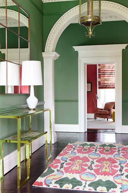
Soften Bold Decor
When working with high-drama looks (such as a bold complementary scheme or a fashion-forward color), accents like white trim help to soften and tie everything together peacefully, while framing each vista like a carefully considered photograph.
Plus, white trim highlights architectural gems, like a grand arched doorway or beautiful molding, so your eye doesn’t miss a detail.
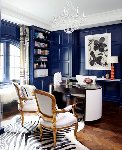
When using a very bold wall hue, even white can feel radical next to it without a little thought. Using white in a variety of forms (including patterns, soft and hard textures, and a multitude of shapes) results in a look that remains bold but doesn’t feel garish or “theme-y.” Remember: Just as with any other pop of color, it’s smart to spread the secondary hue around to different areas of the room so it feels balanced.
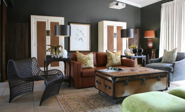
In an eclectic space with curated antiques, hits of clean white translate to a sense of modernity, so the overall effect reads more transitional than strictly traditional. It’s perfect for those who can’t settle on one time period but instead prefer a timeless cosmopolitan look.
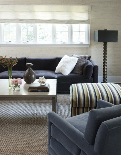
A Little Goes a Long Way
If you like the idea of introducing white but without the high drama factor of many of these looks, try adding small white accessories to dark furnishings, like a bright white pillow. It will make your upholstery stand out and feel new without a long-term commitment.
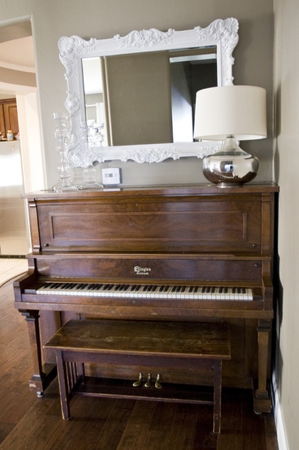
Also consider putting a few white accessories near other white items, such as lampshades, window frames or the ivories of the family piano. The items together will pick up on one another and stand out that much more.
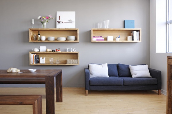
White items on a wood or painted bookshelf create a beautiful effect of shapely negative space that recalls beautiful classical statues. That’s probably why open shelving for dishware has become so popular. Use this effect in a kitchen, living room, bathroom — anywhere — and let your everyday essentials become a key part of your decoration.
More:
Nature’s Color Wisdom: Lessons on White From the Great Outdoors
How to Pick the Right White Paint
Cooking With Color: When to Use White in the Kitchen
Related Articles Recommended


