Houzz Tour: Beach Shack Reborn as a Copper-Clad Cottage
http://decor-ideas.org 03/04/2015 00:13 Decor Ideas
The owner had lived for years in a 1830s cottage in need of serious repair in a densely populated beachside suburb of Sydney, Australia. Although his cottage was dark, cold in winter and hot in summer and lacked cross-ventilation, he deeply valued its seclusion, serenity and proximity to the beach and city. The original plan was for an extensive renovation, but with the house’s deteriorated condition, this was just not viable. Instead, he and his designers embarked on a philosophical and logistical journey to create a new home on the long, sloping, narrow site. The result, called the Copper House, is a tranquil and open small home that resourcefully welcomes the ocean air, sunlight and greenery.
Houzz at a Glance
Who lives here: The owner leases the Copper House to tenants
Location: Coogee, New South Wales, Australia
Size: 645 square feet (60 square meters); 2 bedrooms, 1 bathroom
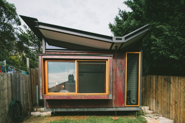
Architect Brent Dunn of Takt l Studio for Architecture says the concept of “one’s place in time” was central to the Copper House.
The owner, Dunn and co-designer Katharina Hendel were friends and had talked informally about the practical considerations of transforming the home. They also had spoken about subtler themes, Dunn says, such as “patterns and rituals of living, dialogue between longevity and decay, and quality of space and place: how spaces shape people as much as the other way around.”
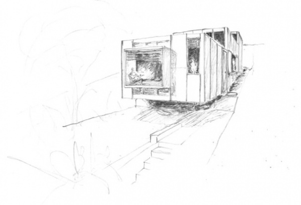
Designs for a new build got underway, working to the challenges of a long narrow sloping site (183 feet long and 20 feet wide) with limited access.
The initial plan was for a two-bedroom vacation home with bathroom, laundry and combined kitchen-living area, access to views and a sense of the original cottage’s calm and tranquility.
It sounds simple, but “a lot of historical research was undertaken to explore the history of the unique old cottage, to help us find an appropriate contemporary expression,” Dunn says.
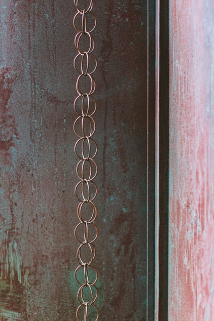
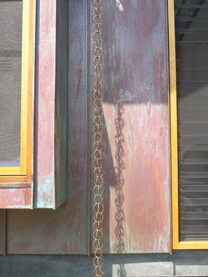
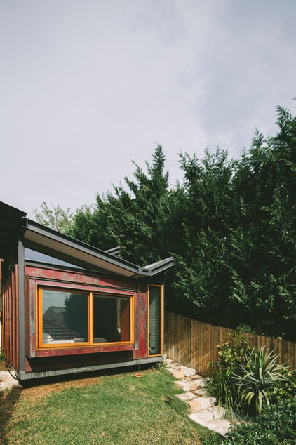
The search for suitable siding was influenced by the demands of a salty beachside environment, a preference for a low-maintenance material and interest in something that would “embrace its aging.” Copper fit the bill and became a meaningful expression of the spirit of the home outside and in.
Copper cladding: KFC Rozelle
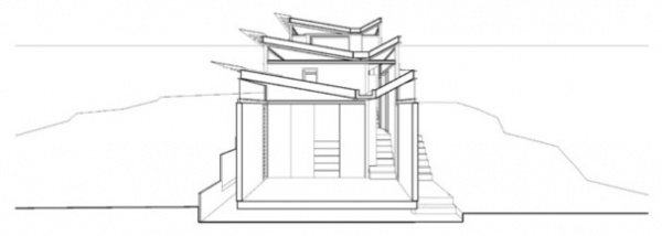
The resulting vision was for three sections, or connected modules, as a response to the sloping site,.
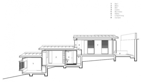
“A linear plan was an ideal solution and the stepping also offered a chance to utilize the space under the level changes for laundry and storage,” Dunn says.
He says “the project is first and foremost designed according to passive solar design principles, admitting sun during winter, while the shading cuts it out in summer. The slab provides thermal mass that, together with the insulation, keeps the house very comfortable year round.”
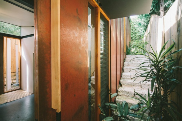
The home has a real sense of openness, dimensionality and engagement with nature and the elements.
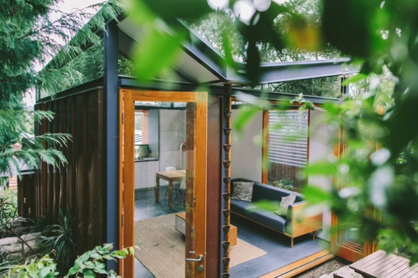
Dunn and Hendel see the sense of calm as the home’s most delightful aspect. “It feels private,” Dunn says, “yet enables an experience of the passing of the day and the seasons. We are particularly pleased that a small project contains such diverse spaces and that we were able to pursue custom solutions to add layers of experience to the place.”
Lounge, dining and coffee table: Takt in collaboration with Craft Design Realisation; landscaping: Greenfriends
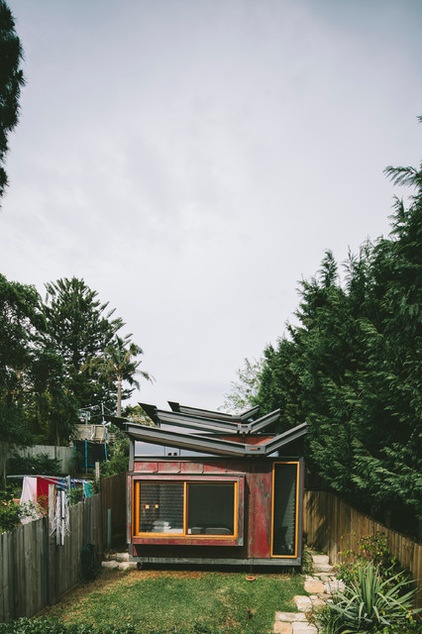
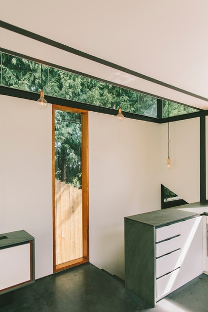
“The roof form came about to allow light in and offer views to the sky and treetops on a narrow site surrounded by fences and walls,” Dunn says.
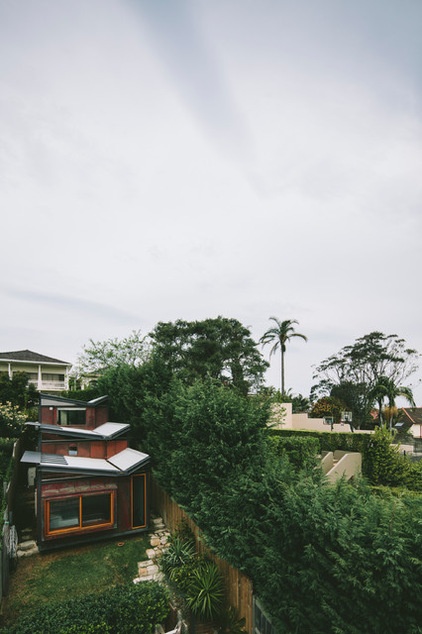
“Each junction between the three sections frames a different view — to the sky, the city, the rear terrace or to the small garden courtyard from the bay window seat, so that the space never feels confined,” Dunn says.
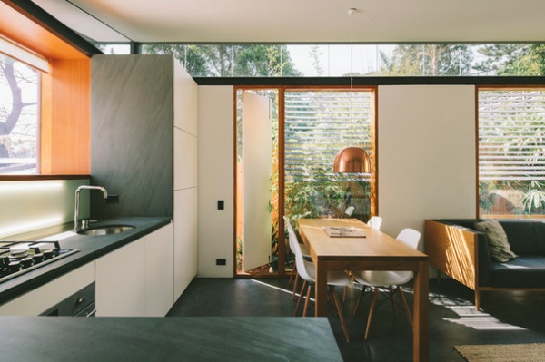
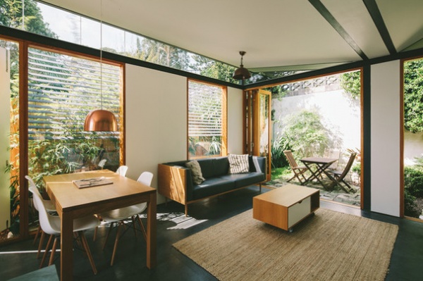
As the most social space of the house, the dynamic living-kitchen-dining area sits in the upper section and gives views across the city. It also opens onto a private rear terrace.
Bedonia countertops: Artedomus; Franke sink: Winning Appliances
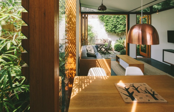
The new-build design encouraged rethinking on how the immediate environment and the challenges of the site might be explored to advantage. “The block is west sloping and has a [13-foot-high] retaining wall to the west,” Dunn says. “The previous cottage was pressed hard against the wall, which felt overbearing. The new building pulls back to allow an outdoor room between the house and the wall, and landscaping with lush foliage and water features makes the most of this existing feature.”
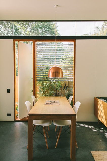
“Those highlights enable an experience of passing time and the seasons as the light tracks across rooms,” Dunn says. While allowing light and “the upper outdoors” in, this feature gives privacy, something that is valued by the owner.
Vintage spun copper pendant: Vampt Vintage Design
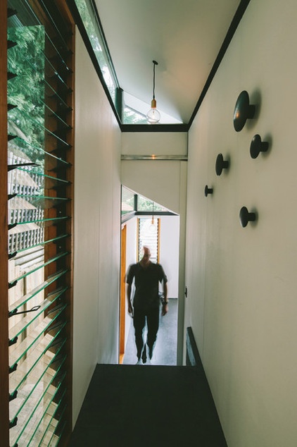
The flow of light and air is a striking feature of the property, owing not least to the use, positioning and style of windows: a variety including deeper wood-framed recesses, louvers at living level and a “highlight glazing” throughout in the higher spaces between the expressed steel structure and the roof.
Hardwood windows and doors: Country Style Windows; steel frame: Helensburgh Metal Fabrication
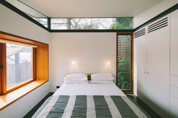
The main bedroom is positioned in the lowest area. It features a bay window seat overlooking a small courtyard garden.
Custom designed beds: Takt
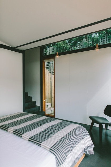
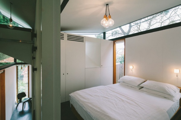
The second, slightly smaller bedroom sits in the middle of the house and, Dunn says, is “more internally focused with highlight glazing for light and a small peephole framing the sky from the bed.” The bathroom is also in this section.
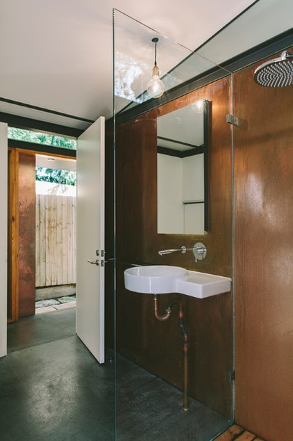
“Copper was used as an accent inside as well, so as to tie the whole place in a reduced material palette,” Dunn says. “We chose copper light fittings … door handles, copper plumbing pipes, and clad the bathroom in flat sheets, unfinished, all to encourage an understanding of one’s place in time. After a few years, the most exposed copper has started to show some of the richer green tones in the shadows.”
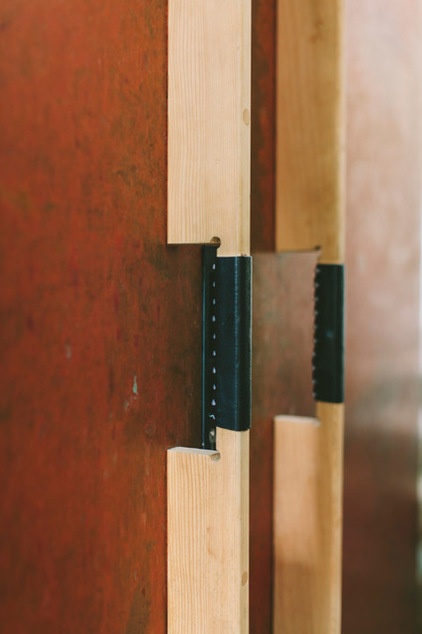
Dunn says: “All the other materials were chosen to complement the copper. The dark concrete platform has been sealed by hand with beeswax and retains a soft luster. Hardwood windows and doors of Australian ash and other wood elements add warmth. A panelled system of artist’s canvas stretched over boards provides a counterpoint to the harder materials. Leather on the door handles has softened with age.”
Concrete: SBN Building Constructions; hand-stretched artist’s canvas on E0 MDF, painted, on internal walls: Levers
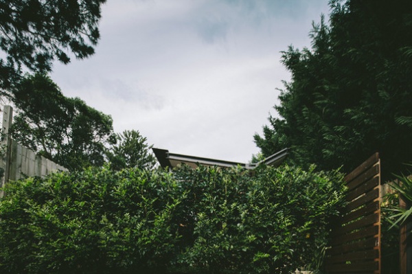
The front of the house is barely visible from the street.
Browse more homes by style:
Small Homes | Colorful Homes | Eclectic Homes | Modern Homes | Contemporary Homes | Midcentury Homes | Ranch Homes | Traditional Homes | Barn Homes | Townhouses | Apartments | Lofts | Vacation Homes
Related Articles Recommended


