Room of the Day: A Living Room Designed for Conversation
After her husband passed away, Penelope Draganic and her son, Sam (age 16), and daughter, Vivi (9), moved from their larger home to a three-bedroom, two-and-a-half-bath bungalow in Belvedere, a scenic community in Marin County, California, by the water, just north of San Francisco. Draganic wanted their new home to feel like a cozy nest where the family could create new memories while incorporating older sentimental pieces.
While the home had lots of potential, Draganic thought it needed some updates. “Before, the house had a Tuscan feel to it, with Venetian plaster on the walls,” she recalls. “I wanted it to be more my style, with clean lines and beachy colors done in an elegant way.”
She and designer Eugenia Jesberg paid special attention to the living room, the first space people see when they enter the home. Wanting the room to set the tone for the house, they used a fresh, light color palette with blue and green accents that reflect the shimmering lagoon just outside the windows.
Room at a Glance
What happens here: Family entertainment, socializing and frequent nights in front of the fireplace
Location: Belvedere, California
Size: About 400 square feet (37 square meters)
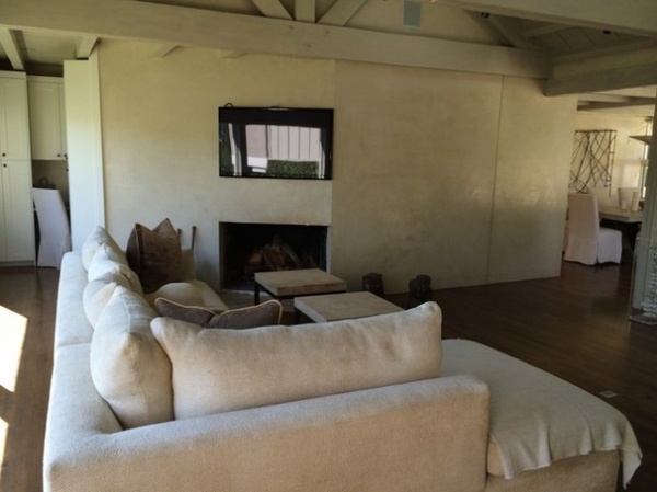
BEFORE: The existing living room had nice architectural details but felt dark and gloomy due to a dingy brown wood floor and Venetian plaster on the walls.
An existing fireplace off center on an angled wall also created a challenge. The previous homeowner had a TV on the wall, but Draganic wanted the room to be all about conversation.
“After” photos by Eric Rorer
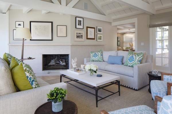
AFTER: Now a gallery of framed drawings, etchings and family photos adorns the top part of the angled wall. “Instead of making the focus on one piece, this helped give us the flow we wanted for this room,” Jesberg says.
Limestone wraps the bottom half of the wall with a subtle pattern that introduces movement and depth. A custom standing glass fire screen provides clear views of flickering flames (or logs when there’s no fire) as well as protection.
The open furniture arrangement is meant to be inviting no matter where someone enters from, while the facing-off sofas (designed by Jesberg) encourage conversation. “We wanted to create a space that felt cozy but not crowded, and I think we accomplished that,” Draganic says.
Blue and green pillows and side chairs add color and pattern to the earthy gray walls and white trim.
Ray Cocktail Table: Oly Studio; Ashcroft Floor Lamp With Tray Table: Paul Ferrante; limestone slab surround: Da Vinci Marble; window shades: custom, Conrad Shades; wall art: client’s own, reframed by The Painters Place
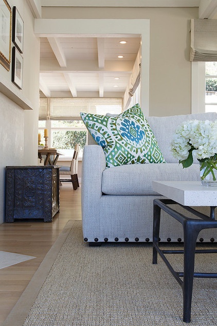
The neutral twin sofas have a welcoming, textural feel and were treated for stain resistance to make them user friendly for the family. A nail detail adds a bit of surprise. “Because the sofas and rug were so plain, that little bit of detail gives a punch,” says Jesberg.
The metal coffee table has a resin top that looks heavy but is soft to the touch. A sisal area rug warms the oak floor, which was stripped and bleached to a light matte finish for a coastal feel. The antique trunk seen on the left here is a family piece.
Sofas: custom, Belmar Fine Custom Upholstery with Twist Dune upholstery by Kirkby Design; sofa trim: Espadrille Striped Border in Crema with large nails from Samuel & Sons; area rug: Stark Carpet; trunk: client’s own antique; large sofa pillows: Bella in Aqua from Manuel Canovas Designs and Forenza in Palm from Romo; wall paint: Edgecomb Gray, Benjamin Moore; ceiling, trim and cabinetry paint: Simply White, Benjamin Moore
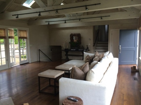
BEFORE: Previously the back of a single sofa greeted guests at the front door. Black track lighting stood out on the wood beams, while the dark stained floors and wrought iron stair rail leading down to the family room added to the room’s muted feel.
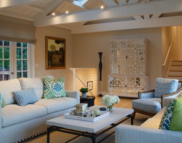
AFTER: Low-voltage LED lights on a white track now blend into the living room’s beams, which are painted in Benjamin Moore’s Simply White, along with the ceiling, trim and cabinetry. A more modern metal stair rail was also added. “The iron there looked so heavy,” Draganic says. “Now it’s a crisp, nicely structured piece, and it gives a bit of a contemporary twist to the room.”
A tall mirrored cabinet conceals a bar. “It’s a glamorous bar with a full set of libations,” she says. “I call it my Mad Men bar.”
Side chairs: McGuire Furniture with Stratford upholstery in blue from Clarence House; small sofa pillow: F. Schumacher & Co.; horn boxes: Roost; cabinet: Anna Tall Cabinet in Bleached Oak, Julian Chichester; track lighting: Juno Lighting
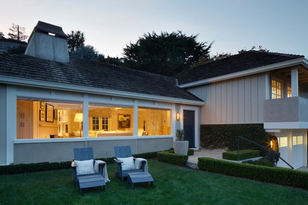
This shot was taken from the front yard and shows how the front door opens directly into the new, more inviting living room. “This isn’t one of those unused living rooms,” Jesberg says. “It’s the heart of the home.”
See more Rooms of the Day
More:
13 Strategies for Making a Large Room Feel Comfortable
How to Plan a Just-Right Living Room Layout


