Houzz Tour: Thoughtful Design Works Its Magic in a Narrow London Home
http://decor-ideas.org 02/25/2015 21:14 Decor Ideas
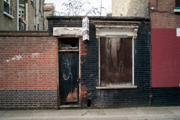
For those who struggle with small-space living, this makeover of a dilapidated workshop with a tiny footprint in east London can offer hope and inspiration. “Everyone laughed,” says architect Fiona Kirkwood of the moment she revealed her plans to make the tiny ruin in east London into a home. “But I had conviction and got stubborn about it.” The building has been transformed into a remarkable three-story home. From the lengthy planning process to extremely tight space constraints, the project was certainly not without its challenges, but the results are impressive.
Houzz at a Glance
Location: Bethnal Green, east London
Size: 2 bedrooms, 2 bathrooms
Who lives here: Fiona Kirkwood of Kirkwood McCarthy and Benjamin Morgan
That’s interesting: The site is incredibly narrow, just a shade over 12 feet (3.7 meters) at its widest
With such a small site, the biggest issue was overcoming the tiny footprint, Kirkwood says. Then there was the lengthy planning process. “Bethnal Green was heavily bombed during the war, and this site is on one of the few conservation areas of its type, so it was important the facade remained red brick,” she says.
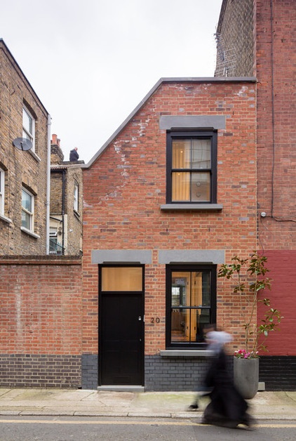
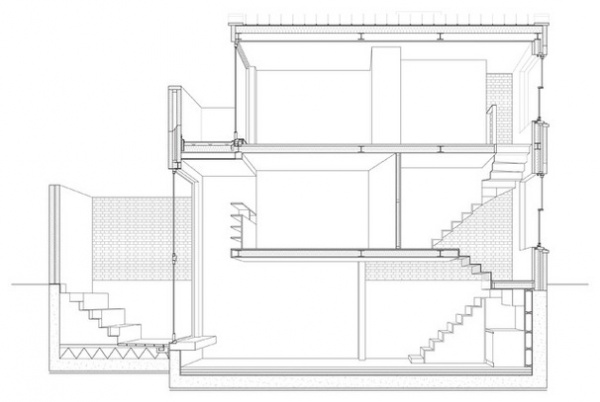
Factors such as a law that protects neighbors’ access to sunlight and the building’s location close to a canal influenced the form the building could take. “We knew it had to be vertical, and the footprint was such that you could only get one room on each level. But I knew I wanted two bedrooms and two bathrooms,” she says.
It made the basic structure simple to determine in terms of the flow from public to private, with the two bedrooms and bathrooms on the ground and first-floor levels, and the main living space in the basement. “Once we understood that conceptual structure, it was about manipulating the architectural structure to falsify the sense of space,” Kirkwood says.
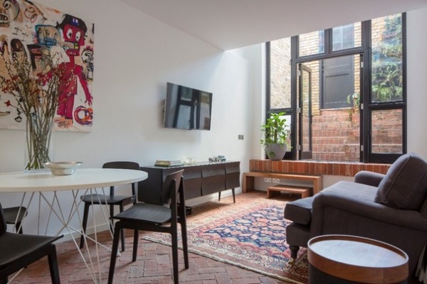
One of the home’s most defining features is the surprising feeling of space and light given its small footprint. This was thanks to thoughtful design that took into account the details and functions of everything in the home. “With such a small space, everything has to have a dual function to maximize performance, be that storage, light or acoustics,” Kirkwood says.
Even though the house is an example of contemporary architecture, Kirkwood was conscious it was to be a home first and foremost. “We wanted it to be comfortable and relaxed,” she says. So she juxtaposed the contemporary architectural features with things like a thick Persian carpet and a squishy sofa.
Walls: Brilliant White, Dulux; Muuto Reflect sideboard; Tavolo by Magis table; NY11 dining chairs: Norr11; Softline drum side table: A White Room
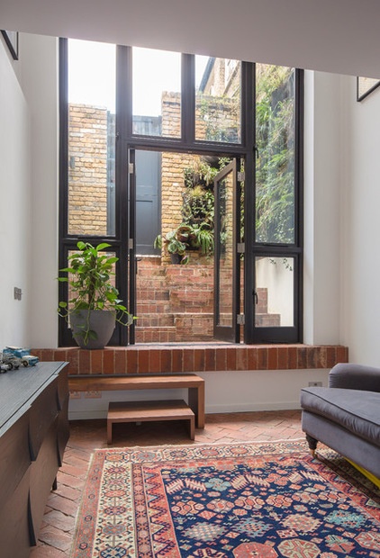
Kirkwood was careful to ensure the basement didn’t feel like a basement, so she had it lifted as high as possible to gain as much of a view of the outdoors as possible.
“The whole house is about pushing what can be achieved on a really small site,’ Kirkwood says. The steps in the courtyard, for instance, are carefully designed to be at seating height. “The courtyard is furniture — it’s like an amphitheater. We’ve had 20 people sitting out there. It becomes a great social hub for the house and is a big part of the integrated indoor-outdoor sense we wanted to create,” she says.
She planted the living wall herself with the help of a landscape gardener friend using Woolly Pocket Living Wall Planters and flowers, herbs and evergreens from New Covent Garden flower market. The wall gets direct sunlight and stands where an old toilet used to be. The greenery acknowledges that an old structure was there and provides a tranquil and peaceful ambience for the small courtyard, as well as herbs for the kitchen.
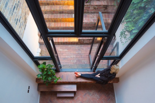
To further enhance the link between indoors and out, Kirkwood continued the brick from the patio onto the basement floor. “The traditionally external material gives a sense of the casual courtyard inside,” she says.
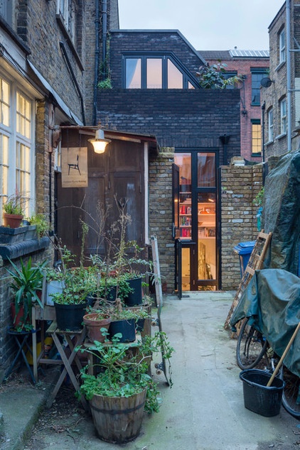
Kirkwood and Morgan’s home extends only to the end of their courtyard. Beyond is a community garden shared by their neighbors, who include furniture designers and artists, so the space has become a sort of workshop area.
While the front elevation of the property had to be red brick to conform to building regulations, Kirkwood wanted to express some of its old identity — it had long been black-painted brick — in the tall elevation at the back.
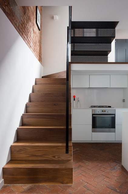
The basement has an open-plan design, and on the other side of the room is the kitchen area.
Kirkwood kept the walls and cabinets throughout the house white, with black accents on the railings, windows, handles and other details. “Black and white was there from the outset,” she says. “It was such an easy palette that offset all of the tonal variations in the brickwork. It became a rule we stuck to quite strictly,” she says.
White lacquered push-release doors and a white Silestone countertop keep the kitchen clean and simple, while under-stairs storage ensures not an inch of space is wasted. “That’s sort of the premise of the house,” Kirkwood says. “Everything is really functional, but discreet and well executed.”
The walnut stairs leading to the ground floor transition into perforated steel stairs at the top to allow natural light from the landing window into the basement.
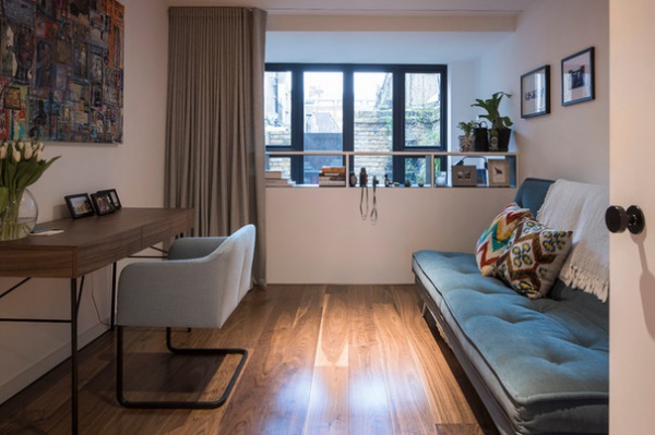
On the raised ground floor is a guest room that doubles as a study, plus a bathroom. “We decided to put in just a curtain instead of a wall because we wanted it to interact with the courtyard and basement below,” Kirkwood says.
The top section of the balustrade is cut out and lined with black aluminum to form shelves and enhance the light and interaction with the rest of the space.
The main key to the home’s success is the consideration that went into every detail. Rather than opt for more floor space by creating three full floors, Kirkwood added in this mezzanine level, resulting in an integrated and more spacious whole. “It was important to know when not to add floor space to make it feel bigger,” she says.
Luca Soft Carver chair; dressing table: Ligne Roset; American black walnut flooring: Woodfloors4U
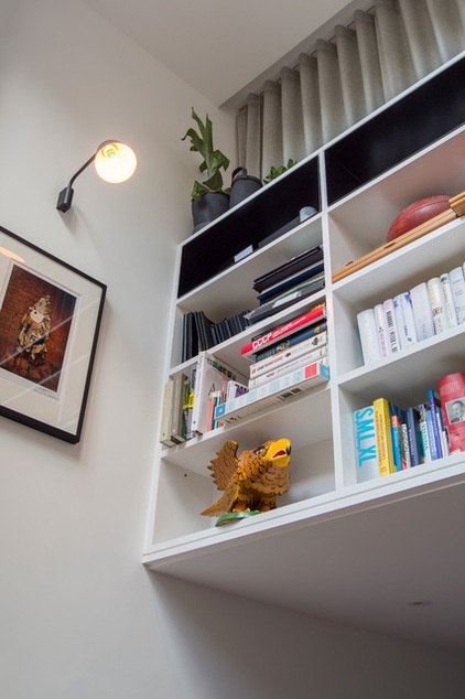
The balustrade doubles as a bookcase on the other side — another example of the creative use of space in this house. “Any surface or space that can possibly store something does,” Kirkwood says. “You have to over-think everything when you work at this scale. It can get really chaotic otherwise.”
Kirkwood and Morgan had a collection of big and colorful West African art from Jack Bell Gallery in Mayfair. “We knew we’d have to keep the spaces as calm as possible to let the soft furnishings and art add the color and interest,"Kirkwood says.
Wall light: Light Years, Skandium
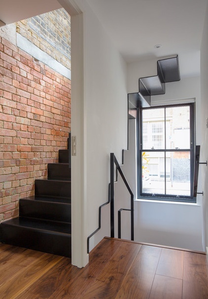
Kirkwood describes deciding on the layout for the staircase as “an extensive exercise.” It was important to minimize their impact on the floor space, and in the end she decided that the most effective way to do it was to bundle them all into the south corner. From there it was all about figuring out how they could add character and a quality of performance.
“It was important to have a continuity of materials,” Kirkwood says. She knew the floors of the home would be a mixture of brick in the basement and walnut for the upper two floors, and the color scheme would be black and white. “I wanted to be able to read the walnut and brick together, and the walnut with the black, and the black with the brick,” she says. So the staircase up from the basement is walnut with black steel banisters, and the other flights are made from steel.
In this image, the front door is to the right of the window, the study/guest room and bathroom are directly behind, and the archway marks the staircase up to the master bedroom.
The lighter bricks are the neighbor’s, and the horizontal line is where the old building’s ceiling was. “We left it open because you don’t need as high an acoustic performance up here — plus it’s another nod to the history of the home,” Kirkwood says.
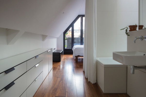
The door to the master suite is at the bottom of the stairs, keeping the top floor open and free-flowing. Although there’s a bathroom on the floor below, Kirkwood was eager to have a bath up here. “I’m obsessed with having baths, and this was the only place we could fit one,” she says. “After the bath, it sort of snowballed into a whole bathroom, because it’s convenient to have a loo here, too,” she says. “It’s actually turned out really nicely. It’s like living in a hotel-style space, and you have a closed-off bathroom downstairs for when you want to be private.”
The drawers were specially designed so as to not be too high to exaggerate the low ceiling. Black aluminum handles connect with the floors below for a harmonious whole.
Tiles: Domus Tiles; Vero Handrinse 500mm basin: Duravit
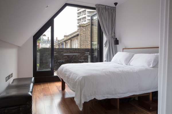
Planning regulations meant the shape of this room would necessarily be awkward. So Kirkwood made a feature of the sloping ceiling by installing LED spotlights.
“We tried not to have too many overhead lights in the space,” she says. “Everything was very specific — more about carefully considered zones of lighting to make sure it didn’t become glitzy,” she adds.
Bifold doors onto a small patio create another link with the outside. “The other day it was snowing in the morning, and we opened it all up to watch from the warmth of the bed.”
Fabric was cut to the specific angle of the glazed wall to create a curtain that sits beautifully on top of the walnut floorboards when closed.
Divina Melange 2 curtain fabric: Kvadrat; Silo pendant light: Zero Lighting; Shetland bed: The Natural Bed Company
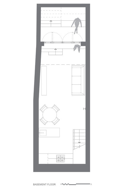
Basement
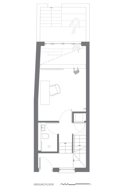
Ground floor
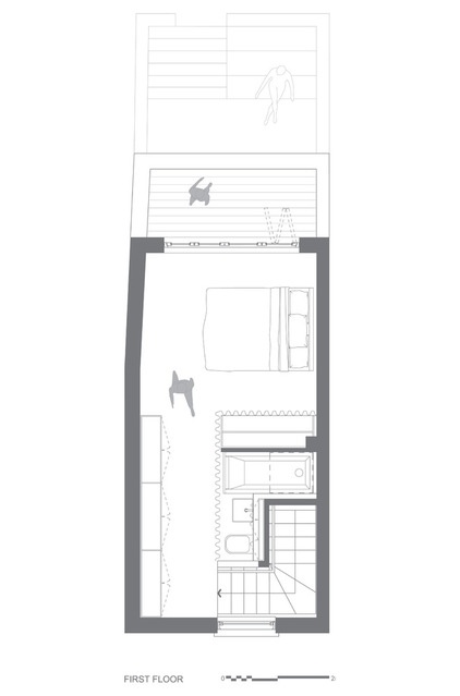
First floor
Browse more homes by style:
Small Homes | Colorful Homes | Eclectic Homes | Modern Homes | Contemporary Homes | Midcentury Homes | Ranch Homes | Traditional Homes | Barn Homes | Townhouses | Apartments | Lofts | Vacation Homes
Related Articles Recommended


