Is Your Home Ready for a 1970s Revival?
The 1970s were an interesting time for style and design. The austere 1950s had picked up on straight-lined 1930s modernism and run with it. The radical social changes of the 1960s threw familiar aesthetics up in the air and dropped them back to Earth in a psychedelic explosion. And, when the midcentury slid into the 1970s, a bold new design era settled in.
While the early part of the decade was dominated by pop art, vibrant colors, emerging technology and newly available plastic furniture, the second half was shaped by the 1973 oil crisis, recession and high unemployment. In came a return to nature and a more homespun ethos, visible in the popularity of Victorian florals; wood and rattan; and handicrafts such as macramé.
As a design era to plunder, there’s plenty to draw on. Indeed, many of us have been comfortably flirting with 1970s touches for a while, without even thinking about the style references. Consider Tom Dixon’s ubiquitous — and gloriously retro — copper globe pendants; bold, clashing patterns; old-school gold accessories; and a renewed love for houseplants, which were all over the soft-focus decade.
But we’ve yet to go at the 1970s look wholeheartedly. While you might not be up for an all-out revival of brown walls, synthetic materials, rainbow motifs, wood-veneer fireplaces and orange on pretty much everything, there are plenty more details from the tail end of the midcentury era to love, as well as clever ways to give some of these less obvious ideas a fresh update. Let these rooms inspire your inner 1970s child.
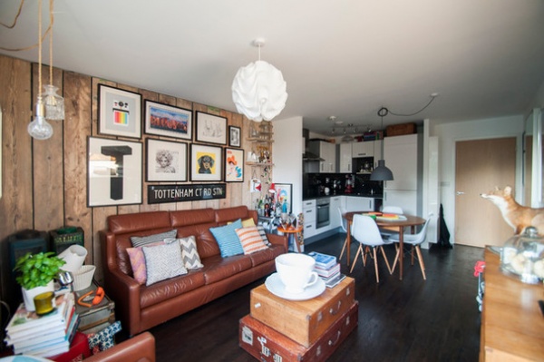
Make brown beautiful. This room takes a number of key 1970s looks, but pulls them together in a contemporary style. The tan leather sofa — the focal point of this space — pretty much sums up retro. But while the print-clash cushions are reminiscent of layers of jarring carpets, rugs and curtains from the era, the designs are fresh and colorful rather than swirly and orange. It makes all the difference and prevents any risk of pastiche.
Equally, the wood panelling, also authentic, is a million miles from the original, which would probably have been highly varnished pine. The ceiling pendant, a Le Klint 172, designed in the era by Poul Christiansen, completes the 1970s flavor.
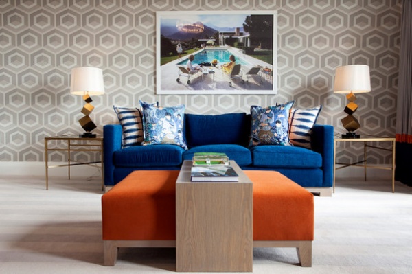
Pull in original photography. The large picture above the sofa is by cult 1970s photographer Slim Aarons, whose prints are now quite widely available. This one, Poolside Gossip, was taken in 1970 and sets the tone for this room.
Other flashes of the era build the retro scheme, but subtly: the neutral colorway gives the retro-patterned wallpaper a fresh look, while keeping some oh-so-70s orange to a discreet splash ensures the reference remains a gentle hint rather than a sledgehammer blow.
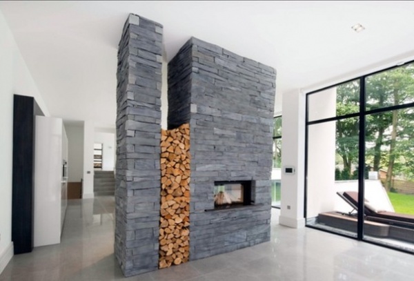
Rediscover stone cladding. No, really. Until recently, homeowners have despaired at their forebears’ fondness for cladding internal and external walls with a decorative stone veneer. It could be a nightmare to remove and often wasn’t pretty.
But could it be coming back into fashion? This time around, let’s clad with care and leave the exteriors of our houses alone. This tunnel-style fireplace looks fabulous with its sleek slate finish, and brings to mind Palm Springs in its midcentury heyday. (If you’re tempted by 1970s architecture, look up images from Palm Springs Modernism Week — it’s most inspiring.)
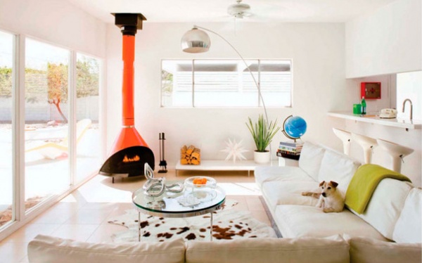
Add orange — in moderation. This clean, white and determinedly contemporary room has been given a throwback flavor chiefly by the bold streak of orange that is the fireplace and chimney.
The arc-style floor lamp echoes the period theme, as does the sectional sofa — which would create an entirely different effect in predictable brown corduroy. This scheme, however, is an exercise in restraint — quite unlike the original 1970s.
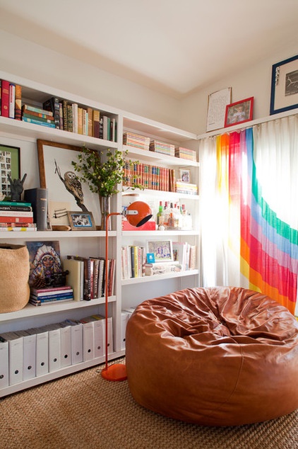
Reinvent the rainbow. Probably the symbol of the 1970s, the rainbow was absolutely everywhere in this technicolor decade. Again, pairing an authentic detail with a modern backdrop is a winning plan. Adding the iconic motif to a pale voile in a pale room and throwing in a couple of other period pieces — that leather beanbag and the orange floor lamp — show stylish understatement while honoring the era.
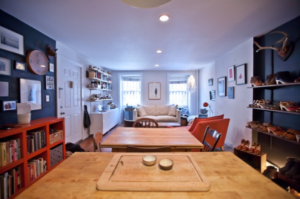
Pick pine. A homey atmosphere, with dark, warm colors, flashes of bright hues (especially red) and plenty of antique pine was a classic 1970s look. With the little earthenware pots and shelves of platform shoes, this space cleverly re-creates a mood, rather than being a textbook copy.
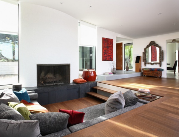
Sink in. What’s not to love about a sunken sofa pit? Simply lowering your living room’s seating area turns it into a super-sociable and cozy space with an intimate feel. But of course it’s not for every house. You’ll need a large space to start with, and it’s going to look best in a property built after 1960, or a new build, where you can start from scratch, since you will be delving into your home’s foundations to create it.
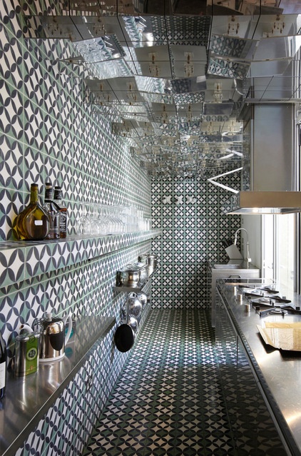
Overdo pattern. I’ve already mentioned that classic 1970s triumvirate of clashing carpet, rug and curtains. And here’s how you reference that maximalism look without giving yourself a headache. The small space and mirrored ceiling ramp up the intensity, but rather than bringing to mind Del Boy’s claustrophobic living room, this all-over tiling in fresh colors says airy Moroccan riad.
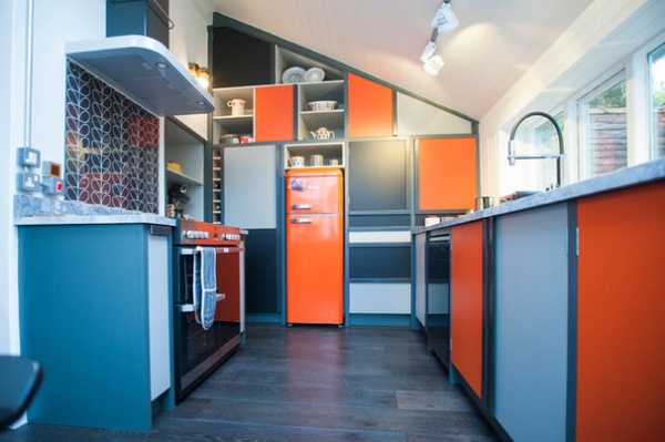
Color-block your palette. The grays and blacks in this kitchen are very now, and yet the addition of orange and the retro cupboard arrangement hark back about 40 years. The retro Orla Kiely print on the backsplash and in the crockery is another nice touch, and picks up on the era’s love of patterns inspired by nature.
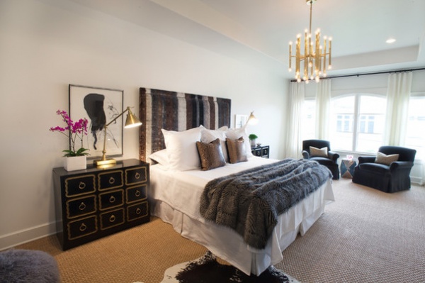
Keep it sleek. The 1970s wasn’t all about gaudy hues and kitschiness, as this gently reminiscent bedroom shows. There’s plenty of the era’s favorite color, brown, and the furry bedspread is the next best thing to a shag carpet. Note the classy vintage-style pendant light and glimmers of throwback gold.
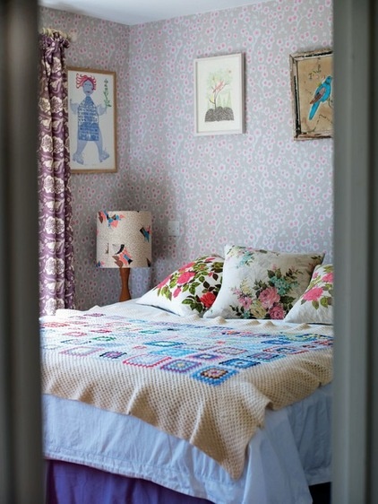
Go romantic. Love for patchwork, flowers and softness (not to mention a huge crush on Laura Ashley) defined a certain late 1970s style. Take the heavy Victoriana out of the original version, and go for light and feminine instead, as vintage styling queen Emily Chalmers has done in this inviting bedroom.
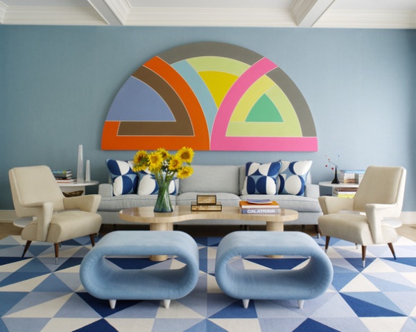
Make it glamorous. There’s nothing kitsch or tacky about this elegant house in the Hamptons, and yet the 1970s styling couldn’t be clearer. The plush, wall-to-wall carpeting creates more than a nod to the era, as do the two geometric prints, artfully clashing with that rainbow-reminiscent artwork above the sofa. The trick here is the dominance of blue, a distinctly non-period-appropriate shade. It cleverly tones down tribute.
Tell us: Does a 1970s revival fill you with joy — or horror? And which is your favorite look here? Share your thoughts in the Comments.
More: The ‘70s Are Back: Can Ya Dig It?


