Houzz Tour: A Creative Renovation Says Hello
http://decor-ideas.org 02/23/2015 23:23 Decor Ideas
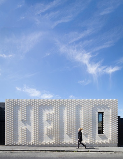
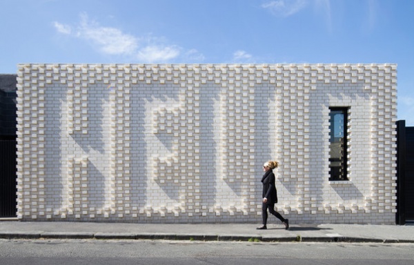
Everyday building materials have been turned into something head-spinning in the extension and renovation of a quaint Victorian-era home in Melbourne. While raised brickwork is nothing new, using it to send a friendly greeting to all who pass has put this renovation firmly into the artful category.
Houzz at a Glance
Who lives here: An artist and her partner, a community culture specialist
Location: Richmond, in Melbourne
Size: 1,496 square feet (139 square meters) on a 1,937-square-foot (180-square-meter) corner lot; 2 bedrooms and a studio
The Hello House could have been a typical inward-looking Victorian home with the usual modern rear extension. The owners, however, were interested in the idea that their project could be more than just a private home.
“With this house, because it’s on the corner and there’s a cafe opposite, the whole neighborhood walks past it on their way to the cafe,” says architect Fooi-Ling Khoo, of OOF! Architecture. “The clients were fantastic, because they understood that it was like a little village and really wanted to do something that contributed to that mini civic center. They understood that their house wasn’t just a private house; it was, in a way, talking to the neighbors as well.”
Rather than blending in blandly with the neighborhood, the Hello House is a slightly loud but friendly new face on the street.
Pressed brick: Bowral Bricks in Charolais Cream
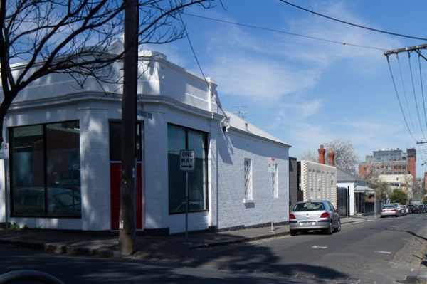
The building was originally a corner shop with small living quarters behind. It suffered the common problems of old properties: dark interiors and poor access to outdoor spaces.
The building’s old, tacked-on 430 square feet (40 square meters) of additions was replaced with a more accommodating 645-square-foot (63-square-meter) space.
This “Hello” addition made room for the architect to reshuffle the original living spaces. (See the floor plans below.)
The front room on the corner used to serve as the home’s main living area. Post-renovation, it’s a workshop/studio for the owners. The two bedrooms remain largely untouched in the original part of the home.
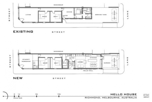
Before and after: a house transformed.
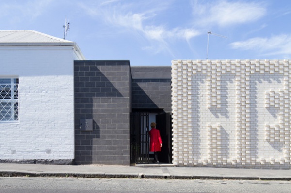
The wall sits just to the right of the home’s main entrance, and was designed in collaboration with Melbourne artist Rose Nolan.
“The thought was that we would contribute something to the surrounding ‘brickness and blockness’ of the area,” Khoo says. She, the owners and Nolan started off thinking it could be a beautiful brick or block, with a color or glazed brick, “but it just didn’t quite cut it,” she says.
They considered the idea of introducing textured brickwork, which led to a discussion around what that pattern could be: an image? Or could it actually be words? “Then Rose Nolan suggested, “Why don’t you just say hello?” says Khoo.
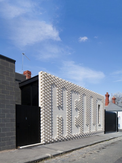
“Nolan’s obsession with text and hand-crafting low-tech materials has huge resonance with our love of modest materials and how they can be transformed,” Khoo says. “The moment she suggested the word ‘hello,’ we knew it was the missing piece of the puzzle we’d been looking for.”
Rather than using the house as a tool to shut themselves off, the owners thought it could be a way to be part of the village they loved.
The wall, literally representing the start of a conversation, greets the locals while also continuing the architectural story of the area. Richmond is home to a mix of 19th-century heritage buildings and ’60s and ’70s brick apartment blocks, as well as small warehouses and a few more modern architectural gems. Getting council permission to make such a contemporary statement was a lengthy process, “but understandable considering the heritage of the area,” Khoo says.
Locals bring visitors by for a look, and cries of “hello” can occasionally be heard at night. “One neighbor even thanked them for their generosity,” she says.
Blockwork: Boral Bricks in Smooth Face Charcoal
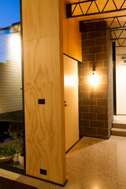
A small courtyard separates the front door from the security-gate opening to the street.
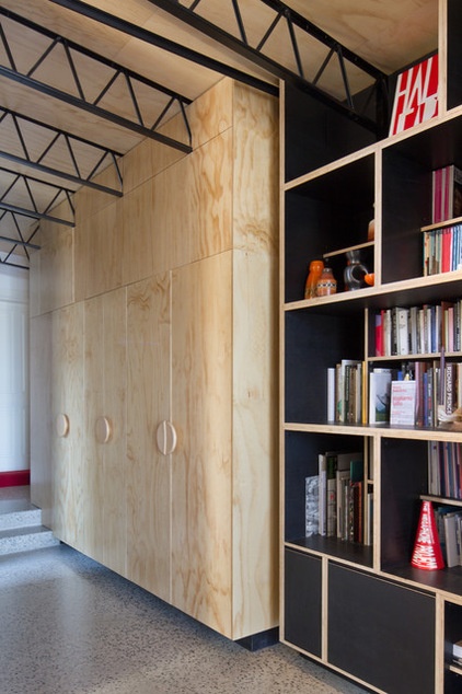
Floor-to-ceiling cupboards and shelving face the front door as you enter the home. They conceal the home’s laundry appliances.
Open web trusses: Hopley’s, Midalia Steel
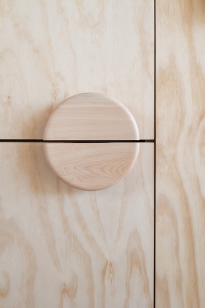
Khoo says the choice of well-priced plain materials, such as plywood and industrial trusses, made room in the budget for custom-designed cabinetry. “We used commonly available materials, but paid skilled people to put in the extra time and thought to treat the materials with craft,” she says. “So there was an investment in ideas and craft rather than stuff.”
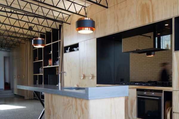
The cabinetry continues along from the entry to the wall facing the living area and into the kitchen.
The owners didn’t want to live in a “shiny, blingy” environment, Khoo says. “They shared our love of modest, everyday materials. One of the things with this house is that while we may have spent more money on things like the ‘hello’ wall and joinery, it wasn’t a question of buying flashy, shiny materials and expensive designer furniture.”
Electric oven: Siemens; gas stove, dishwasher: Miele; range hood: Sirius; refrigerator: Fisher & Paykel; backsplash: toughened bronze mirror; countertop: custom precast concrete on custom fabricated steel frame
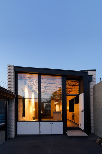
From the backyard, tall windows reveal the home’s open-plan kitchen-dining area within.
Doors, wood-framed double-glazed windows: Aspect Windows; double-glazed sashless windows: Aneeta
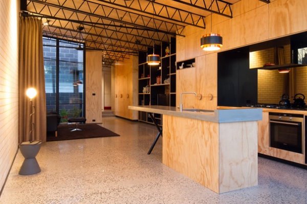
A dining table and island stools have been added to the home since it was photographed. The house isn’t huge, but the polished concrete floor and high ceilings make the open-plan kitchen-living-dining area feel spacious. In-slab hydronic heating keeps the addition toasty in winter.
Ceiling: hoop pine plywood with clear satin gloss seal; floor: polished concrete in Atlantic Ocean with off-white base, Economix; carpet: Studio, Edwardstown; pendants: refurbished Fog & Mørup Saturn, Angelucci
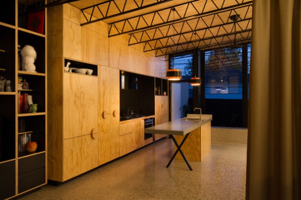
In the kitchen a toughened bronze mirror backsplash is teamed with a precast concrete countertop. The copper and black pendants bounce light off the plywood, giving the home a golden glow.
Cabinet pulls: Interia O series, Blum
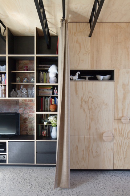
A curtain partition can transform the flowing open space into zones, turning the living area into a cozy retreat. Open shelving enables the owners to show off their favorite things, with a rustic brick wall as the backdrop.
Curtains on theater-grade track system: custom, J&S Window Furnishings; door furniture: Handles Plus
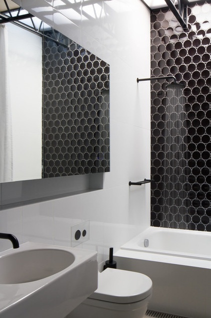
Black hardware and tiles give the bathroom an industrial edge. An abundance of white and a large mirrored cabinet make the space feel larger.
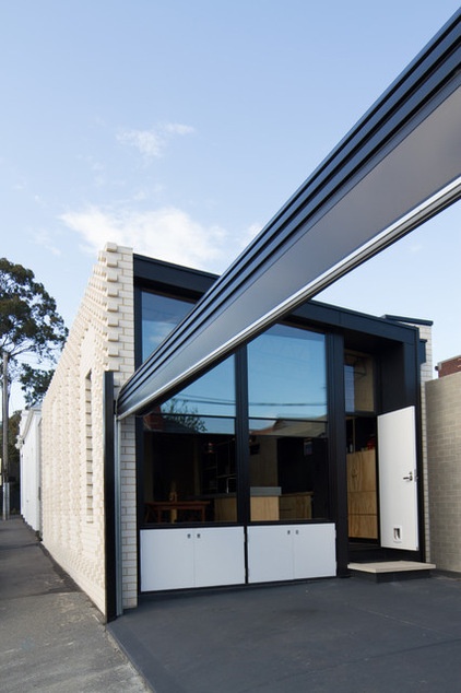
With a lot size of less than 2,000 square feet, there’s not much outdoor space. This parking area, set behind a roller door at the rear of the property, doubles as an outdoor entertaining space.
Concrete pavers: Eco Outdoor
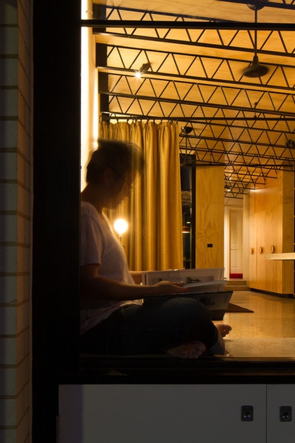
Khoo says the owners lived in the home for a few years before settling on their refurbishment plans, allowing them to refine their ideas.
Lighting: Volker Haug, Mondo Luce; ceiling fans: Haiku, Big Ass Fans
Browse more homes by style:
Small Homes | Colorful Homes | Eclectic Homes | Modern Homes | Contemporary Homes | Midcentury Homes | Ranch Homes | Traditional Homes | Barn Homes | Townhouses | Apartments | Lofts | Vacation Homes
Related Articles Recommended


