Room of the Day: Master-Bath Update Honors a Home's Style
http://decor-ideas.org 02/23/2015 22:13 Decor Ideas
“I’m not crazy. I’ve just been in a very bad mood 40 years!” So said Ouiser Boudreaux in the movie Steel Magnolias, and if this bathroom could talk, it may have felt the same way before its recent renovation. The 1915 Colonial-style home it occupies is so gracious that it served as a major set in Lifetime’s 2012 remake of the movie. However, its 1970s master bathroom renovation was not ready for its close-up. It was quickly deteriorating and didn’t suit the house, designed by renow. ned architect Neel Reid. The designers at Mark Williams Design Associates fixed that, creating an elegant bathroom that lives up to the rest of the home.

Photos by Erica George Dines
Room at a Glance
Location: Druid Hills neighborhood of Atlanta, Georgia
Size: 75 square feet (7 square meters)
That’s Interesting: Lifetime’s 2012 version of Steel Magnolias was filmed here. Driving Miss Daisy was filmed a few blocks away.
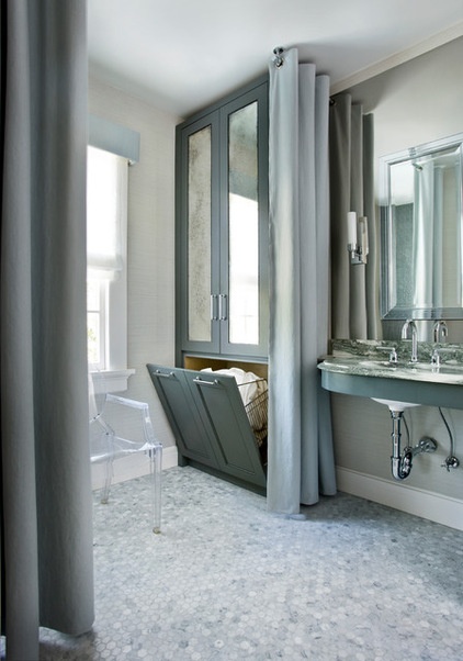
The custom armoire-style cabinet has a nifty secret — the bottom is a hamper. The design team drew it up and hired Karpaty Cabinets to make it. The antiqued glass on the doors creates cohesiveness between the sink area and the hamper, and reflects the natural light from the adjacent window. The cabinet is 30 inches wide by 9 feet high by 24 inches deep. They crafted it from marine-grade lumber to stand up to moisture.
The paint color on the cabinets is custom, mixed to match the elements in the room. Williams recommends Whale Grey by Benjamin Moore for a similar look.

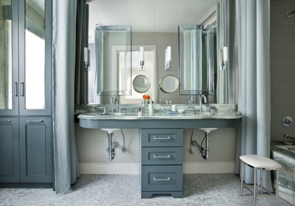
Leaving the area under the sinks open rather than closed off by cabinetry is a nod to the historic era when the home was built. It also makes the room feel larger. This photo was taken from the master bathroom’s entrance. “With a closed vanity, you would have felt like you were walking right into a wall,” Williams says.
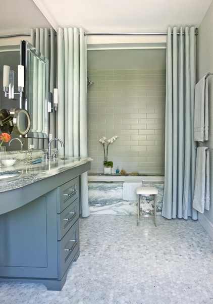
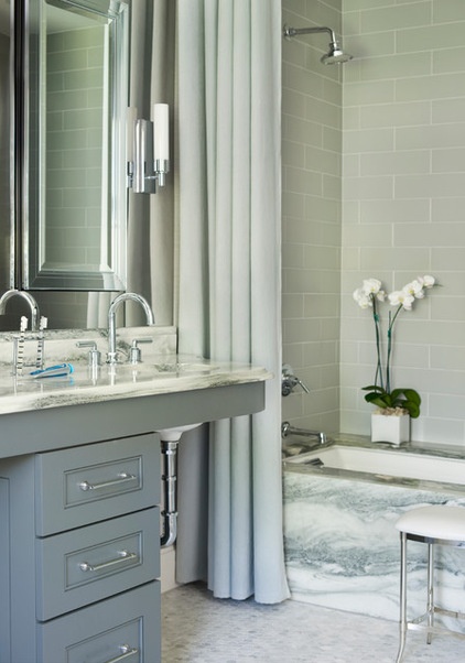
Beautiful Montclair Danby marble provided the inspiration for the gray color palette. “This marble is really dense and doesn’t stain as easily as other marbles do,” Williams says.
The designers also had fabric shower curtains custom made to hang from floor to ceiling, adding dramatic height. They added a second pair of panels on the other side of the room, creating symmetry around the vanity and providing some separation for the toilet, which is located opposite the mirrored cabinet. “The fabric panels also help soften all of the hard elements of the bathroom,” Williams says.

A 1-inch hexagonal marble tile, common in homes from this era, is another nod to the home’s pedigree. “The Carrara marble complements the Montclair marble so well,” Williams says.
Because the clients wanted so many cuts in the mirrored wall, the designers had to use waterjet-cut polished stainless steel instead of glass. “There were so many perforations that a glass mirror could not have taken it,” the designer says. Cuts were made in the steel for two recessed medicine cabinets, two magnifying mirrors, four sconces and electrical outlets.
Montclair Danby Marble: Vermont Quarries via Marmi Natural Stone; sconces and medicine cabinets: Robern; shower curtains: custom in Hummingbird fabric by Yoma Textiles; hardware: Restoration Hardware; Louis Ghost Chair: Kartell; floor tiles: 1-inch Carrara, Walker-Zanger; shower tile: Urban Canvas, American Olean

The designers gave the vanity a graceful ogee curve. “This avoided a blunt edge right next to the tub,” Williams says. The bathtub surround is the same Montclair Danby marble as the countertops and backsplash.
Tip: When the underside of a sink will be exposed, think about what it’s going to look like. The design team ordered these sinks with custom glazed undersides. Likewise, all of the exposed plumbing has a polished chrome finish.
Sinks, faucets and showerhead: Waterworks
More:
A Designer Shares Her Master-Bathroom Wish List
18 Dream Items to Punch Up a Master-Bath Wish List
Related Articles Recommended


