My Houzz: A 1920s Arts and Crafts Home Gets Crafty
http://decor-ideas.org 02/21/2015 22:13 Decor Ideas
“There’s a small gap between tacky and stylish,” says Mikaela Hart of her family’s Montreal home. “We were very close to crossing that line at some points.” Mikaela, a graphic designer at Motek Visuals, and her husband, David, purchased their home in 2006 and slowly decorated it using an eclectic mix of secondhand pieces found online.
As their family grew, the couple decided to renovate to adapt to their changing needs. They removed a wall and gave their kitchen and dining room an overhaul to create an open layout and better flow, and converted their master bedroom walk-in closet into a bathroom. Mikaela says, “Our options were either to move or to make changes to fit our lifestyle.”
Houzz at a Glance
Who lives here: Mikaela and David Hart and their sons, Lev (age 8), Leo (6), and Dylan (4)
Location: Notre-Dame-de-Grâce neighborhood of Montreal
Size: 2,000 square feet (186 square meters); 3 bedrooms, 3 bathrooms
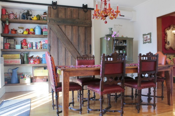
The dining area, with its eclectic style, is anchored by a long table surrounded by chairs from the 1800s. Mikaela and David bought the chairs from their upholsterer, who had found them in scraps and put them back together piece by piece. The end chairs were missing backs, so he built them up to match the set.
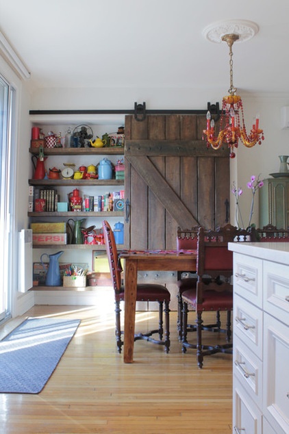
The couple was inspired by a photo on Houzz to add a barn door to the room. They searched exhaustively and bought one that had once been part of a movie set.
They repurposed salvaged wood into shelves that display a collection of vintage items that were found mostly on eBay.
Creative Ways With Barn-Style Doors
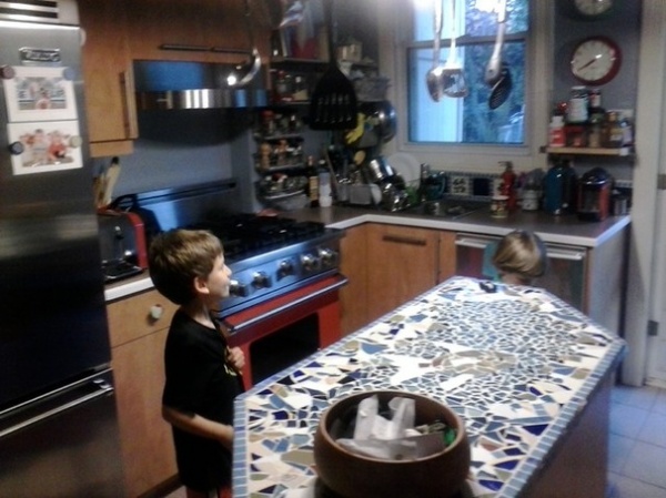
BEFORE: The kitchen was small and cramped and separated from the dining room.
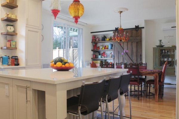
AFTER: The family took down a wall between the kitchen and dining room to create a more open layout. “It really changed our lives in many ways,” says Mikaela. “The kids are nearby while I’m cooking dinner. It allows us all to be together.”
Colorful pendant lights over the island play off the funky chandelier over the dining room table.
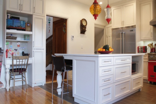
The homeowners couldn’t find an identical oak wood for the kitchen floor and instead used heated tiles. The contrast delineates the traditional-style kitchen from the dining room.
A door at the far end of the room next to the refrigerator leads to the basement.
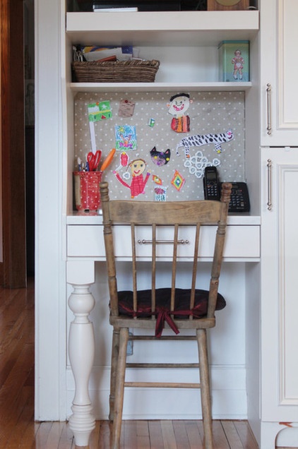
They worked with custom kitchen design company Promina to create a space that perfectly fit their style. The cabinets were painted with three coats to ensure the finish would last for many years.
This little office nook is decorated with artwork by the kids. The single desk leg echoes those found on the kitchen island.
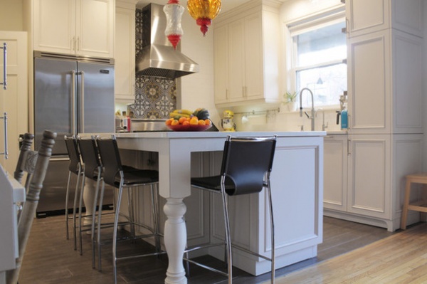
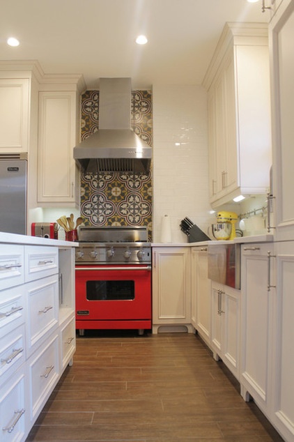
The couple already had their red Viking range and designed around it during the remodel.
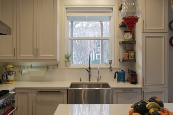
Removing a wall between the two rooms caused a loss of some storage space. To rectify this the couple’s carpenter (from Bokor Renovations) built a floor-to-ceiling pantry.
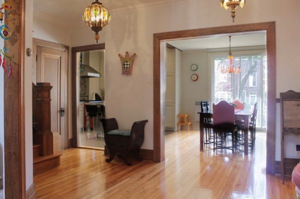
The entrance room has large openings leading to the dining and living rooms, kitchen, guest bathroom and the stairs leading upstairs.
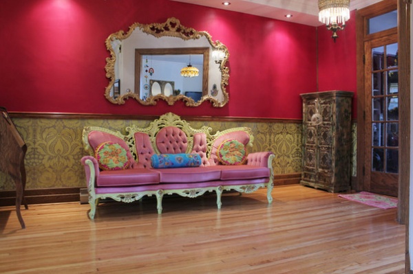
It also features magenta walls that instantly draw you into the playfulness of the space. “I wanted to make a statement but didn’t have the budget yet for a renovation,” says Mikaela. She started the design of this space by buying the tufted sofa. The couple looked into having it reupholstered, but the high cost caused them to forego the idea. Instead, David and Mikaela painted over the previous white and gold frame with a bright green. They then designed the rest of the room around the couch using secondhand finds.
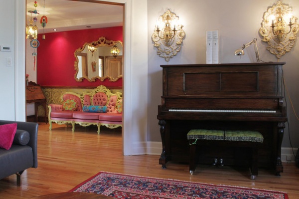
The couple bought the piano in the living room from the Salvation Army; it is used by their eldest son, Lev. The Victorian-style wall lights were repainted.
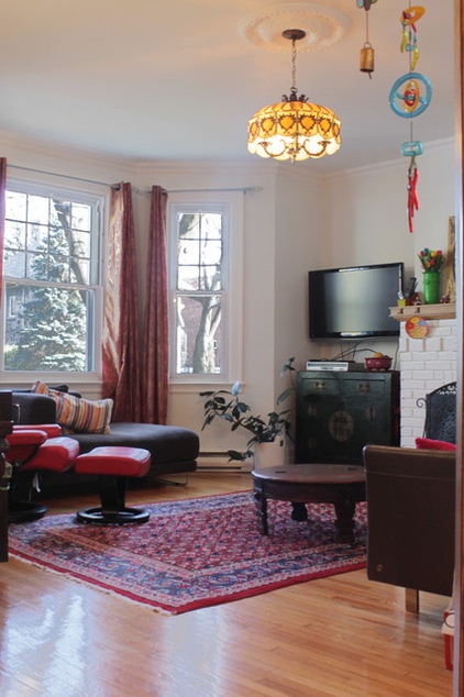
Since completing the kitchen renovation, the family spends less time in the living room, but in the winter, they come in here to warm up next to the fireplace.
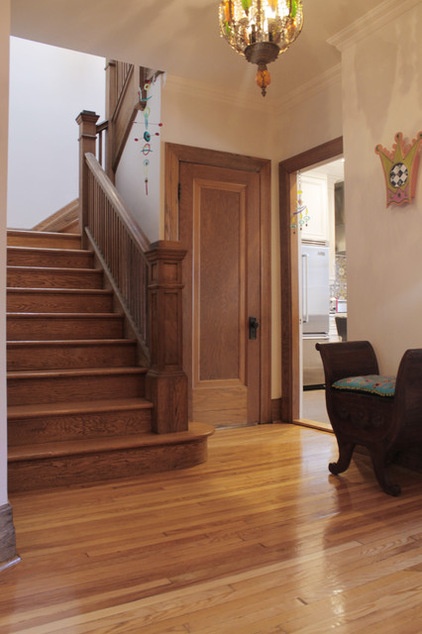
Beautiful oak stairs, reflecting the original character of the house, lead upstairs.
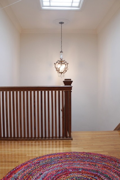
A skylight brightens the upstairs landing, which leads to the bedrooms.
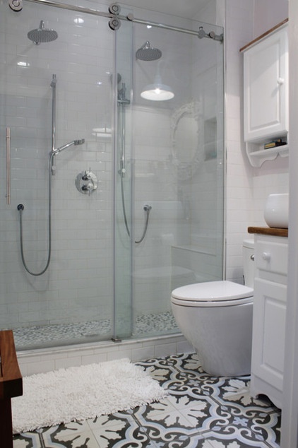
There was only one bathroom on the top floor, and it got too much traffic, so David and Mikaela converted their walk-in closet into a master bathroom. This was no easy feat. They had difficulty with the plumbing, which required them to add a small drop ceiling in the first-floor entryway below.
In the end the changes proved to be worthwhile for the family of five.
See more photos of this home
My Houzz is a series in which we visit and photograph creative, personality-filled homes and the people who inhabit them. Share your home with us and see more projects.
Browse more homes by style:
Small Homes | Colorful Homes | Eclectic Homes | Modern Homes | Contemporary Homes | Midcentury Homes | Ranch Homes | Traditional Homes | Barn Homes | Townhouses | Apartments | Lofts | Vacation Homes
Related Articles Recommended


