Houzz Tour: Plywood Pod Adds a New Dimension to Living Spaces
http://decor-ideas.org 02/21/2015 04:13 Decor Ideas
Nest Architects director Emilio Fuscaldo and his colleague, architect Imogen Pullar, came up with an innovative idea to transform a dingy, cramped worker’s cottage for a Melbourne family by adding a plywood-clad “pod” in the heart of the living area. The pod structure contains a bathroom, a powder room and kitchen storage and allows an open flow through the house via a corridor that runs alongside it. In addition to adding the pod and redoing the home’s layout and decor, the architects demolished a shoddy 1980s addition at the back of the house and added a new dining and family room there.
Houzz at a Glance
Who lives here: Josh Barton, a lawyer; Sarah McIntosh, a consultant; and their 2 young children
Location: Melbourne
Size: 1,440 square feet (134 square meters), up from about 1,290 square feet (120 square meters); 3 bedrooms, 1 bathroom
The principle design challenge was to break up a stacked configuration of rooms from front to rear. And the owners wanted a better indoor-outdoor connection. “There was no flow between the two sections,” says Fuscaldo. This view from the rear of the house toward the front door shows the designers’ ingenious solution: a hoop-pine-plywood-clad pod in the newly opened-up center of the house.
The back section of the house had been a “dodgy home-renovated nightmare: damp, cold and possum-infested,” Fuscaldo says. “The layout was dated, and there were structural issues with its stability.”
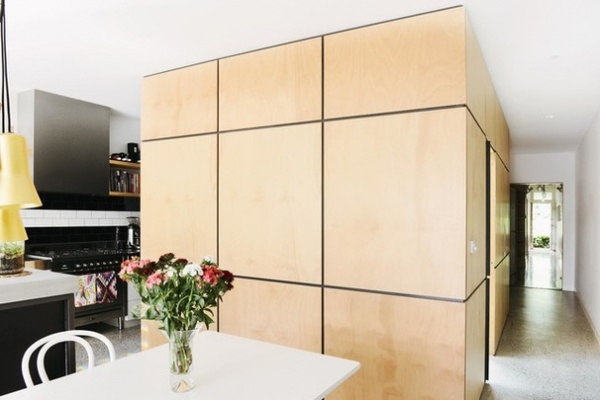
The pod is an architecturally intriguing structure visible throughout the living spaces. Here we see it from the dining area, in the back of the house. The kitchen is on the left, and the front of the house is seen in the background.
The pod contains a bathroom and a powder room, which are accessed from the corridor at right through sliding doors. The other side of the pod, next to the kitchen, contains cupboards and drawers.
The pod wall facing the dining room table in the foreground is made up of panels. These are defined by black shadow-line grooves in the pale blonde wood that break up the rectangular shape of the structure. A similar black edge runs around the bottom of the pod, giving it the appearance of floating off the ground.
Pod finish: Crystal Clear polyurethane, Cabot
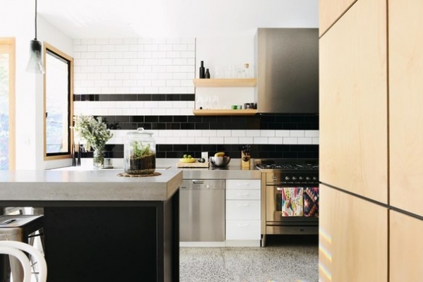
In the galley kitchen, horizontal rows of black and white subway tiles, with gunmetal-gray grout, pick up the linear accents on the pod’s plywood panels. The countertop is polished concrete, and the flooring throughout the house, apart from the front hallway and bedrooms, is polished concrete with exposed aggregate. A compact laundry is located behind cabinet doors next to the refrigerator.
Tiles: U.K. Gloss White and Gloss Black, Johnson Tiles
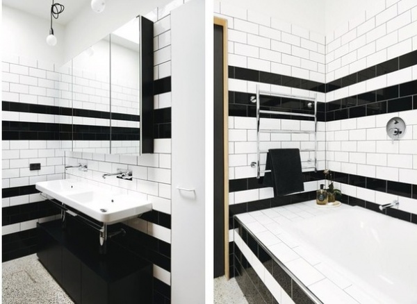
On the other side of the pod, the corridor allows entry to the bathroom and powder room through sliding doors. The black and white tile that was used in the kitchen is repeated in these rooms, seen here in split photos.
Flat skylights direct light into the interior of the pod. Ventilation is ducted through the ceiling and roof to the exterior.
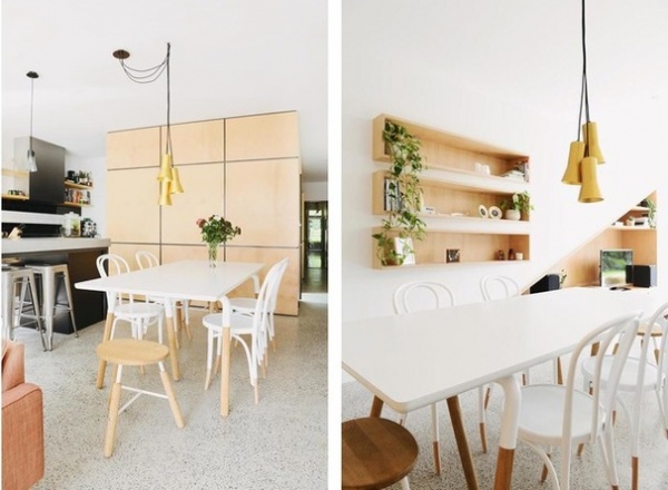
The tidy, clean-cut design of the house is complemented by a restrained approach to the decor — furniture with a fresh Scandinavian feel and light paint finishes that enhance the plywood. The pine tones of the pod and cabinetry are an effective foil to the white Thonet No. 18 bentwood chairs and painted dining table with “dipped” legs.
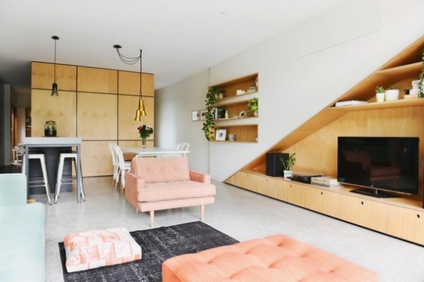
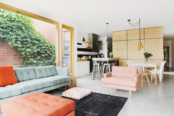
The sofa, lounge chair and ottoman, all in soft pastels, have retro 1950s Scandinavian style, inspired by the designs of George Nelson and Florence Knoll. They are made in Melbourne and are from Angelucci 20th Century.
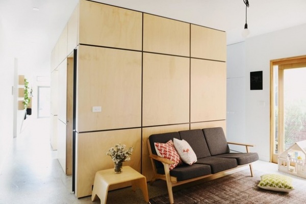
This picture shows how the pod separates the children’s play spot and the living-dining areas, and allows access to the rear of the house down both sides.
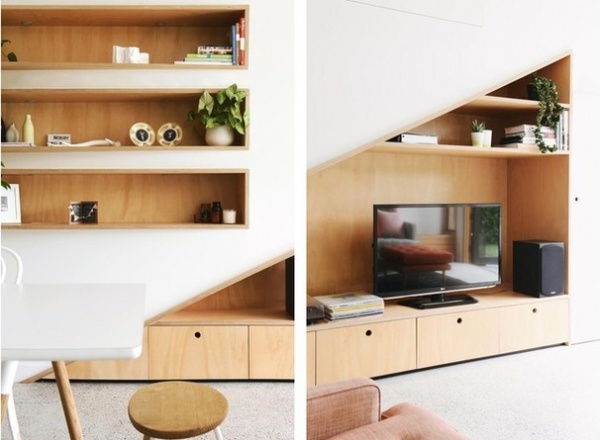
Open shelving and deep drawers in the living-dining space continue the plywood theme in the simple and unobtrusive cabinetry. White walls throughout emphasize the unique tones of the plywood.
Paint: Natural White, Dulux
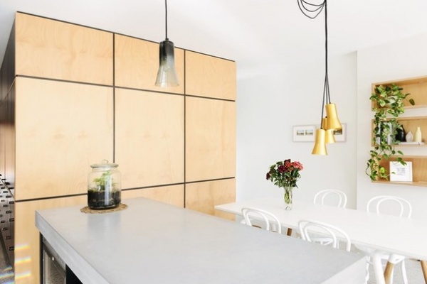
The feeling of spaciousness has been amplified by the simplicity of the decor. The Touch metallic pendant light over the table is by Ross Gardam. A single glass version hangs over the concrete island.
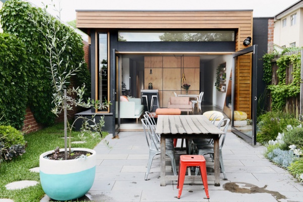
Here’s the pod as seen from the rear of the house. The open living-dining area is located where the addition previously stood. A large steel-framed door to the terrace was installed, with a small entrance on one side. “The door opens up the whole space,” says Fuscaldo. “It gives instant connection with the terrace from the living-dining area, and you see glimpses of the outdoors down both sides of the pod.” The area is paved in honed natural bluestone, and circular concrete pavers set in lawn lead down the side of the house.
Chaise A Sidechair and Tabouret stool in Red: Tolix
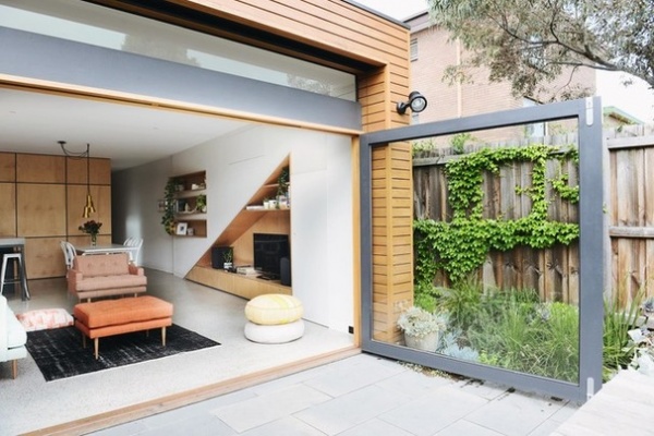
The terrace is now a source of light and sunshine, visually connected to the interior whether the door is open or closed. It provides a pleasant private space for outdoor entertaining and an additional play area for the children. A recessed crank-handled awning makes it usable on wet days.
Many homes in this neighborhood, Fitzroy North, are pretty close together, says Fuscaldo, and this one is cheek by jowl with neighboring properties. Privacy has been maintained with a high wood fence on one side and a Boston ivy–covered brick wall on the other.
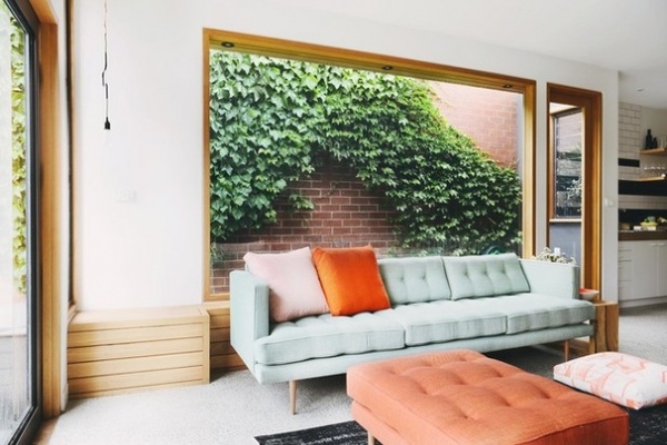
An oversize window looks onto lush ivy growing on the brick boundary wall and is another way the renovation has connected the living-dining space seamlessly with the outdoors. A bench in silvertop ash (Eucalyptus sieberi) runs the length of the window. “This is our favorite part of the house,” says Fuscaldo. “In summer the dark green foliage keeps the space cool and shady, and in winter, the bricks absorb warmth from the sun and reflect it back into the house.”
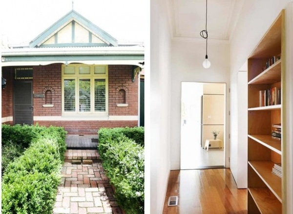
From the modest brick facade typical of North Fitzroy’s early 1900s worker’s cottages, a passer-by would never guess there’s a fresh and contemporary home behind it. Building regulations prevented changes to the facade, but the owners were happy to preserve its charming character anyway.
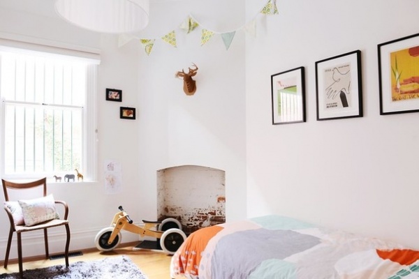
There were some features in the bedrooms that the owners wanted to keep: a small brick fireplace in the front bedroom and a pretty plaster ceiling rose. “It had to be very carefully removed so we could relocate it in the third bedroom,” says Fuscaldo.
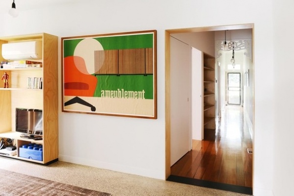
The two original bedrooms at the front of the house were retained, and a third was created from an existing living area. Prior to this project, the owners had done minor renovations in this area, laying stained Victorian hardwood flooring in the entrance hall and freshening up an original white wood fretwork arch.
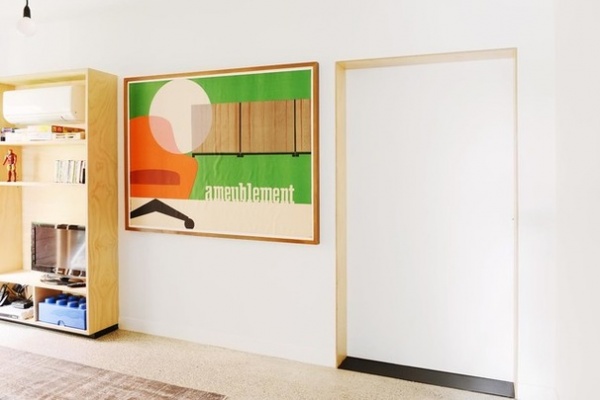
Once the bedrooms are closed off by a wide sliding door, two corridors branch off down each side of the pod, which is integral to the home’s neat new functionality.
Construction: TCM Building Group
Browse more homes by style:
Small Homes | Colorful Homes | Eclectic Homes | Modern Homes | Contemporary Homes | Midcentury Homes | Ranch Homes | Traditional Homes | Barn Homes | Townhouses | Apartments | Lofts | Vacation Homes
Related Articles Recommended


