Kitchen of the Week: Walls Come Down in a Colorful Midcentury Space
http://decor-ideas.org 02/21/2015 00:13 Decor Ideas
Built in the 1950s, this house was in need of a substantial redo. Like many homes from that era, it was compartmentalized and split into small rooms. “The owners wanted to open the house up, to make it light and bright and just more fun,” says interior designer Jenny Baines. This included opening the existing small galley kitchen to the dining area and family room, and designing a new entry.
Photos by Chris Hurtt
Kitchen at a Glance
Who lives here: A married couple and their young son
Location: Portland, Oregon
Size: 161 square feet (15 square meters)
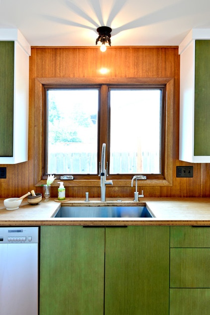
Wood was a driving factor in the design. The couple wanted to save as much of the original mahogany paneling as possible and integrate it into the new design, and they also loved bamboo, which they used on the cabinet doors and countertops.
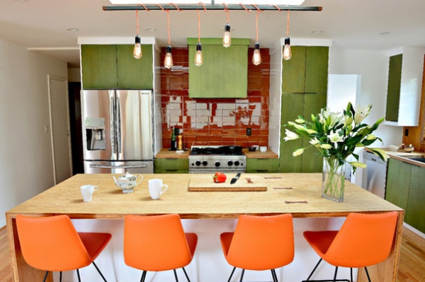
For behind the range, Baines chose glass tile that matches the color of the mahogany paneling. Along with the lacquer cabinet boxes, the tiles help bounce the light around.
Tip: You can save money by going for semicustom cabinets. The lacquered cabinet boxes are from Ikea, and are outfitted with custom bamboo doors stained green.
The light fixture is a custom piece that is supported by a crossbar up inside the skylight. An electric box is installed on one side of the skylight. The blackened steel bar is accented by mahogany finials on the ends and an orange cloth cord.
Pera Wire Stools: Soho Concepts; tile: Ann Sacks
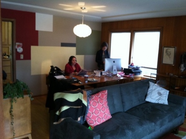
BEFORE: A wall divided the kitchen from the dining space and living room. The sofa in the photo below is in the same place.
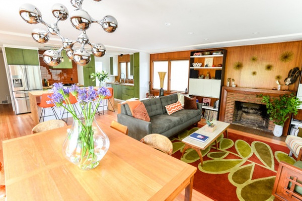
AFTER: In addition to the mahogany paneling, this Angela Adams rug the owners already had drove the color scheme. “These clients are definitely not afraid of color, and wanted to use it to make their house more fun,” Baines says.
The family room is now completely open to the kitchen; the dining area is in the foreground here. The designers also were able to save the mahogany paneling along the fireplace wall. They added new flooring in the kitchen to match the existing oak floor.
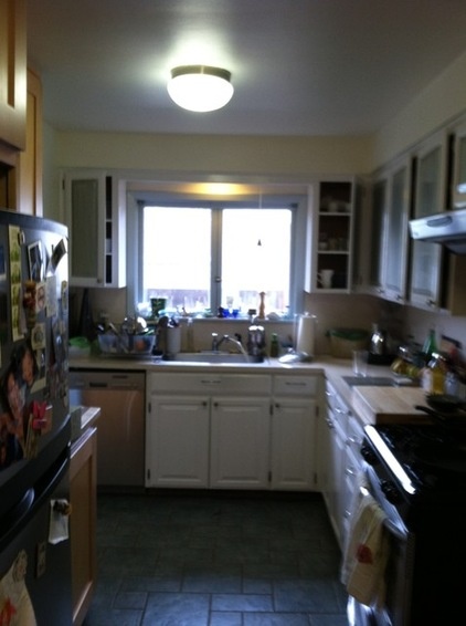
BEFORE: The kitchen was a dark and cramped galley, cut off from the rest of the house.
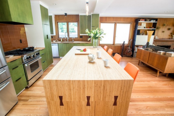
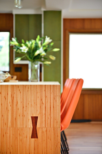
AFTER: The island was larger than a full sheet of the bamboo. Rather than trying to match it up and pretend there wasn’t a seam where there obviously was one, they highlighted the places where the sheets met with these dark joints. “The joints pull in the dark color of the mahogany; it turned a potential design negative into a positive,” Baines says.
One of the homeowners did not want to interrupt the solid expanse of the wood across the island with a sink or range. She also loves to have people gather around while she works in the kitchen, so she wanted to keep any messes away from the seating area. This dictated a work-zone layout rather than a work triangle.
The island contains recycling bins and large drawers for storing pots and pans.

The contractor used the leftover wood to make a matching bamboo cutting board.
“Bamboo is very hard and pretty resilient,” Baines says. “Because the homeowner wanted to limit the use of chemicals, we only sealed the countertops next to the sink to protect it from water stains.”
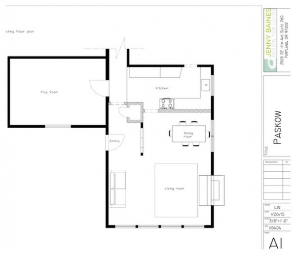
These “before” and “after” plans will help you understand the new configuration. Here’s the plan before.
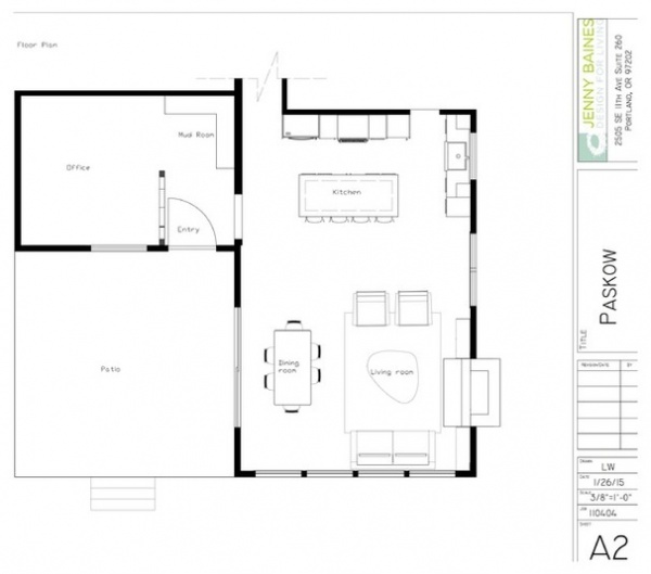
And here it is after.
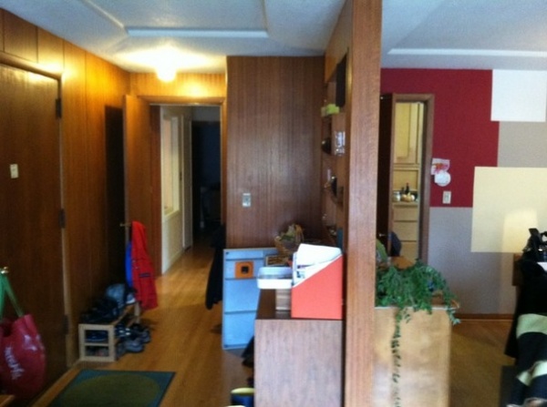
BEFORE: You may have noted the entry area in the “before” plan. Here it is; the door on the right leads into the kitchen. As part of the renovations, the entry was moved, and sliding doors were added next to the dining table to let in more light and add another access point to the outside.
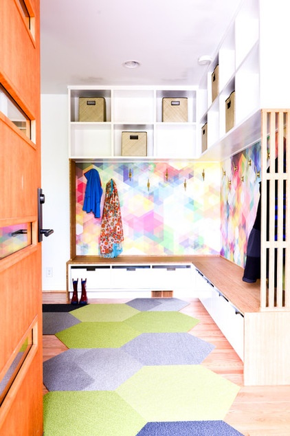
Just off the kitchen is the new entryway, where wallpaper from Flavor Paper welcomes visitors with bright color, foreshadowing the home’s playful spirit. A bamboo bench ties the space to the kitchen. Cubbies underneath for shoes and above for other items keep the area uncluttered.
Floor tiles: Shaw
Browse more Kitchens of the Week
Related Articles Recommended


