Room of the Day: Two Seating Areas and a Mix of Patterns
http://decor-ideas.org 02/19/2015 23:13 Decor Ideas
Few people would complain about a larger living room, but when the space measures 34 by 15 feet, furnishing it can be a challenge. New York designer Claire Paquin took on such a task for a client who loves pattern, design and music. The homeowner came to the project with no fear of mixing patterns. She also had a few great heirlooms from her grandmother and a collection of abstract modern art.

Room at a Glance
Who lives here: A couple
Location: Rye, New York
Size: 510 square feet (47 square meters)
Tip: If you are going to mix bold patterns of the same size, allow them some breathing room.
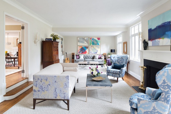
“The space was just too long to furnish as one room,” says Paquin, of Clean Design. To make it all work, the designer divided it into two sections. A more formal living room is centered on the fireplace. At the back of the room is a space for reading and listening to old-school records.

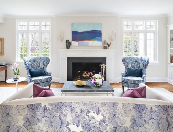
The client picked out two big, but very different, patterns: a romantic floral print and a primitive ikat print. Paquin allowed both to live comfortably in the room by covering the back of the custom sofa with the floral. The front is a simple neutral. She says that breathing room is needed in situations like this so the space doesn’t feel cacophonous.
The move solved another problem: What do you do about the looming back of a sofa? “This room wasn’t wide enough to put a console behind the sofa, and I’m not a fan of pushing two pieces of furniture together anyway,” Paquin says. By adding a print to the back of the long sofa, the designer created a decorative accent rather than something that read as a featureless wall.
The traditional armchairs, inherited from the client’s grandmother, have taken on a new, modern aspect thanks to the vivid ikat print.
Sofa, rug: custom; patterned sofa upholstery: Edith, Donghia; chair upholstery: Donghia; painting: Sharon Paster

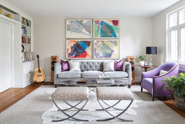
Paquin created a room within a room by orienting a second sofa another way and defining the space with two benches and a hide rug. “The clients like to have a loungey sofa where they can curl up or listen to some of their gigantic record collection,” Paquin said. The designer created a sofa with a deep seat and plush upholstery to facilitate that.
The art here is by Paul Jenkins, and it’s an abstract representation of the seasons. Clockwise from top left, you see winter, spring, summer and fall.
Sofa: custom; benches: Oly

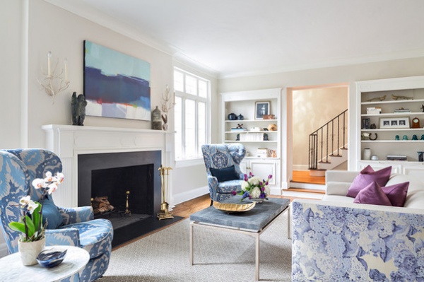
The upholstered pieces are large, so Paquin chose coffee tables and bench seats with thinner silhouettes and narrow legs. For instance, the coffee table in front of the fireplace has thin metal legs and a shagreen top. “Not every piece could be substantial in this room,” the designer says.
To enter the living room, you must descend two steps. “This is a 1920s Tudor-style house,” Paquin says. “In this region it’s not unusual to find sunken living rooms in these sorts of homes. I think the original intent was to make the room feel grander by making the ceiling higher.”
With its dimensions, a room like this could hardly fail at grandeur. But thanks to clever space planning, the room is both elegant and easy to live in.
Coffee table: Made Goods
More:
Decorating Secrets: How to Layer Patterns Right
13 Strategies for Making a Large Room Feel Comfortable
Related Articles Recommended


