Houzz Tour: A Wealth of Style in 800 Square Feet
http://decor-ideas.org 02/19/2015 04:14 Decor Ideas
Several years ago on Christmas Eve, an accidental fire destroyed Claudia Juestel’s San Francisco apartment and nearly everything in it. The interior designer was left with the clothes on her back, a few pairs of shoes and two end tables. “I was just happy that no one was injured,” she says. Like the mythical phoenix rising from the ashes, Juestel created a new home and office for herself in an apartment she bought near downtown.
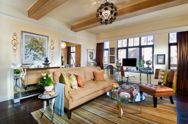
Photos by Crystal Waye Photo Design
Houzz at a Glance
Who lives here: Claudia Juestel, owner of Adeeni Design Group
Location: Near downtown San Francisco
Size: 800 square feet (74 square meters); 1 bedroom, 1 bathroom
Year built: 1926
Juestel began again in this co-op apartment near downtown San Francisco. Having to reassemble her household from scratch, she purchased many items from flea markets, splurging on a few key pieces. Her apartment, though smaller than most of the homes she decorates for her clients, is just as visually rich. “Many people think that if you live in a small home, you have to have a minimally decorated space to make it work,” Juestel says. “That’s not so.”
She was able to pack in style by making smart choices. For the living room, she designed a 7-foot sofa to maximize seating. “There’s an old decorating rule that says your sofa shouldn’t be larger than the front door,” she says. “The doorways in this home are tiny, so I designed the sofa in two parts: seat and base. The craftsmen carried the two pieces in individually and assembled them onsite.”
Look carefully behind the sofa to spot a mirrored chest; its reflective nature nearly camouflages the piece. Juestel wanted it that way. “You can never have enough storage, and I have a china addiction,” she says. “I store tableware here.”
With large items like the sofa and console in place, Juestel selected pieces without so much heft to fill out the space — the side tables and a coffee table and desk with glass tops and narrow legs are more see-through. “It doesn’t matter whether a space is large or small; you are still going to want a side table where you can put down a drink,” Juestel says. For side chairs, she chose armless slipper chairs.
Rug, sofa, chairs, mirrored console, window coverings: custom; coffee table: vintage, Past Perfect; Cheyenne Horn Accent Tables: Z Gallerie; chandelier: Lotus Flower, VivaTerra; Progressive Ring Sconces: Global Views
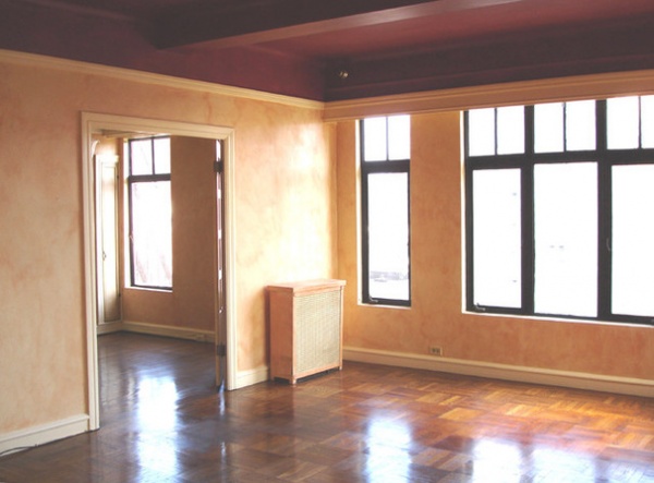
BEFORE: When she first spotted the home, it had dark ceilings, sponge-painted walls and a lingering bad smell. “Of course, as a designer, I’m able to see beyond things like that,” she says. “I loved the row of big windows and the view of the city. It was small, but it felt spacious and it had a New York vibe. I was living in a hotel, I had no furniture, and I didn’t have everything ready at the bank, but I knew I wanted to live there.”
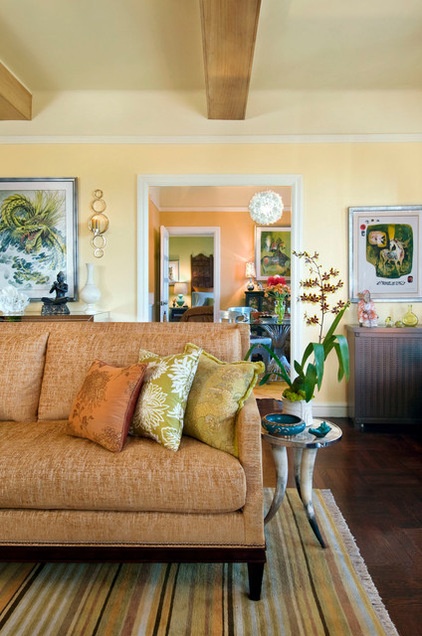
AFTER: One of the big transformative factors in the space is the warm, citrus colors. Juestel likes to use these hues in San Francisco, where foggy mornings caused poet George Sterling to describe it as a “cool, grey city of love.”
Wall paint: custom color; ceiling paint: Burnished Cream, Dunn-Edwards; molding paint: Coffee Cream, Dunn-Edwards
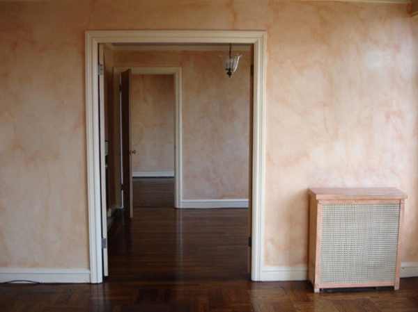
BEFORE: You can see what an impact the new colors make.
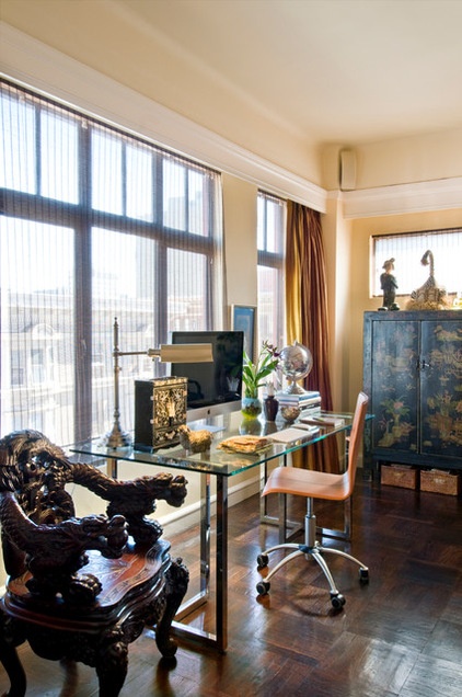
AFTER: Because Juestel works from home, finding room for a desk was a necessary challenge. This glass-topped version with chrome legs seems to float in front of the windows. The desk is the base of a dining table from a big-box store topped with a custom glass top. The Chinese cabinet houses papers and material samples.
Desk base: Silverado, CB2; glass top: custom; desk chair: Morgan, Levenger; carved chair: antique; window molding paint: Black Walnut, Dunn-Edwards
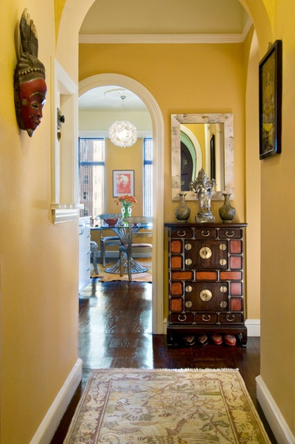
To maximize storage, Juestel invested in several freestanding pieces, including a Korean apothecary chest in the entry that holds shoes removed when entering the home.
The old intercom at left doesn’t function anymore, but Juestel left it; she uses it as a place to hang her door keys.
Beyond the entry you catch a glimpse of the pass-through kitchen and the dining room beyond.
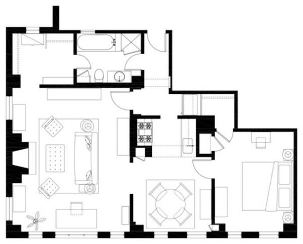
A floor plan helps explain the layout. The home’s entrance is at top center. The living room and office are to the left on the plan. If you enter the house and go straight, you walk through the petite kitchen to the dining room (bottom center). The bedroom is at the bottom right.
“It’s not perfect,” says Juestel of the rooms’ arrangement. “It is kind of strange to have a bedroom off the dining room. And I love to cook, and the small kitchen can drive me crazy. But I live by myself, and this works for now.”
Drawing by Adeeni Design Group
In fact, the place is always evolving. “I think every designer uses their home as a kind of laboratory,” Juestel says.
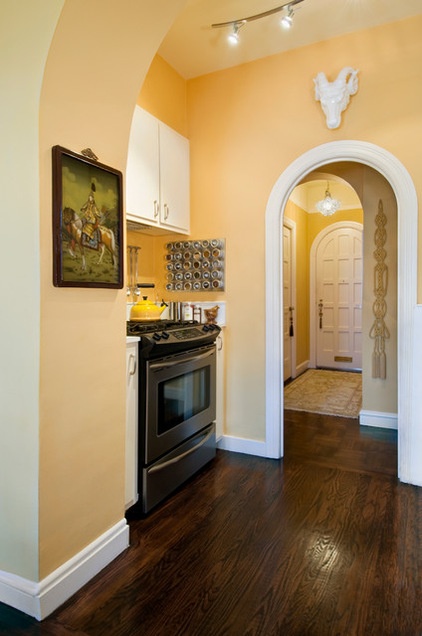
The small kitchen (seen here, in part, from the dining room) has new appliances and cabinets. Juestel considered taking out the wall to the left of the range to open up the space, but it houses cooking ventilation. “It’s kind of tight, and I have to be creative with how I plate and serve food when I’m entertaining,” she says. “But I’ve found that people are happy when you cook for them, and they don’t care whether their food is plated or passed on a platter.”
Across from the range is a small counter and sink. The refrigerator is just outside the arched doorway. Because the refrigerator door kept hitting the wall, Juestel installed a rope wall hanging to cushion the blows.
Range: Frigidaire Professional series
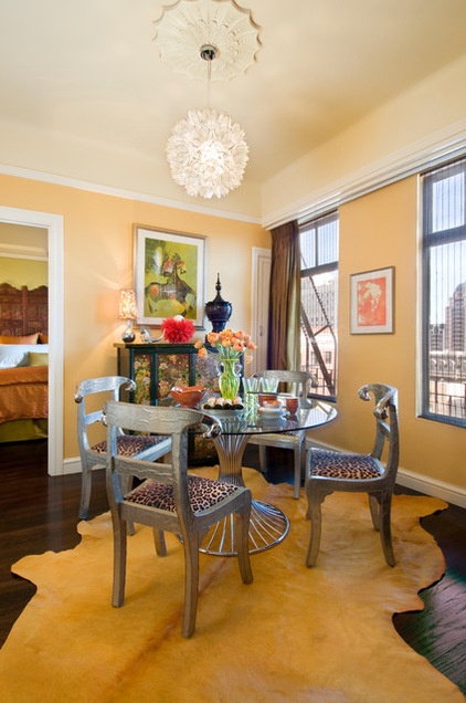
In the dining room, Juestal makes good use of her talent for balancing furnishings that are new and old, and hefty and sleek. A glass and metal dining table serves its purpose without taking up too much visual real estate, while metal, Regency-style ram’s head chairs from India make a design statement. “I had chairs like this but lost them in the fire,” Juestal says. “I had selected the same kind of chairs for a client. When they moved into a smaller home, they gave these to me as a gift. Of course I love them, as I’m an Aries.”
Wall paint: custom color; ceiling paint: Burnished Cream, Dunn-Edwards; molding paint: Coffee Cream, Dunn-Edwards; window molding paint: Black Walnut, Dunn-Edwards
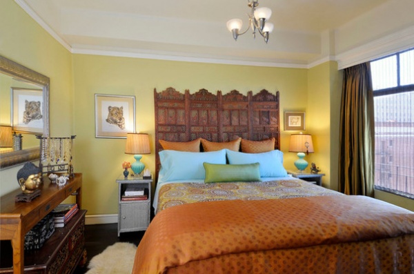
Carved wooden panels from India, another flea market find, serve as the headboard. The bedding is done in shades of exotic spices that are tempered with aqua.
The nightstands are one of the few things that survived the Christmas fire. “They were completely blackened, so I had to repaint them,” she says. “Together with some shoes that were protected by plastic boxes, they were all that was left.”
The experience has changed things for Juestal. “Of course, when you lose belongings, it’s shocking, and you miss the things you had emotional attachments to,” she says. “But then survival mode kicks in. To put it in perspective, no one was hurt, and I now own my own home in one of the greatest cities in the world.”
She also says, from a design standpoint, there’s something liberating about beginning again: “You feel the loss, but starting fresh with, literally, no baggage, is a bit exhilarating too. There really is a sense of a phoenix rising.”
Browse more homes by style:
Small Homes | Colorful Homes | Eclectic Homes | Modern Homes | Contemporary Homes | Midcentury Homes | Ranch Homes | Traditional Homes | Barn Homes | Townhouses | Apartments | Lofts | Vacation Homes
Related Articles Recommended


