Room of the Day: Guest Suite Welcomes Family and Friends
http://decor-ideas.org 02/17/2015 23:13 Decor Ideas
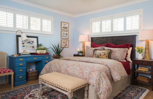
Creating a welcoming guest suite for her adult son, daughter-in-law, grandchildren and friends was a priority for this homeowner. In one of the two guest bedrooms of this Dallas ranch-style home, interior designer Dona Rosene repurposed existing pieces and added new ones to pull together a beautiful bedroom, then directed a bathroom renovation that created a truly luxurious suite.
Photos by Michael Hunter
Room at a Glance
What happens here: A woman’s family and friends enjoy a comfortable stay
Location: Dallas
Size: 11 by 13 feet (about 3 by 4 meters)
Rosene has worked for years with the homeowner, who would call on her to work on projects after earning bonuses at work. The designer had previously refreshed the guest room for the homeowner’s grandchildren.
Though the homeowner calls the room “Jason’s room,” after her son, plenty of her friends enjoy staying here as well. The rug is one the designer had picked out for the house years ago, and she planned this room’s design around it.
Wall paint: Breath of Fresh Air, Benjamin Moore
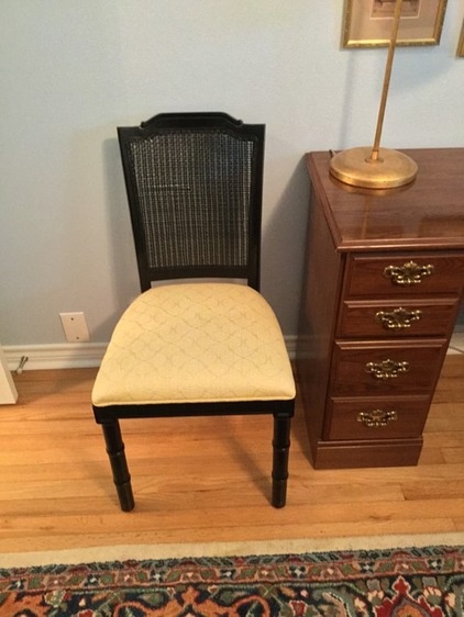
BEFORE: Rosene repurposed this existing chair and desk with new paint, hardware and upholstery.
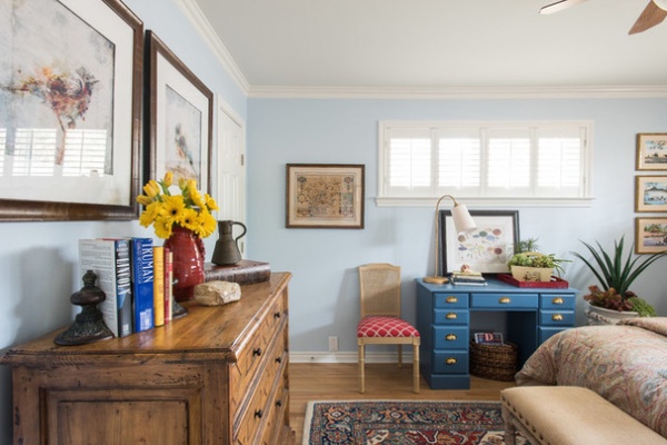
Specialty painter Mark Holden sanded, primed, sanded again and sprayed the desk with three coats of blue paint. Rosene searched far and wide for the perfect hardware, finally finding vintage brass pulls at local shop Uncommon Market.
Rosene re-covered the chair seat with a red fabric by Fabricut, called Chance, that plays off the bedding.
Tip: If artwork is looking tired or doesn’t seem to fit the room, have it rematted and reframed. The homeowner’s brother brought the three prints on the right back from Vietnam. Rosene freshened them up with new mats and frames. The antique map of France on the left is a family piece.
Desk paint: Lucerne with a satin finish, Benjamin Moore; desk lamp: Visual Comfort
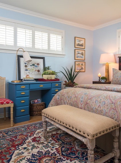
The bench is a HomeGoods find. Its burlap upholstery and large nailhead trim add texture to the room.
Succulent arrangements: Robert-Lawrence Designs
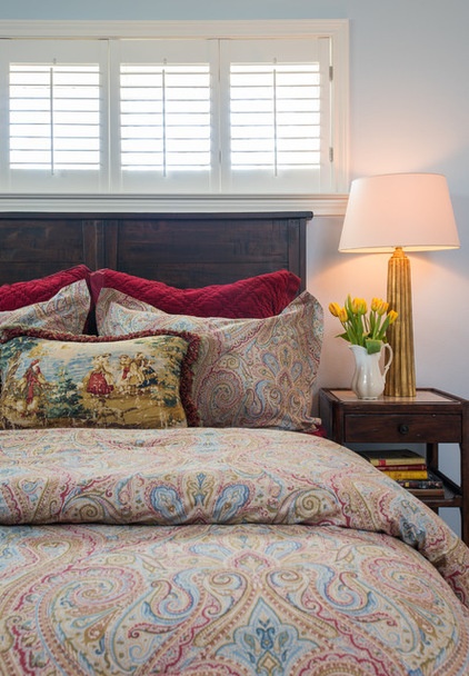
The headboard and nightstands ground the bed with dark color, while the bedding lightens things up. The nightstands have marble inlay tops. The fluted table lamps work with other warm brass elements in the room, such as the nailhead trim, drawer pulls and desk lamp. The designer kept the budget in check by balancing saves and splurges. The paisley shams and duvet cover are both by Ralph Lauren, but she scooped them up at HomeGoods.
Tip: Rosene recommends finding lamps with dimmers for bedrooms. Both the nightstand lamps and desk lamp have dimmers, so that the lighting scheme can go from dark and moody to reading-light bright.
Red shams: Pottery Barn; lamps: Visual Comfort; headboard: Cost Plus World Market; nightstands: Theodore Alexander
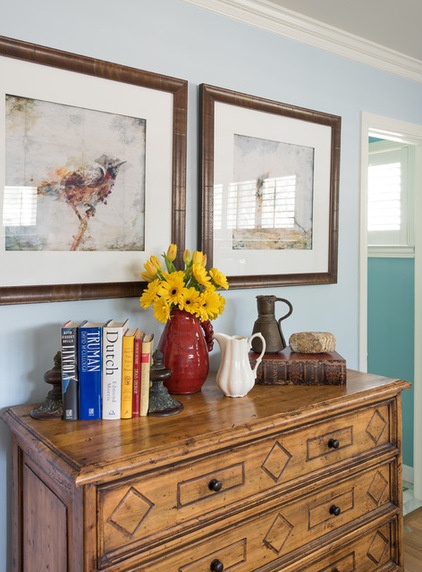
The dresser is new but has a timeless look. The doorway here is new and leads to the renovated bathroom.
Dresser: The David Gilbert Showroom
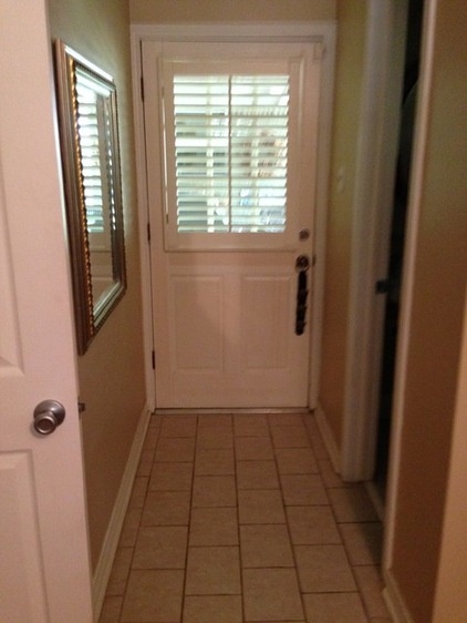
BEFORE: The largest part of the renovation was redoing the guest bathroom. Rosene and the homeowner decided a second back door leading to the backyard was not necessary and took over this small hallway to expand the bathroom. The door on the right led to the bathroom.
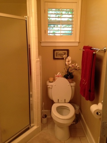
BEFORE: The old bathroom was small and cramped.
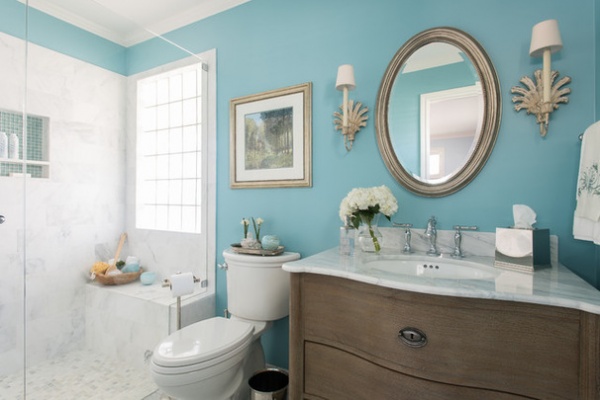
AFTER: The angles between the photographs don’t quite match up. To orient you: The glass block window is where the back door used to be, and the new dresser-style vanity is where the shower stall was. Before, the bathroom was 8 feet by 5 feet; now it is 8 by 10.
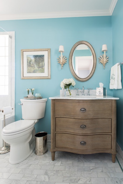
A mirror glints against the aqua walls, while sconces add an antique feel.
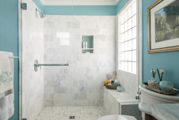
If you look at the floor on the right side, you can see a small glass border tile detail. Rosene repeated the same glass tile in the shower niche.
How to Pick a Shower Niche That’s Not Stuck in a Rut
Sconces: Visual Comfort; wall paint: Chesapeake Blue, Benjamin Moore; vanity, toilet paper holder, toilet brush: Restoration Hardware; tile: Daltile; toilet: American Standard
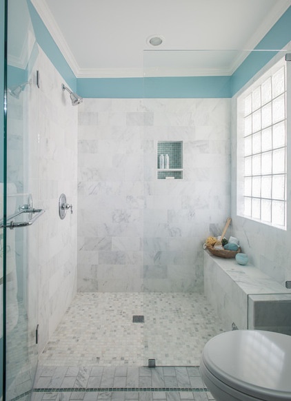
The clear glass lets natural light into the entire room. A curbless entry creates a smooth transition between the shower stall and the rest of the bathroom floor.
The shower stall has a 1-inch by 1-inch coordinating marble tile floor. Rosene had 12-inch by 12-inch tiles cut in half to 12 inches by 6 inches for the shower walls. Note the waterfall detail on the shower bench.
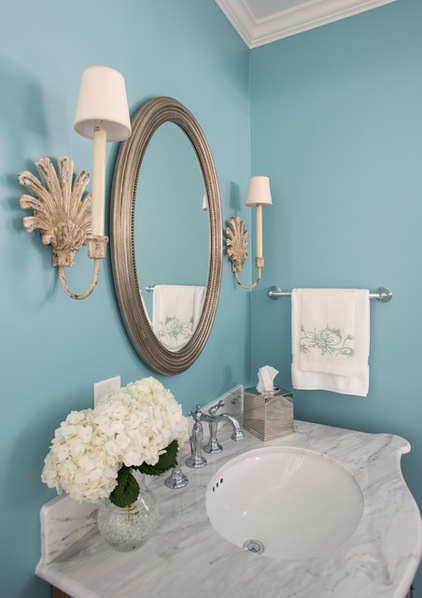
The vanity is topped with Carrara marble that coordinates with the tile on the floor and the shower stall.
“One of the homeowner’s friends said this bathroom made her feel like she was staying at a fancy hotel,” says Rosene. The only problem the homeowner may have now is guests who never leave.
Browse more Rooms of the Day
Related Articles Recommended


