Kitchen of the Week: Hints of Nautical Style Make a Kitchen Shipshape
http://decor-ideas.org 02/14/2015 01:13 Decor Ideas
Carly and Nick Dorendorf make their living designing, building and remodeling houses — and when it comes to their own home, they practice what they preach. The couple, joint owners of Carnik Residential Design, recently purchased a 1960s ranch house for themselves in Lakeside, California, near San Diego, and embarked on a major remodel. The revived kitchen, which draws on vintage and nautical references, is the star of the space.
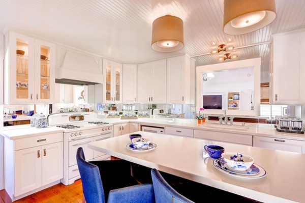
Kitchen at a Glance
Who lives here: Carly and Nick Dorendorf of Carnik Residential Design
Location: Lakeside, California
Size: About 360 square feet (33 square meters)
When the couple purchased their home, the kitchen featured worn butcher block countertops, a crooked island, cabinets that were missing their door fronts and plastered walls with an uneven orange peel texture. There was an awkward addition at the end of the room that didn’t relate to the rest of the space.
Carly knew going into the project that she wanted an all-white kitchen with no stainless steel appliances, and that she wanted to make the addition look more purposeful and less like a feature tacked on at the last minute.
“The room was rather dark, so I felt white would maximize the light,” she says. “After living with stainless steel appliances in my last house, I was sick and tired of cleaning them.”
Her desire for white fixtures and a touch of vintage led her on a hunt for an old-fashioned range. “I stumbled across a 1950s Gaffers & Sattler range on Craigslist. It was in fantastic condition and working properly, but I had it refurbished,” she says. “I love this range; it has fantastic function. The oven may not be as wide as modern models, but I can fit a 21-pound turkey in there, so that’s fine.”
Other vintage touches include a beadboard ceiling. “I felt that the paneled ceiling would put an interesting texture in the room,” Carly says.
The lampshade light fixtures over the island were selected to add a softer note to the space.
Lampshade light fixtures: Lamps Plus; light fixture over sink: Restoration Hardware; sink: Kohler
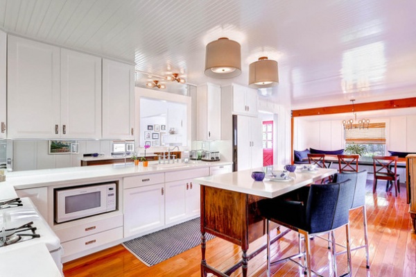
The choice to install a mirrored backsplash might seem like trading one cleaning challenge for another, but Carly says it works for her and for the room. “The kitchen doesn’t have a lot of direct light, so mirrors reflect light into the space and make it seem larger and more open,” she says. “It’s true that I need to wipe up behind the sink to avoid water marks and spots, but that’s pretty much it. If I were a really messy cook, it might become a little frustrating to keep them clean all the time.”
A large interior pass-through, located over the sink, was already in the wall before the remodel. Carly decided to leave it so people working in the kitchen would have a connection to what’s going on in the family room.
The kitchen island started its history with this family as a chance find. “I was over at a friend’s home, and she was cleaning out her garage. She had this console, and it was pretty battered. But when she asked me if I wanted it, I said yes,” Carly says.
The piece lived in the Dorendorfs’ entry for a time, but when they moved to this house, the designer made it a kitchen island by replacing the top with a quartz countertop that overhangs one side by a foot. “By chance it was the perfect size; I didn’t have to alter the height at all,” says Carly. “And it’s perfectly balanced with the new top.”
Countertops: Cambria
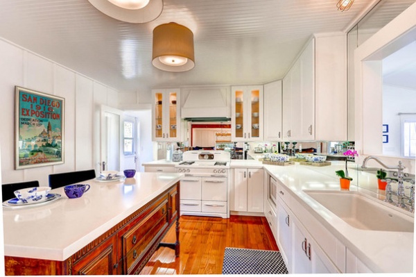
The other side of the island, what would have been the front when it was an ordinary piece of furniture, has drawers that the family uses to store flatware and cookware.
Floor runner: Joss & Main
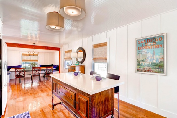
The orange-peel walls have been replaced by board and batten paneling.
At the end of the room, exposed beams mark the beginning of the addition the designer described as looking like an afterthought. “I liked the beams, and I wanted to leave them,” she says. “But I added a built-in banquette, a long table, beadboard on the ceiling and board and batten on the walls. This makes it feel like part of the kitchen.”
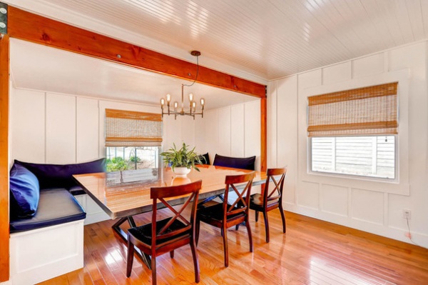
In fact, the space is now the main dining area in the home.
The tabletop was created by Carly’s sculptor cousins, Tiffany and Neal Bociek. They used a piece of the original floor, giving it a mirror-like, glossy finish and placing it on a metal base.
Table: Bociek & Bociek Studios; light fixture: West Elm; banquette back cushions: Target
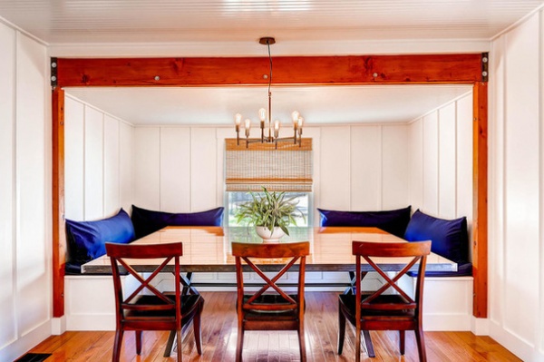
The blue and white color palette is a vague reference to the area’s location. “We are just outside of San Diego and near the beach,” Carly says. “I wanted something that referenced the water and the beach without screaming beachy.”
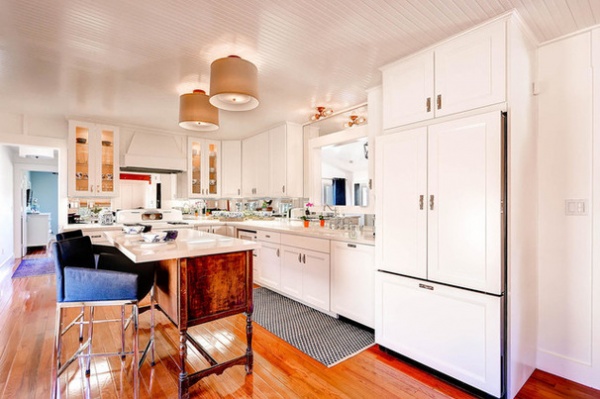
In fact, the entire space is a juggling act. “I tried to balance things between modern and traditional,” Carly says. The designer feels she and her husband have mastered the feat. “Everything functions well, and the house feels like our own,” she says. “If you live in a well-designed space, it can affect your mood and make you feel great. I feel good when I walk into this room in the morning.”
Browse more Kitchens of the Week
Related Articles Recommended


