Houzz Tour: Farmhouse Retreat With a Sophisticated Edge
http://decor-ideas.org 02/12/2015 23:13 Decor Ideas
To understand the style of interior designer RJ Thornburg and lighting designer and sculptor Warren Muller, you have to know how they named their company. Their business, bahdeebahdu (say it: BAH-dee-BAH-doo), is named after an animal they’ve never actually seen. “There was a man in our neighborhood who was always loudly calling his dog, and the animal’s name sounded like Bahdeebahdu. We never got a look at the dog, and we aren’t sure that’s how it’s spelled; we are just speculating,” Thornburg says. “We named the company that because it sounds fun and almost musical.”
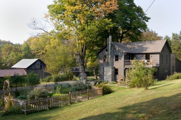
The couple brought their brand of creativity and humor front and center when they remodeled the old farmhouse they bought in Pennsylvania’s Pocono Mountain range.
Houzz at a Glance
Who lives here: This is a weekend home for RJ Thornburg and Warren Muller, principals at bahdeebahdu.
Location: Saylorsville, Pennsylvania
Size: 1,700 square feet (157 square meters); 3 bedrooms, 2 bathrooms
Year built: Approximately 1860
During the week the couple lives in a Philadelphia apartment. When their community garden there was sold and shuttered, they found themselves landless and missing their garden. That spurred them to search for a getaway spot. “It’s a weekend house, but it’s more than that in many ways,” says Thornburg.
The 3-acre property was once part of a larger farm. Look at this photo, and you can see that the couple has their hands in the dirt again. The charming picket fence around the thriving garden plot is to keep out rabbits and “other critters.”
It makes sense that there’s an abundance of rabbits, as the house is on a road named Cottontail Lane. Those facts led the men to nickname the place the Bunny Hole.
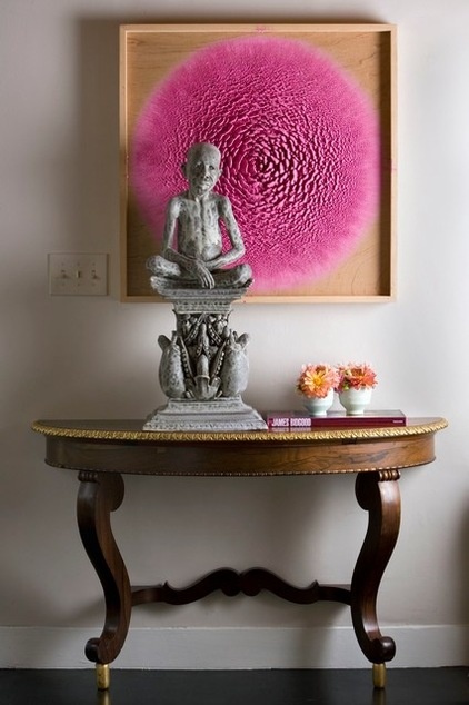
“When we bought the house, it was the color of nicotine inside and out — it looked like someone had been smoking in there for 90 years,” says Thornburg. The new interior color is a soft gray.
The entry displays an example of the couple’s unique spin on design. The console table was once the end of a dining table with many leaves. Thornburg added metal feet to raise it to the proper height, applied gold leaf around the edge and mounted it to the wall. “Once it actually was my dining table — my ex got the other end,” he says. The piece is just one of many recycled and repurposed pieces in this home.
The sculpture, a pensive figure reminiscent of (but not) Gandhi, was a gift from a client. “There’s something sad and beautiful, serene and calm about it,” says Thornburg. “We wanted to give it a place of honor in our home.” The figure is backed by a cheerful candy-pink artwork.
Painting: Martin Kline
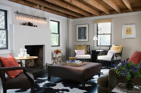
Thornburg describes the house as a simple farmhouse that, when it was first constructed, was a classic two-over-two — that is, two rooms downstairs, two rooms upstairs. It was heated with woodstoves. In the 1940s a small addition was added to the house, giving it another bedroom, a kitchen and an indoor bathroom.
Thornburg reordered the rooms on the lower level and expanded the kitchen. He swapped the living room for the dining room, because the former dining room was a better place to add a fireplace. (“When we started house shopping, we just had three requirements,” he says. “We wanted a fireplace, a large tub, a garden and room for a hammock.”)
The new living room has a minimalist fireplace and mantel. “This is not just a summer house, so a fireplace is an important element for us. There are many months when a fire feels wonderful,” Thornburg says.
The mantel is topped by a light fixture by Muller, made with a vintage meat rack found at a nearby flea market. The hooks that once held choice cuts of meat now support a row of small lights.
Given that the farm used to be home to cattle, the meat hook light fixture and the ceramic steer and black cows beneath it are a humorous design statement.
The ceiling was composed of lath and plaster, but when it was removed during construction, Thornburg decided to keep the support beams exposed, even leaving the small traces of plaster on them. He also left radiator pipes (seen in the right-hand corner) visible. “I liked the old wood of the beams. I also liked the additional headroom removing the ceiling gave us; it makes the space feel taller,” he says. “Sometimes I wonder why we insist on hiding things like support beams and radiator pipes — it’s not like they are bad.”
The floors on this level were not original to the house, and Thornburg had them stained black. Some of the windows are original — or at least very old. He had them painted black, and likens the accent to adding mascara around an eye. “We didn’t want to use window treatments, so painting the windows black makes them feel more finished,” he says.
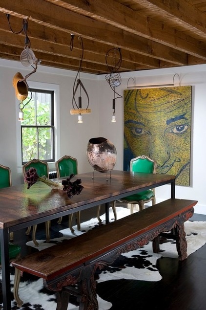
The ceiling was removed in the dining room as well.
Thornburg wanted to have a dining room table that would seat 10 to 12 people. When he found the hammered copper tabletop seen here at an antiques store, he knew it would be perfect and had a metal base custom made to fit it. It’s surrounded by vintage chairs with green patent leather upholstery and a long Asian bench. The mismatch was purposeful. “When I was in design school, I had a teacher who always said, ‘Every room should have the right wrong thing,’” he says. “Surrounding this table with matching chairs would have been too expected and easy.”
Or perhaps the bold light fixtures are the right wrong item. Made by Muller, they utilize a wooden shoe, a glass funnel, a pair of calipers, an egg basket and a buffing wheel. “They totally fit with our idea of reclaiming objects and using them in this house,” Thornburg says.
The artwork is a self-portrait by Kim Kamens. “She’s a good friend of ours. It’s a self-portrait, but it’s so abstract, it doesn’t totally read as one,” Thornburg says. “But I love her, so if you can tell it’s her, what the hell?”
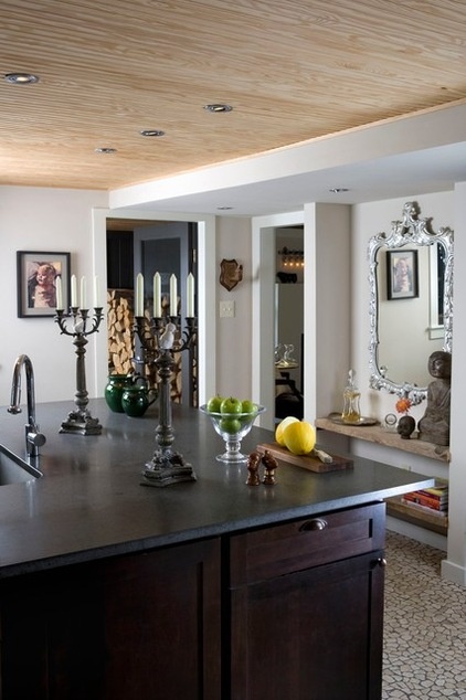
The couple expanded the kitchen, making way for a large island topped with a lava stone countertop.
The ceiling here is covered with traditional beadboard, but in an nontraditional move, it isn’t painted. “We had to install a ceiling here to hide plumbing,” Thornburg says. “I thought the beadboard looked interesting in its natural state.”
The floor is made of a tumbled travertine tile that looks like pebbles. “We chose these floors because they are forgiving,” Thornburg says. “We don’t want to spend all of our weekend cleaning, and we found these just don’t show dirt.”
The console, located to the right of the entry, is made of boards the couple discovered in the barn.
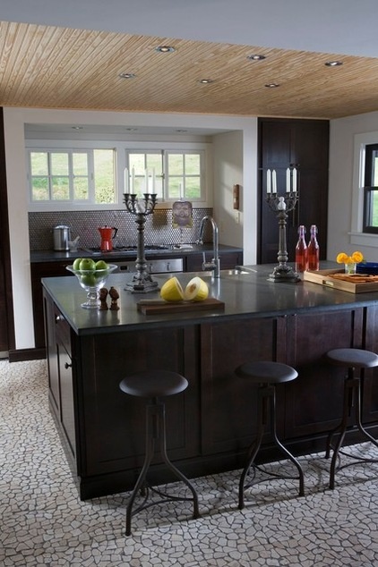
Remember the wish list that included a large tub? That wish is in part fulfilled by two support walls that flank the cooktop. They were necessary to reinforce the floor above, where the tub is, and they make niches for the refrigerator (left), the range (center) and a pantry (right).
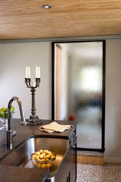
Sliding, metal-framed glass doors are a hallmark of Thornburg’s work.
The large candlesticks on the countertop were once lamps. The couple converted them to candelabras and added little white ceramic ducks in the centers. “Things that are too serious really bore me,” Thornburg says.
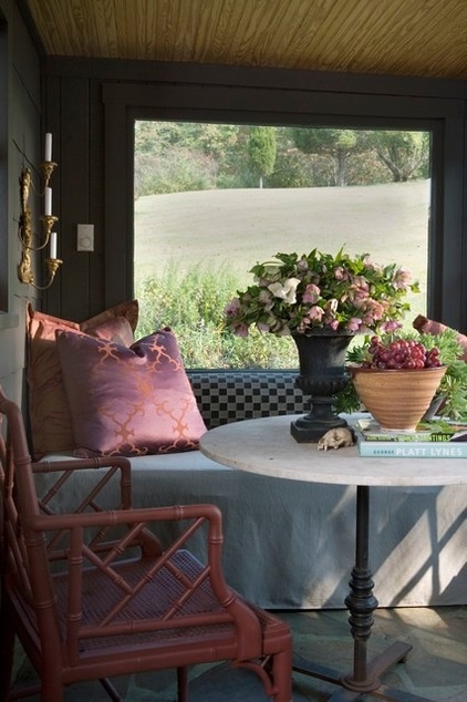
Off the kitchen is a breakfast room that leads out to the garden. “This is on the east side of the house, so it gets perfect morning light,” Thornburg says. “We use the stools at the island for hanging out, and we eat most of our meals out here.”
The banquette is actually a daybed with a trundle hidden underneath, and it can be used for sleeping when guests fill the house.
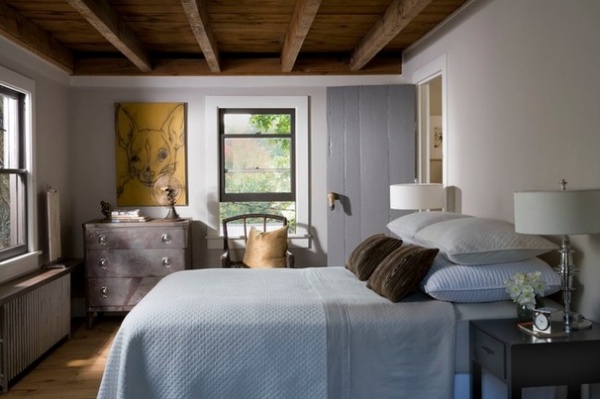
Upstairs the master bedroom is small, so Thornburg skipped a headboard in favor of Euro pillows. Instead, details such as the exposed ceiling make a design impact. The door handle is a vintage deer hoof; the designer says deer hooves can be found by the dozens at area antiques shops and flea markets — bygone souvenirs from long-ago hunters.
“I think that recycling and reuse was not new to this house,” Thornburg says. “This old door was probably cobbled together from wood that was on hand. It’s likely it was old when it was installed here.”
The floors on this level are original to the house. When Thornburg sanded them down, he loved the look of the naked wood so much, he left them bare. “Sometimes I think things are better if you don’t seal them,” he says. “Wood just wears quietly.”
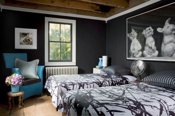
The couple had the art in this guest room before they bought the property, but the laughing bunny in the photo makes it a good fit in a house dubbed the Bunny Hole.
Twin beds make for a flexible guest space. “I always say, ‘You can shove two beds together, but you can’t spilt a double bed,’” Thornburg says.
Artwork: Ric Best; wall paint: Caviar, Benjamin Moore
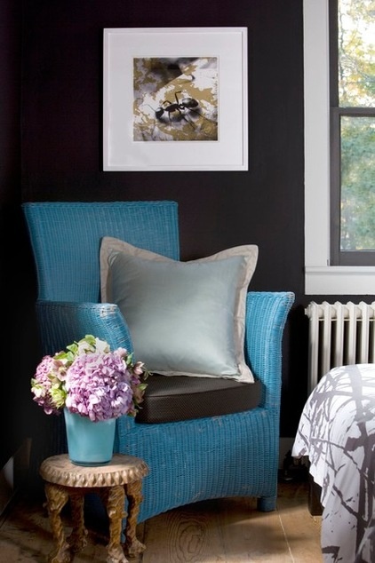
A blue wicker chair is another flea market find. “I’m not a blue person, but I liked the weathered original paint on this piece,” says Thornburg. “I just couldn’t change it.”
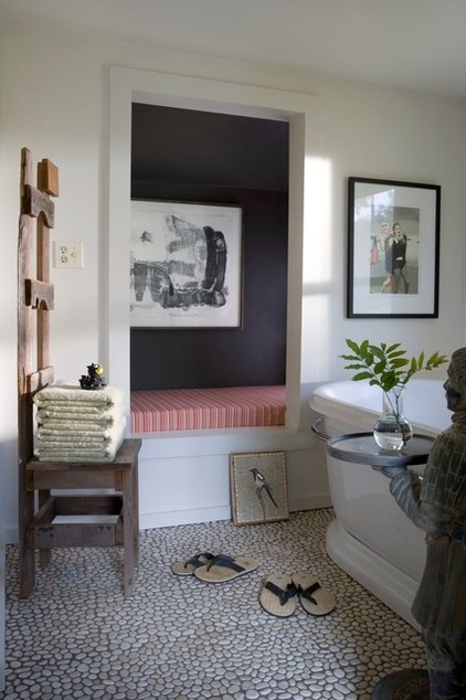
A fourth bedroom was recast as a second-floor bathroom. The chair with the sky-high back is a piece of naive art. “It was the first thing we bought at the local flea market and the first thing we brought through the door,” Thornburg says. In the home it has a new life as a place for folded towels.
It sits beside what was once a bedroom closet and is now a banquette. “It was the easiest way to deal with it,” he says.
The tray-bearing statue at right is in the form of a Samurai warrior. “I walked into a Pier 1 outlet store, and there he was with his little topknot,” Thornburg says. “He’s almost tacky, but it’s one of those things that is so bad, it’s good.”
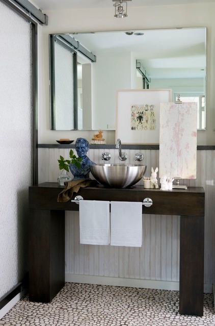
The bathroom vanity is made from a big-box-store console that Thornburg had drilled for plumbing. He then added a towel bar on the front.
Another glass door covers the entry to the room. Thornburg says the pebbled glass makes it nearly impossible to see through the door. “You can’t really see through unless someone is pressed up against it,” he says. “Perhaps some people would be a little intimidated to use a bathroom with a glass door, and for those people we have the downstairs bathroom.”
Console: West Elm; sink: Stone Forest; faucets: Van Dyke’s Restorers
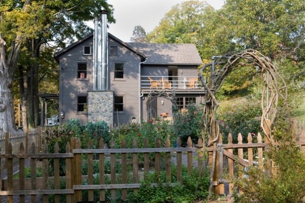
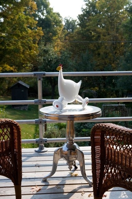
The balcony was added off the master bedroom; it rests over the expanded kitchen.
Thornburg made the rails from plumbing pipes.
“The pipe came from a display booth we had erected at a trade show we were in,” he says.
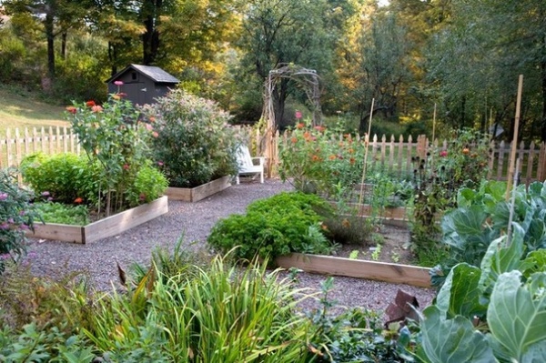
The couple loves the finished home so much, they would live there full-time if life permitted. But weekend residence has its benefits. “I think we have a greater appreciation for the home because we don’t live there all the time,” Thornburg says. “This way we never take it for granted.”
Browse more homes by style:
Small Homes | Colorful Homes | Eclectic Homes | Modern Homes | Contemporary Homes | Midcentury Homes | Ranch Homes | Traditional Homes | Barn Homes | Townhouses | Apartments | Lofts | Vacation Homes
Related Articles Recommended


