Houzz Tour: Ranch Home With a Fresh Approach to Patterns
http://decor-ideas.org 02/11/2015 21:13 Decor Ideas
This young couple was excited to go bold in their newly renovated ranch, but knew that careful editing would be key in keeping the look refined. They brought in interior designer Sarah Wittenbraker toward the end of construction to help create eclectic, collected interiors that would stand up to their three young children. “They were starting pretty fresh with a fairly open floor plan,” the designer says. When rooms are open to one another, it’s even more important to find ways to create cohesion between the different spaces. Thanks to a careful mix of geometric and brushstroke patterns, and saturated and neutral hues, the house is playfully welcoming and suits the vibrant young family to a T.
Photos by Tre Dunham, Fine Focus Photography
Houzz at a Glance
Who lives here: A family with 2 young girls and a boy
Location: Austin, Texas
Size: 3,400 square feet (316 square meters); 4 bedrooms, 3½ bathrooms
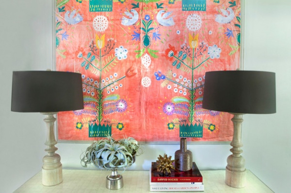
An exuberant Paul Nouveau tapestry sets the tone for bright color in the entry. Wittenbraker knew she could pluck some of the hues out of this piece to use throughout the house. “This helped warm my client up to lavender, which we used on the living room rug. It was a bit of a hard sell at first,” she says.
The botanical tapestry was as flowery as the designer got in this house. “One of the homeowners was antifloral; I told her if we used all geometrics, it would be too much and could look dated within a few years,” Wittenbraker says. So she found nongeometric, nonfloral patterns to add to the mix.
Tapestry: Natural Curiosities
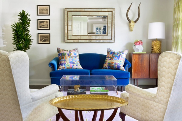
While the couple was starting fresh, Wittenbraker eyed some pieces they already owned that had potential. “I love to be able to work with what my clients already have and not cost them money they don’t need to be spending,” she says. For example, she gave their camelback sofa and pair of wingbacks in the living room a refresh with new upholstery.
“This is Austin, so you have embrace the vintage!” she says. She found the vintage cabinet (right) and the brass table locally, and the homeowners already had the vintage prints on the left.
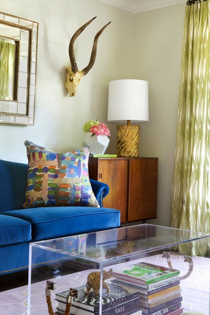
“They didn’t want bright color all over the place just for the purpose of being bright,” the designer says. The pattern on the drapes presents chartreuse in a way that’s not so shocking, and the lavender rug tones down the sofa’s royal-blue velvet.
Because she had to childproof the home for a 2-year-old, Wittenbraker knew her client could not leave the kind of artful objects she loves out on the coffee table. Instead, she opted for a Lucite trunk table. “This way you can still see the objects, but their toddler won’t be able to knock them over,” she says.
While looking for a nonfloral print to soften the geometrics, the designer came across the watercolor-like fabric seen here on the pillows, which hit just the right note. She wound up carrying brushstroke patterns throughout the house, using them to help tie the rooms together. “These patterns are soft without being too girly,” she says.
Rug: Madeline Weinrib
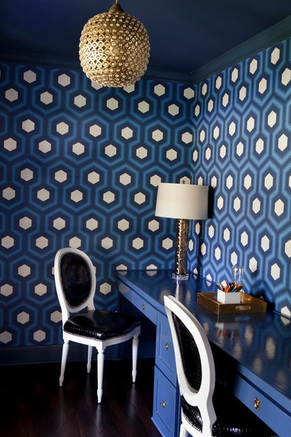
You may have spied this bold David Hicks wallpaper reflected in the living room mirror, which was an intentional move. The couple needed some quiet, separate-from-the-children space to get work done from home. The desks are built in and covered in a high-gloss paint that matches the paint used on the ceiling. Bold black and white chairs and brass accents round out the scheme.
Light fixture: Serena & Lily
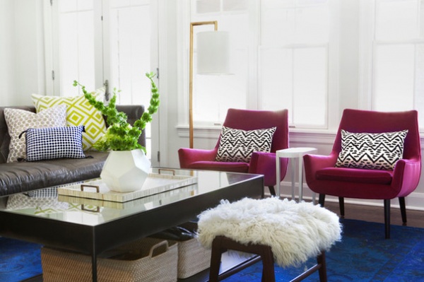
The living room is open to the more casual family and TV room, seen here. Just out of view are doors to a backyard and covered porch, which means the room gets a lot of traffic with potentially dirty shoes. Aware of the foot traffic and budget in here, Wittenbraker found an inexpensive overdyed rug from West Elm that ties the space to the living room sofa’s color. “With a neutral sofa, it brings in some bold color on the floor,” she says. The pillows on the armchairs combine a geometric pattern and the brushstroke look.
The bench was made locally and is topped with Tibetan fur that’s nice and soft for little ones climbing atop it. The baskets underneath the metal coffee table are another West Elm find, perfect for stashing magazines, remotes and toys when picking up.
Armchairs: Mrs Godfrey, Jonathan Adler
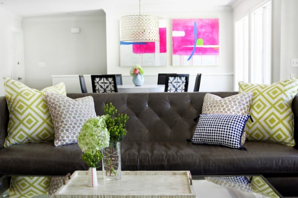
Wittenbraker chose durable leather for the sofa in the TV room, which will get a lot of use and abuse. However, she softened the leather look by choosing a tufted back and a warm gray leather, along with cheery throw pillows.
Sofa: Lee Indusries; green pillow fabric: La Fiorentina, David Hicks
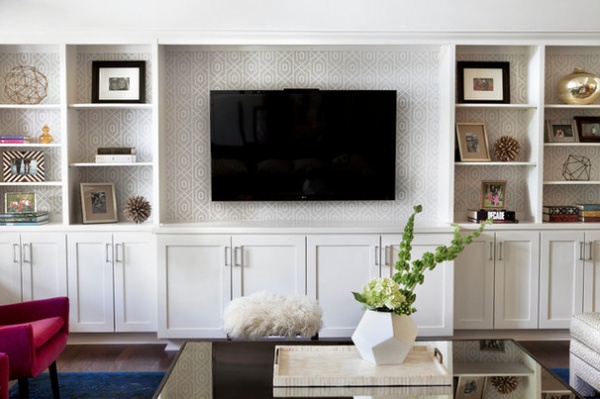
“When you have three kids, a place to keep items out of sight is a must,” the designer says. She recommends going with lower cabinets on built-ins for rooms where kids will want to play with toys.
A geometric wallpaper behind the shelves brings in soft tan and ties this wall to the rest of the room.
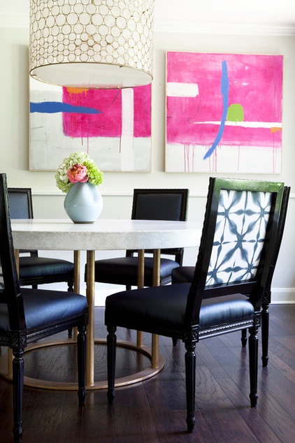
In the adjacent dining room, she commissioned abstract artwork that picks up on the bold pink from the armchairs in the family room.
The dining room mixes casual and glamorous; the brass table base is topped with concrete, while an intricate Oly shell drum pendant brings in glitz overhead. The dining chairs have glossy black lacquer legs and frames, and the upholstery is black vinyl, which will stand up to all sorts of spills. The chair backs are upholstered in a fabric with another brushstroke-like pattern; the chairs were made by local artist Katie Kime.
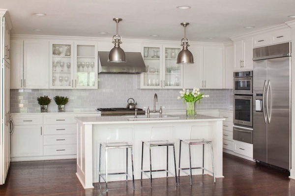
When Wittenbraker began her work, the kitchen was already completed. It was designed by Page Gandy of 3 Fold Design Studio. The neutral palette on more permanent elements like cabinetry and the backsplash is timeless.
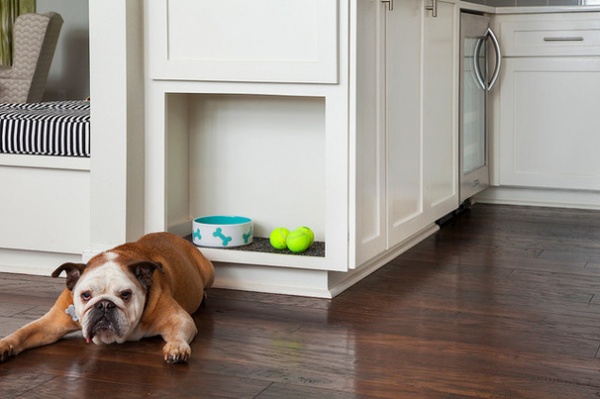
Gandy gave the family’s dog his own special niche in the island. “Buford followed me around tirelessly during the entire design process,” Wittenbraker says of the dog, who became her canine assistant.
Pet-Friendly Design: Making Room for the Dog Dish
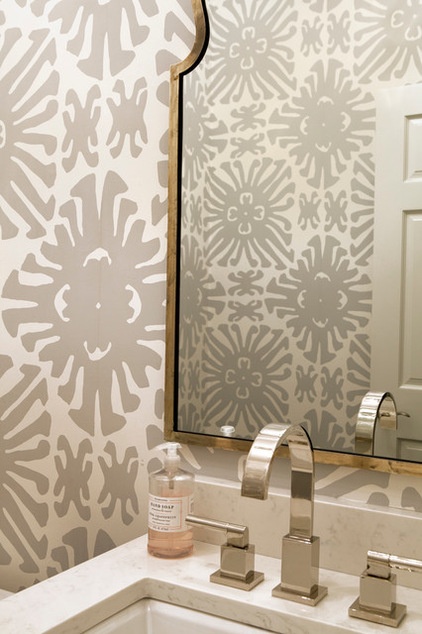
One place where Wittenbraker always loves to make a big statement is the powder room. “It seems counterintuitive, but a tiny, tiny bathroom needs a big, big statement, like this large-scale print,” she says. Silvery finishes on the faucets and mirror give the room an elegant look.
Wallpaper: Sigourney, Quadrille
Yes, You Can Go Bold With Wallpaper in a Powder Room
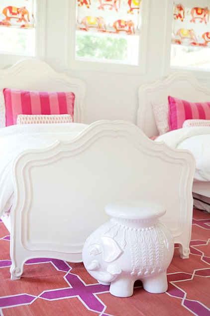
The couple’s daughters already had their French-inspired beds and pink striped shams in their room. Wittenbraker amped up the look with an orange and pink Moroccan rug, printed lumbar pillows and pink Roman shade fabric. The elephant usually sits between their two headboards, but it wanted its 15 minutes of fame via this photo. Just out of sight on the other sides of the beds, the designer added modular glossy Ikea cubes for books and lamps.
Rug: Madeline Weinrib
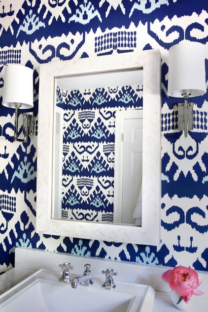
The guest bathroom sports another large-scale wallpaper, a blue and white ikat-inspired print. After all, the guests should get to experience the playful bold touches that have become the home’s signature style too.
Wallpaper: Quadrille
Interior design: Sarah Wittenbraker Interiors
Kitchen design: Page Gandy, 3 Fold Design Studio
More:
Decorating Secrets: How to Layer Patterns Right
Pattern Primer: How to Pair Different Prints
Related Articles Recommended


