Room of the Day: Bright Red Dining Room Glows in Fog City
http://decor-ideas.org 02/10/2015 22:14 Decor Ideas
If you’ve ever read anything about San Francisco weather, you’ve probably heard there’s fog. And while low-hanging mist shrouds the city in drama and mystery, over time the hazy veil can become a little morose. Interior designer Christy Allen brightened a growing family’s newly purchased apartment in the Outdoor Richmond District, one of the city’s foggiest neighborhoods, with bold color, white details and light accessories and banished the gloom to get the household off to a glowing start every day. She kept most of the house clean and white but turned the dining room all red.

Photos by Michele Lee Willson
Room at a Glance
What happens here: A family of 3 entertains and eats all of their meals together.
Location: San Francisco
Size: 13½ by 14 feet; 189 square feet (about 17½ square meters)
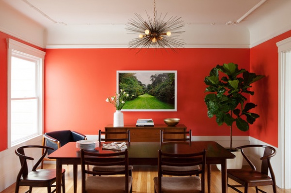
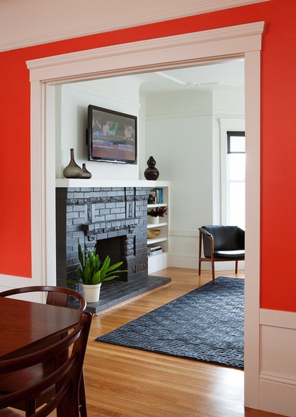
This view of the dining room is the first thing visitors see once they reach the top of the staircase leading into the third-floor apartment. The dining room connects to the living room on the right and kitchen on the left. The family spends a lot of time here because it is the center of the home and also because it’s their only place to eat. “They don’t have any eat-in space in the kitchen,” Allen says.
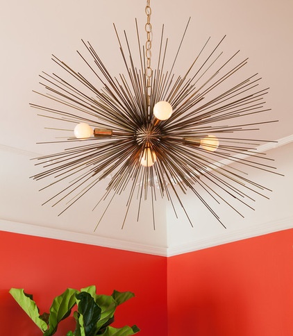
The clients brought all of their own furniture: a mixture of midcentury teak and leather pieces they had collected over the years. “It was convenient that their furniture fit,” Allen says. She added a Sputnik-style chandelier and other accessories that mix well with the furniture but also add some contrast. The clients avoided having an area rug, because they thought with a toddler it would be easier to clean a wood floor than a rug. In this picture you can’t see the high chair and kid-size table for art.
Allen also chose the art for the dining room. “I always encourage people to think about art when designing a space,” she says. And as soon as they decided to paint the walls red, she knew it would have to be something green, preferably a landscape photograph. She ultimately discovered this photo of Killarney National Park, in Ireland, on a negative taken by Michele Lee Willson, the architectural photographer who took the photos of this dining room. (She’s also Allen’s sister-in-law.) “I definitely had this vision, and it definitely came through,” she says.
The fiddle leaf fig tree pops against the wall much like the art does and harmonizes with the photograph’s subject.
Coral paint: Soft Glow; white paint: White Heron, both by Benjamin Moore; bowl, Holden vase: Crate & Barrel; chandelier: Stimulight, Etsy

It makes sense that the apartment’s central room is a focal feature, but that wasn’t Allen’s only reason for the colorful walls.
She incorporates color whenever she can but particularly likes dining rooms. The reasons: They are rarely the largest room in the house, so the color won’t be too overwhelming, and they are usually self-contained, so you don’t have to worry about awkwardly ending the paint in a hallway or painting the whole hallway an eye-catching shade.
In certain instances she’ll paint the whole room white but then paint the ceiling a bold color for contrast. “I appreciate a good white as much as I do a bold color,” she says.
The white shown here is Heron, by Benjamin Moore. She painted the dark trim throughout the apartment white — it wasn’t precious wood, she says — and it instantly brightened the house.

Allen doesn’t always choose red walls for the dining room, but it is a hue she’s repeated — especially for homeowners who are nervous about color. “It seems to be a good color for lots of people to wrap their minds around it,” she says. This room is painted in Benjamin Moore’s Soft Glow, a coral red with pink undertones. It was the first color she sampled in the room, and everyone immediately knew it was the right choice. “It’s definitely a bold color, but people have responded positively,” she says.
When choosing colors, Allen says it’s important to not only look at the color but also the base. There may be five or six colors in the same range, but it’s the undertones that will really make the difference between creating a warmer or cooler room. For this room in a foggy area, she went with a warmer red. It’s bright and youthful yet warm and inviting.
At night the space transforms from a family dining room into a sophisticated entertaining space. “I like that it functions both ways,” Allen says. “It’s family friendly but clean and put together.”
More:
How to Add Color if You’re Color Shy
Browse more colorful homes on Houzz
Related Articles Recommended


