Key Measurements: Hallway Design Fundamentals
http://decor-ideas.org 02/09/2015 23:14 Decor Ideas
The importance of hallways cannot be overstated. After all, they are utilized many times each day. While we may give them little attention relative to other parts of the house, they deserve consideration. Even if we quickly pass through them, they can provide opportunities to showcase artwork, emphasize focal points or play with light. Whether your hall is wide or narrow, you can take advantage of shapes, details or color to get more pleasure from your house.
Focal Points
Creating a focal point at the end of a hall draws you onward and rewards your senses as you proceed.
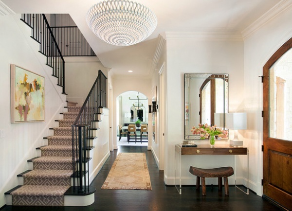
At first glance, the hall of the Dallas house seen above may seem secondary to the beautiful staircase and foyer furnishings. However, take a closer look at the arch at the end of the hall and the room beyond. The arch defines the focal point and frames the scene in the dining room, where the table is centered to the arch, and a mirror hanging on the far wall reflects light and movement. The hall itself is simply decorated and, while not too narrow, has modest proportions. Note that two doors along the sides and a return air vent convey the hall’s utility. The runner rug contributes movement and direction, while the artwork and sconces on the wall opposite the stairs complete its confident statement.
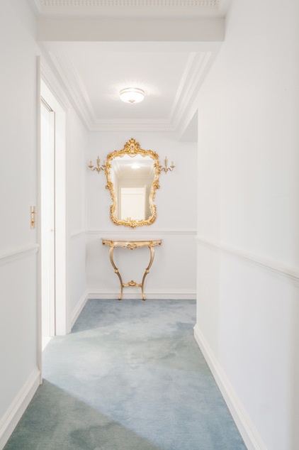
In the Paris apartment at left, white walls neutralize the composition, and the molding and carpet color create a low and sumptuous contrast. The gilded mirror, sconces and table at the turn define the focal point with glittering emphasis.
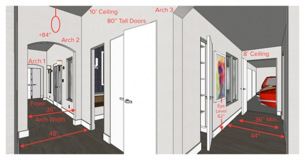
Study this illustration to understand the key measurements that are important to hall design. The hallway runs in two directions. The foyer of the house is to the left, between two arches, and the garage is at the far right, at the end of the hall. A third arch is barely within the field of view and begins at the hall toward the garage.
The foyer and adjacent hallway have 10-foot ceilings and are 48 inches wide, while the garage hallway has an 8-ft. ceiling and is 44 in. wide. American standards call for a minimum 36-in.-wide hallway in most circumstances. Light fixtures should clear 84 in., or more if necessary, and eye level is commonly 62 in. above the floor. The doors in this design are 80 in. tall, a common height. Another standard door height is 96 in.
In this layout the arches define the extent of the hall and signify transitions in ceiling height and purpose. The 48-in. width is generous and can hold very narrow furnishings. To place larger furniture, a width of 54 to 72 in. is better. The hallway toward the garage is also generous for its purpose, and a 36-in. width could have also worked, though it would likely have felt cramped. The width of the arch could have been as little as 32 in., but any less than that would have been too tight for most purposes.
Widths and Heights
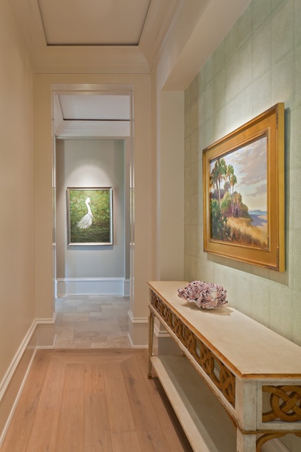
More generous halls can accommodate furniture and require larger scaled details. This classically rooted contemporary Mediterranean house in Florida shows sophisticated harmony in its carefully selected details and finishes. While the paintings provide focal emphasis, attention has been given to changes in wall finishes and floor materials to define the transitions. Generous widths allow for the table, and higher ceilings provide room for significant molding detail.
The American standard ceiling height is 8 ft. minimum, but most people prefer ceilings of at least 9 ft. A ceiling height greater than 9 ft. can allow more significant design opportunities.
Details
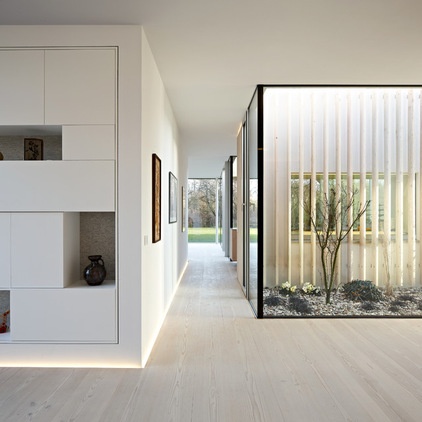
Comparing the previous example with this modern German residence reveals the language of their respective architectures. Crispness and precision combine with refined finishes define this hall. Clever lighting provides an implied baseboard while gently washing the lower part of the wall. All the lines are flush, and the planes are continuous. Movement is gently suggested by the direction of the grain of the wood flooring. A narrower passage is possible without the space’s feeling too tight since one side is primarily a glass wall.
Built-ins
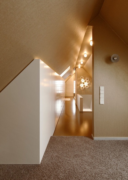
Whether modern or traditional, extra spaces along the sides of a hall are great places for built-ins. In the German hallway seen here, a bank of custom-built drawers is sleekly concealed, for a modern aesthetic. Psychologically, the narrow hall feels larger because its extremities provide storage.
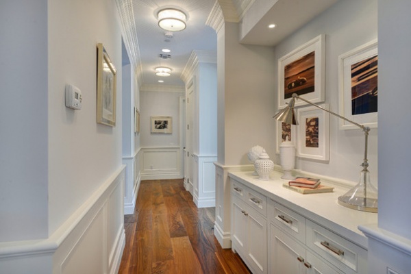
In the Los Angeles traditional home below, an alcove holds a custom cabinet. The drawers and shelves provide always-needed storage for linens and supplies. Also, the countertop is perfect for displaying a few favorite objects and artwork. It also provides a place for conveniently setting things down as the owners traverse the rooms.
Framing
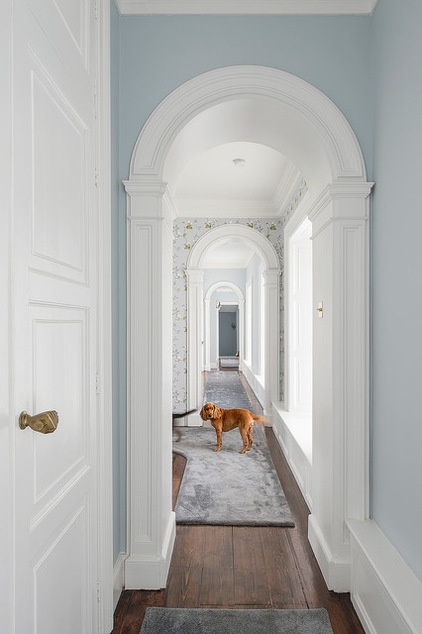
In this Irish home, details have been captured from its 19th-century structure to divide this long hall into more acceptable proportions. Framing and dividing long halls with cased arches adds significant interest and complexity to these otherwise utilitarian spaces. With some knowledge of casework, you can add this effect to the simplest house.
Displaying
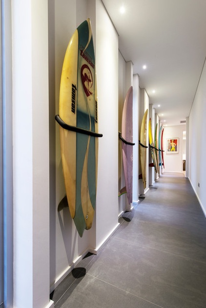
In this residence in Perth, Australia, the hall displays a surfboard collection. While this is a generous space done with a significant budget, you could just as easily display a collection of your own, perhaps related to a hobby. Just be sure to maintain at least a 36-in. width.
Lighting
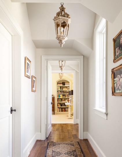
Imagine this Texas house without the hanging lanterns. This simple touch implies alignment and defines movement through the space. The proportions are modest, and the baseboard and trim details are common. The light fixtures add enough punch to give the space more individual character. Granted, you will need a high ceiling to achieve this exact effect. There is a vaulted dormer in this case; however, many different sizes of light fixtures can produce a similar detail. Look for fixtures that complement your architecture and are well scaled to your circumstances. As mentioned above, allow at least 84 in. for head clearance.
Gallery
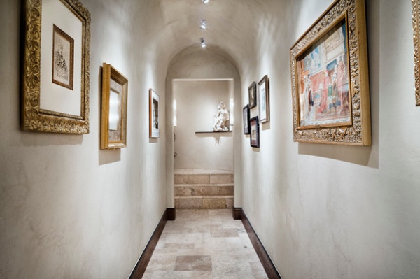
Halls can be delightful places to create your own art gallery. Since you frequently pass through these spaces, they are ideal for displaying collections of your favorite artwork and photographs. You will want to place artwork at eye level or slightly lower. Eye level is about 62 in. for the average adult. In general, oversize art is better placed in large rooms, where you can stand back from the work to appreciate its composition. Hallways are ideal for a collection of smaller pieces.
More:
The Essentials: Key Measurements to Help You Design Your Home
Ideas for Making the Most of Your Hallway
Related Articles Recommended


