Houzz Tour: A 1905 Cottage Gets a Major Family Update
http://decor-ideas.org 02/08/2015 04:14 Decor Ideas
It was a tall order. This young family wanted to find a home in Santa Monica, California, that embodied the historic homes of Boston, where the husband grew up, and the outdoors of Oregon, where the wife is from. They lucked out with a well-kept historic cottage that just needed some tweaking to support their active family life.
They tapped architect Lewin Wertheimer from nearby Venice to refresh much of the house, turning a jumble of rooms at the rear into a kitchen, breakfast room, laundry and powder room, and adding a master bath and closet upstairs.
Houzz at a Glance
Who lives here: He’s in the entertainment-management industry; after a career in environmental policy, she’s now a stay-at-home mom to 2 young boys
Location: Santa Monica, California
Size: 2,820 square feet (262 square meters); 3 bedrooms, 2½ bathrooms
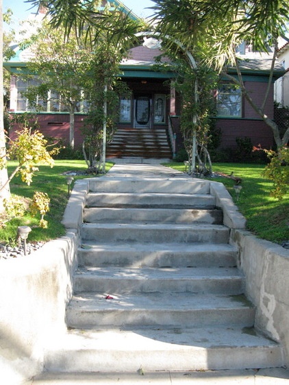
BEFORE: The 1905 cottage was in good shape. “Most of the home’s original details, which I would call post-Victorian and pre-Craftsman, were still intact,” Wertheimer says. “Although the house is historic, it didn’t have landmark status, so we were able to update it without restrictions.”
The home’s original magenta exterior inspired its name, Villa Rosa, which is written on a sign hanging on the entry arbor. “Even though we changed the color of the house,” says Wertheimer, “we kept the arbor and the sign.”
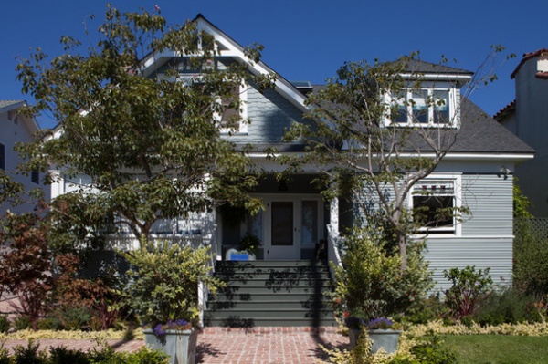
“After” photos by Douglas Hill
AFTER: Landscape designer Mary Effron refreshed the home’s front yard with new plantings and a brick walkway. Wertheimer rebuilt the porch steps and railing. He also chose the new exterior color for its chameleon-like quality. “It’s a grayed blue-green that changes color during the day,” he says.
Exterior paint: Sea Pine, Benjamin Moore; trim paint: Whisper, Dunn-Edwards
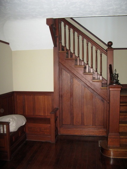
BEFORE: In the entry and throughout the house, most of the home’s original millwork was intact and well maintained, and appealed to both the homeowners and the architect.
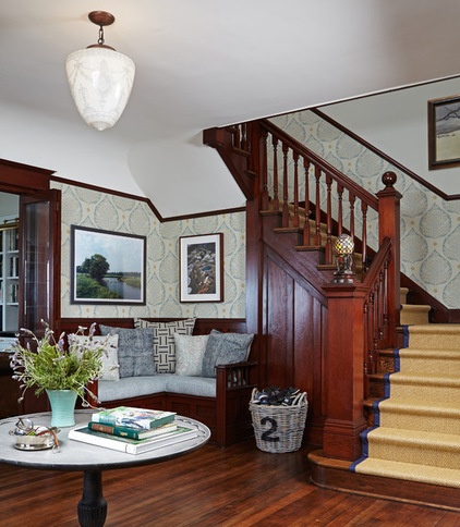
AFTER: The original Douglas fir floors throughout the house were refinished. And on the stairs, the original newel post lamp was restored.
Interior designer Sasha Emerson warmed the interior with a mix of the couple’s existing furnishings, new traditional-style pieces and vintage finds, all done in finishes and fabrics that could withstand the rigors of childhood. For example, a sisal runner on the steps is durable and provides traction for little feet.
Table: Nickey Kehoe; cushions: Acapillow Home Furnishings; wallpaper: Galbraith & Paul
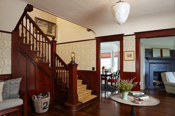
In the entry hall, the stairs lead up to the bedrooms, while the doorways lead to the small living room on the right and the dining room to the left. The ceiling light is an antique find.
Basket: HomeGoods
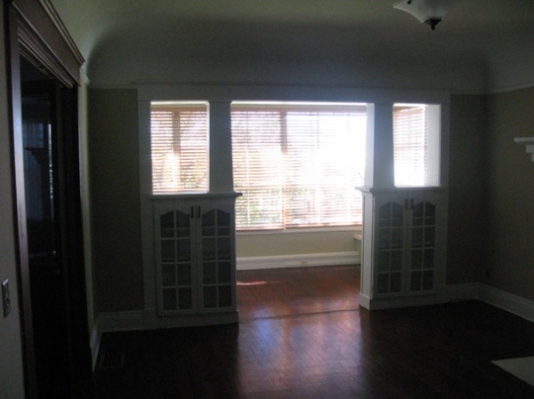
BEFORE: Just off the entry hall, built-in cabinets separate the cozy study from the small sunroom that overlooks the front yard.
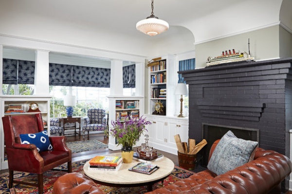
AFTER: The study was updated with a new built-in bookcase to the left of the fireplace, which was repainted a charcoal gray (it was originally white) for visual punch. The light fixture is a vintage find. “The original cove ceilings and built-ins give this house so much architectural character,” Wertheimer says. “Everything new was inspired by what was there.”
Sunroom chairs: HD Buttercup; shade fabric: Hollywood at Home; cushions: Acapillow Home Furnishings
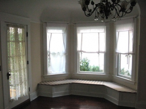
BEFORE: The dining room included a bay window and window seat, but the doorway led to a porch that was too small for any use.
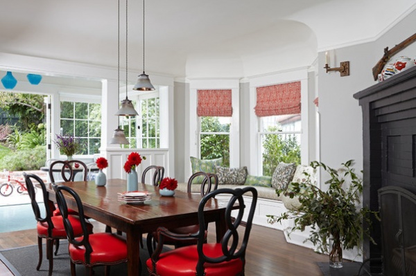
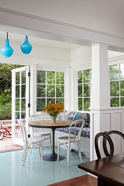
AFTER: The refreshed dining room now opens to a new breakfast room that’s part of the kitchen expansion at the back of the house. The owners’ original chairs were updated with red leather upholstery.
The original small porch was enclosed to become part of the new breakfast room that opens to the back yard. New custom windows and doors work with the home’s 1905 architecture, while the vintage pendants and painted pale turquoise floor are playful touches.
Table: Big Daddy’s Antiques; shade fabric: Raoul Textiles; cushions: Acapillow Home Furnishings
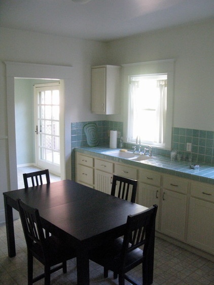
BEFORE: The old kitchen, while obviously updated in recent decades, was inefficient and part of a warren of small rooms at the back of the house that included a full bath and laundry.
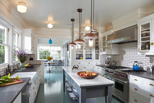
AFTER: Working within the home’s footprint, Wertheimer reorganized the floor plan to create a more expansive kitchen, a new breakfast room, a laundry and a powder room instead of the full bath. He also opened the back of the house to the garden through the use of windows and doors. “This couple loves to cook, so the kitchen had to be the center of the universe,” he says.
Shaker-style custom cabinetry, honed basaltina and marble countertops, and vintage-style pendants add the comfortable patina of age to the new kitchen. The furniture-style island keeps the narrow kitchen from looking cramped.
Range: Wolf; pendant lighting: One Kings Lane; ceiling lights: Rejuvenation
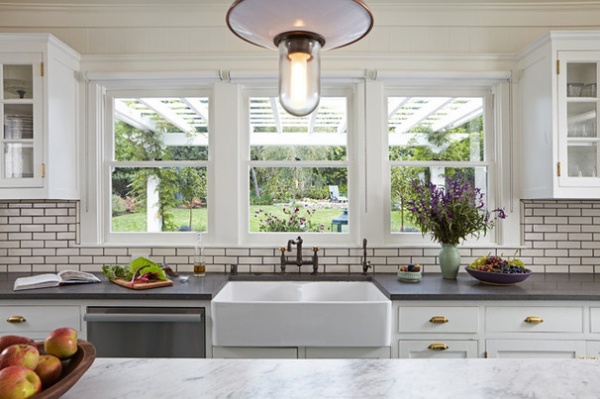
Windows overlook the backyard, which now includes vegetable beds, fruit trees and a chicken coop.
Sink: Franke; faucet: Rohl; tile: Classic Tile & Flooring; cabinetry hardware: Crown City Hardware
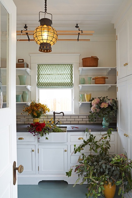
A glass panel in the door keeps the new laundry visually connected to the adjacent kitchen. The small sink handles both hand washables and cut flowers. The Sheila Maid drying rack goes up and down from the ceiling via rope and a pulley.
Sink: Franke; faucet: Rohl; light fixture: Olde Good Things; shade fabric: Hollywood at Home
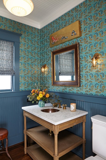
The new powder room sports a narrow, V-groove ceiling treatment and wainscoting, echoing the home’s turn-of-the-century cottage detailing.
Sink pedestal: Restoration Hardware; copper sink and faucet: Waterworks; lighting: Olde Good Things; wallpaper: Schumacher
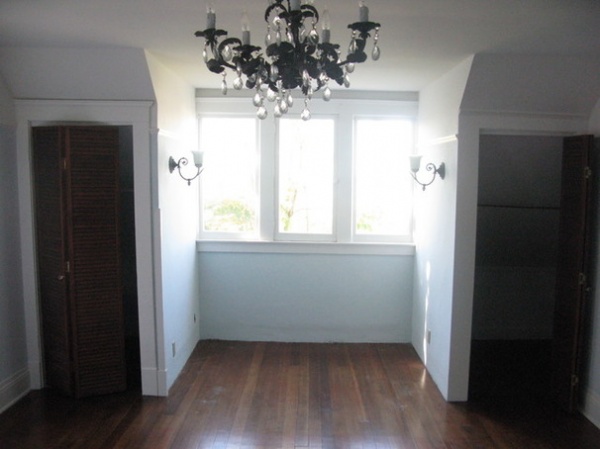
BEFORE: The master bedroom had two small closets that ate up floor space and low ceilings that added to a sense of confinement.
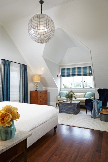
AFTER: Wertheimer raised the ceilings in all three bedrooms, adding a much-needed sense of volume. In the master bedroom, he also removed the two small closets, creating space for a sitting area. The bed and sofa are custom designs.
Chair: HD Buttercup; coffee table: Big Daddy’s Antiques; rug: Serena & Lily; shade fabric: Hollywood at Home; sconces: Olde Good Things; pendant light: Design Mix Furniture
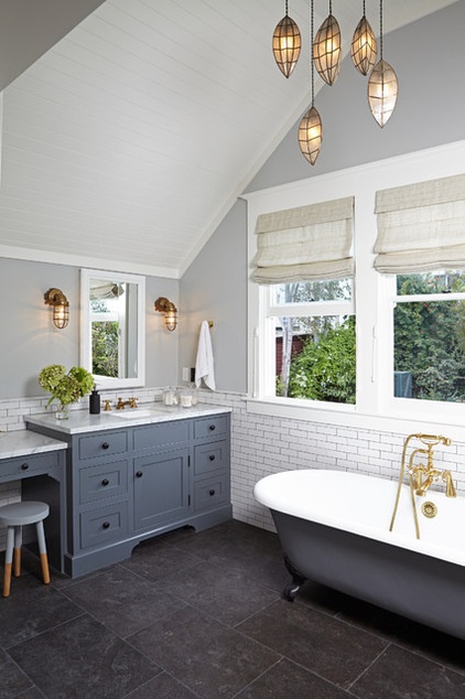
One bathroom originally served the three upstairs bedrooms. The architect persuaded the homeowners to add a master bath and closet, building out above the kitchen.
Period plumbing fixtures, Shaker-style custom cabinetry, marble countertops and blue limestone flooring with a sandblasted finish work together to create a harmonious retreat that overlooks the backyard. The pendants are a vintage find.
Tub: Sunrise Specialty; sink: Kallista Plumbing; faucets: Newport Brass; medicine cabinet: Barbara Barry; wall-mounted light fixtures: Olde Good Things; flooring: Classic Tile & Flooring
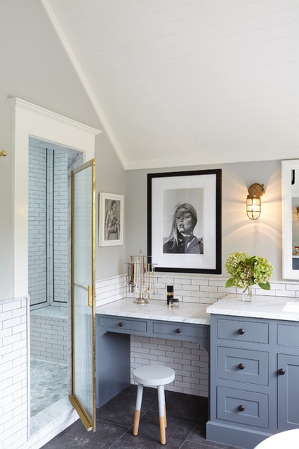
A walk-in shower anchors one end of the new master bath.
Shower door: Met-Tec Shower Enclosures; subway tile: Heath Ceramics
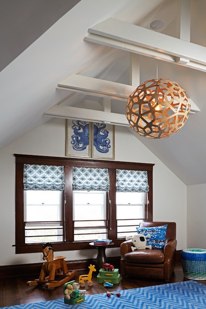
In one of the boys’ bedrooms, raising the ceiling line exposed the rafters, adding volume and architectural interest.
Pendant light: Design Within Reach; rug: Overstock.com; shade fabric: Hollywood at Home
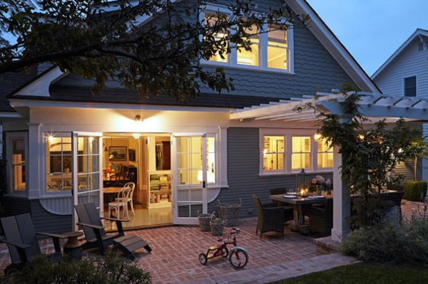
A new gable at the back of the house matches the home’s original architecture and houses the newly built master bath and closet. The pergola and brick patio are also new additions, creating outdoor living and dining areas off the kitchen.
Table: Olde Good Things; dining chairs: Design Mix Furniture
Interior design: Sasha Emerson Design
Landscape design: Mary Effron Landscape Design
Builder: Campbell Contractors, Los Angeles
Browse more homes by style:
Small Homes | Colorful Homes | Eclectic Homes | Modern Homes | Contemporary Homes | Midcentury Homes | Ranch Homes | Traditional Homes | Barn Homes | Townhouses | Apartments | Lofts | Vacation Homes
Related Articles Recommended


