How to Choose the Right Tile Layout
http://decor-ideas.org 02/06/2015 07:13 Decor Ideas
Whether you’re splurging on a rare natural stone or standing by classic porcelain, choosing a tile type is only part of the design decision. The way the tile is installed also matters. To help you figure out the best layout for your kitchen, bathroom and beyond, here are some of the most popular options.
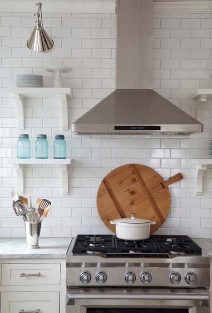
Brick
This is the classic layout for subway tile. In a brick pattern, each row of tiles is typically offset by half a tile width, which results in long, horizontal lines that can subtly widen a room. It’s a timeless layout that can work for any rectangular tile, making it a great option for virtually any space.
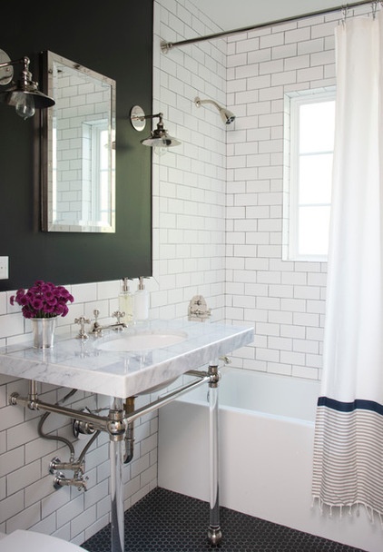
A brick layout can look especially stylish when paired with a contrasting grout color, such as gray grout with white tile, emphasizing the geometric pattern.
Where to use a brick pattern: Anywhere, but especially in spaces where one simple tile is used throughout.
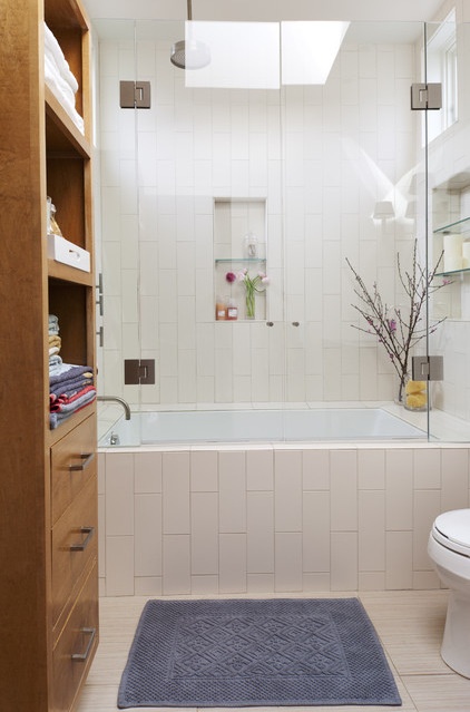
Vertical Brick
Choosing a brick pattern but orienting it vertically takes the widening effect and rotates it, emphasizing the height of a space instead. It also adds a touch of contemporary appeal by being a little unexpected but still classic, for a fun twist that isn’t too trendy.
When to use a vertical brick pattern: To lift the ceiling height, such as in a compact bathroom.
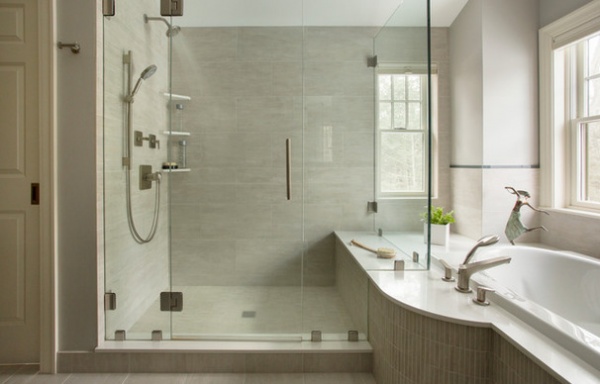
Large Brick
An oversize brick pattern is not technically different from a standard brick, but the effect can be different, especially with rich stone tiles. Here the pattern helps minimize the visual impact of the grout, allowing the tiles to have a more seamless appearance.
When to use a large brick layout: When you want oversize tiles to appear as a continuous plane of stunning unbroken material.
Tip: Use color-matched grout to enhance the effect.
Stacked
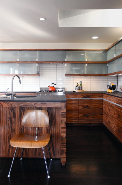
This is the simplest layout. In a stacked pattern, the tiles are aligned to form a basic repeating grid. This results in a modern look that works well with clean shapes and crisp angles, and plays against the organic forms of exotic woods.
Where to use a stacked layout: In a modern space with rectilinear forms, especially with a beveled-edge tile or bright grout, which emphasizes the Zen-like simplicity.
Mosaics
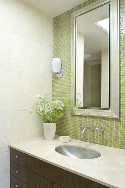
While the word “mosaic” may bring to mind complex forms that create lively patterns and images, in design terms a mosaic is simply any small tile in a repeated shape (or set of shapes), typically attached in small sheets to matting for easy installation. A very common example is a 1-inch by 1-inch square, although endless shapes and patterns are available.
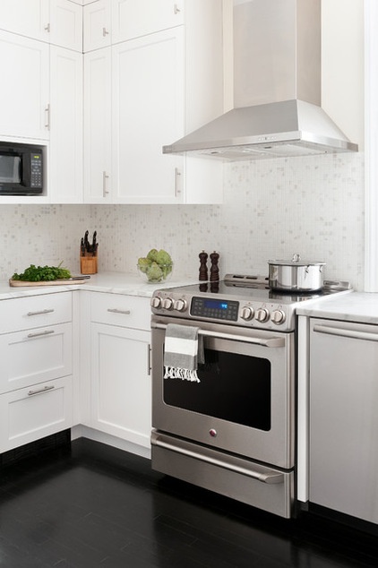
Mosaics are more common for accent areas (rather than full-height walls), because they require more grout. This means they can require more maintenance if exposed to heavy soil or moisture, which can be an issue in mildew-prone bathrooms.
However, they can create a rich and subtle multi-tonal effect that has the appeal of luxe stone without the luxe cost, making them a popular backsplash option.
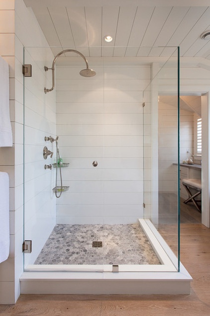
In the case of a shower stall floor, the additional grout can be a benefit, as it helps create a less slippery surface.
In general, mosaic makes a great counterpoint to larger tiles, because the dramatic shift in scale makes the mismatch clearly intentional. (Here a hexagonal mosaic beautifully contrasts oversize Corian planks.)
When to use a mosaic layout: To highlight an accent wall, on a shower floor or lining a niche.
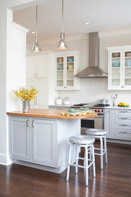
Herringbone
A herringbone pattern is achieved by laying tiles at right angles into zigzag formations or by a preformed mosaic. Either way, the look is sophisticated and has high-end appeal, even with a simple material. However, this pattern will inevitably require additional cutting of tiles at the borders, so it can create some extra material waste.
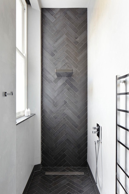
The angular nature of this pattern creates a dynamic energy, which can be perfect for accent walls but a little overwhelming if used on too large a surface.
Where to use a herringbone layout: In a traditional or transitional kitchen (especially in classic white on white), or with a long, thin tile to form a powerful accent anywhere.
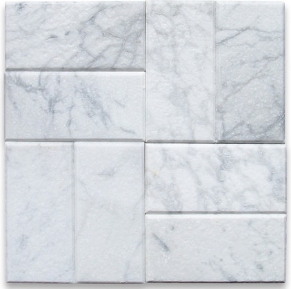
Carrara White Marble Subway Tile - $13.89Basket Weave
Basket-weave and similar patterns that turn subway tiles into square units are effective for adding a sense of drama similar to a herringbone layout, while avoiding the extra cutting of material. In fact, this sort of pattern can potentially avoid any cutting at all when filling a rectangular area, making it a good secret weapon for DIYers.
When to use a basket-weave layout: To add subtle energy to contemporary decor.Buy
Other Considerations
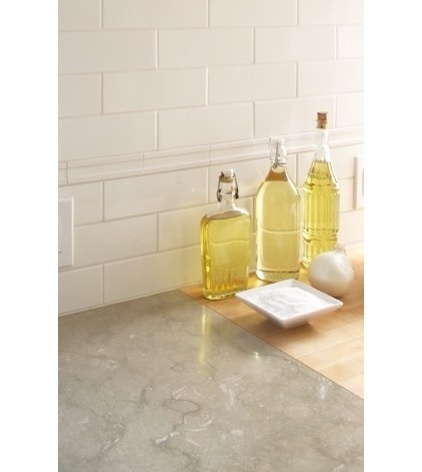
Accent borders. Although a border strip of accent tile can be added purely for visual interest, it can serve another important function beautifully with just a little planning. When tiling a full wall, it’s common to find that the ceiling height is not an exact multiple of the desired tile size, meaning tiles at the top or bottom will have to be cut to fit. By including a slightly wider or narrower stripe, your tiles can add up to the exact height of the wall and avoid costly (and possibly unattractive) cuts.
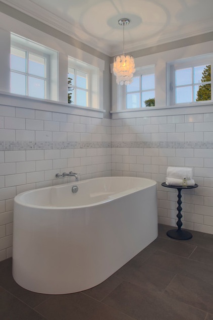
For example, when using a 3-inch-high tile with a 7-foot, 2-inch ceiling, using a 2-inch border at any height will leave a remaining even 7 feet for the tiles to fill perfectly. Of course, grout size can affect the way the tiles stack up, so talk to your designer or installer to figure out the exact math in advance, and you can achieve a perfect result with no headaches.
See how to install tile flawlessly
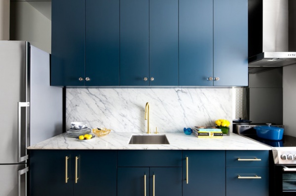
Solid slabs. The opposite of a tile pattern, a single slab is a popular choice for contemporary backsplashes. Although typically more of an investment than patterned tile, a slab can be an excellent choice for compact kitchens where not much material is required. It achieves a very open look and can be created with one single material piece cut to form a matching backsplash and counter.
For a budget-friendlier option, you can also look for off-cut slab pieces to create a short backsplash in a luxe stone, and use a less expensive material for the counter that picks up on the veining tones to coordinate beautifully.
See more stories about tile
Related Articles Recommended


