Houzz Tour: A Home in Sync With Its Surroundings
http://decor-ideas.org 02/05/2015 03:13 Decor Ideas
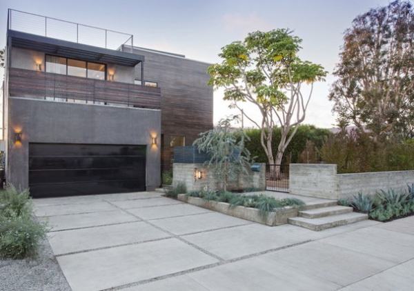
While doing the site planning for this Los Angeles home, Shelby Wood designed around the Schefflera actinophylla — also known as umbrella tree or octopus tree — in the front courtyard. She designed the whole house to interact with the landscape, in fact. Whether via large doors that open up the first floor to the yard, an edible garden next to the kitchen or a breezy balcony off the bedroom, the house blurs the lines between indoors and out.
Photos by Meghan Bob Photography
Houzz at a Glance
Who lives here: A surgeon, his 16-year-old daughter and their dog
Location: Mar Vista neighborhood of Los Angeles
Size: 3,500 square feet (325 square meters); 4 bedrooms, 3½ bathrooms
While doing the site planning, Wood, of Shelby Wood Design, prioritized saving the sculptural tree, which serves as a focal point in the entry courtyard. Thanks to the walls and the growing hopseed bush, this outdoor living space will soon be completely private even though it faces the street.
Wood also believes in making livable the open floor plans people love so much today, incorporating quiet rooms and creating separation between public and private spaces. She softens strong industrial elements with furnishings and warms them with materials like reclaimed wood. While this house began as a spec project, a single father with a teenage daughter recognized how well the home would work for them and scooped it up during construction. The architect worked with them to adjust her original plans to suit the way they live.
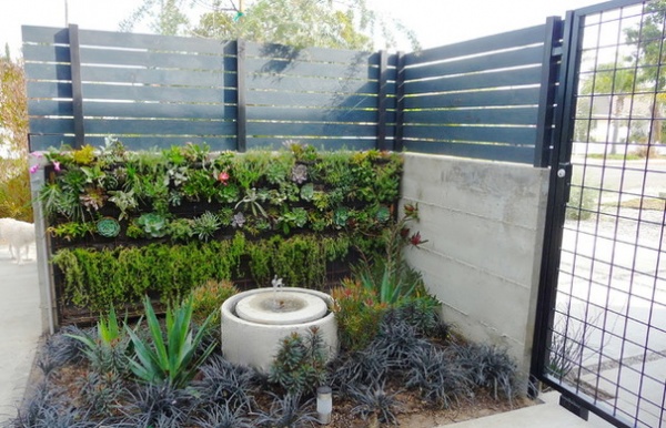
The pleasing splash of this fountain adds a sense of peacefulness to the garden, but almost all of the plantings are drought tolerant, including this living wall of succulents. Poured concrete and a slatted fence tie the walls to the home’s facade, while the blue-green stain on the slats and the concrete pavers used on the ground tie it to the landscape.
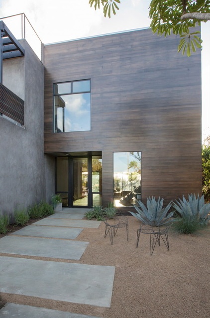
“I designed so you can see through the whole house — backyard to front view,” Wood says. Because of the walls, the way she staggered the entry back from the garage and the plantings, this clear view is private from the street. The front door looks out directly to the vertical garden and fountain.
The facade is composed of stucco and wood planks, punctuated by dramatically large windows.
Front doors: Fleetwood
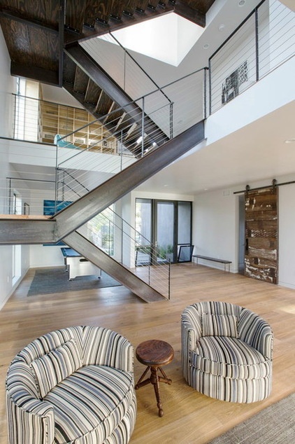
Inside, the industrial-style staircase that occupies the center and goes up three stories to the roof deck is a focal point and one of Wood’s favorite elements in the house. An engineer helped design the structural system, which is hidden in the walls to avoid the need for posts. This keeps the strong diagonal lines of its profile elegantly streamlined.
Wood mixed modern, industrial and vintage furnishings throughout the home, adding warmth and style. These barrel-shaped chairs are vintage; Wood had them re-covered in a striped fabric that picks up on the tones of the staircase.
The reclaimed-wood sliding door on the right leads to a mudroom and storage closet and beyond that to an office. The two doors between the open area and the office give the homeowner a quiet zone for work, or to retreat to when his daughter has friends over.
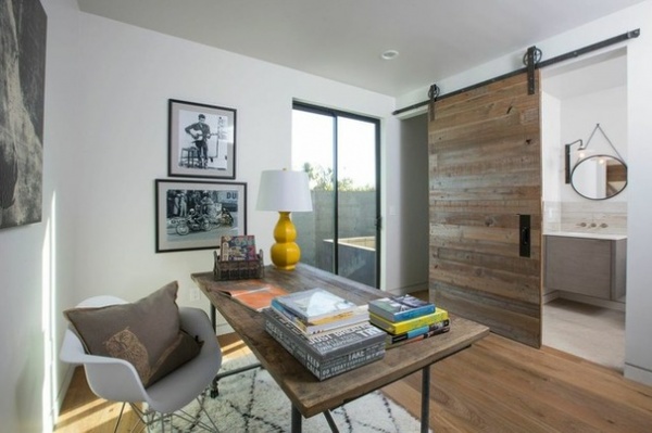
The sliding barn doors in the home were made by local furniture maker Scott Pezzini, who collects barn wood when he goes on surfing trips in Northern California. This one leads to the office bathroom.
The desk has a top that matches the reclaimed-wood look and a new blackened metal base. The classic Eames Shell Chair with an Eiffel base brings in some midcentury modern style, while the Moroccan-style rug softens the room.
Desk: Restoration Hardware
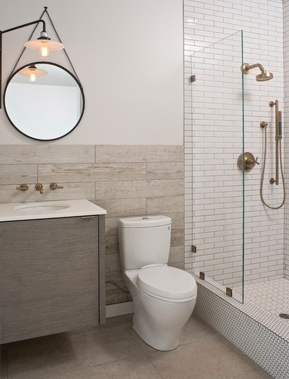
One of the adjustments Wood made to suit the family was adding a sprayer that transforms the shower in the office bathroom into a dog washing station. “There is also a sliding glass door that leads directly outside from the office, so that after the bath, the dog can run right out and roll around in the dirt,” she says with a laugh.
“When people don’t want color in the bathroom, I love to have a lot of fun with different tiles,” she says. “I love to mix my tiles, and have the most amazing tile installer that allows me to push the limits.” In here she used mini subway, long wood-like planks, hex tile and penny tile. The floor is concrete. “The key to giving such a mix a clean look is not to use accents and border details,” she says. The varying neutral tones add depth, while the gold-bronze faucet finishes add color and shine.
This office suite adds to the versatility of the home. For another family it could serve as a first-floor bedroom with its own bathroom.
Swing-arm lamp: Restoration Hardware; faucets: Kohler
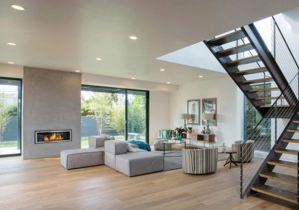
Wood placed a second industrial focal point in the center of the back wall — a fireplace finished in smooth concrete. This way the dining room, living room, kitchen, upstairs library and even the front courtyard can enjoy a view of it. Large Fleetwood doors flank it and blur the lines between indoors and out.
Sofa: Bryght
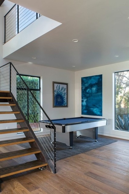
The stairs help delineate a game room area. The table’s bright blue felt picks up on the colors in the artwork.
Woods used stained heavy-duty plywood treads on the stairs to provide contrast with the wide-plank oak flooring. The steel adds a big dose of industrial style, while the stainless cable rails keep the focus on the stringers’ strong diagonal lines.
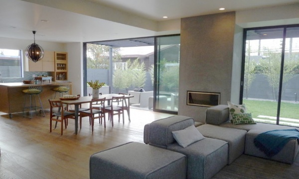
The fireplace and the glass doors help define different areas in the open plan.
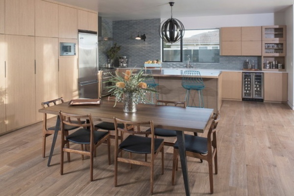
The new dining table has an industrial distressed black iron base; the chairs are vintage Danish modern. Thin quartz countertops add to the very clean-lined look of the kitchen.
The streamlined storage cabinets are plywood with thin light oak veneers. Each of the four tall cabinets on the left is outfitted inside for a specific purpose. On the left is a broom, vacuum and cleaning supplies cabinet. To its right is a cabinet for dog-related and bulk items; then there’s a cabinet for food and one for smaller appliances. On the right side of the kitchen is a built-in bar and wine refrigerator, well placed for parties. The bar cabinet has chicken wire glass, which adds an industrial element.
A-Leg Large Dining Table: HD Buttercup
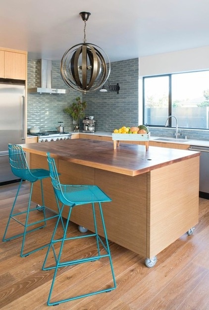
“I designed the kitchen with lots of storage and open to the backyard for those beautiful California days,” Wood says. The solid walnut-topped island is the room’s centerpiece.
Lucy Counter Stool: Bend Goods; light fixture: Noir
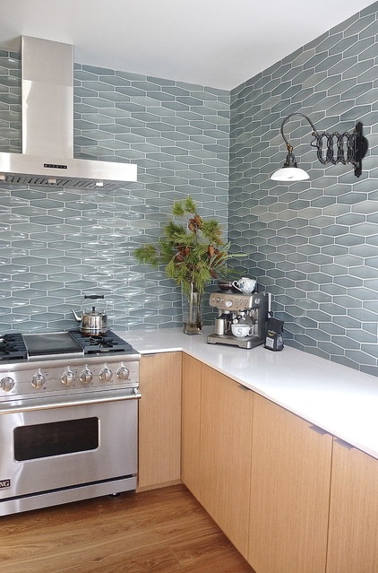
Beautiful watery tiles from iconic California company Heath Ceramics extend to the ceiling.
Tile: Dimensional Diamond in New Crystal Blue, Heath Ceramics; light fixture: Restoration Hardware; appliances: Viking; 1950s Factory Scissor Sconce: Restoration Hardware
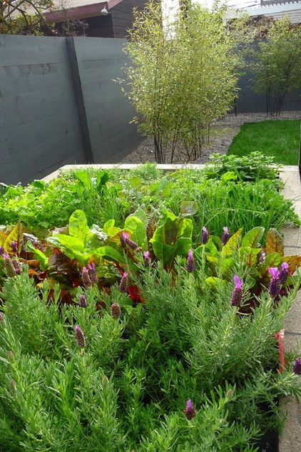
Perhaps the most productive part of the kitchen is actually in the backyard — it’s a raised organic edible garden bed. “You can go right out and get mint for your juleps, lavender for the bath and chamomile for tea — you can’t get any fresher than that!” Wood says. She also planted basil, rosemary, two types of kale and tomatoes. Because it’s raised, the garden saves the owners from a lot of bending over.
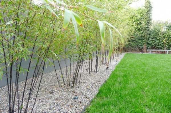
Except for the grass the dog needs, the landscaping is drought tolerant. Black bamboo adds lush texture, privacy and noise insulation. “Black bamboo is not as invasive and water hungry as other bamboos,” Wood says.
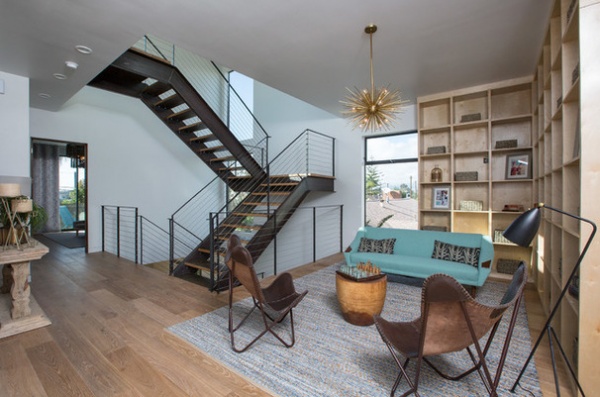
Upstairs, a library lounge space provides a common area for gathering, reading, visiting and watching movies. It also adds privacy; Wood placed the master bedroom on one side of the library and the other two bedrooms on the other side.
A Sputnik chandelier, butterfly chairs and a vintage Danish sofa add a loungey midcentury modern vibe. A birch grid of shelves wraps the corner.
Zanadoo Chandelier: Arteriors
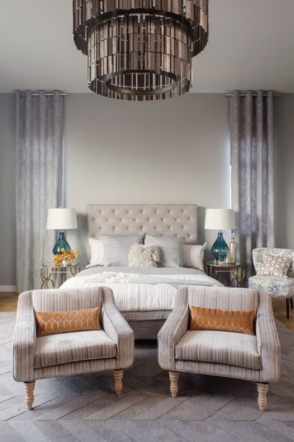
A large tiered chandelier serves as a dramatic focal point in the master bedroom. Floor-to-ceiling drapery panels, a gray chevron rug and a tufted headboard add softness. Hues of gray and cream are soothing, while blue-green glass lamps add dashes of color. The chairs are vintage; Wood had them re-covered in a striped fabric that picks up on all the neutral tones she used in the room.
Bedding: Restoration Hardware; headboard: custom; chandelier: One Kings Lane (Woods removed one of the original three tiers)
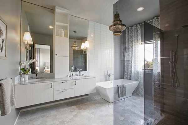
In the master bathroom, the monochromatic scheme is calming. Dark gray glass gives the shower definition without blocking the view. The chandelier, glass-tiled wall behind the bathtub and tall center cabinet and mirrors emphasize the 10-foot height of the ceilings. A long, cantilevered custom vanity counteracts all the verticality. Six-inch hexagonal tiles on the floor suit the scale of the room, while glass rectangular tiles reflect the light. The wooden beaded chandelier adds a contrasting warm touch overhead.
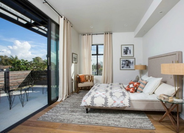
The guest room extends outdoors, thanks to large glass doors and a balcony. The area rug, long drapes and high headboard help balance the proportions of the long, narrow room. The occasional chair in the corner and the mix of patterned pillows add a groovy California vibe.
Lamps: Arteriors; bedspread, rug: West Elm
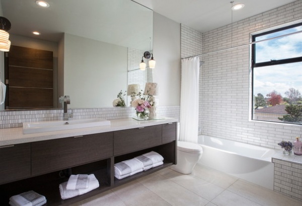
Once again, Woods played with different proportions on the tiles, from the large rectangles on the floor to the thin subway tiles surrounding the tub shower, to the tiny backsplash tiles with a staccato rhythm.
In the mirror you can spy the walnut door with metal strip accents. With the exception of the three reclaimed-wood doors downstairs, Woods used these as interior doors throughout the house.
Tile to the ceiling, a cantilevered vanity and an expansive mirror add a luxurious, spacious feeling. The first mirror did break, but fingers crossed with this one — so far, so good.
Sconces: Schoolhouse Electric; tile: Ann Sacks
Architecture: Shelby Wood Design
Contractor (including landscaping): Santiago Gonzales, Southland Building and Remodel
Browse more homes by style:
Small Homes | Colorful Homes | Eclectic Homes | Modern Homes | Contemporary Homes | Midcentury Homes | Ranch Homes | Traditional Homes | Barn Homes | Townhouses | Apartments | Lofts | Vacation Homes
Related Articles Recommended


