A Living Room Miracle With $1,000 and a Little Help from Houzzers
http://decor-ideas.org 02/03/2015 01:13 Decor Ideas
Kimberlee Dray hung her new custom draperies in her living room and stood back to admire them. But something was wrong. Not with the draperies themselves. As a hobby seamstress, she had used high-quality textiles and sewn them just the way she wanted. Rather, it was the way the draperies now called attention to the rest of the space. “Those draperies highlighted and enhanced everything else that wasn’t right in the room,” she says.

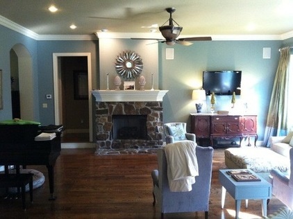
BEFORE: The addition of the fabric made her realize that she had two competing focal points: a fireplace and a TV (shown here). She tried to overcompensate with accessories but fell into a repetitive symmetry trap. “There was two of everything — two lamps, two moss things, two artichokes,” says the mother of four children. And she had tried different furniture arrangements, but nothing seemed to work. “It was like the ship was sinking with all the furniture on one end of the room,” she describes.
Stumped and frustrated, she sought advice. “Sometimes you need to get a viewpoint from others to get out of a rut,” she says. She posted photos of her living room conundrum in Houzz’s Design Dilemma forum and waited for people to come to the rescue. And they did.
Houzzers posted more than 130 comments with suggestions for Dray. “I was so overjoyed,” she says. “These people were so articulate about exactly what I needed to do to make some changes right away. And it wasn’t anything that was going to cost me an arm and a leg. It was mostly based on excellent design principles that I wasn’t paying attention to.”

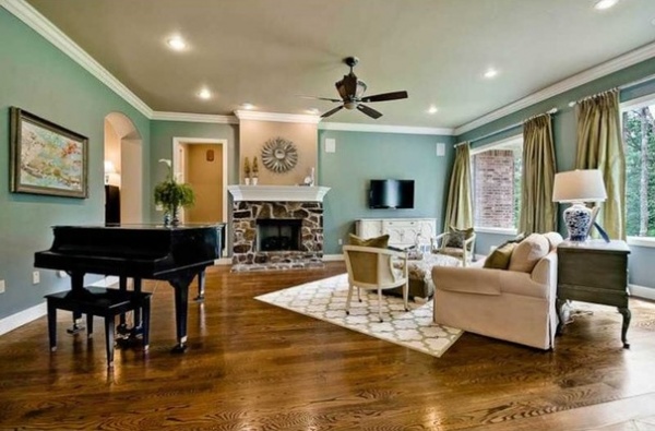
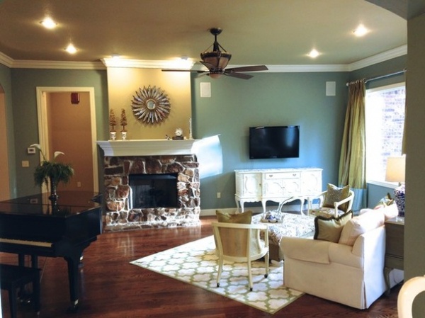
AFTER: Dray got to work trying out many of the suggestions posted by users. The most useful improvement was painting the fireplace wall a different color than the rest of the room. “It made all the difference,” she says of the brown color she used to match the wall with the ceiling. “It gave the fireplace the prominence I was looking for.”
From there she moved the TV down to no more than 6 inches above the buffet, another useful suggestion from the community. “I realized before it was kind of floating in space and wasn’t related to the buffet,” she says. “It was an easy fix that made a huge difference.”

Then, at the suggestion of Houzz user Nancy Travisinteriors, she pared down her accessories on the mantel and buffet. She also painted the buffet white. While Dray recognizes that some people are against painting wood, she wanted the buffet to match the trim so it wouldn’t compete for attention so much.
With the fireplace wall and TV wall now somewhat balanced, Dray turned her attention to the furniture placement, which seemed to bring back the issue of competing focal points all over again.
She tried many suggestions given by Houzzers. Two chairs in front of the fireplace felt too crowded, as did two chairs by the windows. It wasn’t until she tried a user’s suggestion of angling the sofa and swapping out a few club chairs for armchairs that she finally solved the puzzle. Now the seating arrangement is balanced between the fireplace and TV and doesn’t tip the room to one side.
Buffet paint: Mayonnaise, Benjamin Moore; wall paint: Singing in the Rain, Hirshfield’s; rug: HomeGoods

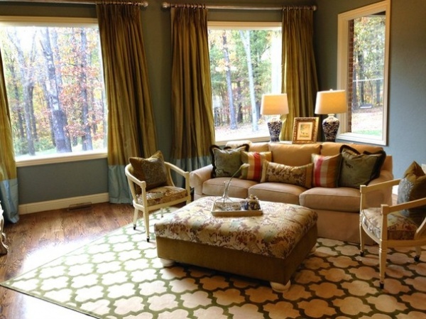
She bought a new rug to anchor the sofa and chairs, which she upholstered herself. She also made custom pillows to bring in a bit of color, another suggestion from the Houzz community. “Sometimes you try to tackle the trees without looking at the forest,” Dray says. “The people of Houzz helped me see that forest again.”
Here’s the budget breakdown for Dray’s project:
Rug: $425
Buffet paint: $30
Chairs and fabric: $150
Custom pillows: $150 (about $30 each)
Share it: Have a decorating challenge you need help with? Post your own design dilemma now!
See more “before and after” projects
Related Articles Recommended


