Design Workshop: How to Borrow Light
In 1915 the 38-story Equitable Building in New York City was the largest office building in the world. Containing 1.2 million square feet of office space, it consumed nearly every available square foot of its diminutive lot and cast an equally large shadow on its neighborhood in lower Manhattan. Its construction inspired the enactment of the city’s 1916 Zoning Resolution, which was designed to preserve access to light and air at the street level. The resolution prescribed specific limitations for a building’s envelope — its outer walls — and would go on to shape the stepped forms that you see today on many of the iconic towers in the city.
This underscores the importance that access to daylight had in shaping even the largest of cities, the individual buildings that make up those cities and, more broadly, sensible building design. With an increasing focus on sustainable design practices, the smart use of natural daylight in our homes is no longer a luxury — it has become a necessity. At the heart of any good daylighting strategy is a concept of “borrowed” light: the capture of light falling on the exterior of a home and transporting it to the spaces where it’s needed.
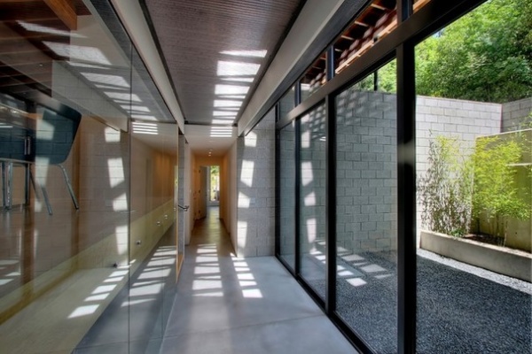
The sun delivers an incredible amount of light energy to us each day. To get an idea of just how much, it helps to understand the standard by which we use to measure light intensity: the foot-candle. The light from a full moon is roughly 1 foot-candle, while the sun’s illuminance on a cloudless day is roughly 10,000 foot-candles. Of course, clouds and the filtering effects of glass can reduce the actual amount of light that reaches the interiors of our homes by 50 to 90 percent. But 1,000 to 5,000 foot-candles is still an amazing amount of light, given that we need only around 35 foot-candles to comfortably read by.
Harnessing this light energy isn’t as simple as placing a window on an exterior wall. Interior rooms without access to an exterior wall or spaces oriented in a way that restricts access to adequate daylight are common problems, each with a unique solution. Here’s a look at some solutions.
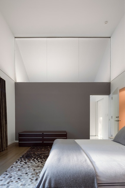
Walls. Interior walls built to collect and disperse light rather than restrict it are one solution. The wall shown here gathers indirect light from an adjacent light-filled bathroom and capitalizes on the reflective nature of the bath’s wall surfaces to diffuse it into the bedroom. Clear glass will transmit the greatest amount of light into adjacent spaces. And because the glass here is positioned above eye level, the bath remains private and sound-isolated.
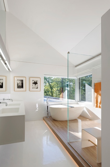
The white walls of the same bathroom act as the indirect light source for the nearby bedroom. Bright, neutral colors work well for an indirect borrowed-lighting strategy.
Good solar exposure is borrowed by the bedroom simply via the glazed upper wall.
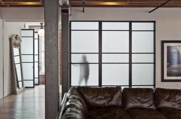
Because translucent materials reflect, absorb and scatter light, they make great walls for borrowing light. The degree of translucency will affect just how much light is scattered. The effect is similar to obscuring direct sight but preserving the passage of daylight. Diffused light is comfortable and limits eyestrain.
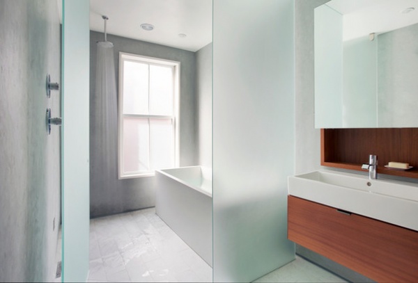
Translucency can be achieved in a variety of ways. Glass can be sandblasted or acid etched. It can also be textured or laminated. With laminated glass, a plastic interlayer lends a translucent effect similar to that created by sandblasting but without the marking characteristics. There are applied films to consider too.
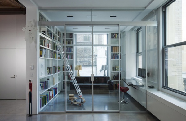
Full-height glass walls offer auditory but not visual privacy. When there’s limited access to exterior window space, they’re an obvious choice.
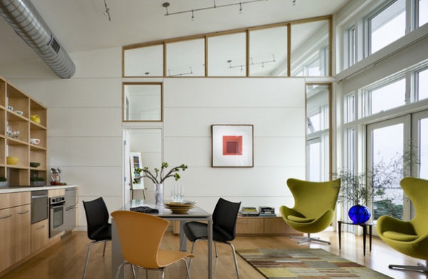
The perceived dimensions of our rooms are naturally increased when we use the borrowed-light concept too. This means it works particularly well for spaces with floor-area constraints.
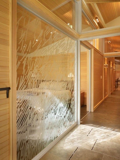
In this project the concept of borrowed light has been applied to the overall ordering system in place. There’s a logic to the order of solid and void, and it offers plenty of light to the bedroom space. The pattern on the glazed wall has been achieved with a custom film; the design was created from a sketch by the architect.
The vaulted ceiling and clerestory take advantage of reflected light from the entire volume of space.
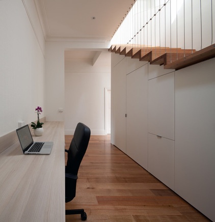
Stairs. Another option and an efficient vehicle for borrowing light in a home is the stairway. It’s a natural conduit for illuminating an often light-starved lower level. If the stair can be positioned to capture and reflect light from above by either fully glazing it or using a skylight, it’s even more effective.
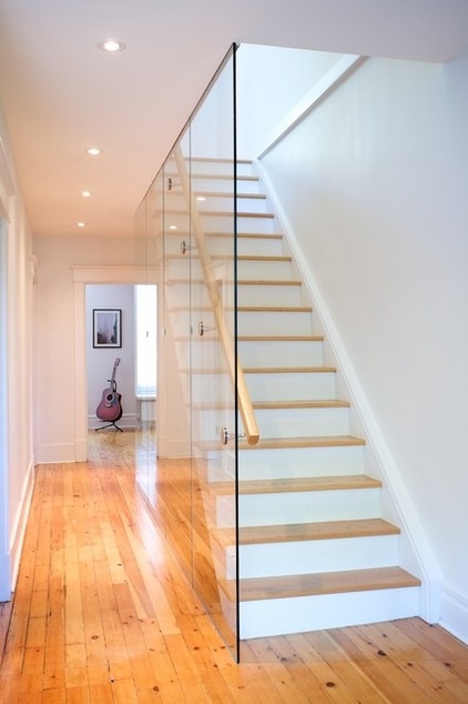
The combination of glass guard and white walls has made this stairway a light source for the surrounding rooms. A solid wall used here would have changed this space dramatically.
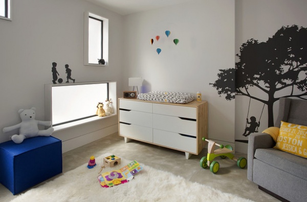
Interior windows. Whether they’re clear or frosted, there are plenty of functional incentives to borrow light using interior windows. The ones here bring in light from the adjacent living area while preserving the nursery’s acoustical privacy.
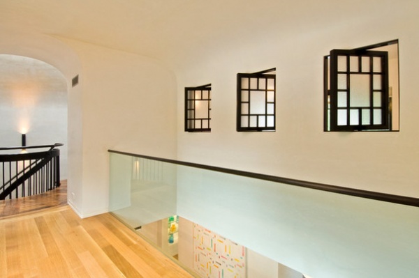
Interior windows aren’t subject to the same weathering and insulation restrictions as exterior windows, so they’re less expensive to buy and install. Making them operable, especially in a stairwell where natural convective flow is greatest, can help to passively ventilate a space too.
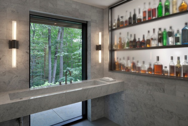
Functional reasons aside, interior windows can offer unexpected delight. Why connect a bar and a powder room? I don’t have a good reason, but I don’t need one. I love the idea that the powder room will look different based on what’s on the top shelf and the time of day. In the bar too, the differences that the powder room renders to its backsplash can be appreciated. It’s these connections that make architecture interesting. Linking spaces doesn’t always have to make sense, functionally or otherwise.
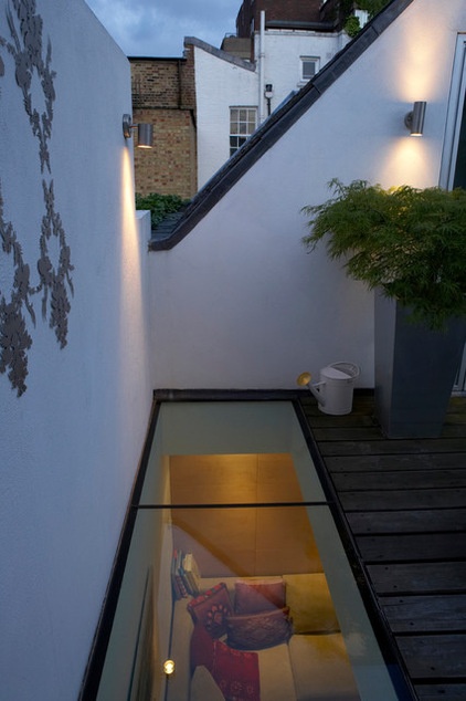
Skylights. Because the sky dome above is a giant light source, it’s hard to find a more efficient means for borrowing light here than the skylight. On tight urban lots, a skylight can be used in conjunction with an interior atrium or light well and be surrounded by reflective walls to increase its efficiency.
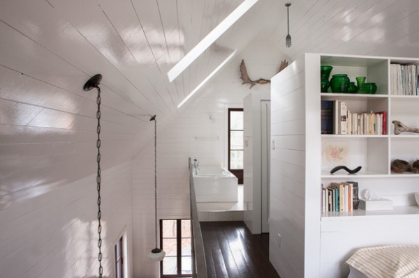
This project utilizes a light well of sorts, allowing the lower level to borrow light from the upper skylights. The second floor hovers in the space instead of being extended to the full width of the gable, and the overall effect is lighter and brighter. The more we open up our interior spaces, the easier it becomes to bounce daylight around from areas with good solar exposure to areas with poor exposure. Painting the surfaces with a higher-sheen paint further helps distribute the light.
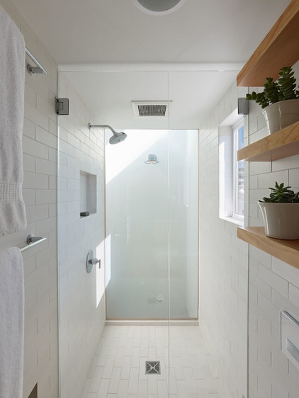
This luminous shower is an example of how a light well and skylight can transform a tight space into a pleasant one.
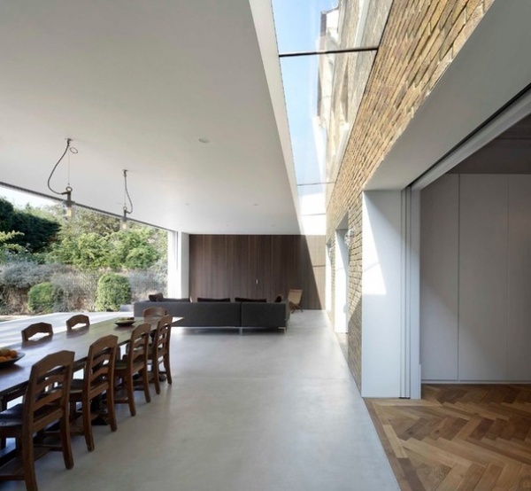
Additions to existing structures often compromise the amount of daylight the original building receives. Not here, though. The skylight ensures that the existing home borrows daylight at its perimeter.
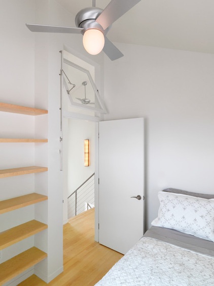
Transoms. Similar in concept to the ideas seen in the first images in this story, a glass transom extends the dimension of a space and introduces light to a room without compromising its privacy.
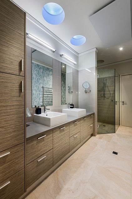
Light tubes. Simple-technology solar tubes channel light to where it’s needed using highly reflective, flexible tubes. They’re especially effective in private spaces or spaces where a lot of glass isn’t desirable.
How to Add a Skylight or Light Tube
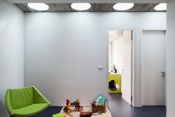
Although short tubes are used in this project, the concept is similar. Six large tubes light this otherwise dark space, a bold and considered element. The choice of multiple solar tubes rather than a single one not only feels more intentional, but as you can see, it’s also exceptionally functional. A grouping of three is usually a good starting point, but the more, the better.
More: Design Workshop: Just a Sliver (of Window), Please


