Two Homes Focus on Community
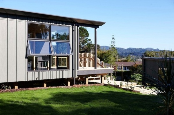
Community housing often gets a bad rap for being poorly designed and a blot on the urban landscape. These two modest, ecofriendly homes, by Strachan Group Architects, sit on a shared site west of Auckland, New Zealand, and defy that stereotype. Designed by a team of architecture students under the guidance of Dave Strachan, a former builder and now award-winning architect, the homes incorporate elements of green design but go a step further by embracing the idea of village living.
“I’m a bit of an idealist, and I haven’t lost the utopian dream of ‘architecture for the people’ that was instilled in me in my university days,” says Strachan. The two houses were built for a community trust, a nonprofit group offering supported care for low-income families. They were designed not only to function well but also to foster a sense of neighborliness. “They are positioned so that from the living room, the occupants of one home can see the comings and goings of the other, rather than having a complete focus on privacy,” he says.
Houzz at a Glance
Location: Henderson, West Auckland, New Zealand
Size: Each 4-bedroom home is 1,120 square feet (104 square meters); each 2-bedroom home is 700 square feet (65 square meters).
That’s interesting: The architects embraced cool-store technology (usually used in warehouses where bulk frozen foods are housed) when searching for a roofing material that was budget friendly and offered superb insulation. They used structural insulated panels (SIPs), in which a thick layer of insulation is sandwiched between steel panels.
With views over the bush-clad hills of the Waitakere Ranges, the homes were designed and built by a team of third- and fourth-year architecture students (called Studio 19) in 2014. They were constructed for $1,400 per square meter.
“I’ve tried to prove to ourselves and to others that architects can work at both ends of the economic scale. The principles are the same, but you do need to be much smarter and more careful with a smaller budget,” says lead architect Strachan.
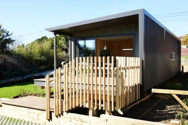
The SIP roof provides two functions for the price of one, in that it contains the insulation material (sandwiched between sheets of metal) required to make the home warm and cozy. The home also has SIP exterior walls, in which particleboard replaces the metal. “As far as we know, it is the first time in Auckland that a home has used these type of walls,” says Strachan. The railings that surround the front deck echo a cultural element in that they are reminiscent of the battens used around a Maori pa, or hill fort.
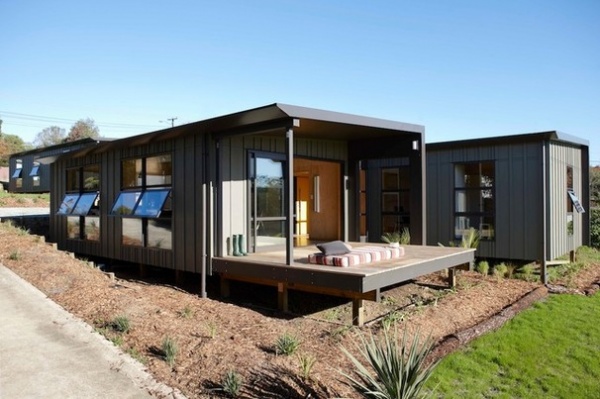
A substantial overhang shields the living room from the harsh summer sun and also provides a covered deck so the occupants can sit outside. The board and batten ply cladding is quintessentially Kiwi.
The homes were prefabricated offsite and then transported to the site. “Then we connected the dwellings to the piles and the services. A neighbor couldn’t believe that they went up in two to three weeks,” says Strachan.
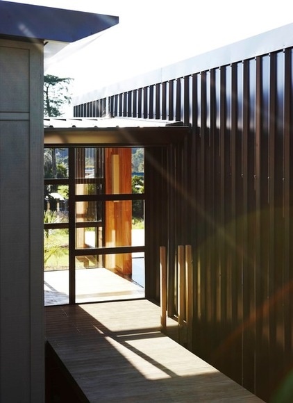
Sunlight floods the entrance hall, which creates a sense of arrival. It is a transparent link between the more solid forms of the living area and bedrooms, and allows views of the surrounding hills to flood into the home, which makes it feel more at one with the elements.
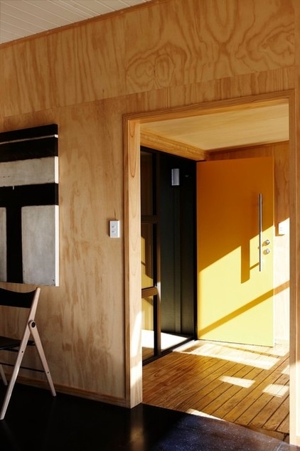
There was room for a bit of fun in the design, with a bright orange front door providing a welcome shot of color. The bigger house is accessed via a boardwalk that leads to an entrance hall (seen here), a glassed pavilion that links the living area to the bedroom zone. It also completely separates the cooking and bathing functions, which is so important in some cultures. The “T” artwork is in keeping with the contemporary simplicity of the decor and is by Donna North.
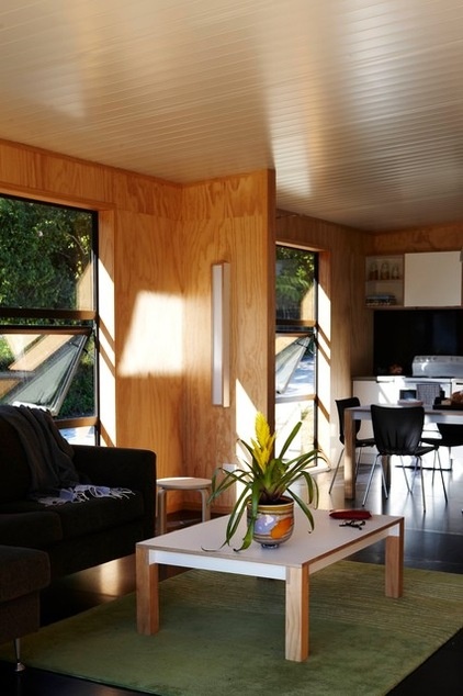
Low-formaldehyde pine plywood wall linings bring warmth and texture to the interiors. “New Zealand pine is sustainable, because we just keep growing the stuff,” says Strachan.
The architects ensured the houses had plenty of passive ventilation by using fixed-sash vent windows to control the fresh-air supply without jeopardizing security.
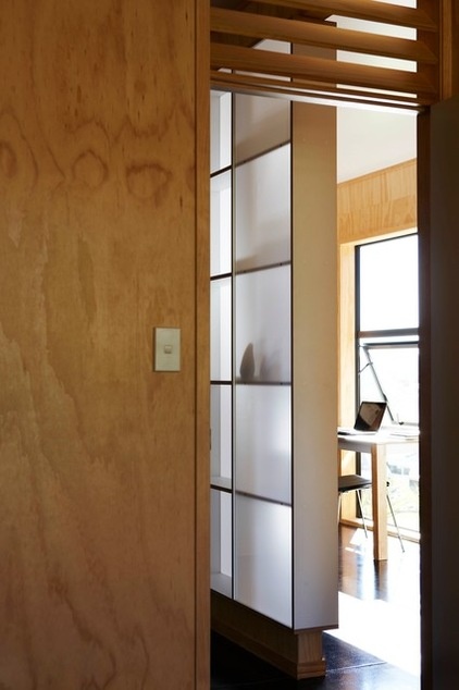
Including an area for study in each home was imperative. “It’s pretty simple, really — if there’s nowhere to study, kids won’t study,” says Strachan. The divider with Perspex screening features cubbyholes that can be accessed from both sides. “It was made by one student with a CNC router and slots together like a jigsaw puzzle,” Strachan describes.
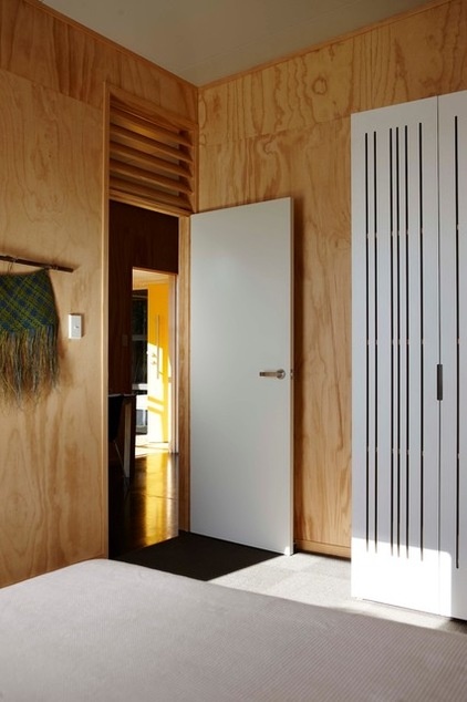
Internal louvers above the doors allow good airflow, and the architects also included trickle vents in the design for this purpose. Although the houses of both sizes have a relatively small footprint, they are well planned, with little wasted space (for example, there are no corridors) and high ceilings, which lends a feeling of spaciousness.
The floors are concrete to create a thermal mass that traps heat during the day and slowly releases it into the home during the cool evening.
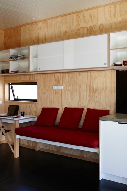
Built-in furniture, such as this banquette seat, desk and cabinetry provide the essentials for day-to-day living but also act as space savers within the small footprint of the houses.
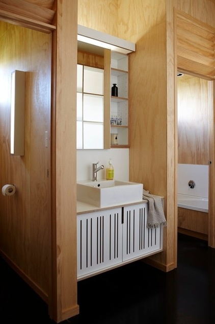
Even though there are four bedrooms in the bigger home, there is only one bathroom — a planning issue that could have caused chaos in the mornings. The architects circumvented daily delays by locating the sink separate from the main part of the bathroom. The toilet is alongside.
Although keeping a tight rein on the purse strings meant the materials used were mainly utilitarian, with little ornamentation, the students who helped to build this house added decorative cutout design details to the bathroom cabinetry using a CNC router.
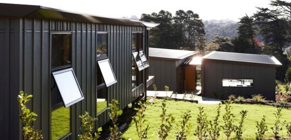
The two-bedroom is positioned in a neighborly fashion overlooking its bigger relative. “It’s a deliberate move away from an insular attitude and embraces the idea that we should all be looking out for each other,” says Strachan. The tenants report that they are enjoying the sense of community. They have installed a garden box to grow vegetables; they also recycle the kitchen water and are looking into ways to reduce food waste by worm farming or making compost.
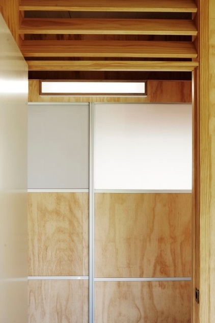
Making the spaces light-filled was a core element of the plan, and was accomplished in part by incorporating a high stud and using Scandinavian-style pale woods and translucent Perspex for screening.
Read more stories about green design


