Kitchen of the Week: Modern Update for a Midcentury Gem
http://decor-ideas.org 01/31/2015 00:13 Decor Ideas
“Decorate all you want, but it’s important to live in a space for a while before a major renovation so that you can figure out exactly what you need,” advises interior designer Debra Szidon. After moving from the Boston area to the East Bay area near San Francisco, she and her family got to know their house for about a year before they began construction, tweaking plans and figuring out how to make the cramped space functional for their family. They also prioritized honoring their home’s pedigree — the midcentury modern gem was designed by architect Fred Langhorst, who trained with Frank Lloyd Wright. “We needed modern functionality for our family but wanted to do it in a way that respected the original architecture,” she says.
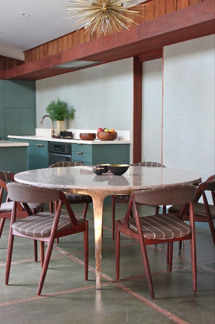
Kitchen at a Glance
Who lives here: Debra and Alex Szidon and their 3 children
Location: Lafayette, California
Size: About 300 square feet (28 square meters)
Szidon did make one big architectural change, and that was to remove a dividing wall that cramped the kitchen. The redwood valances and paneling and the concrete floors are original to the home. Szidon was careful to preserve and reuse as much of the original wood as possible during the renovations; only a few spots needed new fill-in pieces.
A new table imported from Australia gives the family a place to gather for meals. Its brass legs play off the light fixture overhead, while the marble top adds elegance. The dining chairs nod to the home’s midcentury vintage.
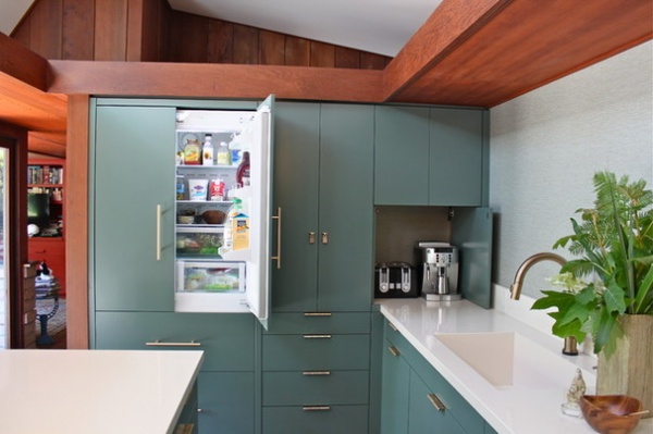
A recent remodel of the kitchen hadn’t produced a very functional space. A dividing wall cramped and darkened the room, and the kitchen had a variety of counter heights. Not only did the family want the kitchen to better fit the home’s midcentury modern architecture, but they also wanted it to be more welcoming, as the main entry to the home opens right into it.
“It needed to be functional but not scream kitchen,” Szidon says. Thus, there are no upper cabinets over the countertop, the refrigerator and dishwasher are completely hidden by panel fronts, and the countertop appliances are tucked away into a garage for a clear, seamless look.
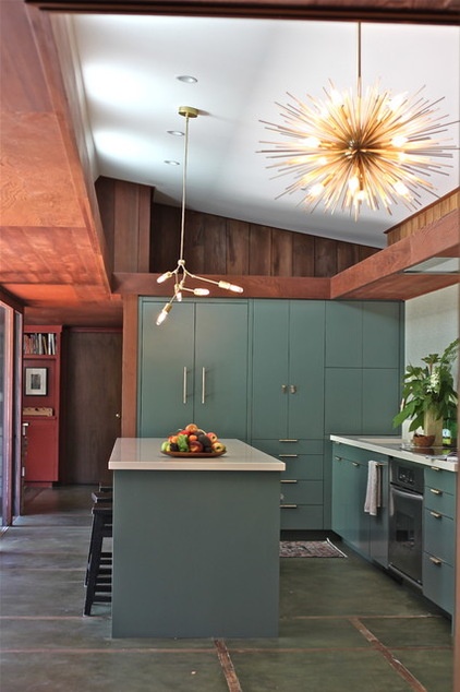
Here is a photo without the table in it, which gives you a better look at the concrete floors. They are original to the house. Szidon had them refinished after the old walls and cabinets came down. Matching the new finish to the original green hue was painstaking but worth the effort.
Chandelier: Astra, Anthropologie
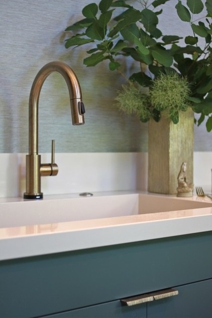
The wall covering has the look of textured grass cloth, something that would have been popular during the period in which the house was built. However, it is vinyl, which stands up to any spills or splashes the family throws at it — it can be wiped down with ease.
The sink is integrated into the quartz countertop, and Szidon had it made as big and deep as possible. “I can’t stand leaving things out on the counter,” she says. With such a deep sink, the couple can drop dirty dishes out of view and get back to the party.
Wallpaper: Maya Romanoff; faucet: Champagne Bronze finish, Delta; countertops: Haiku, Silestone
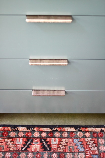
The hardware, faucets and light fixtures are a mixture of warm brass and bronze. While their finishes and textures vary, they are all a similar color. These textured drawer pulls are bronze that has a brass look. They were designed by San Francisco artisan Ted Boerner for Rocky Mountain Hardware.
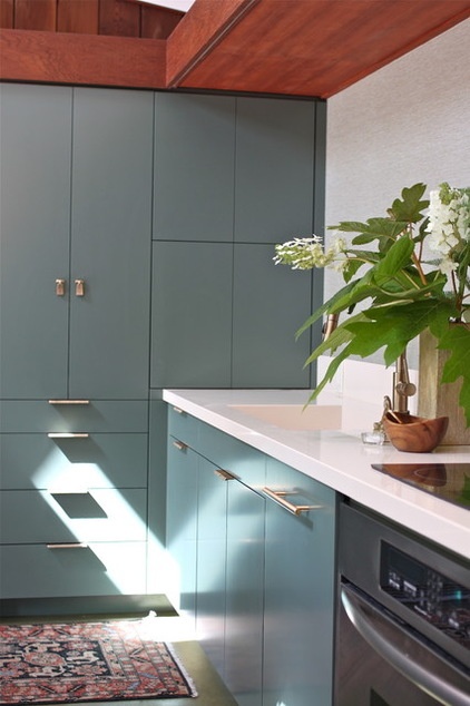
Szidon chose green cabinets with a bluish tint to cool down the home’s warm wood tones. The cabinets are painted with a conversion solution that is sprayed on and resembles laminate when dry. Like the vinyl wallpaper, this paint can stand up to the usual kitchen abuse.
Cabinet paint: Caldwell Green, Benjamin Moore
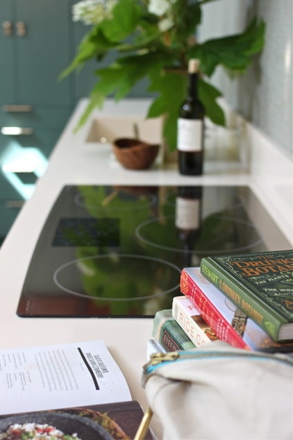
The designer-homeowner can’t say enough about her mirror-top induction stove. “It boils water in about three seconds, and the top is instantly cool when you turn it off,” she says. (This is especially useful with little ones around, particularly in kitchens where the stovetop is on the island.)
Induction stove: 36-inch Monogram, GE
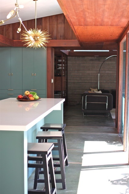
“Because we don’t have upper cabinets, we needed a lot of storage in the island,” Szidon says. The island has seating on one side and garbage-recycling plus dish and glass storage on the other. Deep drawers that hold the dishes and glasses are conveniently located across from the dishwasher. They are also low enough for the kids to be able to grab their own cups and plates.
The lighting choices are fresh takes on midcentury design. The Astra chandelier is from Anthropologie, and Szidon’s husband put together the other fixture himself with Lindsay Adelman’s DIY guide (the fixture is now available as a kit you can buy).
Szidon created a kitchen that functions well for the whole family, adding the updated elements they needed while remaining true to the home’s midcentury soul.
See more photos of this home | Kitchens of the Week
Related Articles Recommended


