Room of the Day: Designer Outfits a Condo Top to Bottom in 5 Weeks
http://decor-ideas.org 01/29/2015 04:13 Decor Ideas
The night before her client was due to arrive in Austin, Texas, from Dubai, interior designer Sarah Wittenbraker was installing furniture, making up beds and arranging peonies while her husband assembled Ikea pieces and her mother steamed bed skirts. The homeowner was living in Dubai but wanted a base in her hometown, where she could stay and host family while stateside. She also bought the place with plans to move in full-time after her stint in the Middle East. The challenge was that she wanted to host Christmas there five weeks after she hired her designer, and the scope of the project included everything from soup spoons to chandeliers.
Room at a Glance
What happens here: Relaxing, unwinding, gathering with family and friends, eating dinner, watching TV
Location: Austin, Texas
Size: About 25 feet by 14 feet; 350 square feet (32½ square meters)
With her client eager to show off her new home around Christmas, Wittenbraker was under the gun to outfit the two-bedroom condo in just five weeks. She had to find off-the-shelf pieces available for immediate purchase while creating a collected look that didn’t look straight out of a catalog spread. This involved buying floor models, finding retailers with quick shipping and even having her mother pick up a console at a boutique in Dallas and drive it to the high-rise condo in Austin.
“My client let me know she was looking for contemporary but classic,” Wittenbraker says. “We had to work with the existing neutral colors and finishes and couldn’t do any additional electric work for light fixtures.” Adding to the challenge was the time zone difference. Design conversations took place at 3 a.m. Texas time, and often there were 12-hour gaps between an email question and a response.
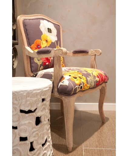
In the open living space, the homeowner wanted to use a lot of neutrals on the larger pieces with dashes of bright color brought in via accessories. This chair sets the tone in the small entry area, which is open to the main living area. “This chair was a hard sell at first, but it brings in so many great colors,” the designer says. “In fact, it gave us the color palette for the entire home.”
Chair: Anthropologie; Ceramic Cumulus Stool: Wisteria
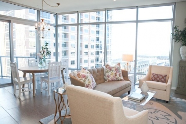
“The finishes and colors were very modern and cool; we needed to warm and soften things up,” the designer says. “I wanted to make it a little more feminine in a sophisticated way without it being girly.”
Tip: To help a tight seating area look more open, choose smaller-scale furniture. To give you an idea of this seating area’s dimensions, the area rug is 8 by 10 feet. Because of the limited square footage, the designer paid careful attention to the scale of the furniture to prevent anything from looking too bulky. The sofa is relatively diminutive but still very comfortable, and the armchairs are smaller scale as well.
Hexagonal side table: Worlds Away, rug: Robin, Thomas Paul; armchairs: West Elm; all pillows: John Robshaw; sofa: Crate & Barrel
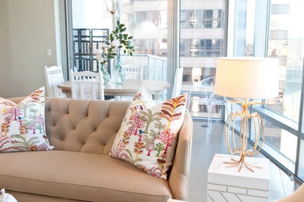
The homeowner was happy with the existing window shades and was not interested in any drapes. Instead, Wittenbraker brought in softness via the sofa’s tufting, throw pillows and mix of textures. There is also a variation in the neutral hues that adds a lot of depth; the shades of ivory, flax, cream and white contrast rather than match. An intricate pattern on the John Robshaw throw pillows brings in pinks, oranges, greens and blues. Their exotic look plays a big part in the collected look.
Side table: Horchow
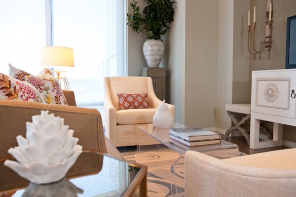
The visual openness of the Lucite coffee table prevents the space from looking cluttered and keeps the view of the rug clear. Metallic finishes on the side tables, lamps and sconces have a bit of glam without being too glitzy.
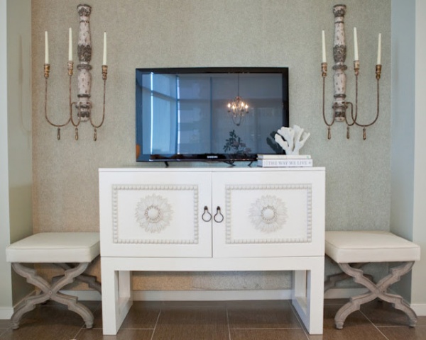
Tracking down this special console table to use for the media center was a family affair. Wittenbraker remembered seeing it in a boutique in Dallas and begged to buy the floor model. She was in luck. A scratch on it that was no big deal helped her score a great price, and her bed-skirt-steaming mother extraordinaire was willing to pick it up and deliver it to Austin.
The details on the piece give it global style that contributes to the collected look. So do the stools, which have French style. They serve as extra seating when the homeowner has a full house.
“We had to consider the vertical space in here because of the high ceilings,” the designer says. Unable to add new electricals, she chose patinated candle sconces to occupy the wall. A plant on a tall column (see the previous photo) helps add some height as well.
Cabinet: Shine, S.H.O.; X-base stools: Wisteria
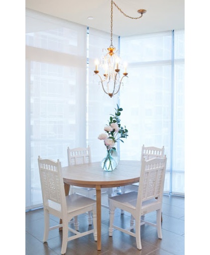
In the dining area, an extendable dining table from West Elm is surrounded by chairs found at Cost Plus World Market. “These chairs really helped this look more collected than just buying a set at West Elm to go with the table,” the designer says. A chandelier adds some shine and dash of glam.
There are two Lucite chairs that can be added when the table is extended for guests. One chair lives in the corner here and disappears into the skyline view. The other serves as the desk chair in the owner’s bedroom. Since the final unveiling, the homeowner has relocated back to Austin full-time. What originally worked well as a crash pad is now serving as a comfortable home with high style, just as the designer intended.
See more of this condo | Rooms of the Day
Related Articles Recommended


