Houzz Tour: A Gin Distillery Turned Bachelor Pad
This North London canal-side apartment — part of a former gin distillery — dates back to 1894, but a bland redevelopment in the 1990s had created a rabbit warren of rooms. “It was very tired and dated when the owner bought it,” recalls designer Cassidy Hughes. “The layout was confused, and it had poky rooms and very little character.”
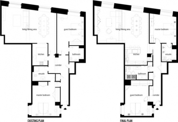
The sociable owner wanted a contemporary space in which to live and work, with plenty of room for entertaining. “We completely opened up the kitchen to create a generous open-plan living area, and we also switched around the bedrooms and bathrooms to make better use of the space and improve the sense of flow between rooms,” Hughes says. High-tech gadgetry controlled via the owner’s tablet, sculptural furniture and feature lighting complete the look.
Houzz at a Glance
Location: Camden, North London
Year built: 1894
Year renovated: 2014
Size: 2 bedrooms, 2 bathrooms
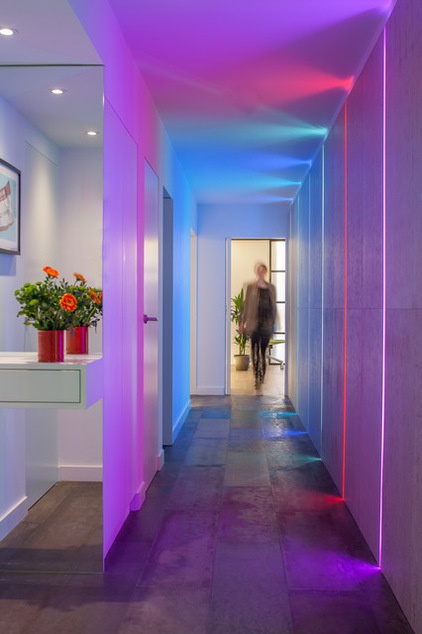
An LED light installation integrated into the wall panels of the entrance hall creates a dramatic effect. “We completely reconfigured the hallway to make it longer and wider as you approach the main living area,” says Hughes, of Cassidy Hughes Interior Design & Styling. “It also helped to make the shape of the bedrooms more regular.”
For the corridor flooring, Hughes found an ecofriendly alternative to concrete that’s durable, easy to install and cost effective. “It looks and feels like poured concrete, but it’s actually an engineered product that’s laid down in panels, similar to tongue and groove,” she says.
The wall panels in the corridor provide much-needed storage, concealing the boiler and electrical appliances.
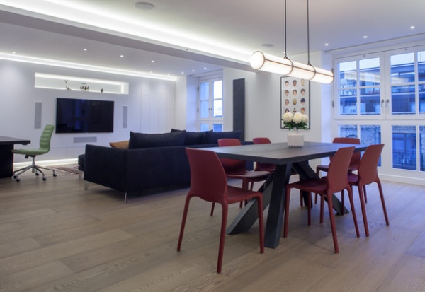
“The back wall, where the TV now hangs, was an uneven niche before the redesign,” Hughes says. “We smoothed it out and opened up the space with feature lighting to create a media wall.”
The floor in here is laid with double-wide engineered oak floorboards. The uplights around the edges of the room help create the illusion of height.
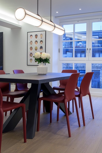
Clean lines in a monochromatic scheme were the starting point for the interior. “Once we had the bones, we decided to introduce red as an accent color,” says Hughes. “As well as breaking up the look, it also adds warmth and interest to the scheme.”
Finishing touches such as the pendant light and bold dining table add sculptural notes to the aesthetic.
Light: Endless by Jason Miller, Roll & Hill; table: Bonaldo; chairs: Hidra by Bontempi Casa, Harrogate Interiors
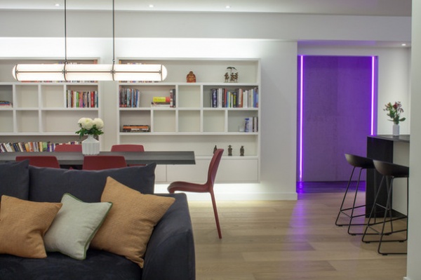
The box pattern of the built-in bookshelf is based on the tile-match puzzle game Tetris. “The owner is very techie, so we wanted to incorporate some subtle references to his passion for video games into the scheme,” says Hughes.
Sleek push-click drawers at the bottom of the unit provide concealed storage.
Sofa: Moooi Canvas by Marcel Wanders, Ferrious
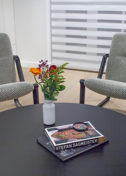
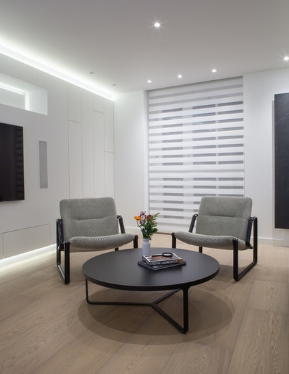
Vintage 1960s armchairs by Brazilian designer Jorge Zalszupin provide a sculptural focal point in another corner of the open-plan living space. “They have quite a graphic profile, which complements the bar stools in the kitchen, as well as the coffee table,” says Hughes. “We’re really playing with horizontal and vertical lines in this part of the flat, especially against the backdrop of the duo roller blinds. It’s a very effective but minimalist way to add some drama to the scheme.”
Armchairs: vintage Jorge Zalszupin; table: Cage, Tacchini
The wall-mounted graphite radiator is another dramatic piece. “It’s a very minimalist space, so we chose a radiator that would stand out, almost as a piece of installation art,” says Hughes. “It’s lovely and tactile and contrasts really well with the starkness of the room. Nobody ever guesses it’s a radiator.”
Radiator: Graphite 905 Heater, Cosy Art
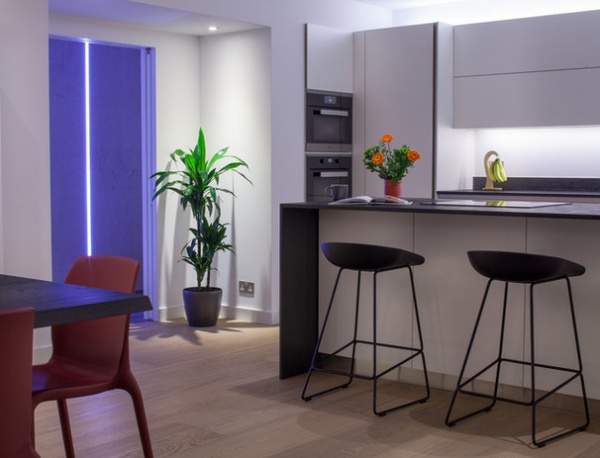
The minimalist theme continues in the fuss-free kitchen, by Rational Kitchens, where concealed storage and hidden appliances keep the look uncluttered. “The owner is something of a perfectionist, so clever storage solutions were essential given the limited space,” says Hughes.
A sleek induction cooktop integrated into the breakfast bar is barely visible, while the extractor fan is tucked neatly into the ceiling.
Kitchen: Rational Kitchens; bar stools: About a Stool, Hay
Laundry facilities are hidden behind custom units in the main bathroom. “There’s also a pullout rail where you can hang washing to dry without having it on display,” says Hughes.
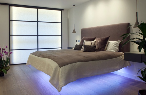
A dramatic floating bed by Daniele Lago and shoji-style doors add a touch of drama to the master bedroom. “Soft creams and taupes soften the look in this room, but the LED lights emphasize the wow factor,” says Hughes. Along with the soft purple glow emanating from underneath the bed, a channel of white lights behind the shoji screen gives the impression of daylight peeping through after dark.
Bed: Fluttua, Lago; pendant lights: Aplomb by Foscarini, Made in Design
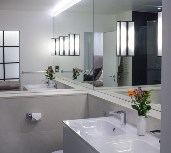
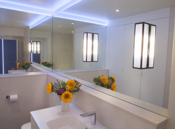
Simple sconce lights in the en suite bathroom echo the shoji screen in the bedroom, while mirrored walls give the illusion of space and light. “It’s a very simple look that references the clean lines used elsewhere in the flat,” says Hughes. “Essentially, what we’ve done is simplified the layout and chosen a few key pieces of furniture to infuse personality into the pared-back scheme.”
Sconces: Mashiko 500, House of Orange
Browse more homes by style:
Small Homes | Colorful Homes | Eclectic Homes | Modern Homes | Contemporary Homes | Midcentury Homes | Ranch Homes | Traditional Homes | Barn Homes | Townhouses | Apartments | Lofts | Vacation Homes


