Room of the Day: Kids and Adults Share a Bright 40-Square-Foot Bathroom
Designer Christie Hausman had a lot to think about when she was hired to remodel a family’s bathroom in a 1960s house in Santa Cruz, California. Two brothers, ages 12 and 8, shared the bathroom, so the homeowners wanted to keep it as simple and easy to clean as possible, but the bathroom also served as the home’s guest bathroom. Then there was the fact that everything needed to fit into its 5- by 8-foot footprint.
By keeping the bathroom’s configuration the same and incorporating some fun details that would appeal to kids and adults, Hausman was able to create an efficient and cost-effective bathroom that worked hard but still left room for play. “It really works for everyone,” she says. ”You can go into the bathroom and feel like a guest, not like a guest in a little boys’ bathroom.”
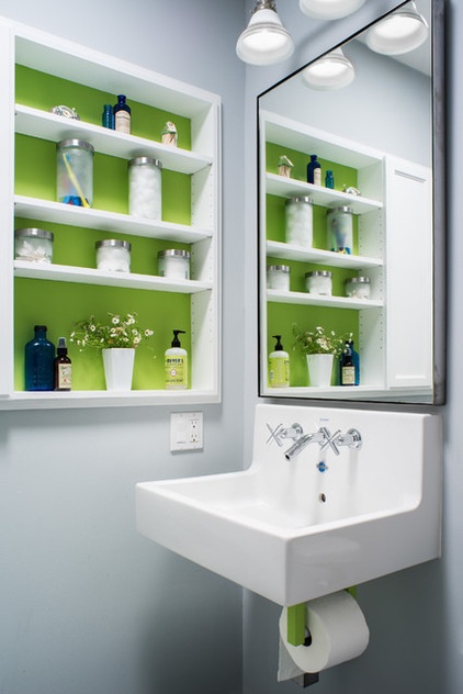
Room at a Glance
What happens here: Boys ages 12 and 8 share this bathroom, which also functions as the guest bathroom.
Location: Santa Cruz, California
Size: 40 square feet (about 4 square meters)
“They really wanted to keep it simple so that it’s easy to clean,” Hausman says. The clients suggested a wall-mounted sink with no cabinetry underneath as a way to keep the space open and to minimize future messes and cleanups.
They decided on this wall-mounted Duravit model. This sink typically comes with a wall-mounted frame and sits on a floating vanity, but Hausman worked with her contractor to build a custom sturdy metal frame that would hold the sink up without the vanity. She also wanted the sink to be strong enough to support kids’ hanging on it or even climbing up onto it. A metal frame that looks like an L is attached to the wall studs on one arm, and the sink sits on the other arm. The contractor tested its strength by climbing up onto the sink after it was installed.
With the sink and toilet fitting so snuggly against the bathroom wall, there wasn’t really space to add a toilet paper holder. Hausman thought a freestanding one would clutter the room and wouldn’t be that functional, so she came up with the idea to attach it to the sink’s underside. They attached two pieces of metal painted lime green to the frame underneath the sink; the toilet paper roll sits between the two pieces, accessible but out of the way.
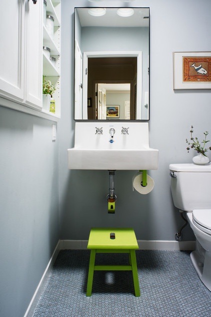
The color palette Hausman selected contributes to the efficiency and simplicity of the bathroom, without making it feel stark. The subdued gray calms the space, while the lime-green accents give it a little youthful kick. Hausman says she always likes to incorporate bold color into a project. “People get nervous about color,” she says, adding that there’s no need to be. In this case she painted only the accent pieces lime. The color will be easy to change in the future if the boys move out or the parents want a different color.
Lots of light, both natural and artificial, also contributes to the room’s overall brightness. A new light tube above the sink brings sunlight down into the bathroom, and the oversized mirror reflects that light into the room. New vanity lighting and an overhead light in the shower also bring soft light in. “It’s a pretty bright bathroom in a pretty dark hallway,” Hausman says.
Gray paint: Silvery Moon; green paint: Springhill Green, both by Benjamin Moore; mirror: Infinity, Room & Board; wall sconce: Schoolhouse Electric
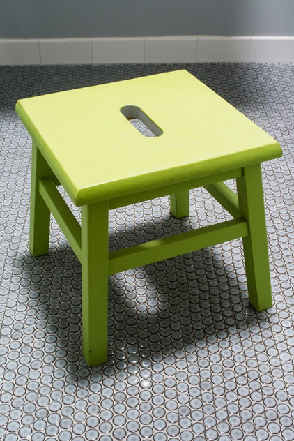
The reflective penny tile floor nearly matches the blue-gray walls and adds nice texture and detail to the bathroom. This material was a bit of a splurge, but since there is so little of it, it didn’t end up costing that much. Hausman says they used a lighter grout than originally discussed to highlight the penny tile edges. Everything, including the grout, has held up well and been easy to clean.
See how to use penny tile in your house
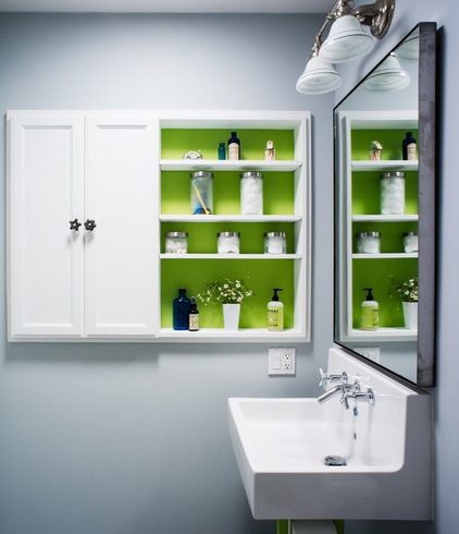
Hausmann installed a custom wall-mounted cabinet to give the bathroom back some of the storage it lost by having an open sink. She recessed it into the wall about 8 inches to maintain the bathroom’s openness and placed it next to the sink so that soap, toothbrushes and other daily toiletries could be easily accessed. Open shelving on the right displays more curated accessories, while cabinet doors on the left conceal less decorative essentials, such as toilet paper.
To give the cabinet a little more zing and tie it in with the rest of the bathroom, she painted the back of the shelves the same color as the toilet paper holder and stepstool, and she used vintage faucet handles she found at the Alameda Point Antiques Faire as knobs.
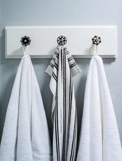
She used more of the antique handles from the flea market to make this towel rack. She used hooks instead of a towel bar because she thought it would be easier for the kids to hang up their wet towels.
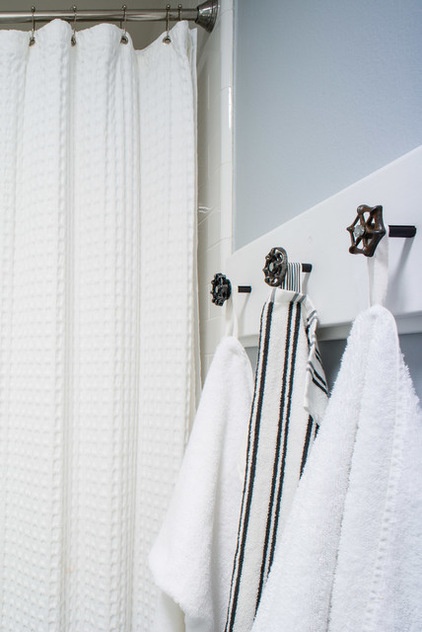
A new shower-tub combination replaced the old tub. White subway tiles line the wall up to the ceiling.
More: Key Measurements to Make the Most of Your Bathroom


