Houzz Tour: Bright Outlook for a Midcentury Home in the Trees
Five years ago Robert Jamieson and his wife, Tami, did what a lot of city dwellers swear they’ll never do. They bought a house in the suburbs. Robert, an architect and the director of store design at retailer Anthropologie, and Tami, a visual director at Anthropologie, had relocated to Philadelphia from Brooklyn, New York, a few years earlier and were looking to buy a downtown loft. They searched for an urban space that they could transform and customize. “We looked for a long time, and beyond lofts and townhouses in the city, we looked at the odd abandoned warehouse and church,” says Robert. But between listings in dangerous neighborhoods and expensive but poorly executed renovations, they never found their blank-slate loft.
They expanded their search outside the city and discovered the houses of Robert McElroy, a designer who had built a number of homes in the area from the 1950s to the 1970s. The homes feature open plans, and many overlook lush, natural greenery. The house they ended up buying sits at the top of a slope, with trees surrounding it on three sides. The 1968 home had never been remodeled and was the fixer-upper they were looking for. “We never saw ourselves in the suburbs, but this home is truly what brought us there,” Robert says. “We see it as a beautiful escape from urban life.”
“After” photos by Sam Oberter, except as noted
Houzz at a Glance
Who lives here: Robert and Tami Jamieson, their 21-month-old son and their Boston terrier
Location: Suburbs of Philadelphia, about 25 minutes from the center of the city
Size: 2,100 square feet (195 square meters); 3 bedrooms, 2 bathrooms
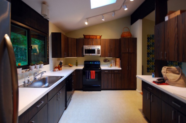
BEFORE: “The home was very well loved by the previous owners, but everything was original from 1968,” Robert says. They liked the home’s scale and layout, but the finishes needed an update, especially the kitchen’s Formica countertops, plastic appliances, laminate flooring and dark-stained cabinets.
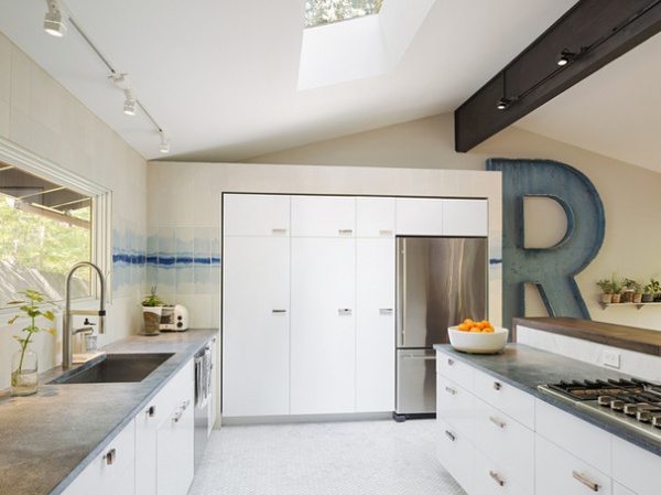
AFTER: The home remodel was wrapped up last fall, with the kitchen being the last room completed. They installed all-new cabinets, tearing out the dark cabinets and putting in white ones to brighten up the kitchen. Soapstone counters and new stainless steel appliances pair nicely with new Carrara marble floors.
They got rid of the upper cabinets on the peninsula and moved the range there to create a more fluid workspace so whoever is cooking could engage with people sitting at the bar.
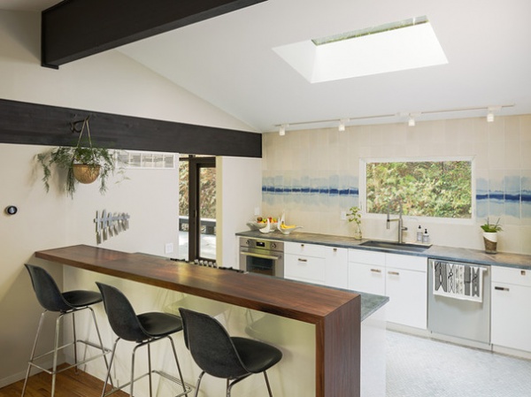
The open peninsula became a split-level prep station and breakfast bar. The dining area of the peninsula is reclaimed walnut and fabricated from one solid piece. Right behind it is the dining room. Existing glulam beams frame the kitchen space. The hardware is petrified hardwood from a small shop in the U.K.
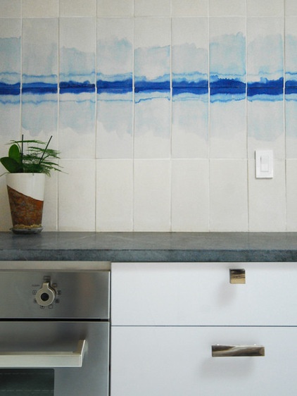
In what is an otherwise simple white kitchen, backsplash tiles stand out. These porcelain tiles by Deborah Osburn are hand formed and hand dyed with indigo pigment; no two are the same.
Kitchen: built by Niko Calliagas, Okin Pivot; custom walnut bar: Provenance
Photo by Studiorobert jamieson
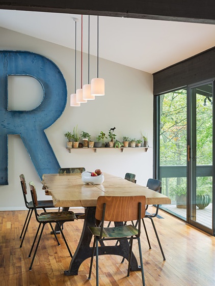
The dining room has a mix of custom pieces, salvaged finds and new designs for a space that reflects the couple’s style. The dining table came from Anthropologie; the dining chairs are by Leslie Oschmann and have recycled paintings folded over midcentury frames. The “R” is from a marquee sign the couple bought at Found Object. The lights are by Terence Woodgate.
The couple renovated the house in phases, working through each room over five years. During that time the two continuously worked together and made each decision collaboratively. “This means something as simple as choosing pendants over the dining table can take a really long time, but we always get something that we both love,” Robert says.
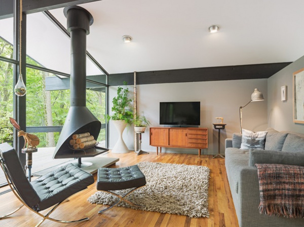
The home sits on a steep slope of about 1 acre. There is no yard, but lush trees, ivy, wildflowers and ferns surround it on three sides. A creek runs along the bottom of the property, and Robert says they can hear it babbling when they open the windows. The living room overlooks all of this and is a relaxing space after a long day at the office. “We feel like we are always on vacation in our own home,” he says.
The functional freestanding fireplace is the room’s centerpiece and is original to the home. Midcentury furniture pieces, including a vintage TV credenza and an original reproduction Barcelona chair, mix with a comfy contemporary sofa and collected art pieces, including a wax sculpture by Italian sculptor Nino Walter Riondato, a jackrabbit made from leather and a canvas hunting vest by Beau Buck.
The low-pitched roofline and expansive glass walls are characteristic of a midcentury ranch, but Robert and Tami didn’t feel chained to that aesthetic. “We wanted to be true to the home but didn’t feel we had to be preservationist in our approach to the rehab,” he says. Instead they focused on using furniture and materials they liked, all with a handmade quality that’s a little imperfect and worn but still modern. You can’t quite nail down what the style is, but it’s one that makes them happy every day.
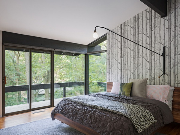
Farther down, the master bedroom has the same view as the dining room and living room. A single wall of wooded wallpaper calls to the landscape outside.
Potence Lamp: Jean Prouve; wallpaper: Woods, Cole & Son
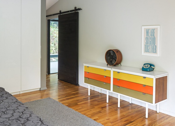
The colorful dresser on the opposite wall is vintage, and above it hangs a letterpress print by Dylan Fareed. The sliding barn door is a custom ebonized reclaimed oak door with a custom antique brass pull.
Barn door hardware: Rustica Hardware
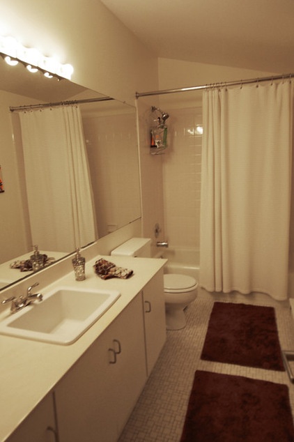
BEFORE: The original master bathroom had ceramic tile floors and a Formica countertop.
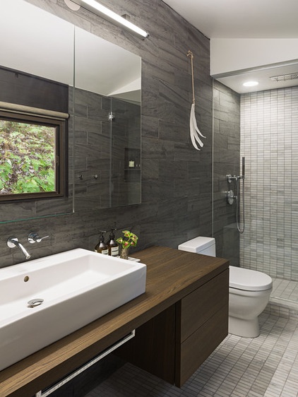
AFTER: They took out the tile, countertop and tub and installed new fixtures and a new shower. Honed Carrara marble tiles run down the far wall and across the floor. Heathermoor slate with a natural cleft finish covers the other wall. Handmade porcelain feathers by ceramics artist Michele Quan hang above the toilet.
Fixtures: Stillness collection, Kohler; rain shower: Aquabrass; vanity, toilet: Duravit; slate tile: Vermont Structural Slate
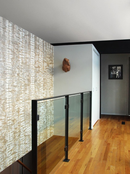
The remodeled staircase leads to the lower level, where the guest bedrooms, laundry room, garage and family room are. The house sits on a hillside; the front door is on the second floor.
The staircase is made of glass and steel. Wallpaper in an abstract tie-dye pattern from Maya Romanoff frames the staircase.
Guardrail: custom, Creative Architectural Metals; wallpaper: Anniversary Half Plaid, Maya Romanoff
Photo by Studiorobert jamieson
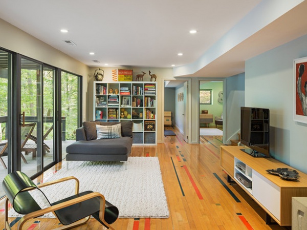
The stairs open up to the newly expanded lower-level family room. The home’s original entry from the garage had been through the laundry room. They removed the bedroom next to the garage and expanded this room so that instead of entering the house through the laundry room, they now get to walk in through here.
After they removed the extra guest bedroom, they were left with a mix of floor coverings on the lower level. Robert reached out to Urban Evolutions, a reclaimed-wood vendor, with the idea to use the wood from an old gym floor. The company offered him a few options, and he picked one that still had some painted boards. “I liked the primary colors on this one and gave them the direction of 25 percent painted to 75 percent unpainted boards as a mix,” he says. A local company installed the wood, mixing the colored pieces with the natural pieces per Robert’s design. “The installers were ultimately great,” he says, “but originally were like, ‘You want to plane it down, right?’”
Rug, sofa: ABC Carpet & Home; TV credenza: Design Within Reach: armchair: Aalto, Artek original reproduction
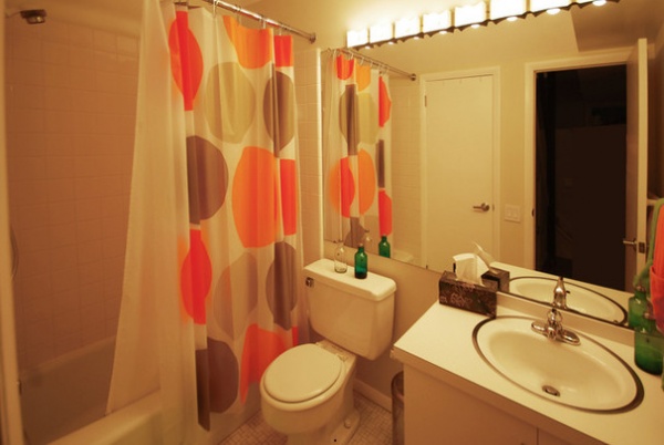
BEFORE: Like the master bathroom, the downstairs guest bathroom originally had a Formica vanity and a ceramic tile floor.
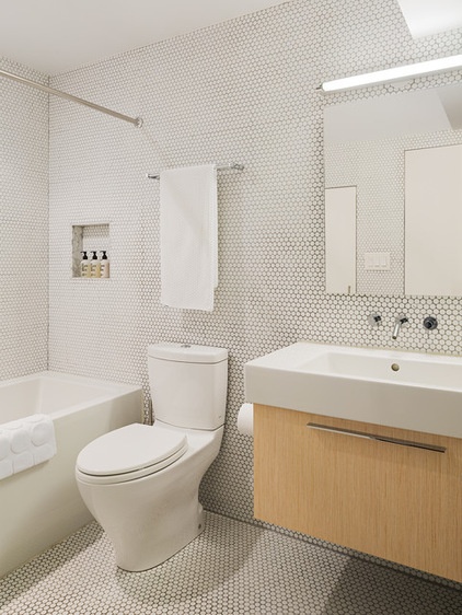
AFTER: New fixtures and matte white penny tiles simplify the space and tie it to the rest of the home.
Bathroom: built by Element Kitchen and Bath Design; vanity: Duravit: fixtures: Stillness collection, Kohler
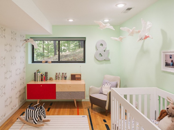
The nursery, on the lower level, is where the couple’s 21-month-old son, whom they adopted from Ethiopia, sleeps. The same reclaimed-wood flooring flows into this room to tie the lower level together. Like most rooms in the house, the nursery overlooks a wooded hillside. The white birds hanging above the crib and credenza look like they could have just flown in from the woods, but they are actually made from used “I Heart NY” plastic shopping bags and packing tape and are from an old Anthropologie display.
The lower level was rarely used during the first few years the couple lived there, but now it’s one of their favorite hangouts. “As our family has grown, it has been fun to see our use and appreciation for different spaces in the house grow,” Robert says.
Wallpaper: Steers, Louise Body; wall paint: Early Frost, Glidden; rug: Land of Nod; pillow: Lucky Boy Sunday; armchair: Draga Obradovic; dresser: Anthropologie
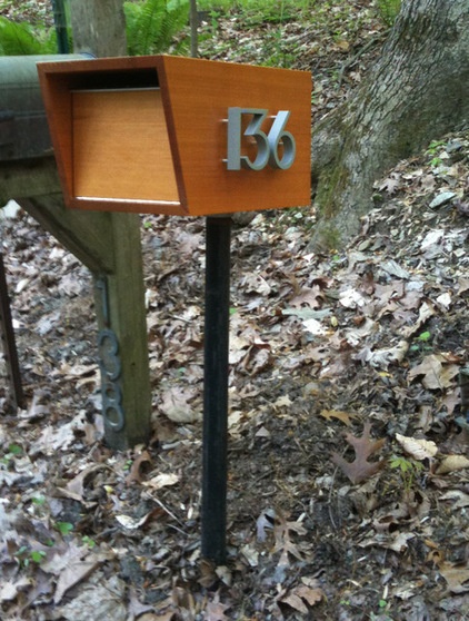
The home’s exterior remains as it was when the couple bought the house, but they did have a friend make a new midcentury-style mailbox.
Browse more homes by style:
Small Homes | Colorful Homes | Eclectic Homes | Modern Homes | Contemporary Homes | Midcentury Homes | Ranch Homes | Traditional Homes | Barn Homes | Townhouses | Apartments | Lofts | Vacation Homes


