Room of the Day: Great Room Solves an Awkward Interior
A couple with two little kids was stoked to snatch up a midcentury Eichler home in Mountain View, California. But before they moved in to the classic midcentury home, they wanted to make a few updates that would open and brighten the off-white and tan interiors. Previous homeowners had roofed over an atrium, which had turned it into an awkward indoor space. Sliding glass doors that once exited to the outside separated two interior rooms. Meanwhile, the window over the kitchen sink looked into the newly interior space as well.
The couple worked with architect John Klopf to tear down walls and the interior sliding glass doors to create one large great room. Lighter hardwood floors, a new white palette and plenty of open space deliver the sunny, airy home they’d hoped for.
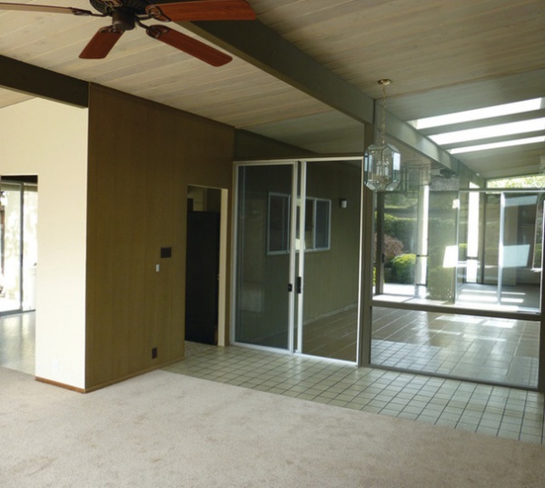
BEFORE: Here you can see the former atrium that previous homeowners enclosed; they also added a few skylights. The kitchen, through the door on the left, felt completely closed off from the rest of the home.
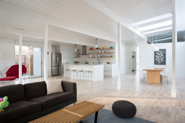
AFTER: This photo was taken from the same angle as the previous image. (The skylights and ceiling beams match up.) You can see how the homeowners and Klopf removed the interior walls and sliding glass doors to create one large, open great room. “We don’t normally recommend enclosing an atrium, but this one was already enclosed, so we sort of just finished the job,” Klopf says.
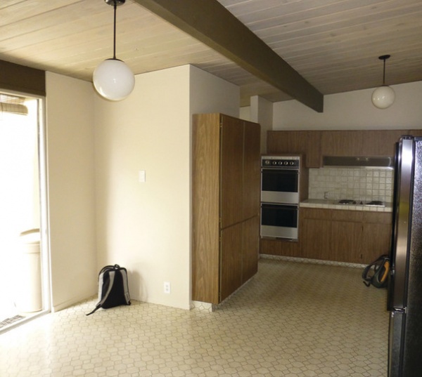
BEFORE: Like many homes of that era, the layout was chopped up, with the kitchen in its own compartment. That meant if you were in the kitchen, you were missing out on anything happening in the rest of the house. Not to mention that the appliances needed updating, and previous owners had painted everything an off-white color. “Eichler houses are awesome, and many have been remarkably well preserved,” Klopf says. “This house was not one of the well-preserved specimens.”
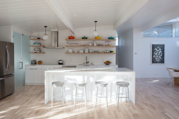
AFTER: They kept the light fixtures, ceiling boards and beams in the original Eichler style, but opted for white finishes and new appliances, cabinets and Caesarstone counters that pushed the bright vibe. “It worked out for this family that the brightly painted space was brighter and cheerier, even though we didn’t add any doors or windows to the house,” Klopf says.
Klopf recognizes that there will always be disagreement over painting ceilings and beams in an Eichler home white, but that it just made sense for this family. “To people who feel that change is never good, there will not be any satisfactory explanation for painting an Eichler white,” he says. “For people who believe that modernism as a movement is about human-centered design that was intended to be updated over the years, changing paint colors to freshen up a house for a new generation is no big deal.”
Cabinets: Crystal Cabinets
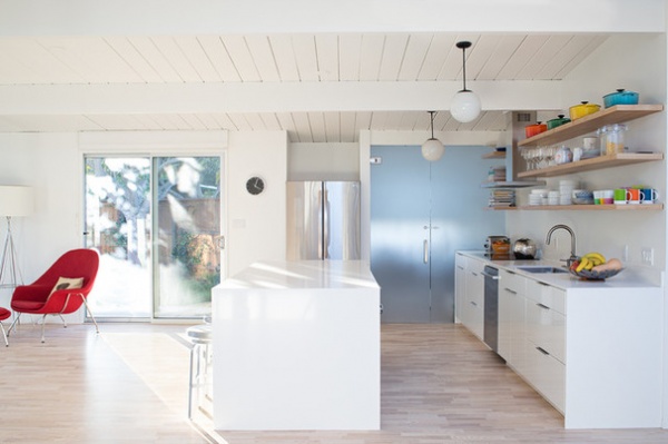
The couple told Klopf they wanted a home that was calm and well aligned — nothing angular or jutting out. A lot of attention was paid to how things were arranged. For example, the edges of the island line up with the refrigerator, the hallway and ceiling beam. “Setting things into a sensible, logical layout so things are composed and aligned makes a space feel less chaotic and therefore calmer,” he says.
A frosted glass door hides the pantry and laundry room but lets filtered light into the kitchen. Open shelving helps give the space lightness. And the fridge even got tucked into a compartment to minimize mass in the room.
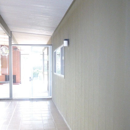
BEFORE: Here’s a view from the former atrium–turned–interior room. The window on the right used to be the window above the kitchen sink.
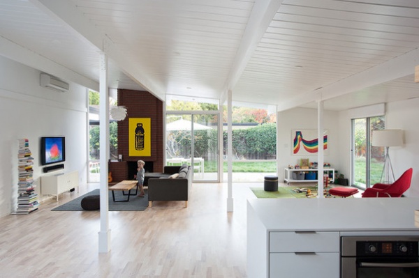
AFTER: Looking at the same angle in the home today (again, the beams match up, as does the fireplace, with the ones in the previous image), you can see how removing that interior wall and incorporating the indoor-outdoor space expanded the floor plan. “Everything is now connected,” Klopf says.
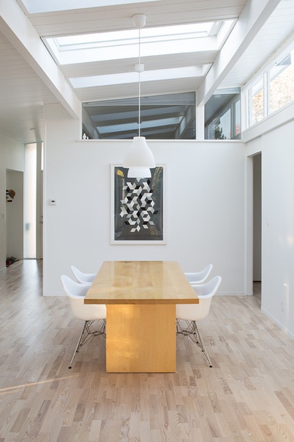
The skylights remain, letting sunshine pour onto the dining table.
Architect: John Klopf, Klopf Architecture
See more Rooms of the Day


