Houzz Tour: ’50s Ranch Redo Could Be a Keeper
http://decor-ideas.org 01/26/2015 03:13 Decor Ideas
Designer Ryan Brown has moved 20 times in the past 12 years. As a frequent house flipper (if he looks familiar, you may recognize him from Bravo’s show Flipping Out), he’d live in homes that were staged to perfection for a few months until they were sold, then he’d move on, often selling many of the furnishings with the house. But since he put lots of blood, sweat and tears into this house and designed it specifically for his family, it may be the house they stay put in. “I put so much hard work into this one, it’s hard to imagine leaving,” the designer says. It’s easy to see why this is the home that could possibly be their “forever” home. Or at least their much-much-longer-than-a-few-months home.
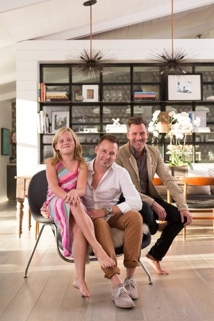
Photos by Matt Wier
Houzz at a Glance
Who lives here: Ryan Brown (right), partner Diego Monchamp and daughter Chloe, age 8
Location: Los Angeles
Size: 3,100 square feet (288 square meters); 3 bedrooms, 3½ bathrooms
Brown gutted the 1950s ranch, ripping out “everything but the roof,” he says. He removed the low popcorn ceilings and left everything open up to the vaults; they now soar up to 12 feet high. Brown added tongue and groove boards to the ceiling as well as beams, which break up the vast expanse in this wide-open room.
“The intention was to open up as much of the back of the house as possible to the backyard and pool,” he says. The doors are large sliders, and their metal gives them a clean, modern, industrial look. The kitchen, dining room and living room occupy one big, open space, with the exception of the structural dividing wall seen here. Brown repeated the tongue and groove look by wrapping the dividing wall in it.
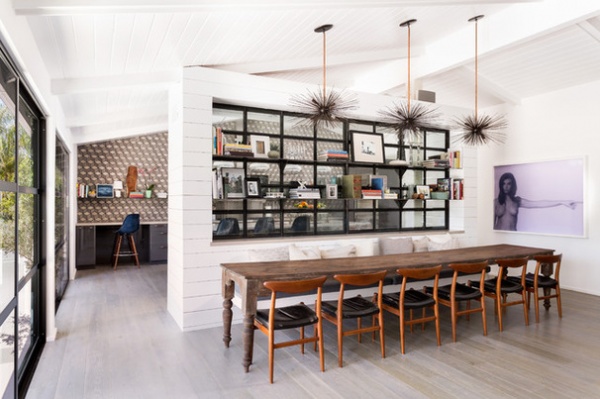
“I’ve sold almost every piece of furniture I’ve owned over the years, but the one piece I will never sell is this 13-foot-long table,” he says. “It’s solid teak. Sometimes it’s lived inside; sometimes it’s lived outside because it wouldn’t fit in the house, and it’s beaten up and gorgeous.”
Tip: Look to Etsy when you want something fabricated. Brown found a metalworker who was willing to make these urchin chandeliers for him. “I now have several Etsy artisans I’ve only met online custom-making great things for me,” he says.
Art: “Julia in Violet,” by Paul Rusconi (it’s composed of tiny little “pixels” of nail polish); flooring: 7-inch-wide white oak planks, The Garrison Collection; doors: Fleetwood Windows & Doors
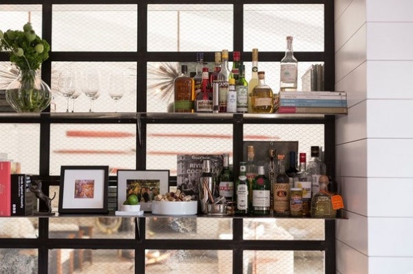
Brown filled the dividing wall between the kitchen and dining room with vintage factory chicken wire glass he found at a local architectural salvage yard.
“Originally I bought the factory windows thinking I’d use it in a shower stall, but when that didn’t work out, I had the idea to use it here,” he says. He had the metal shelves welded to the metal frames. The dividing wall adds an industrial element to the kitchen and works really well with the exterior sliding doors he used across the back of the house.
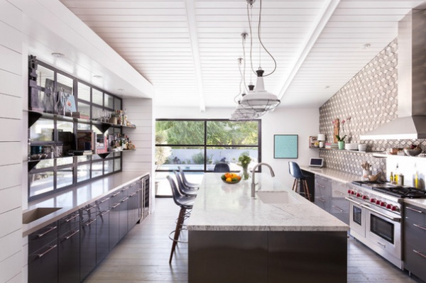
Across the kitchen he mimicked the window’s shelves with shelves on the tile wall.
An 11-foot by 4-foot island suits the kitchen’s proportions. The elegant Carrara marble counters contrast the island’s industrial stainless steel cabinetry. Another industrial element is the stainless steel on the island cabinets. “The stools swivel, so they are really fun for the eight-year-old kids,” Brown says.
“Usually I’d use three pendant lights over the island, but since there were three urchin lights over the dining table, I added four to make it different in here,” he says. The vintage-style pendants came from Schoolhouse Electric; Brown spray painted the cages black to match the dark detail at the top.
Dowel Bar Stools: Modernica; countertops (except on island): Linen, Caesarstone
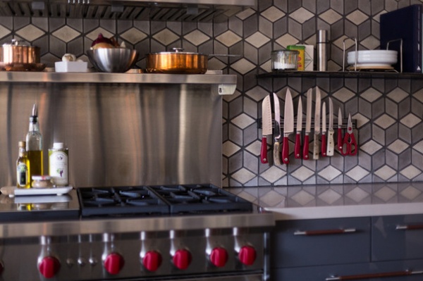
The bold graphic backsplash is composed of handmade diamond-shaped concrete pieces with a flat finish. They were made by Arto, a family-owned Los Angeles company that has been in business since 1966. “Each tile is handmade, and the color in every one is a little bit different,” says Arto co-owner Armen Alijian. “The concrete patinas over time, which is part of their beauty.” Alijian recommends sealing the tiles when they are used in a kitchen setting; Brown used a penetrating sealer here.
Range: Wolf; tile: Diamond, Arto
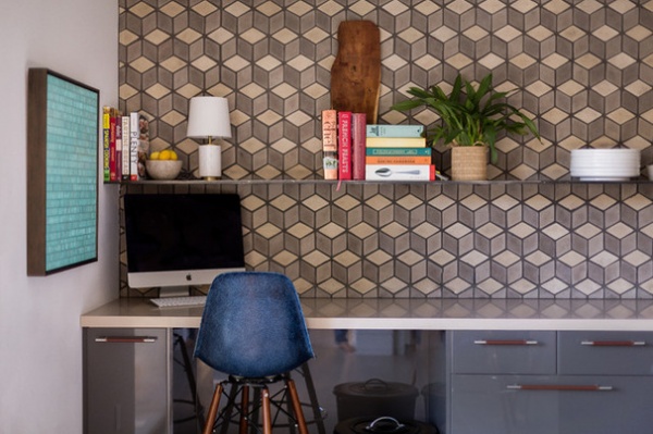
This part of the kitchen serves as command central. Glossy gray lacquered cabinets contrast with the flat-finish graphic tile wall. A leather wrap softens the industrial look of the stainless steel drawer pulls.
Art: Brian Wills
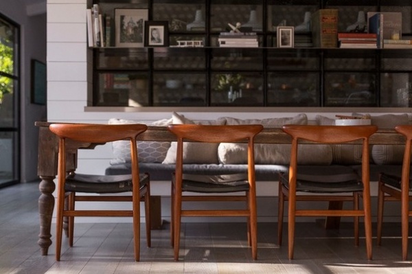
The dining room chairs are vintage Hans Wagner, complete with the original leather upholstery. The banquette on the opposite side is 12 feet long. It has a cantilevered look but has some hidden supports.
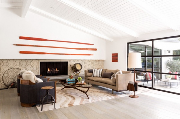
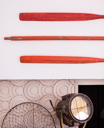
Just beyond the dining area is the living room. To make sense of the length of the room, Brown stressed long horizontal lines with a long fireplace surround and hearth and three vintage oars.
Alijian jokingly describes this room as “Hollywood meets Deadliest Catch meets crew team.” The room decor includes unique objects, like a brass lamp from a World War I ship that Brown picked up in Amsterdam. “It weighs a ton, but I had to have it,” he says. The termites that chomped on the vintage oars are long gone, but they left some artful damage that gives the long pieces character. “I was going to hang the old fishing net from Chloe’s ceiling and fill it with stuffed animals, but I never got around to it,” Brown says with a chuckle. He has an eye for picking pieces that he can use in all sorts of rooms.
The stunning concrete tile on the fireplace surround is called Ring Fish, and it was also made by Arto. The pattern throws a lot of circles into a room marked by strong and long straight lines.
Brown missed out on a vintage coffee table on 1stdibs, so he had one like it made. He designed the walnut-accented art deco–inspired barrel chairs and the sofa, covering both in classic Knoll fabrics. The floor lamp with the magazine rack is a vintage piece; the rug is Pale Swirl by Paul Smith for The Rug Company.
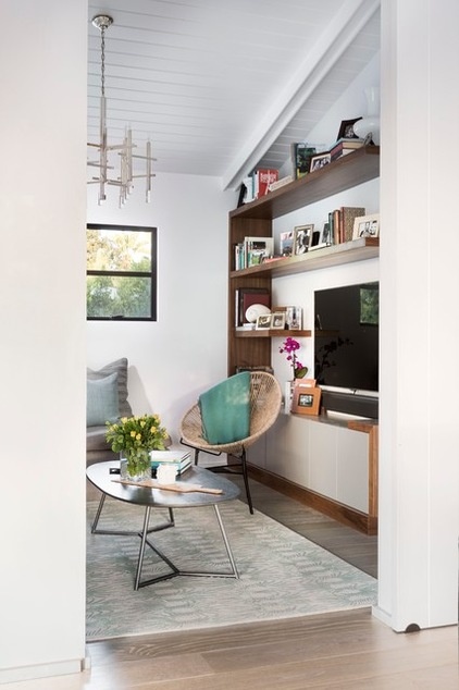
There’s a massive 12-foot sliding barn door that closes off this cozy den. “It’s great when we have friends over — the kids can hang out in here and watch TV, and we don’t hear it,” Brown says. “It has a huge built-in sofa, so it really feels like their own domain.”
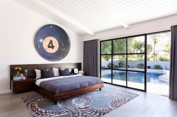
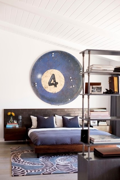
When Brown found this pool ball for a client, he said, “You have to buy this — if you don’t buy it, I will.” His client balked at the size of the carnival remnant and, true to his word, Brown went home with the large-scale piece himself. It set the tone for the master bedroom’s color palette and style. It has little Ping-Pong-ball-size lights built in it that serve as reading lights.
Brown designed the walnut bed and nightstands and the headboard. He had his upholsterer wrap tile-size boards in leather to create the headboard.
The shelves separate the bed area from an office/sitting area. The office has a curved midcentury modern desk and a sofa. This space also looks out to the pool.
Rug: Serpent by Kelly Wearstler, The Rug Company
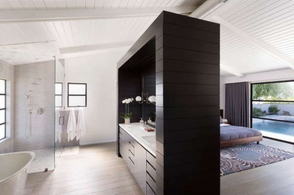
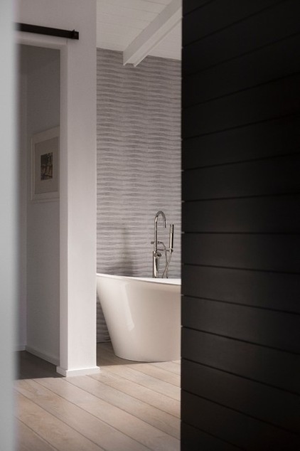
This dividing wall between the bedroom and the bathroom works much like the one in the kitchen. It has deeper grooves that make the boards appear to float, and holds the bathroom mirror instead of factory windows. “This layout was inspired by a trip to Thailand,” Brown says. “We wanted a hotel-like feeling in here.”
The designer thinks he has the answer to whether or not to go with an open en suite (a growing trend that has caused a bit of a controversy here on Houzz lately). “Since my partner and I have similar schedules, it works just fine for us,” Brown says. “But if you’re on opposite schedules and waking each other up, it doesn’t work.” Also, a separate room for the toilet is key in this scenario.
Tile: Porcelanosa; bathtub: Tulip, Wetstyle
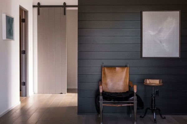
This is what the bedroom side of the dividing wall looks like. Just behind it is the vanity; the sliding door leads to the toilet.
Brown scooped up the vintage side table and leather safari chair, which folds up, in Paris. The dove artwork is by Alison Van Pelt.
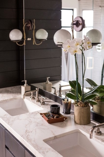
The countertops are Calacatta marble. The elegant retro-style light fixtures are by Schoolhouse Electric. Note the doubling effect that mounting them on the mirror has created.
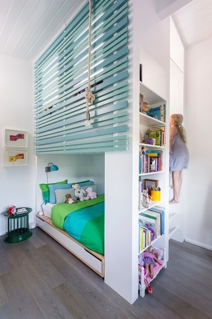
Chloe’s room was inspired by a cardboard playhouse she loved to play in at their last house. Brown designed a fort over her bed that can fit three to four kids comfortably. The piece also has integrated bookshelves and her bed. “Chloe’s room is the smallest one in the house, so it was also a good use of space,” the designer says.
Brown’s pals have a hard time believing he’ll stay in one place for long, based on his history. “If any house will make me stay, this one will,” he says. “I put a lot of time and energy into this; we have no plans to move anytime soon.”
Browse more homes by style:
Small Homes | Colorful Homes | Eclectic Homes | Modern Homes | Contemporary Homes | Midcentury Homes | Ranch Homes | Traditional Homes | Barn Homes | Townhouses | Apartments | Lofts | Vacation Homes
Related Articles Recommended


