Houzz Tour: Room for Everything in Just 596 Square Feet
“He’s an entrepreneur, he’s a multiple Ironman competitor, he plays in a band and has about a million other activities going on, so he desperately needed an organized and efficient space that maximized every nook and cranny,” interior designer Kimball Starr says of her client, Tony Lillios. The catch was, she had to do it all in 596 square feet. Lillios had struggled to get the layout right and to find places to keep all of his things in his San Francisco townhouse. “I went through multiple furniture and space layouts on my own and couldn’t get it right,” he says. “I felt like a rat in a maze; it was cluttered and claustrophobic, and unpleasant to be home.” Starr brought in hardworking multifunctional furniture and created storage space for all of Lillios’ things, integrated his favorite possessions into the decor and still left plenty of room for him and his home to breathe.
Houzz at a Glance
Who lives here: Tony Lillios, cofounder of Speck
Location: San Francisco
Size: 596 square feet (55 square meters)
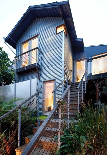
To orient you before we enter the home, the entry space is right through the glass door at the top of the stairs, the bedroom is on the ground level, and the living room and kitchen are on the top floor.
Starr knew she had to make every inch count but also leave enough open space to make the house feel airy and comfortable. “Tony always has lots of projects going on when he’s home; he’s working or he’s tinkering or he’s playing the guitar,” she says. “We needed places for him to be able to take things out and work on them, then easily be able to put them away.”
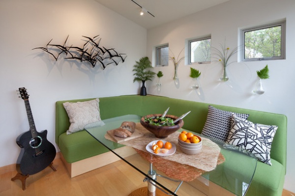
Using every nook and cranny meant taking full advantage of the entry space. The designer created a great spot for projects and even hosting dinner parties in here.
One part of the challenge was some odd angles. “None of the corners of the house are actually 90 degrees,” the designer says. “It was originally designed around a crystal” (not by Lillios). When designing this built-in banquette for the entry area, she was dealing with a 110-degree angle in the corner behind it. She eased the awkwardness by giving it a pleasing curve and filling in the space behind it. The base of the banquette is all storage drawers, where Lillios keeps things like a keyboard, a small guitar and extra pillows.
The glass table’s height is adjustable — it can transform from coffee table to project or dining table height. Starr custom designed a rounded-off rectangle for the top so that it’s easy to move around in the small space without bonking into the edges.
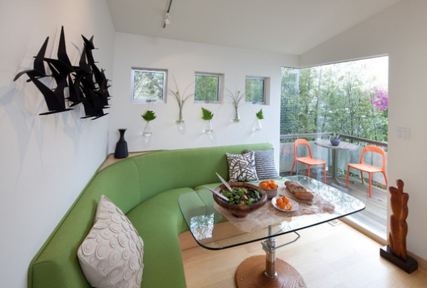
Starr chose green fabric to tie the area to the outdoors. The wall-hung teardrop vases filled with leaves help the transition as well. “There’s no chop in color,” she says. “It’s a really nice transition.”
Because the room gets so much direct sunlight, she chose a high-end outdoor fabric that can stand up to fading. It is a solution-dyed acrylic and, unlike some outdoor fabrics, it is very soft. “It feels really nice, and it will last a long time,” she says.
Banquette, tabletop: custom; banquette fabric: Alaxi in Silver State, Sunbrella; adjustable table base: Hydra Designs; sculpture: vintage C. Jere; circles pillow: Layla, Crate & Barrel; Teardrop Wall Vases: Wind & Weather
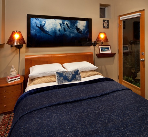
Downstairs, Lillios had room only for a nightstand on one side of the bed. Starr added the shelf on the right and the sconces to free up floor space. The artwork is from Lillios’ native Australia and reminds him of his Ironman challenges. He hadn’t been able to figure out how to use this rug, so it had been rolled up in his storage unit until Starr pulled it out and put it down in here.
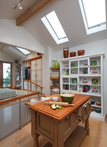
The top floor consists of the kitchen and the living room–office. Before, there was only a church pew in the kitchen. Starr made Lillios give the pew the boot and replaced it with this butcher-block-topped island. While it’s all cleared out for the photos, the bottom shelf usually houses all of his small appliances so that he can keep his limited counter space clear and uncluttered.
Lillios wanted his friends to have a spot where they could hang out with him while he cooked, so he keeps two stools that fold up tucked nearby in a closet, and the island has a retractable shelf that creates a countertop for them. “Being able to have his friends hang out around the island was huge for him,” Starr says.
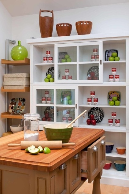
Starr had some fun channeling Andy Warhol while styling for the photo shoot, but she says that the white shelves are usually filled with canned goods, china, glasses and other kitchenware. She added the shelves to the left of the white shelves to house additional items from the kitchen and office.
Nesting bowls: Crate & Barrel; ice bucket: Dansk; wood shelves: Design Within Reach
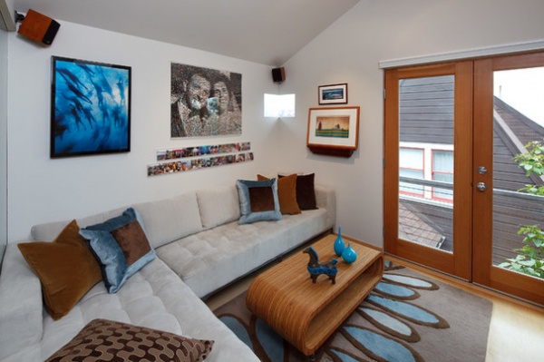
The living room’s large sectional may be a surprising choice to some, given the small space. “The key is that it’s a color very similar to the wall color, so it blends,” Starr says. “Also, in a tight space, you should go wall to wall with it if you can.”
Rug: Fern, Angela Adams; sectional: Carter, Gus Modern; pillows: custom
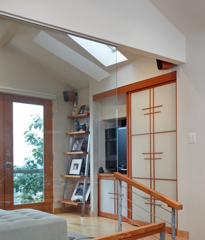
Opposite the sofa, shoji screens conceal a workspace complete with a computer desk, lighting and room for files and supplies. The wall to the right of the screen is hollow, so Starr filled it with more shelving for this compact office space.
All of the artwork in the home is special to Lilios. “He’s a very sentimental guy. Every piece has a meaning,” the designer says. “Photos of family and friends, artworks given to him by special people or that remind him of a memory or favorite place or thing — it all makes his house feel like a home to have these things around him.”
And Lillios does feel completely at home and relaxed in his space now. “I feel proud of my home and now want to have people over,” he says.
Browse more homes by style:
Small Homes | Colorful Homes | Eclectic Homes | Modern Homes | Contemporary Homes | Midcentury Homes | Ranch Homes | Traditional Homes | Barn Homes | Townhouses | Apartments | Lofts | Vacation Homes


