Houzz Tour: Refreshing Citrus Twist in a London Home
For a newly purchased home in a new London development, interior designer Bhavin Taylor wanted to bring color and character to the space through carefully chosen artwork and furniture. One of the benefits of the property’s being new was that no heavy work was needed; the kitchen, bathroom and flooring were all in place, and the walls had been painted. This allowed Taylor to focus on bringing out the owner’s taste and character with new and secondhand furnishings.
Taylor used the owner’s existing art collection as the starting point for much of his design. He wanted to create an eclectic feel that melded artwork from India with contemporary pieces, bright colors and even a few antiques. The apartment didn’t have any furniture in it when it was bought, and almost all of the pieces were purchased on a budget of less than $7,000.
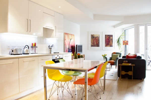
Houzz at a Glance
Location: London
Size: 1 bedroom, 1 bathroom
The kitchen was already installed when the property was bought, and provided a neutral backdrop against which Taylor could introduce a little color. He chose a minimalist dining table, with a high-gloss top and stainless steel, and added some fun with colorful chairs.
Dining table: Torsby, Ikea
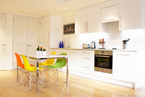
Taylor picked the colors for the chairs based on the client’s existing artworks. “The client had two pieces of art that are now side by side in the living room. The first thing I did was lay out the pictures and use colors from them as my starting point,” he says. So while the dining and living areas feel quite separate, the layers of color all tie into one another for a cohesive feel.
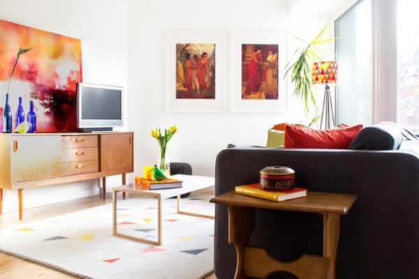
The main living area is open plan, and Taylor wanted to create a different feel in each section. “I wanted to separate the living area from the rest of the space,” he says, “so I introduced lots of layers and built up color and pattern.”
The charcoal sofa was chosen first; then other furniture and accessories based on the colors in the artworks were added. Taylor found the sideboard at a charity shop, bringing in a retro touch. The wooden side table was also a charity shop find.
Taylor advises patience when hunting for charity and junk shop bargains. “One time you’ll go in and they’ll have loads of stuff, and the next time nothing. You have to have the patience to keep going, and also make sure you buy in the moment,” he says.
Porto Greys sofa, Kilo coffee table: Habitat
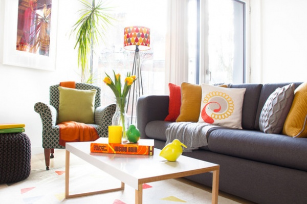
One of the only items the owner brought with him along with the artworks was this armchair. It’s an antique, and Taylor gave it a modern update with a punchy orange throw.
The rug was a key find. “That rug is the perfect fit,” Taylor says. “It repeats all of the colors, separates the area from the rest of the space and ties it together.” The floor lamp has a similar effect, and incorporates many of the colors used in the scheme. “There was a big, empty space there, and the lamp adds a pop of color and moves the eye up and down,” he says.
Rug: Peto, Habitat; floor lamp base: Åstorp, Ikea; lampshade: Charley, Humblesticks
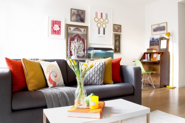
The cushions were finishing touches brought in toward the end. “With this project, a lot of it evolved over time,” the designer says. “It was a process of bringing things in gradually to spread the cost, so it built up in layers.”
A desk area was a must-have, but, given the space restrictions, Taylor didn’t want it to be visually obvious all the time. “Using a bureau means you can hide the desk away, and you have the flexibility of pulling a dining chair over when you need it,” he says.
Cushions: John Lewis, HomeSense and Pattern Lounge; yellow lamp: Fenwick
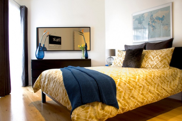
In the bedroom Taylor went for something different than the living space. “I wanted to make it feel more masculine by using darker wood,” he says. “The client already had the map, and this became the basis for this room’s blue, yellow and gray color scheme, which works so nicely with the dark wood.”
Malm chest of drawers, mirror: Ikea
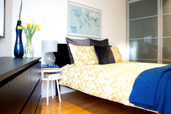
“There was absolutely nothing to start with in here, so the priority was the bed and storage,” says Taylor. The closet, although it looks built in, is actually a freestanding piece. “The extra height makes it feel as if it’s meant to be there,” he says, “and the glass adds a bit of reflection and bounces natural light around the room.”
Taylor felt that two bedside tables would have been too much and opted instead for one white side table.
Closet: Pax, Ikea; bed: Warren Evans; bedding: Organic Fan Diamond, West Elm; throw: John Lewis; nightstand: Bumble, Habitat
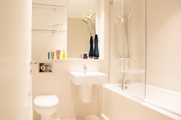
The client was happy with the existing clean and bright scheme in the bathroom, so this room didn’t require any design work.
Browse more homes by style:
Small Homes | Colorful Homes | Eclectic Homes | Modern Homes | Contemporary Homes | Midcentury Homes | Ranch Homes | Traditional Homes | Barn Homes | Townhouses | Apartments | Lofts | Vacation Homes


