Modern Storage and Sunshine Scare Away the Monster in a Kansas Kitchen
http://decor-ideas.org 01/22/2015 02:13 Decor Ideas
Monsters come in all shapes and sizes. For this young Kansas City family, the scary beast wasn’t all gnarled hair and venomous fangs. Rather it was an enormous range hood covered in decorative scrollwork and low-end wood trim that they felt dominated the lair, er, kitchen.
OK, not exactly the kind of thing that will keep you up at night, but after removing as much scrollwork as they could and trying to live with the results for a few years, they eventually had had enough of the inefficient cabinetry. And it wasn’t just the kitchen that they thought didn’t work. The adjacent family room bore the same cabinets and fixtures, which a house flipper had added prior to the couple’s buying the home.
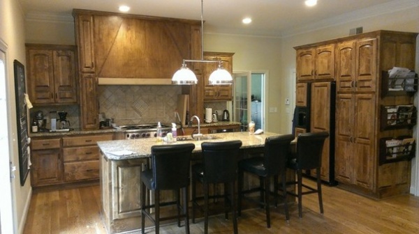
BEFORE: At first the homeowners thought they could transform the space by removing the range hood, refacing the cabinets (they disliked the arch-topped doors) and adding some skylights to brighten the great room. But after meeting with architect Matthew Lero, of RDM Architecture, they soon found that with a 14-foot-high attic space above the area, adding three skylights would be insanely expensive. “There were some roof complications too, and they would have spent all this money for three skylights and still have a kitchen that doesn’t work,” Lero says.
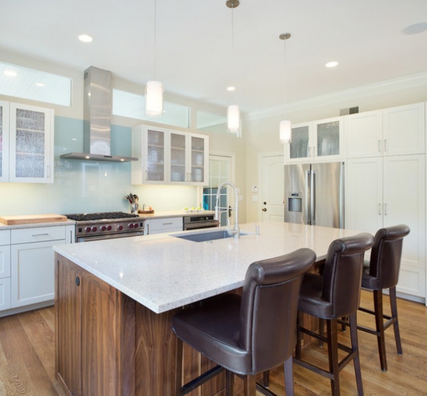
AFTER: So the couple shifted their focus to overhauling the kitchen. Working with Lero, contractor Ian Hurst of Hurst Construction, and Shikles Cabinets, the team ripped everything out and started fresh.
The kitchen’s doors and other openings meant that to avoid costly structural changes, they had to stay within the same footprint. New white custom cabinets and an island brought in more efficient storage.
Lero says the original cabinets were a premade modular system that left more space in between drawers to make up the difference if a homeowner needed to added a couple of inches later to make the units fit within a particular layout. With the new cabinets, each drawer is taller. Where there were three drawers, there are now four. “Everything got bigger and more efficient,” Lero says.
Countertop: quartz
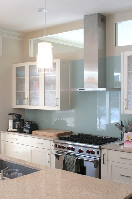
Glass-fronted upper cabinets and a back-painted glass backsplash are a break from the white while keeping things light.
For the backsplash the homeowners wanted something with minimal joints for easy cleaning. They considered large tiles but decided on the back-painted glass for an even cleaner look. Power outlets mounted beneath the cabinets keep the backsplash free and clear. Lero says the back-painted glass ended up being about the same price, if not cheaper, than a nice tile.
“And it reacts to the light,” he says. “You can see cones of light. It changes color because of the reflections and translucency of the glass.”
The back color was matched to Benjamin Moore’s Heather Gray, which is the wall paint in the adjacent family room.
Not surprisingly, the couple looked at a lot of range hoods. They eventually landed on something minimalist and functional. A fan in the attic makes the slim addition powerful.
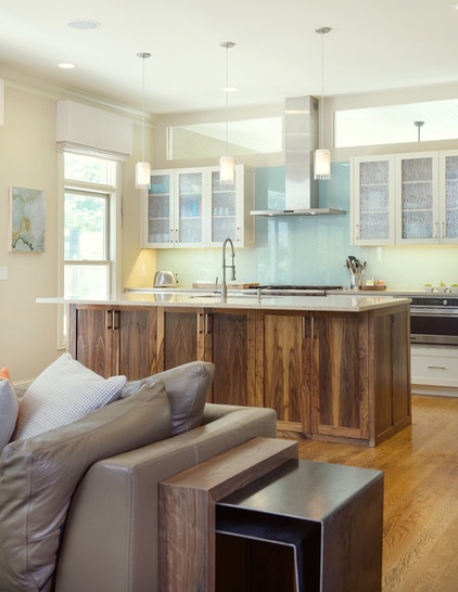
Transom windows over the upper cabinets bring in light from a sunroom on the other side, while a new window to the left of the cabinets also brightens the room. The walnut-wrapped island adds a touch of warmth and connects with walnut furniture found throughout the house.
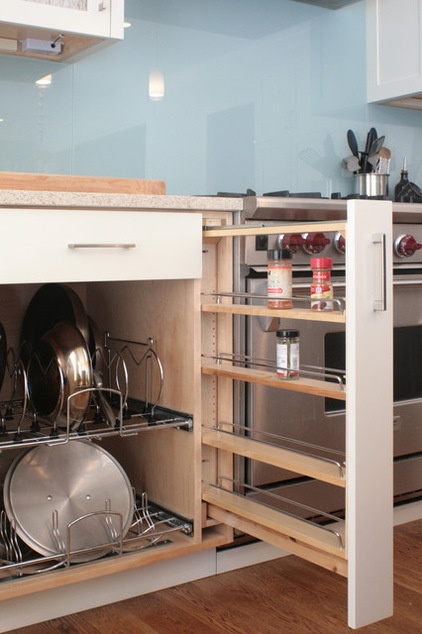
More efficient storage was the main goal for the new cabinets. Here a pullout rack for spices and another for pots and pans keep things organized and easy to reach.
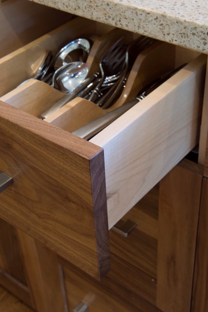
Custom dividers in an island drawer corral silverware.
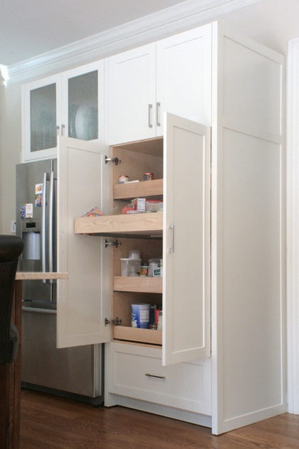
And pullout shelves make the most of a deep pantry cabinet.
The 15 Most Popular Kitchen Storage Ideas on Houzz
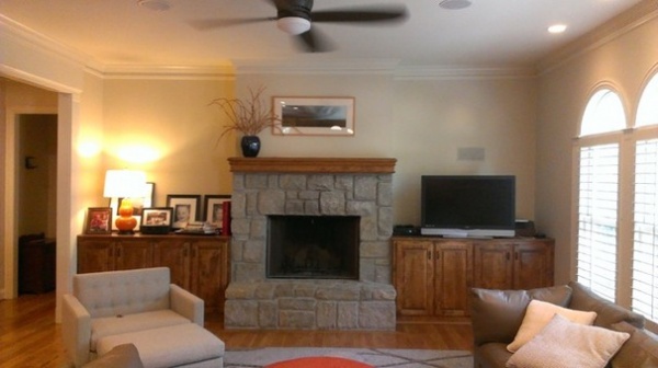
BEFORE: The adjacent family room also needed an update. Because there’s a fireplace in a nearby room, the family wasn’t keen on keeping this one in use. Plus, the existing cabinets didn’t provide the storage they needed.
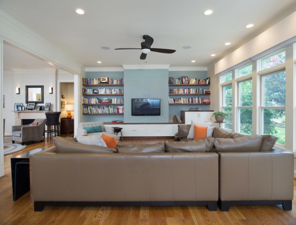
AFTER: Lero removed the fireplace but kept the chimney, in case the couple wanted to add a fireplace in their master bedroom, which is on the other side of this wall.
New windows and simpler trim replaced the original arch-topped windows and decorative column trim.
Wall paint: Heather Gray, Benjamin Moore
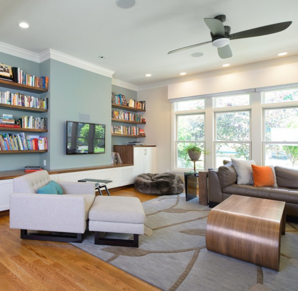
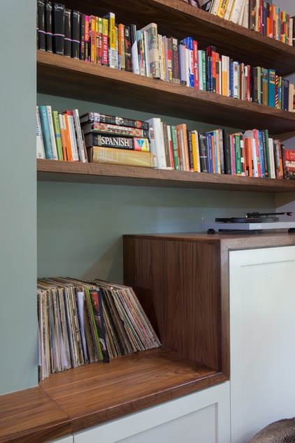
New cabinets topped with walnut connect the family room to the kitchen update. The drawers under the TV go all the way back into the wall to create ample storage for toys. To the right of those is a subwoofer concealed behind a perforated metal panel. A walnut toe kick gives the cabinets a floating appearance.
See more kitchen stories
Related Articles Recommended


