Houzz Tour: Layered Look Adds a Fresh Sense of Style
http://decor-ideas.org 01/21/2015 23:33 Decor Ideas
Just the other day, I spotted a woman whose chronological age was greater than mine, but whose style was effortlessly timeless and wonderfully fabulous. I was likely 30 years her junior, but her elegant outfit, paired with funky eyeglasses and interesting shoes, made me feel like a fuddy-duddy. Looking at the photos of this house might engender the same impression of classic cool with a strong dose of a striking, hip style.
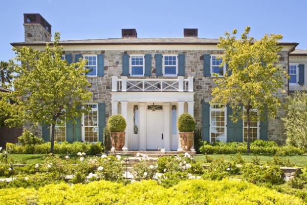
Houzz at a Glance
Location: Brentwood neighborhood of Los Angeles
Who lives here: A music industry couple and their child
Interior designer Jeff Andrews recognizes the stylish woman-of-a-certain-age analogy, “I know the kind of person you are talking about,” he says. “People like that might be wearing something they bought 20 years ago, but it still looks sharp.”
The house embodies the concept because, although it is new construction, it’s done in a very traditional style that’s cut with an enviable amount of hipness.
With its column-lined entry, shutters and fieldstone exterior, the home looks almost staid. “This was a spec house,” says Andrews. “It was well constructed and appointed, but inside, the rooms were mostly white, plain and uninteresting.”
Rug: Tracery by Kelly Wearstler, The Rug Company; paint: Bone, Farrow & Ball; mirror: vintage, JF Chen
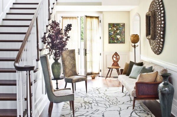
Andrews set out to correct that with layers of art and accessories. His clients were expecting a baby, and they wanted the house to be finished and move-in ready ASAP. Luckily, they had a style mind-meld with Andrews, and he was able to complete the house within six months. “Although people hire me for my taste, their personal style doesn’t always match mine,” says the designer. “These clients liked the same things I like and have in my own house — our style was so similar that sometimes during this project I felt like I was designing my own place. I would often arrive with a truckload of items, and they would take 95 percent of it.”
The layers look relies on highly textured items: midcentury paintings, atomic-age pottery, rich collections and vibrant wall coverings. Pair that with a plethora of seating areas, and you have a home that has many places where you can sit back and take in the eye candy. “All throughout the house, I wanted to give people something remarkable to look at,” the designer says.
He adds that the house is well proportioned, especially for a new home. “I didn’t want any part of it to look cold and stuffy, so I found several nooks and crannies where people can sit and have a conversation or read a book,” Andrews says.
So the entry may be on a somewhat grand scale, but a pair of chairs (one is vintage, and Andrews had a duplicate custom made) and vintage settee invite anyone coming through the door to sit back and relax.
The midcentury artwork also begins as you enter the front door. “I love the textures and colors of paintings made in the 1960s and 1970s,” Andrews says. “It doesn’t have to have a fancy provenance; it just has to have that look.”
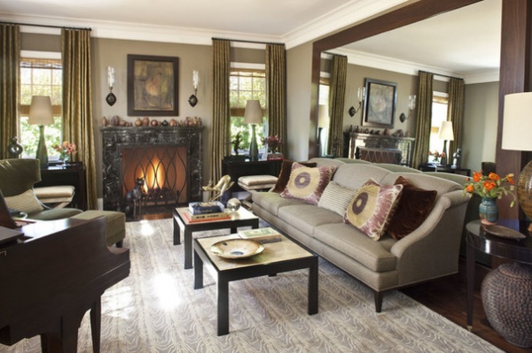
The living room’s size was not so stately, so Andrews added one of his signature touches: a mirror that stretches from nearly floor to ceiling. “Really, I’ve never met a mirror I didn’t like,” he says. “I designed this one, and it’s so large, it had to be assembled onsite.” He feels the effort was worth it, as it makes the room feel more spacious and gives it a different perspective.
Paint: Mouse’s Back, Farrow & Ball; rug: Marquetry by Kelly Wearstler, The Rug Company; sofa: A. Rudin
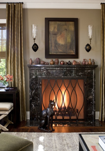
In truth, the designer’s perspective wasn’t that favorable the first time he saw the space. “I wasn’t a fan of the fireplace, and changing it wasn’t an option,” he says. But after surrounding the statement-making marble piece with a fresh background, art, new light fixtures and a fire screen of his own design, he changed his mind.
One of the transformative moves was to cover the mantel from end to end with a collection of earth-hued pottery pieces. “I was going to do small groupings, but I loved them all, so we got them all,” Andrews says. “There are some pricey pieces and some that were likely made in a beginning pottery class.”
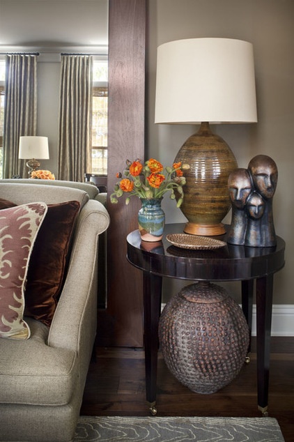
“I’m a little obsessed with pottery,” Andrews says. “It just adds so much depth and texture to a room. I like new and old pieces, but all the pottery in this project is older.”
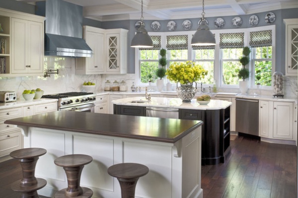
The combined kitchen, family room and breakfast area needed similar injections of personality. Before Andrews touched it, the kitchen was white on white. A coat of blue-gray paint, a row of Fornasetti plates above the windows and industrial pendants (they were salvaged from a Range Rover factory) over the island make the room more remarkable.
Paint: Adagio, Benjamin Moore; stools: Bottega Montana, Twentieth
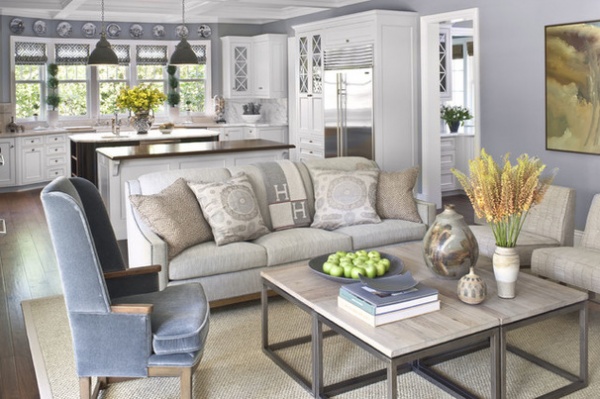
The color palette continues into the family room.
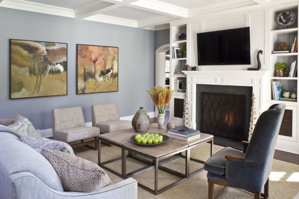
In addition to pottery pieces and abstract art made around the time the peace sign was invented, Andrews added two rustic-glam vintage garden elements (metal spires that bookend the fireplace) and natural wonders such as geodes and agates. “The husband loves those kinds of elements,” he says. “This couple is also completely vegan, so we didn’t use any leather or animal products — and all the fabrics are green.”
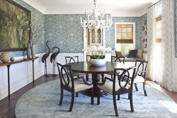
Knowing their love of animals and nature, Andrews added a lot of animal imagery throughout the house — including bronze crane statues in the dining room. The delicate, rounded lines of their necks are echoed in the curvaceous chair backs.
Wallpaper: Malabar Sage by Cole & Son, Lee Jofa; rug: Madison Square, House of Tai Ping; Councill Loop Back Chairs: Baker; chandelier: Metropolitan, Lighting Showroom
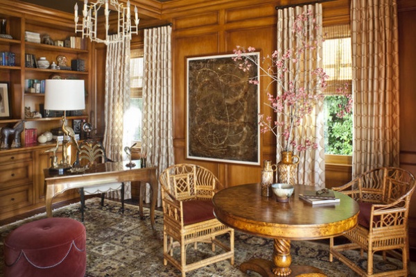
The home has a wood-paneled library, a decorating feature that is perhaps more Downton Abbey than Westside Los Angeles. Andrews gave the grand dame a sense of humor by installing 1970s-era cane chairs around a burled-wood table, along with abstract art and mod curtains.
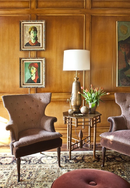
“I wanted it to look cozy but in a very cool way,” he says.
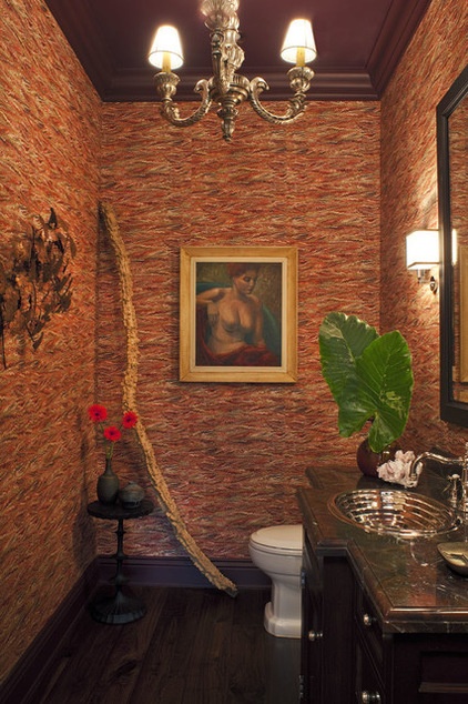
There’s a powder room off the library; its walls are covered with a wallpaper that mimics marbleized book endpapers. “In a sample it looks intense. But once you get it up on the wall, there’s a Missoni-like texture and rhythm to it,” says Andrews.
He brought in nature with a long, gnarly root propped in the corner. He found it at the Flower Mart, but allows he’s been known to pick up a sculptural branch or piece of driftwood from the curb.
Wallpaper: Twigs
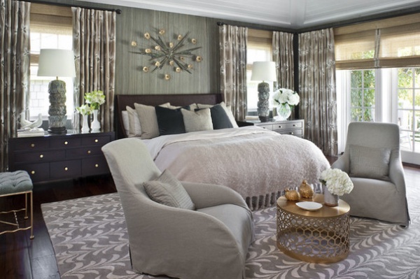
A similarly bold wall covering envelops the master bedroom. “I think it adds a lot of warmth to the space,” the designer says.
Wallpaper: Reeds Reef, Keith McCoy; chairs: Kalos, B&B Italia
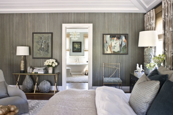
The view from the bedside is an example of his belief that there should be interesting things to see in every direction.
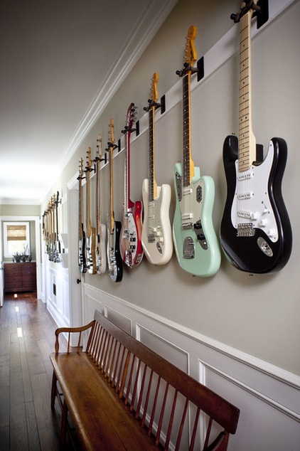
If you want to find the husband’s office, just follow the guitars. “He’s a songwriter and music producer,” says Andrews. “He plays all of these guitars for his work, so we decided to hang them like artwork down the hall.”
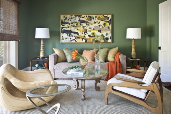
You might think that the nearby media room was inspired by the dramatic painting over the sofa, but in fact it was inspired by the vintage ceramic lamps. The armchairs are driftwood-like in character and color, but they live companionably with the scrolled legs on the coffee table. It all speaks to the alchemy that happened during the months Andrews worked on the project.
“It was a great run, where I found wonderful things everywhere,” he says. “There’s no formula to this house. I found amazing things and tried to put them together in amazing ways.”
Paint: Calke Green, Farrow & Ball; chair (left): Strata, Twentieth
Browse more homes by style:
Small Homes | Colorful Homes | Eclectic Homes | Modern Homes | Contemporary Homes | Midcentury Homes | Ranch Homes | Traditional Homes | Barn Homes | Townhouses | Apartments | Lofts | Vacation Homes
Related Articles Recommended


