Kitchen Takes Off in a Former Aircraft Parts Factory
http://decor-ideas.org 01/20/2015 02:13 Decor Ideas
A tight budget and a busy work schedule had put the much-needed renovation of this kitchen-dining space on hold for several years after the homeowner, a TV executive, moved in. She shares the home with two housemates, so a well-functioning space is essential, but the original kitchen was confined to a tiny corner of the room, while the rest of the space was strewn with furniture and bric-a-brac due to a woeful lack of storage.
“The client wanted the kitchen and its mezzanine to feel more integral to the general living space,” says designer Sarah Ellison. “Her vision was for a sleek, contemporary and minimalist space. The challenge was to marry her vision and the reality together into a workable solution on a fairly tight budget.”
Houzz at a Glance
Who lives here: A young media professional and her 2 flatmates
Location: Clapton, London
Designer: Sarah Ellison, Trunk Creative
Budget: $30,000
Decade built: 1930s
Size: 3 bedrooms, 2 bathrooms
That’s interesting: The building was used as an aircraft parts factory in the 1930s.
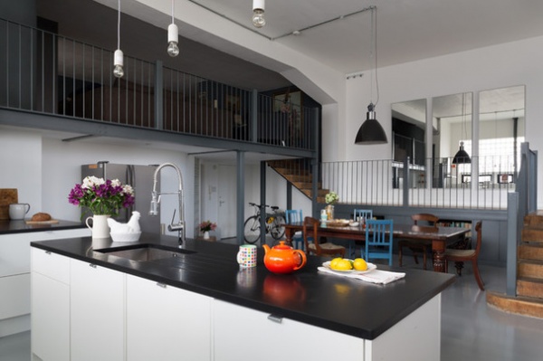
Storage areas built under the stairs cleared the way for a sleek kitchen-dining space, with the client’s oak dining table — a family heirloom — taking center stage in the open-plan scheme. “It was important to create a sociable environment that would be suited to entertaining,” says Ellison, of Trunk Creative. “As it is, guests can sit at the table while the owner prepares food at the kitchen island, which faces it. It’s very inclusive, and the eclectic mix of furniture enhances the warm, lived-in feeling.”
Glass bricks, a relic from the property’s industrial past, and a row of small windows at an unusual height meant that overhead cupboards were out of the question. “We had to be quite creative with the cupboard space,” recalls Ellison. “In the end we bought standard internal units, then customized them to fit the space, so essentially we created a bespoke kitchen for a high-street [less expensive] price.”
Although the room is fairly large, deciding on the layout wasn’t without its challenges. “There’s very little wall space in the room, so a kitchen island was central to the scheme,” says Ellison. “It has concealed storage, as well as housing the sink unit and providing a food preparation surface.” She constructed the island using a mix of standard ready-made units, which were then given a facelift with custom doors and topped with a black slate top for a dramatic effect.
Customized kitchen cabinets and Lamona chrome professional-style single-lever faucet: Howdens Joinery
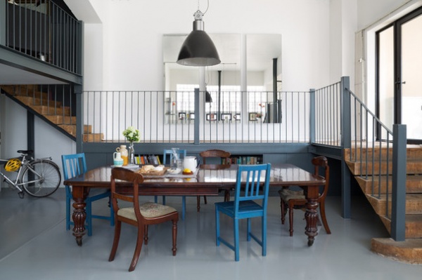
“We were led by budget when it came to the flooring,” says Ellison. “The existing floor was a cobbled-together mix of laminate and rubber that we replaced with epoxy paint, in keeping with the industrial vibe. It’s also very hard wearing and easy to maintain, which is perfect for the owner’s busy lifestyle.”
Ellison painted the back cupboards and the stair railings in Farrow & Ball’s Down Pipe to add interest to this corner of the room and prevent it from looking too stark. A salvaged factory pendant light from the 1950s illuminates the dining area and is a subtle nod to the building’s industrial heritage.
Railing paint: Down Pipe, Farrow & Ball; pendant: Eastern Bloc, Skinflint Design
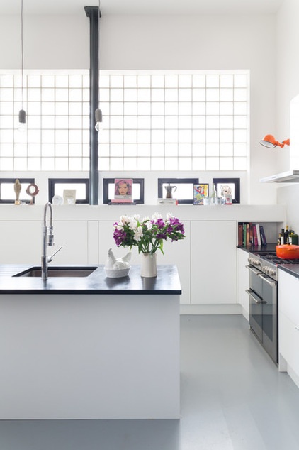
Walls of glass bricks are featured throughout the property, meaning overhead storage units were out of the question. “Despite their appearance, the bricks don’t really allow much light to filter into the room, so we kept the walls and units white to emphasize the sense of airiness and space,” says Ellison.
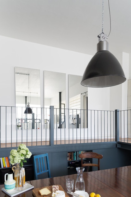
The three mirrors on the back wall were already there, as were the dining table and chairs. “The client inherited the table from her father, so this was always going to be a major feature in the room,” says Ellison. “It’s very traditional in style, but the collection of mismatched chairs pulls it back and makes it feel more eclectic, which ties in with the rest of the scheme.”
The walkway to the mezzanine is composed of original floorboards, which Ellison left untreated for an authentic look.
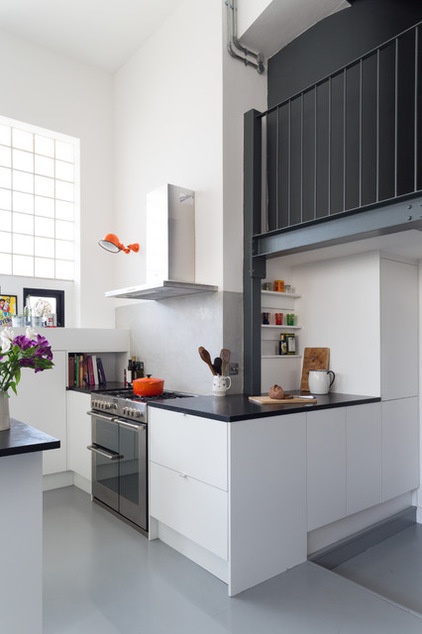
“The Stoves cooker was the client’s choice,” says Ellison. “She really wanted to use a British brand, and this one fits in effortlessly with the scheme and is easy to use.”
Ellison introduced a pop of color to the scheme by matching a colorful wall lamp to the owner’s collection of Le Creuset cookware.
Range: Sterling, Stoves; orange wall light: Jielde
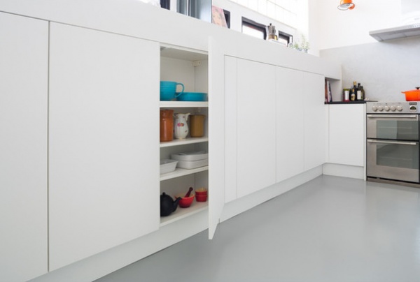
“The cupboards answer the owner’s desire for a minimalist scheme,” says Ellison. “We’ve kept them looking sleek and unfussy by doing away with handles in favor of a push-click mechanism.”
The unusual window height posed a challenge, however. Ellison wanted the units to sit flush under the narrow windows, which called for some clever carpentry. “In the end we used the internal structure of bought units from Howdens and customized them to make them taller before adding new doors,” she says. “So essentially, they’re bespoke units.”
Customized kitchen cabinets: Howdens Joinery
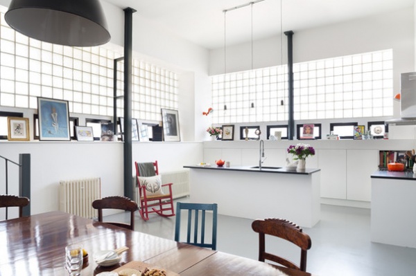
To keep costs down, Ellison found reclaimed radiators on eBay. “They look great, and saving money on items like this allowed us to spend more on other fixtures and fittings,” she says.
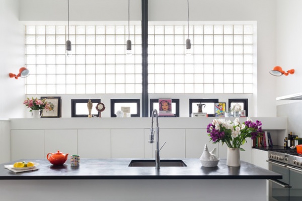
Metal support beams are painted in Farrow & Ball’s Down Pipe to break up the large expanses of white and to reference the staircase, which is painted in the same color. “It’s a spacious room, so it was important to create a sense of continuity as you move around it,” says Ellison.
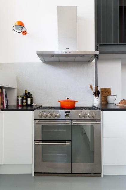
For the backsplash Ellison opted for an unusual metal-troweled microcement finish. “It’s not very common in the U.K.,” she says. “It’s applied directly to the walls, and it fits in perfectly with the tone of this industrial-style scheme, plus it’s easy to maintain.”
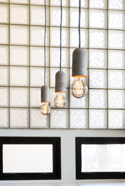
The trio of edgy pendants above the island features concrete fittings, which Ellison chose to match the backsplash.
Concrete light fittings: Nud
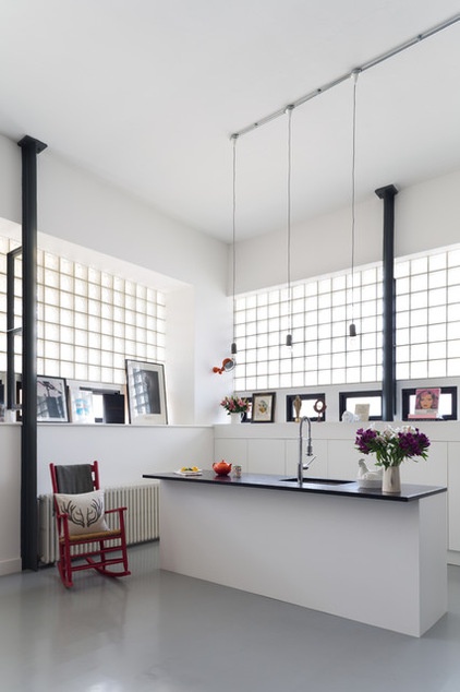
A red rocking chair and a collection of artwork along the windowsill were part of the owner’s existing collection of furniture and knickknacks. “She’s been able to conceal a lot of the clutter in the understairs cupboards, but it was important to incorporate many of her treasured items into the scheme,” says Ellison. “You have to work around people’s lifestyle, and the finished look should reflect their personality.”
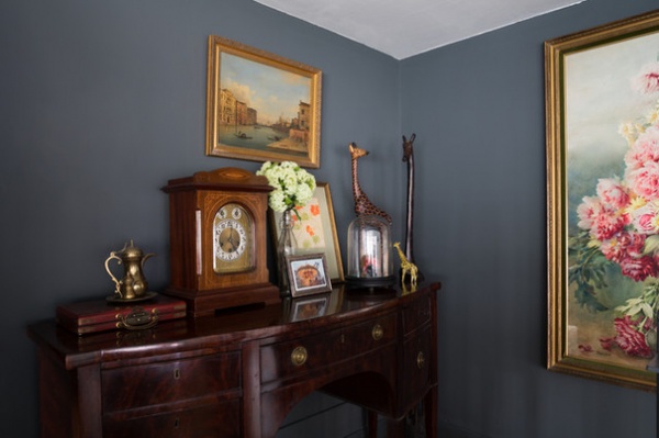
Upstairs, the small mezzanine houses more of the owner’s treasured items. “This is naturally a very dark space with a low ceiling, so we decided to embrace the darkness and transform it into a cozy, den-like annex,” says Ellison. “We used Down Pipe by Farrow & Ball on the walls to connect the room to the kitchen, so there’s a real sense of flow as you move from one room to the other.”
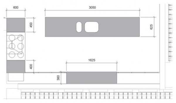
The floor plan illustrates how Ellison divided up the spacious room into a relaxed kitchen–dining room, which the owner and her housemates can now enjoy as part of their living space.
More: Homeowner’s Workbook: How to Remodel Your Kitchen
Related Articles Recommended


