Mixing Vintage and Modern in an Urban Family Kitchen
http://decor-ideas.org 01/19/2015 04:15 Decor Ideas
If Emily and Ian Allison’s kitchen looked like it was thrown together on a whim, that’s because it kind of was. When previous owners converted their 1888-built home into a duplex, they put together an ad hoc kitchen on the second floor because the original kitchen resided on the ground floor. So when the Allisons bought both units and rented out the bottom floor, they were stuck with a kitchen that seriously lacked function. “There wasn’t even a single drawer,” says Ian. “It was a bummer.”
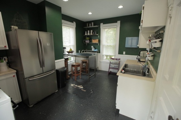
BEFORE: There also were limited counter and cabinet space and a river-rock floor left over from the 1960s or 1970s that the couple had attempted to cover up. “We erroneously painted the floor black,” Ian says. “But it started to chip, and you could see the brown and cream-colored river rock tile beneath.”
Fed up, the couple met with interior designer Kelli Kaufer. After several conversations about their likes and dislikes, they handed the reins over to Kaufer. “We basically said, ‘We trust you. Build a kitchen that you think suits us,’” Ian says.
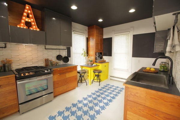
AFTER: They gutted everything but left the plumbing where it was to save money. Kaufer interpreted the couple’s personalities — he’s a bass player; she’s a digital artist — into a design that channels modern urban hipness with a vintage feel.
For example, repurposed bleacher seats form the honey-colored lower cabinets, while old schoolhouse chalkboards make up the countertops. There are also a black ceiling, pops of color and a funky, graphic floor pattern. But, above all, there’s finally function. “It looks like us, it’s functional, and it’s a delight to be in,” Ian says.
Flat-slab upper cabinets deliver a dose of modern, and the flooring plays on an old houndstooth print that’s been around for a century, Kaufer says. She enlarged the pattern and printed it in a funky color on tiles. She then painted the ceiling black as a visual trick that forces the eye up and makes people pay attention to the whole space.
Upper cabinets: Ikea
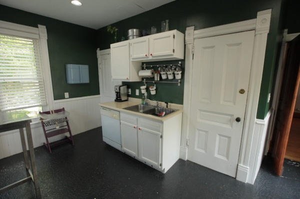
BEFORE: A door to right of the sink closed the kitchen off from the hallway and staircase. A pantry to the left of the sink was needed because there was so little functional cabinetry.
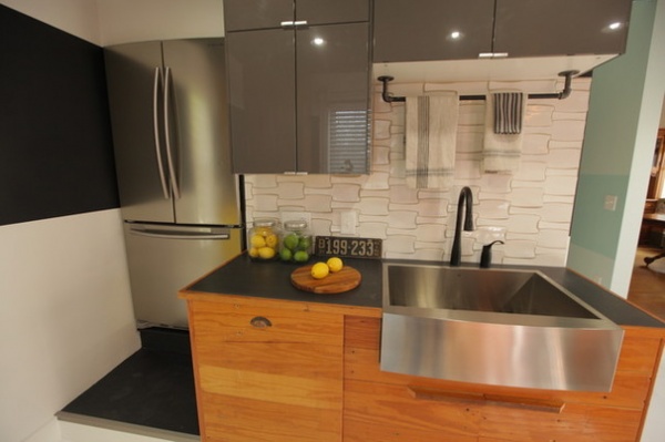
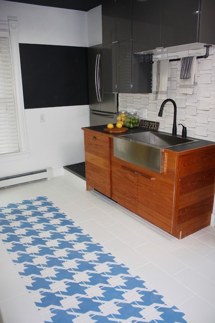
AFTER: Removing the door and 4-foot wall opened the kitchen to the hallway. Kaufer moved the range to where the refrigerator once was to free up traffic flow and create more counter space. She then replaced the pantry with the refrigerator, because the new cabinetry meant a large walk-in pantry wasn’t needed. Because the entry stairwell is directly beneath the refrigerator, she had to raise the appliance. “We weren’t sure about the step, but we trusted them,” Ian says. “Now I don’t think about it anymore.”
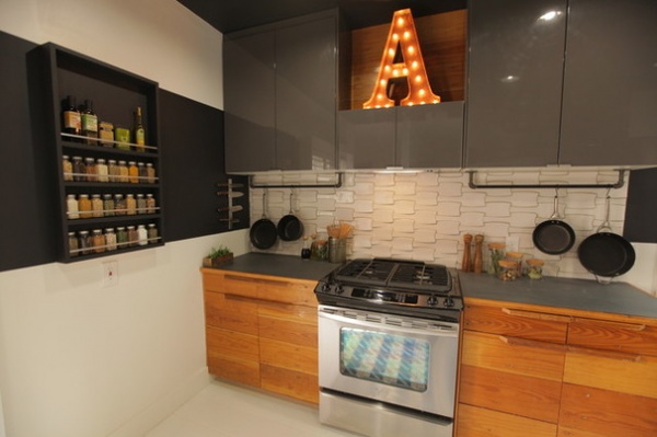
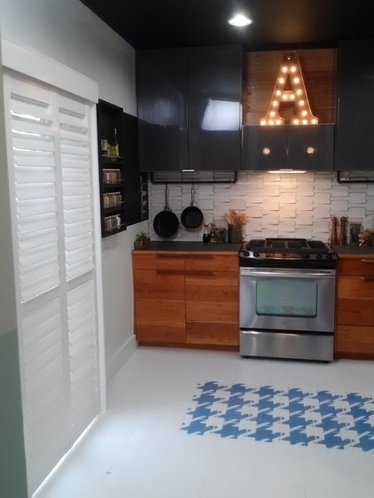
The wall where the range used to sit is now open, save for a handy spice rack, to keep the main traffic path into the kitchen and out to the patio clear.
Kaufer found the schoolhouse chalkboards for the countertops in a salvage yard. “I thought, ‘Wow, that’s all slate. What can we do with it?’ So we got a wet saw and cut it up,” she says. “In some places they still have lines on it for practicing cursive.” She sealed them with mineral oil.
Plumbing pipe hangs beneath the upper cabinets at 24 inches above the counter, with S-hooks to hold pots and pans.
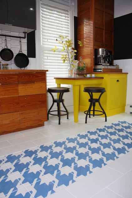
The only thing Kaufer was able to save and repurpose from the original kitchen was a long, tall cabinet that she turned into a custom coffee bar in the corner.
In the end the Allisons got a functional kitchen that’s anything but ad hoc. “It’s beautiful,” Ian says. “We have drawers and counter space, and the materials are really cool.”
See more kitchen stories
Related Articles Recommended


